
Landscape vs Shorts Thumbnails: Format Strategy
Landscape thumbnails win the long-form feeds; vertical Shorts thumbnails win the Shorts tab, search and suggested placements where a Short is shown as a still. The 1of10 generator builds both from one engine with a single format switch, so you compose for the surface, not the tool.
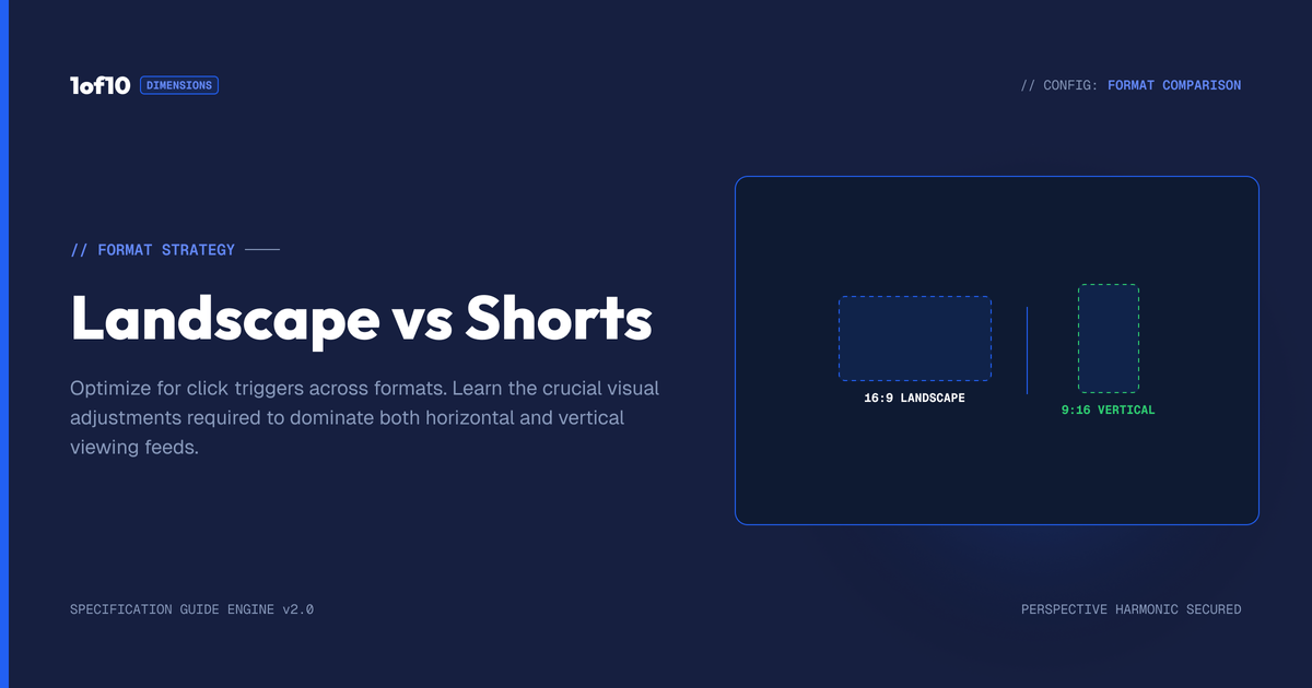
Quick answer: Landscape thumbnails win the long-form feeds; vertical Shorts thumbnails win the Shorts tab, search and suggested placements where a Short is shown as a still. The 1of10 generator builds both from one engine with a single format switch, so you compose for the surface, not the tool.
Most creators think of a thumbnail as one thing: the landscape image on a long-form video. But YouTube is two surfaces now, long-form and Shorts, and they do not treat thumbnails the same way. If you are pumping out Shorts without a deliberate thumbnail strategy, you are leaving clicks on the table on the fastest-growing half of the platform. This guide covers when a Shorts thumbnail matters, how it differs from a landscape one, and how the 1of10 Thumbnail Generator builds both from the same engine with a single switch.
For the full tool, see The Complete Guide to the 1of10 Thumbnail Generator. For exact pixel dimensions of every format, the YouTube Thumbnail Size Guide 2026 has the numbers. This post is about the strategy, not the specs.
The format switch, and what it changes
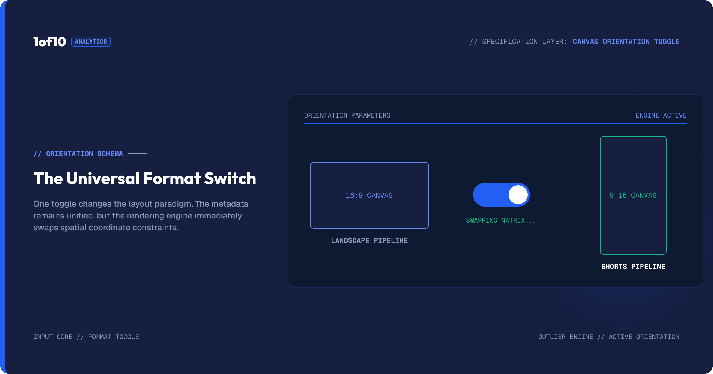
Inside the generator, a format control sits along the top next to your channel and model settings. It has two settings: a landscape thumbnail for long-form videos, and a vertical thumbnail for Shorts. When you flip it, one thing changes: the shape of the output. The landscape setting produces a wide image. The Shorts setting produces a tall one.
Everything else about the tool works identically. The prompt box, the reference and face uploads, the sketch tool, the editor, the four-variation default, all of it behaves the same way. You are not learning a second tool. You are telling the same tool which canvas to fill.
That simplicity is the point. The hard part is not making the two formats. It is knowing when each one earns its keep, and composing for the surface it will appear on.
Where each thumbnail actually shows up
This is the part most creators miss, so it is worth being precise.
Landscape thumbnails appear everywhere long-form lives: the home feed, search results, the suggested sidebar, your channel page, and anywhere your video gets embedded or shared. This is the classic YouTube thumbnail, the one that has to win a fight against a wall of competing thumbnails. Its job is to out-click the videos around it.
Shorts are a different surface. In the vertical Shorts feed itself, viewers swipe and the video autoplays, so there is no thumbnail to click in that moment. But the Shorts thumbnail is far from useless. It shows up in places that drive real traffic: your channel's Shorts tab, search results, the suggested area, and any place YouTube displays your Short as a still rather than autoplaying it. A Short with a strong custom thumbnail looks intentional and clickable in those surfaces. A Short with a random auto-grabbed frame looks like filler.
So the strategy is not "Shorts do not need thumbnails." It is "Shorts need thumbnails for the surfaces where they are shown as a still, not for the swipe feed." Once you see it that way, the decision of when to make one gets simple.
When to make a dedicated Shorts thumbnail
You do not need a custom thumbnail on every throwaway Short. You do need one when:
The Short is a pillar of your channel. If Shorts are a core format for you, your Shorts tab is a storefront. Custom thumbnails make it look curated and pull people deeper into your catalogue.
You want the Short to rank in search. Shorts surface in YouTube search as stills. A clear, readable vertical thumbnail beats a random frame for the click.
The Short is part of a series. Consistent custom thumbnails across a series signal "this is a thing, there are more," which builds the binge behaviour YouTube rewards.
The auto-grabbed frame is weak. If YouTube's default still is a blurry mid-blink frame, almost anything deliberate beats it.
If a Short is a quick one-off and none of the above applies, skip it. Spend the effort where it returns clicks.
Composing for vertical vs landscape
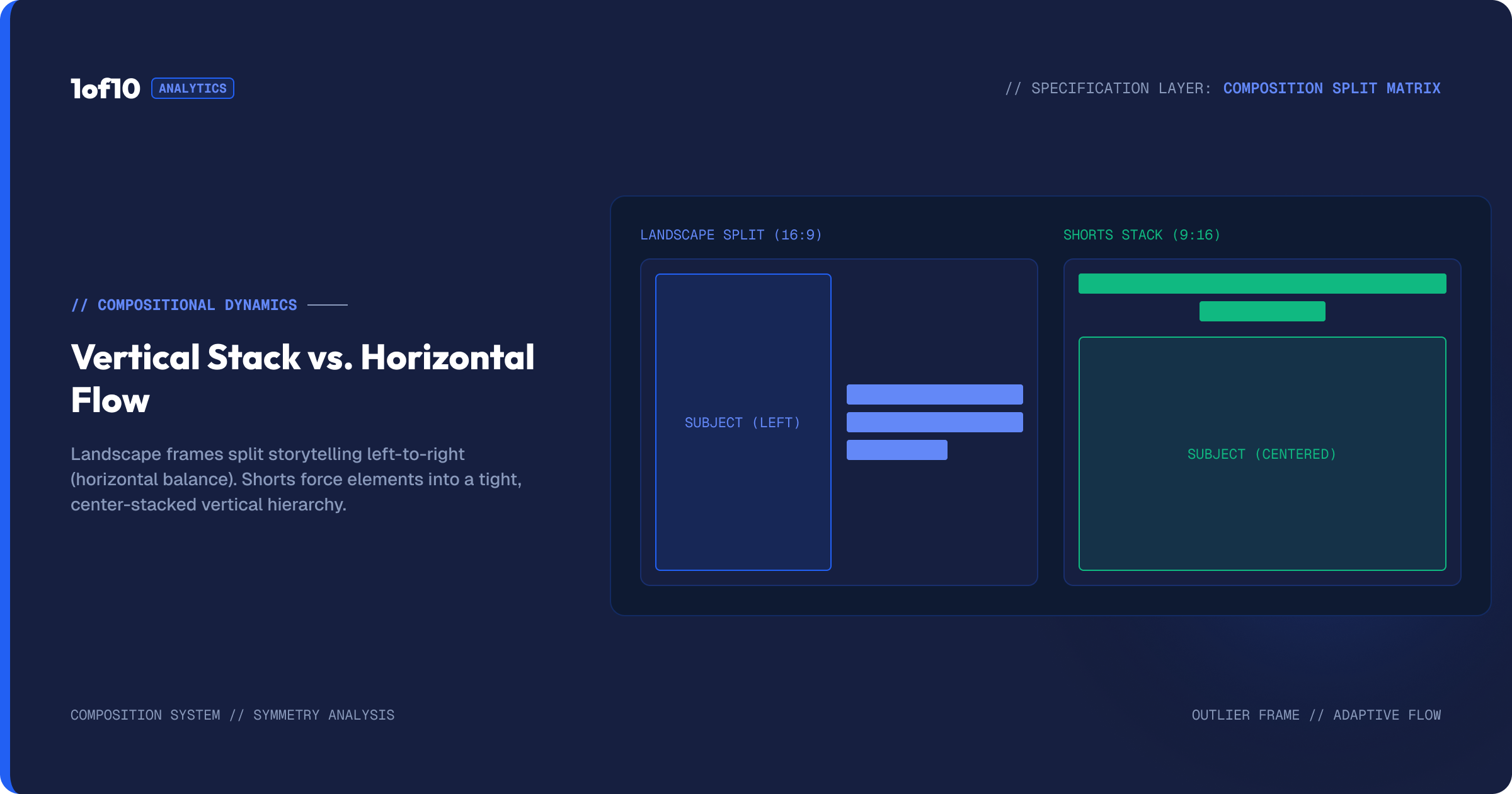
Same engine, different canvas, and the canvas changes how you should compose. A few rules carry over from good thumbnail design, and a few are specific to vertical.
Subject placement. In landscape, you often balance a subject on one side and text on the other. In vertical, you have height to work with and less width, so faces and subjects tend to sit centre or upper-third, with text stacked above or below rather than beside.
Text length. Vertical space punishes long text lines. Short, punchy text reads better in a tall frame. This is true on landscape too, but vertical is less forgiving. Keep it to a few words.
Crop awareness. Some surfaces crop vertical stills differently. Keep the critical elements, the face and the key text, away from the very top and bottom edges so nothing important gets clipped.
Readability at small size. Both formats get displayed small, but vertical stills in a busy Shorts tab are tiny. Heavy fonts, strong contrast, and minimal text matter even more. The Text and Fonts guide covers typography that survives at small size, and the Thumbnail Color Psychology Report covers contrast choices that pull the eye.
The generator handles the rendering for either shape. Your job is to prompt and compose for the surface the thumbnail will live on.
The Shorts-to-long-form funnel, and why thumbnails connect it
There is a strategic reason to care about Shorts thumbnails beyond the clicks on any single Short. Shorts are the top of the funnel for most channels now. A viewer swipes onto your Short, watches, and if they like it, they go looking for more. Where do they land? Your channel page and your Shorts tab, both of which display your content as still thumbnails. If those stills look deliberate and on-brand, the viewer sees a real channel worth subscribing to. If they look like random auto-grabbed frames, the viewer sees a content mill and swipes away.
So your Shorts thumbnails are not just fighting for clicks on individual Shorts. They are doing the work of converting a casual swipe into a channel visit, and a channel visit into a subscriber. That is a high-value job for something most creators ignore. Building consistent, branded thumbnails across your Shorts is one of the cheapest ways to make a channel look established, and the generator makes it a one-switch task rather than a design project.
This connects to how the algorithm surfaces your work, since a stronger channel-level signal helps everything you publish. For the bigger picture, see How the YouTube Algorithm Works in 2026 and How to Get More Views on YouTube in 2026.
Building both formats in the tool
The workflow is the one you already use, with the format switch set first.
- Set the format to landscape or Shorts before you generate, so the tool composes for the right shape from the start.
- Write your prompt as normal. The structure from The Detailed-Prompt Method applies to both formats.
- Generate your four variations, pick the strongest, and refine.
- Open the editor for final touches. Magic Eraser, Text, and Adjust and Crop all work the same in either format.
- Download, or upscale and download for higher resolution.
If you are making both a long-form video and a companion Short on the same topic, generate the landscape thumbnail first, then switch the format to Shorts and adapt the same idea into a vertical composition. You keep visual consistency across the two while respecting each shape. Use the history and folders to keep the pair together.
Format strategy by channel type
How much Shorts thumbnails matter depends on how you use Shorts. A few common setups.
Shorts-first channels. If most of your output and growth comes from Shorts, your Shorts tab is your shop window and custom thumbnails are not optional. Treat the vertical thumbnail with the same care a long-form creator treats their landscape one. Every Short that could rank in search or pull a profile visit deserves a deliberate still.
Long-form-first channels using Shorts as feeders. If you publish long-form and post Shorts to funnel viewers toward it, your Shorts thumbnails should visually connect to the long-form video they promote. Generate the landscape thumbnail, then build a vertical version that echoes it, so a viewer who liked the Short recognises the full video when they find it.
Mixed channels. If you publish both formats as equals, keep a consistent visual identity across them: similar fonts, similar color treatment, similar framing logic. The generator's settings and the Text and Fonts tool make that consistency easy to hold across shapes.
The common thread is that format is a strategic choice, not a technical afterthought. Decide what role each surface plays for your channel, then build the thumbnail that surface needs.
A note on sizes and specs
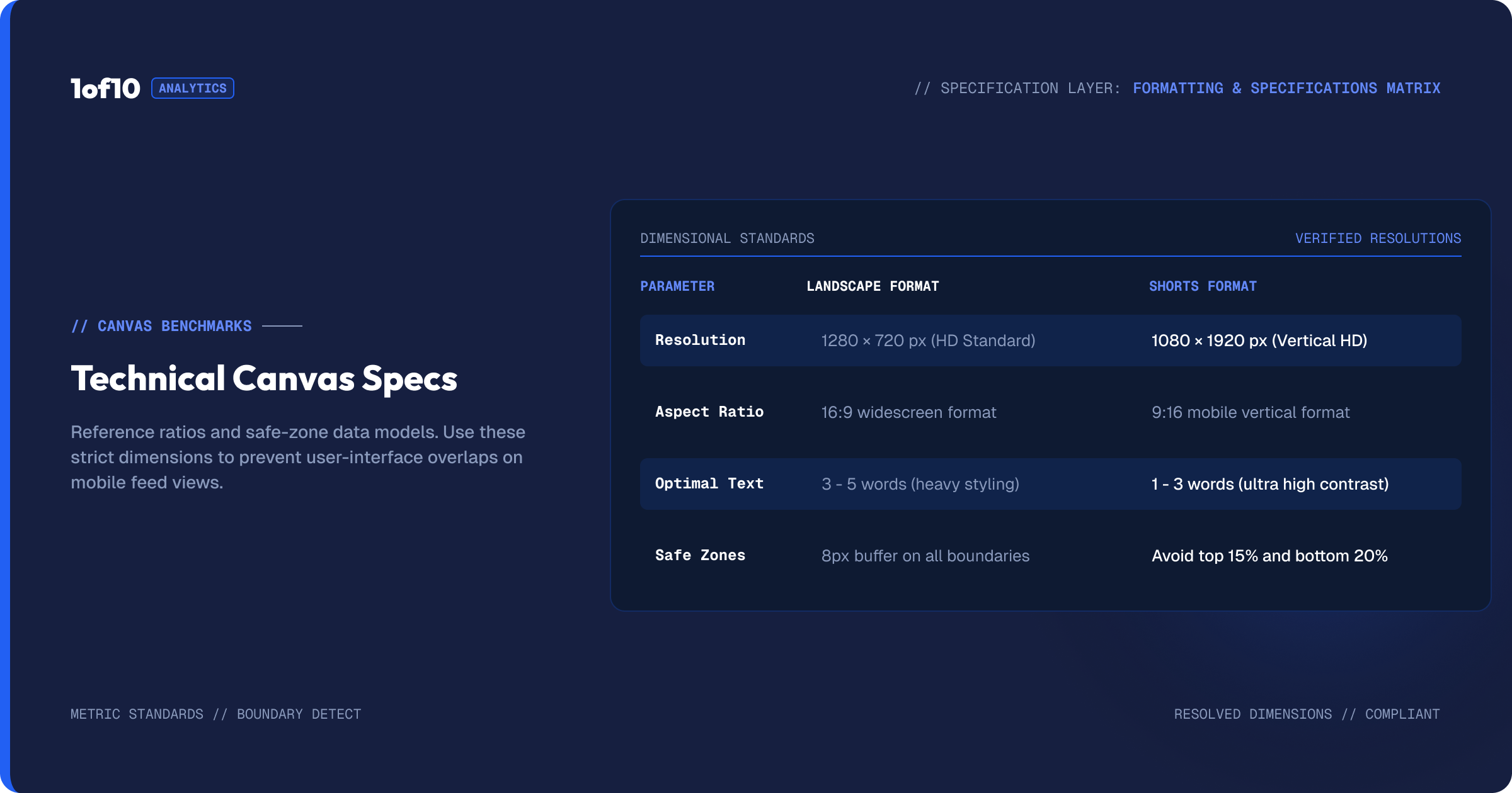
This guide is about strategy, not pixel dimensions, on purpose. The exact width and height YouTube wants for each format, and the aspect ratios involved, are covered in detail in the YouTube Thumbnail Size Guide 2026 and the YouTube Thumbnail Resolution: The Complete 2026 Guide. The short version is that the tool outputs the correct dimensions for whichever format you select, so you do not have to manage the numbers yourself. If you ever need to resize an existing image to fit, How to Resize an Image for YouTube Thumbnail walks through it.
Common mistakes
Treating Shorts as thumbnail-free. They are not. The Shorts tab, search, and suggested surfaces all show stills. A custom thumbnail wins those placements.
Reusing a landscape thumbnail on a Short. Cropping a wide image into a tall frame usually clips the face or the text. Generate the vertical version properly instead.
Stuffing text into vertical. Tall frames shown small cannot carry a sentence. Cut it to a few words.
Forgetting to set the format before generating. If you generate in landscape and then realise you needed a Short, you are regenerating. Set the switch first.
Ignoring the Shorts tab as a storefront. For creators who lean on Shorts, the tab is a major discovery surface. Curating it with custom thumbnails is one of the cheapest wins available.
Vertical compositions that actually work
A landscape thumbnail and a vertical thumbnail are not the same picture in a different box. The tall frame rewards different choices. A few compositions that hold up in vertical:
The stacked layout. Subject in the middle or upper portion, short text stacked above or below rather than beside. The vertical frame gives you height to separate the face from the text, which keeps both readable when the still is small.
The big-face crop. Vertical is unforgiving of clutter, so a single strong face filling much of the frame with a clear expression often outperforms a busy scene. Emotion reads even at thumbnail size in the Shorts tab.
The top-and-bottom split. Text or a graphic on top, subject on the bottom, or the reverse. This uses the height the format gives you and keeps the two elements from competing.
What to avoid: wide landscape scenes squeezed into a tall frame, long text lines that shrink to nothing, and critical elements pushed to the very top or bottom where cropping can clip them. Keep the face and the key words in the safe middle band. The same readability rules from the Text and Fonts guide apply, just with less room for error, and the contrast guidance in the Thumbnail Color Psychology Report matters even more when the still is tiny.
Frequently asked questions
Do YouTube Shorts need a thumbnail? Yes, for the surfaces where Shorts appear as a still: the Shorts tab, search results, and suggested placements. The swipe feed autoplays without a thumbnail, but a custom vertical thumbnail wins clicks everywhere else a Short is shown.
What is the difference between a Shorts thumbnail and a regular thumbnail? Shape and surface. A regular thumbnail is landscape for long-form feeds and search. A Shorts thumbnail is vertical for the Shorts tab and search. In the 1of10 generator, a single format switch produces either, and the rest of the tool works the same.
Can I use the same thumbnail for a video and its Short? Better to adapt it. Generate the landscape version, then switch the format to Shorts and rebuild the same idea vertically so nothing important gets cropped. You keep the visual link without clipping the face or text.
Does the tool handle the correct sizes automatically? Yes. Select landscape or Shorts and the tool outputs the right dimensions for that format. For the exact numbers, see the YouTube Thumbnail Size Guide 2026.
Which format should I make first? If you publish both a long-form video and a Short, make the landscape thumbnail first, then adapt it to vertical. It keeps your branding consistent across both surfaces.
Should every Short have a custom thumbnail? No. Make one when the Short is a pillar of your channel, when you want it to rank in search, when it is part of a series, or when the auto-grabbed frame is weak. For quick one-off Shorts where none of that applies, skip it and spend the effort where it returns clicks.
Do Shorts thumbnails help me get subscribers? Indirectly, yes. A viewer who likes a Short visits your channel and Shorts tab, both of which show your content as still thumbnails. A curated, on-brand set makes the channel look established and worth subscribing to, which is why Shorts thumbnails do funnel work beyond any single click.
A Shorts thumbnail checklist
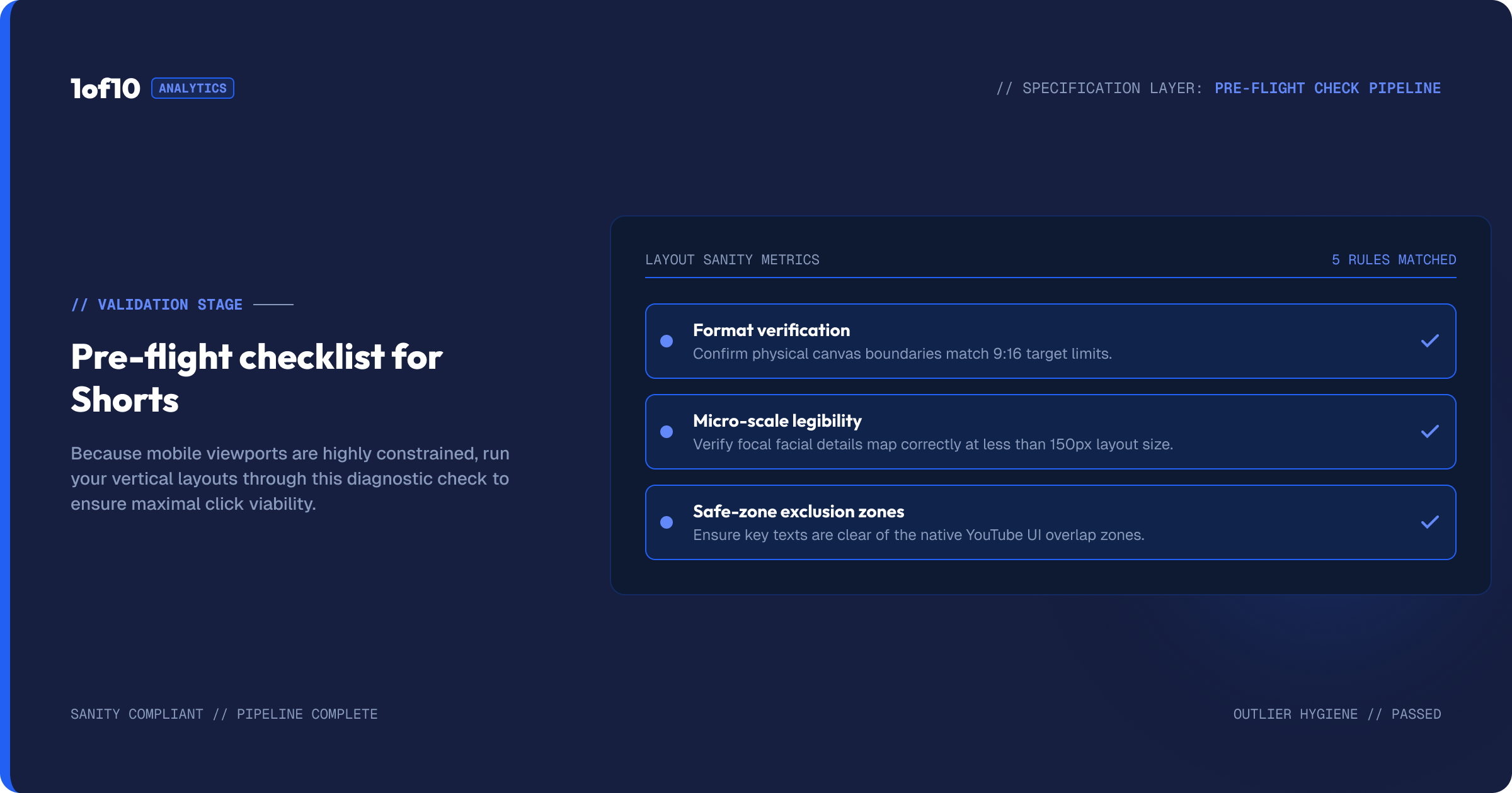
Before you publish a Short with a custom thumbnail, run it through a quick check built for the vertical format.
- Is the format set to Shorts? Generate vertical from the start rather than cropping a landscape image.
- Does the face read at small size? View the still tiny. If the expression is unclear, crop tighter or pick a stronger variation.
- Is the text under about four words? Tall frames shown small cannot carry a sentence. Cut it down.
- Are the key elements in the safe middle band? Keep the face and text away from the extreme top and bottom so nothing gets clipped.
- Does it match your channel's look? Consistent fonts and color across your Shorts make the tab look curated.
- Is the contrast high enough? Tiny stills need strong contrast to stand out. Bump it in Adjust and Crop if needed.
Six checks, a few seconds each. They are the difference between a Shorts tab that looks like a real channel and one that looks like a dumping ground. For the long-form equivalent and the design fundamentals behind both, see The Complete YouTube Thumbnail Guide.
The takeaway
Long-form and Shorts are two surfaces, and a deliberate thumbnail strategy treats them that way. Landscape wins the long-form feeds. A custom vertical thumbnail wins the Shorts tab, search, and suggested placements where your Short shows up as a still. The 1of10 generator builds both from one engine with a single switch, so the only real work is composing for the right shape and surface. Set the format first, prompt as usual, and finish in the editor. The full workflow is in The Complete Guide to the 1of10 Thumbnail Generator.