
YouTube Thumbnail Fonts and Text: Typography That Reads Small
The editor's text tool adds draggable text layers with a full font library (Impact, Anton, Bebas Neue and more) plus custom font upload, stroke and shadow. The one rule that governs thumbnail typography: it has to read small. Big, bold, few words and strong contrast win the click.
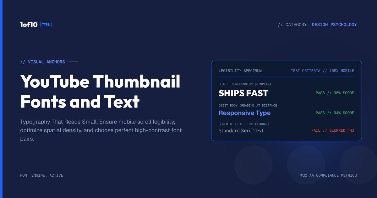
Quick answer: The editor's text tool adds draggable text layers with a full font library (Impact, Anton, Bebas Neue and more) plus custom font upload, stroke and shadow. The one rule that governs thumbnail typography: it has to read small. Big, bold, few words and strong contrast win the click.
A few words on a thumbnail can do as much work as the image behind them. The right text adds the hook the picture cannot say, sharpens the promise, and pulls the click. The wrong text, or the wrong font, turns to mush at the size people actually see your thumbnail and gets ignored. Typography is half the battle, and most creators treat it as an afterthought. The 1of10 Thumbnail Generator gives you a full text editor with a deep font library, custom font upload, and the controls that make words readable at small size. This guide covers how to add and style text, which YouTube thumbnail font to reach for, and the one rule that matters more than any other: it has to read small.
For the full tool, see The Complete Guide to the 1of10 Thumbnail Generator. This post is about the typography that turns a good image into a clicked one.
The text tool: add and place words anywhere
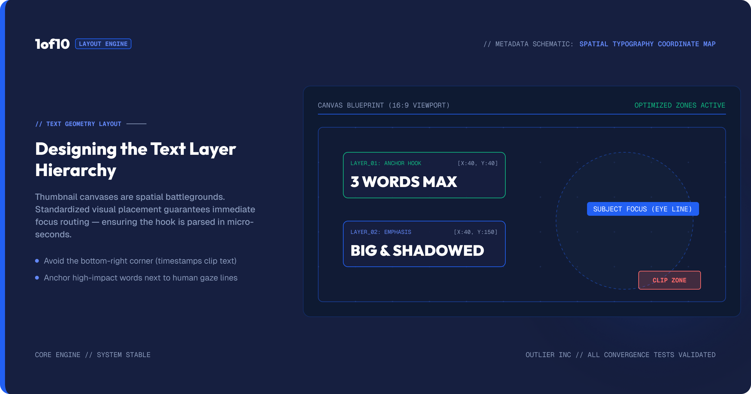
In the editor, the text tool lets you add text layers and position them anywhere on the thumbnail. You add a block, type your words, and drag it where you want it. You can add more than one block, so text can sit in multiple spots, a hook in the corner and a label on the subject, for example. Each block is its own layer you can move, resize, and style independently.
This is a real layout tool, not a single caption field. You are composing typography on top of your image, with the freedom to place each piece exactly where it serves the thumbnail. When you are happy, you apply the text and it bakes into the image at the position you set.
The font library, and uploading your own
Font choice sets the entire feel of a thumbnail, and the tool gives you a strong library to choose from. The set includes heavy, high-impact display faces built for exactly this job: Impact, Anton, Bebas Neue, Oswald, Montserrat, Poppins, Bangers, Luckiest Guy, Playfair Display, and Roboto Slab, among others. These cover the range from bold and aggressive to clean and modern to playful, which is most of what thumbnails need.
Just as important, you can upload your own font. If your channel has a signature typeface, the one you use across your branding, upload it and use it on every thumbnail. A consistent font is one of the strongest, cheapest branding signals you have. When a viewer sees your font, they know it is you before they read a word. Most creators overlook this, which is exactly why doing it sets you apart. For the broader design context, see Thumbnail Design: The Complete Guide to More Clicks.
Picking a font that fits your channel
A few guidelines for choosing.
Heavy display faces for impact. Impact, Anton, and Bebas Neue are tall, bold, and dominate the frame. They are the classic YouTube thumbnail fonts because they read at any size and carry energy. For entertainment, challenge, and most high-arousal content, these are the default.
Playful faces for fun content. Bangers and Luckiest Guy bring a comic, energetic feel that suits gaming, kids, and lighthearted content.
Clean faces for modern or educational content. Montserrat, Poppins, and Oswald read as modern and trustworthy, which suits tech, finance, and educational channels where you want authority rather than chaos.
Serif faces for premium or editorial content. Playfair Display and Roboto Slab carry a more refined, editorial tone for channels where polish is the point.
The rule underneath all of these: the font should match the emotion of your content and stay legible at small size. A beautiful font that cannot be read at thumbnail size is useless. When in doubt, go heavier and simpler.
The controls that make text readable
The text tool gives you the standard controls, and a few of them matter more than the rest for thumbnails.
Size. Make text big. Thumbnails are seen small, so text needs to be large in the frame to survive. Timid text disappears.
Bold and weight. Heavier text holds up better at small size. Most thumbnail text should be bold.
Stroke (outline). An outline around your letters separates them from the background so they stay readable over any image. This is one of the most important thumbnail typography tricks. A white stroke on dark text, or a dark stroke on light text, keeps words crisp even over a busy background.
Shadow. A drop shadow adds depth and separation, lifting text off the image so it does not blend in.
Alignment. Standard alignment controls for arranging your text blocks cleanly.
The combination that works for most thumbnails: large, bold text in a heavy font, with a contrasting stroke and a subtle shadow, kept to a few words. That formula reads at any size over any background.
The one rule: it has to read small
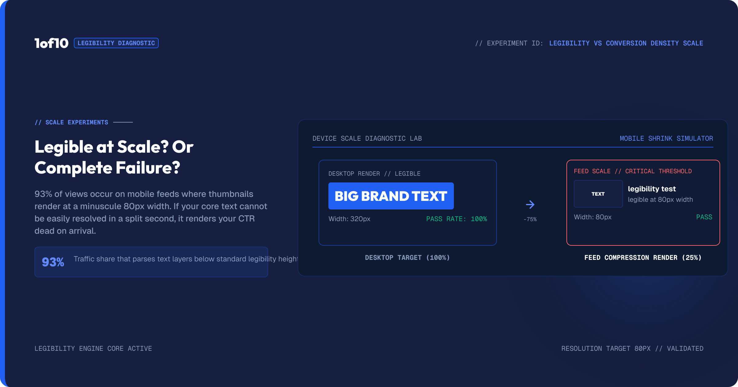
Everything about thumbnail typography comes back to this. Your thumbnail will most often be seen at the size of a thumb, in a feed, on a phone. Text that looks great at full size and turns to an unreadable smear when shrunk has failed, no matter how nice it looked on your monitor.
So test small. After you place your text, shrink the thumbnail down and look at it the way a viewer will. Can you read the words instantly? If you have to squint or lean in, the text is too small, too thin, too long, or too low-contrast. Fix it: make it bigger, bolder, shorter, or add a stronger stroke. Keep text to a few words, because a sentence shrunk to thumbnail size is just texture. Three or four punchy words beat a full phrase every time. The contrast side of this is covered in The Thumbnail Color Psychology Report.
Generate text-free, then add it in the editor
There is a cleaner path to thumbnail text than letting the generator render it. AI image tools sometimes produce garbled or misspelled text during generation. To avoid that, switch on the No Text option before generating, so the tool produces a clean image with no baked-in words, then add your text in the editor where you have full control over font, size, stroke, and placement.
This is the approach most serious creators use. The generator builds the scene, the text tool owns the typography. You get a clean image and crisp, correctly spelled, perfectly placed text, instead of fighting whatever lettering the generator tried to add. If a generation did add unwanted text, remove it first with Magic Eraser, then add your own.
Multiple text blocks and layouts
Because you can add several text blocks, you can build layouts with text in more than one place. A common pattern: a big hook word in one corner and a smaller label pointing at the subject. Or a top line and a bottom line framing the image. Each block is independent, so you can give them different sizes, fonts, and colors to create hierarchy, the main hook large and bold, a secondary detail smaller.
Use this deliberately. The goal is hierarchy, not clutter. One dominant piece of text the eye lands on first, and at most one supporting piece. Two well-placed text elements can structure a thumbnail; four competing ones make a mess. As with everything in thumbnails, restraint reads better at small size.
Color: making text fight the background
Font and size get the attention, but color is what makes text survive over an image. The job of thumbnail text color is contrast: the words have to separate hard from whatever is behind them. White text on a dark scene, dark text on a bright one, or a bold accent color that clashes deliberately with the background. If your text color sits close to the colors behind it, the words vanish at small size no matter how big the font.
This is where the stroke earns its place again. A contrasting outline lets a single text color work over a mixed background, white letters with a black stroke stay readable whether they cross a bright sky or a dark shadow. A common high-impact combination is a bright color, yellow or red, with a heavy black stroke, which pops against almost anything. Choose two or three text colors that match your brand and use them consistently, the same way you use a consistent font. The deeper logic of which colors pull the eye and which combinations drive clicks is in The Thumbnail Color Psychology Report.
Text and the title work together

Your thumbnail text and your video title are a team, and the worst thing they can do is repeat each other. If the title already says the words, the thumbnail text saying the same words wastes the space. The strongest setups have the thumbnail text and the title each add something, so together they tell a fuller story than either alone. The image and a few words create curiosity, and the title resolves or sharpens it.
So write the thumbnail text to complement the title, not echo it. If the title states the topic, the thumbnail text can deliver the emotional hook or the stakes. Think of the pair as one message split across two surfaces. For the title half, see How to Write YouTube Titles That Get Clicked.
What words to actually put on a thumbnail
Choosing the words is its own skill. The best thumbnail text is short, punchy, and creates a question the video answers. A few principles: favor strong, concrete words over generic ones, use numbers and stakes where they fit, and aim for the emotional core of the video rather than a description of it. "LETHAL" hits harder than "a dangerous weapon." A big number lands harder than a vague claim. And less is more, three or four charged words beat a full phrase, because the image is doing half the talking. Let the picture carry the scene and the text carry the hook, and keep that hook to the fewest words that land it.
How text fits the editor workflow
Text comes near the end of the editor sequence. The natural order: clean the image with Magic Eraser, make any targeted changes with Magic Edit, then add your text, and finally polish with Adjust and Crop. Text goes on a clean, finished image so you can place it against the final composition rather than guessing where elements will end up. Adding text first and then erasing or editing underneath it just means repositioning the text afterward.
Where to place your text
Placement is as much a part of thumbnail typography as the font. A few guidelines that hold up. Keep text clear of the subject's face, never cover the eyes or the expression, since that is doing its own work to pull the click. Use the empty space in the composition, which is why generating with a deliberate gap for text, prompted in the generator, pays off. Watch the bottom right corner, because the video duration stamp sits there on YouTube and can clash with text placed too low and too far right.
Position the dominant text where the eye naturally lands, often the upper or central area, and let it anchor the thumbnail. If you have a second text element, place it to support rather than compete, smaller and out of the main line of sight. Because each text block is a movable layer, you can drag and test placements until the composition feels balanced. The image and the text should feel like one designed thumbnail, not text dropped onto a picture, and placement is what makes that difference.
Common mistakes
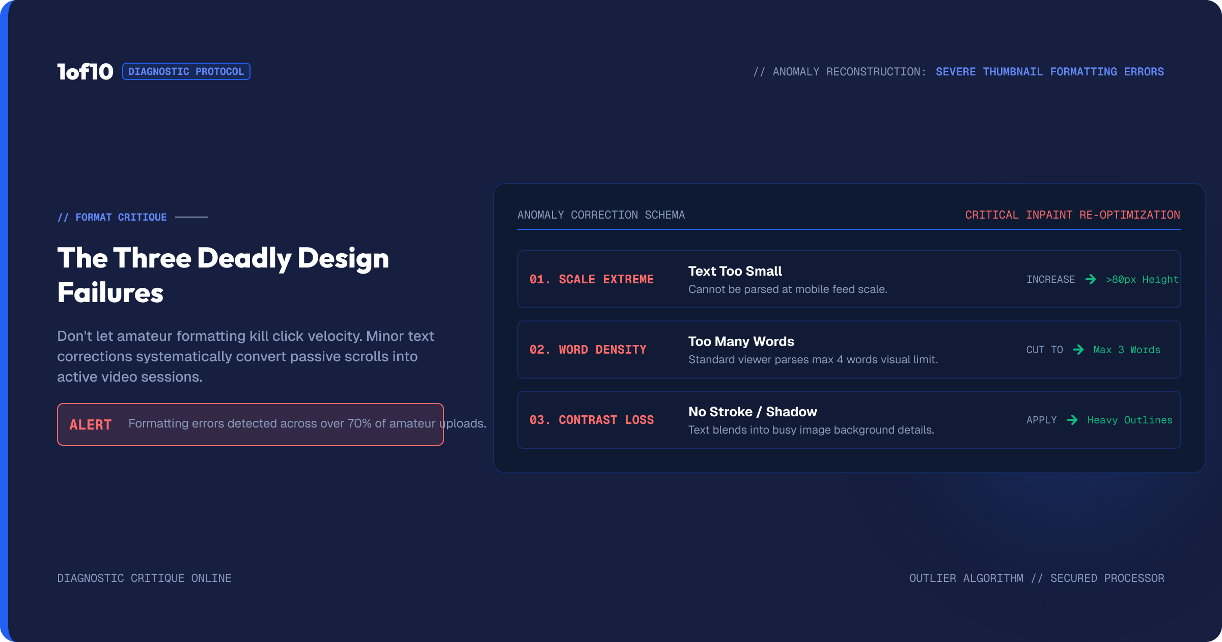
Text too small. The most common failure. Thumbnails are seen tiny, so text must be large in the frame. Make it bigger than feels necessary.
Too many words. A sentence shrinks to nothing. Cut to three or four punchy words.
No stroke or shadow. Plain text disappears over a busy background. A contrasting outline keeps it readable.
Low contrast. Dark text on a dark image, or light on light, is invisible at small size. Make text fight the background, not blend with it.
Letting the generator render the text. AI lettering is often garbled. Use No Text, then add controlled text in the editor.
Cluttered typography. Four competing text blocks make a mess. One dominant hook, at most one supporting line.
Frequently asked questions
What font should I use for a YouTube thumbnail? Heavy display fonts like Impact, Anton, and Bebas Neue are the classics because they read at any size and carry energy. Use playful faces like Bangers for fun content, clean faces like Montserrat or Poppins for educational content, and match the font to your channel's emotion. The tool also lets you upload your own brand font.
How do I add text to a YouTube thumbnail? In the 1of10 editor, use the text tool to add a text block, type your words, choose a font, and drag it into place. You can add multiple blocks, style each with size, bold, stroke, and shadow, and apply when done.
Can I use my own font? Yes. Upload your channel's signature font and use it on every thumbnail. A consistent font is a strong, low-effort branding signal that makes your thumbnails recognizable before a viewer reads a word.
Why is my thumbnail text hard to read? Usually it is too small, too thin, too long, or too low-contrast. Make it larger and bolder, cut it to a few words, and add a contrasting stroke and shadow so it stays crisp over the image. Always test it at small size.
Should I add text in the prompt or the editor? The editor. Generate with the No Text option on to get a clean image, then add crisp, correctly spelled, precisely placed text in the editor where you control the font, size, stroke, and position.
How many words should be on a thumbnail? As few as land the hook, usually three or four. The image carries the scene, so the text only needs to deliver the hook. A full sentence shrinks to an unreadable smear at thumbnail size, while a few charged words stay punchy.
Where should I place thumbnail text? Clear of the subject's face, in the empty space of the composition, and away from the bottom right where YouTube's duration stamp sits. Put your dominant text where the eye lands first and let any second element support rather than compete.
The takeaway
Text is half of what earns the click, and the tool gives you a full typography editor to get it right: a deep font library, custom font upload, and the size, stroke, and shadow controls that keep words crisp. Pick a font that matches your content, generate text-free and add type in the editor for clean lettering, and obey the one rule that governs all thumbnail text: it has to read small. Big, bold, few words, strong contrast. That formula wins at the size your thumbnail actually lives. The full workflow is in The Complete Guide to the 1of10 Thumbnail Generator.