
Adjust and Crop: The Final Polish That Pops in Feed
Adjust and Crop are the final polish pass. A light bump to vibrance and contrast makes the thumbnail pop at small size, and cropping dead space tightens the framing. It takes under a minute, it is the pass most creators skip, and it is what makes a thumbnail stand out in a crowded feed.
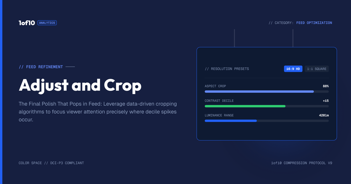
Quick answer: Adjust and Crop are the final polish pass. A light bump to vibrance and contrast makes the thumbnail pop at small size, and cropping dead space tightens the framing. It takes under a minute, it is the pass most creators skip, and it is what makes a thumbnail stand out in a crowded feed.
You have a strong thumbnail. The composition is right, the face is yours, the text is clean. There is one pass left, the one most creators skip, and it is the difference between a thumbnail that looks fine and one that jumps off the screen. Adjust and Crop are the final-polish tools: Adjust pushes the color so the image pops at small size, and Crop trims the frame so every part of it earns its place. They are quick, they are the last thing you do, and they punch above their weight. This guide covers how to use both, the light touch that works best, and why this pass matters most at the size your thumbnail actually lives.
For the full tool, see The Complete Guide to the 1of10 Thumbnail Generator. This post is about the finishing pass.
Why a polish pass matters

A thumbnail does not get viewed on your monitor at full size. It gets viewed small, in a feed, surrounded by competitors, often on a phone. At that size, two things separate the thumbnails that get noticed from the ones that blur into the background: how much they pop, and how tightly they are framed. A thumbnail that looks good large can look flat and loose when shrunk, and flat and loose loses the click.
The polish pass fixes exactly this. Adjust makes the colors more vivid and the contrast stronger so the image holds its punch when small. Crop tightens the framing so there is no wasted space diluting the impact. Neither is a big change. Both are the kind of small, deliberate finishing that you feel more than you see, and that is precisely why skipping them costs you. The thumbnails that win feeds are almost always the ones that got this last pass.
Adjust: making the image pop
The Adjust tool gives you color controls, most importantly vibrance and contrast. The goal is simple: make the thumbnail pop a little harder than it does straight out of the generator.
Vibrance. A small bump to vibrance makes the colors richer and more saturated, which helps the thumbnail stand out in a feed of duller images. Colors that pop draw the eye, and the eye going to your thumbnail first is the whole game.
Contrast. A small bump to contrast deepens the difference between light and dark, which makes the subject separate from the background and the whole image read more clearly at small size. Higher contrast is easier to parse in the half-second a viewer gives you.
The key word in both is small. You are enhancing, not transforming. Most generations come out close to right, so a light touch on vibrance and contrast is usually all it takes to make everything pop that bit more. The point is to lift the image, not to push it into looking processed.
The light touch: enhance, do not overdo
It is tempting to crank the sliders. Resist it. Over-saturated, over-contrasted thumbnails look artificial and harsh, and at small size that harshness reads as low quality rather than high impact. The thumbnails that pop best are enhanced just enough that you would not consciously notice the adjustment, you would just notice the image looks crisp and vivid.
A good rule: make the adjustment, then shrink the thumbnail down and check it small. If it pops more than the unadjusted version without looking artificial, you have it right. If it looks garish or unnatural, pull it back. Most of the time you are nudging the sliders, not slamming them. The color work should serve the image, not announce itself. For the deeper logic of which colors and contrasts pull the eye, see The Thumbnail Color Psychology Report.
When you can skip Adjust
Not every thumbnail needs it. The generator often produces vivid, well-balanced images that already pop, and forcing an adjustment onto a thumbnail that is already strong can make it worse. Look at the thumbnail small first. If it already jumps out, leave the color alone. Adjust is a tool for when an image is a touch flat or muted, not a mandatory step on every thumbnail. The skill is knowing when the image needs the lift and when it is already there.
What good color looks like for different content
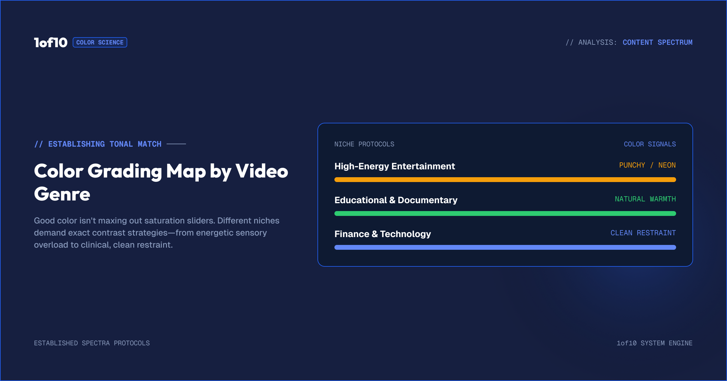
The right amount of pop depends on what you make, and matching the adjustment to your content keeps thumbnails feeling intentional rather than uniformly cranked.
High-energy entertainment. Challenge, reaction, and stunt content can carry punchier color. A stronger vibrance and contrast suit the loud, high-arousal feel these thumbnails are going for, and the audience expects intensity. Even here, though, keep it the right side of harsh.
Educational and finance. These thumbnails are selling trust and clarity, so a more restrained adjustment fits. You want the image clean and readable, not screaming. A light contrast bump to separate the subject is usually plenty, with vibrance kept gentle so the thumbnail looks credible.
Lifestyle and vlog. A natural, true-to-life look serves these best. Adjust toward crisp and clear rather than saturated, so the colors feel real. Over-processing a lifestyle thumbnail makes it look fake, which works against the authenticity the content trades on.
The through-line is that color should match the emotional register of your content. Loud content can take loud color, calm content wants restraint, and in every case the test is the same: does it pop at small size without looking artificial. The deeper science of color choice is in The Thumbnail Color Psychology Report.
Crop: making every inch count
The Crop tool trims the edges of your thumbnail. Most of the time the framing the generator produced is good, and you will not need it. But sometimes there is dead space, an empty stretch on one side, too much room above the subject, a distracting edge, that dilutes the impact. Cropping it out tightens the composition so the thumbnail uses all of its space on what matters.
A tighter crop often makes a thumbnail stronger, because it removes the parts that were not contributing and lets the subject and text fill more of the frame. At small size, a tightly framed thumbnail reads more clearly than a loose one with wasted space around the edges. Crop to the framing that makes every part of the image earn its place, then apply, and the crop carries into your final thumbnail.
The Crop tool is about framing and composition, trimming dead space to strengthen the shot. It is not where you set output dimensions for YouTube, the tool already outputs the right size for your chosen format, and the technical numbers for each format live in the YouTube Thumbnail Size Guide 2026. Here, crop is purely a composition tool: tighten the frame, drop the dead weight, strengthen the image.
The polish pass, step by step
The whole pass takes under a minute and comes last in your editor workflow.
- Finish everything else first. Cleanup with Magic Eraser, changes with Magic Edit, text with Text and Fonts. Polish goes on a finished image.
- Check the thumbnail small. Shrink it and look. Does it pop? Is the framing tight?
- Adjust if it is flat. A small bump to vibrance and contrast if the image needs more punch. Skip if it already pops.
- Crop if there is dead space. Tighten the frame to remove anything that is not contributing. Skip if the framing is already strong.
- Recheck small. Confirm the polished version reads better than the unpolished one at the size it will be seen.
That is the pass. Two light touches, applied only where needed, checked at small size. It is the last thing between your thumbnail and the download.
Why polish comes last
Adjust and Crop go at the end of the editor sequence for a reason. Color adjustment should apply to the finished image, including your text, so everything gets the same treatment and reads as one coherent thumbnail. Cropping should happen once all the elements are placed, so you are framing the final composition rather than guessing where things will sit. Polishing early, then adding text or editing underneath, means redoing the polish. Clean, change, add text, then polish: that order means each step builds on a settled version of the one before.
Polish matters more for Shorts
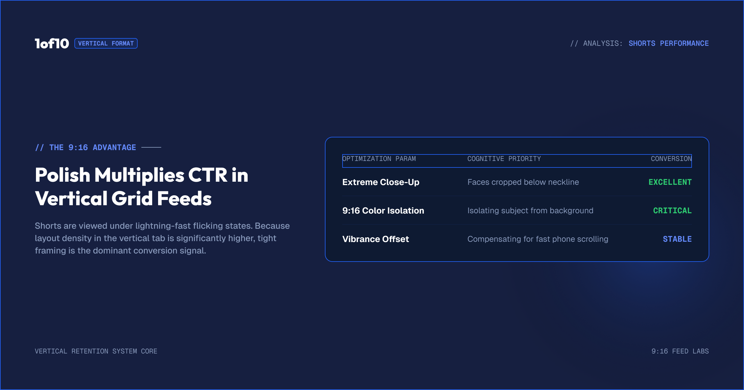
The smaller and busier the surface, the more the polish pass earns its keep, which makes it especially worth doing on vertical thumbnails for Shorts. A Shorts thumbnail in a packed Shorts tab is displayed tiny, so the contrast that separates your subject from the background and the tight framing that removes wasted space both matter more there than on a landscape thumbnail seen larger in a feed. A flat, loosely framed vertical thumbnail disappears in the Shorts tab; a punchy, tightly cropped one stands out.
So when you finish a Shorts thumbnail, give the polish pass extra attention. Push the contrast a touch harder than you might on landscape, since vertical stills shrink smaller, and crop tight so the subject fills the frame. The format strategy behind all of this is in Landscape vs Shorts Thumbnails. The principle holds across both formats, but it bites hardest where the thumbnail is smallest.
The compounding effect of finishing every thumbnail
One polished thumbnail is a small win. Polishing every thumbnail is a channel-level advantage. The creators who consistently apply this last pass build a feed and a channel page where every thumbnail pops and frames cleanly, and that consistency reads as quality. A viewer scrolling your channel sees a wall of crisp, vivid, tightly framed thumbnails and registers, without thinking about it, that this is a channel that takes its craft seriously.
That impression compounds. It lifts the click on individual videos and it lifts the sense that your whole channel is worth subscribing to. The polish pass is under a minute per thumbnail, but done every time, across every upload, it is one of the cheapest ways to raise the perceived quality of your entire channel. The discipline is the point: not a heroic edit on one thumbnail, but the same quick, deliberate finish on all of them.
Common mistakes
Skipping the pass entirely. The most common one. A finished thumbnail that never got the polish pass leaves impact on the table. It is under a minute of work for a real lift.
Overdoing the adjustment. Cranked vibrance and contrast look harsh and cheap at small size. Enhance lightly. If it looks processed, pull it back.
Adjusting a thumbnail that did not need it. If the image already pops, leave the color alone. Forcing an adjustment can make a strong image worse.
Cropping away important space. Tighten dead space, but do not crop so hard that the composition feels cramped or you clip an element. There is a balance between tight and crowded.
Polishing before the thumbnail is finished. Adjust and Crop come last. Do them before the text and edits are settled and you will just redo them.
Checking only at full size. A thumbnail that looks polished large can still fall flat small. Always check the pass at the size the thumbnail will actually be seen.
Small tools, real impact
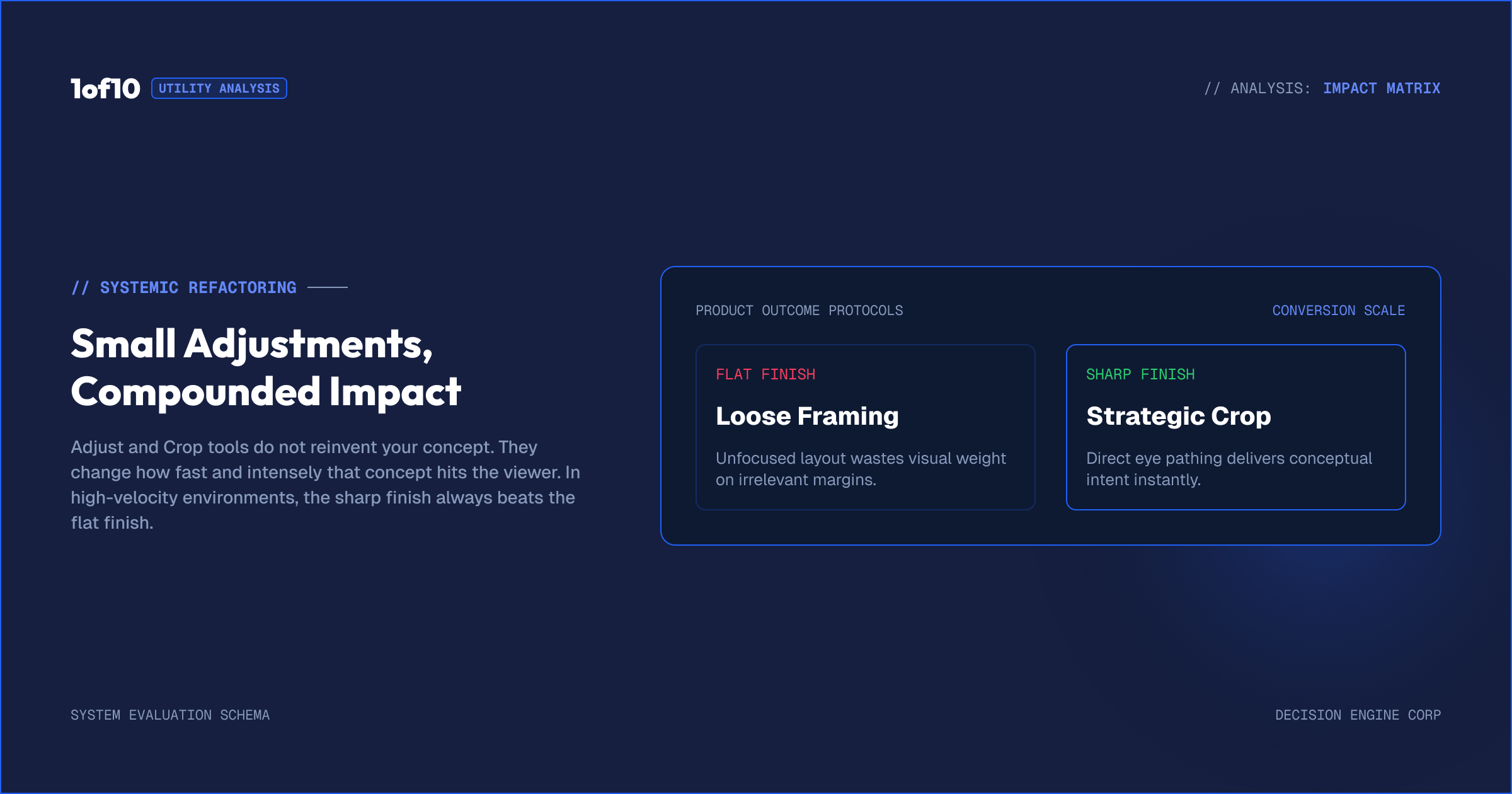
It is worth naming why these two unglamorous tools deserve a place in your routine at all. Adjust and Crop do not change what a thumbnail is. They change how hard it hits. A thumbnail with a great idea and a flat finish underperforms a thumbnail with the same idea and a sharp finish, because the click happens in a crowded feed at small size where pop and tight framing are doing real perceptual work. The idea gets you into the running; the finish helps you win it.
That is why skipping this pass is a quiet, repeated cost. You are not losing a thumbnail outright, you are shaving a little off the click on every video, the kind of loss that does not announce itself but adds up across a channel. Spending under a minute to make sure each thumbnail pops and frames tight is the cheapest insurance you can buy on the work you already did in the generator and the editor. The big swings happen earlier in the process; this is where you stop giving a piece of them back.
Frequently asked questions
How do I make a YouTube thumbnail pop? Use the Adjust tool for a small bump to vibrance and contrast so the colors are richer and the subject separates from the background, then crop out any dead space to tighten the framing. Keep both light, and check the result at small size where the thumbnail is actually viewed.
How much should I adjust contrast and vibrance? A little. The goal is to enhance, not transform. A small bump usually makes everything pop without looking artificial. If the thumbnail looks harsh or over-saturated at small size, pull it back. Many already-vivid generations need no adjustment at all.
What does the Crop tool do? It trims the edges of your thumbnail to remove dead space and tighten the composition, so every part of the frame contributes. It is a framing tool, not where you set output dimensions, the tool already outputs the correct size for your chosen format.
When should I do the polish pass? Last, after cleanup, edits, and text. Color adjustment should apply to the finished image including text, and cropping should frame the final composition. Polishing before the thumbnail is finished means redoing it.
Does every thumbnail need adjusting? No. Many generations already pop and need no color work. Adjust is for thumbnails that come out a touch flat or muted. Check the image small first and only adjust if it needs the lift.
Should I crop or adjust first? Either order works, but crop to your final framing before you make a final judgment on color, since cropping changes the balance of the image. In practice both are quick, so set the crop, then check whether the framed version still needs a color lift.
Does the polish pass matter more for Shorts? Yes. Vertical Shorts thumbnails are displayed very small in a busy Shorts tab, so the contrast and tight framing the polish pass provides matter more there. Push contrast a touch harder and crop tighter on Shorts than you would on landscape.
The takeaway
Adjust and Crop are the final pass, and the one most creators skip. Adjust gives a light bump to vibrance and contrast so the thumbnail pops at small size; Crop trims dead space so the framing is tight and every inch counts. Keep both light, apply them only where the thumbnail needs them, do them last after everything else is settled, and always check at the size your thumbnail will actually be seen. Under a minute of work for a real lift in a crowded feed. The full workflow is in The Complete Guide to the 1of10 Thumbnail Generator.