
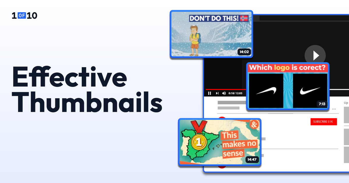
YouTube Thumbnail Design: 9 Tips for High-CTR Thumbnails
A design-focused YouTube thumbnail guide covering composition, color, and typography best practices that drive clicks. Tested against outlier video data.
Thumbnails matter. You already know that.
But fewer people know why their thumbnails look bad despite following the same advice as everyone else.
The problem is usually the YouTube thumbnail design execution: how the subject is placed on the canvas, which colors actually work together at 120 pixels, and whether the text reads before the viewer scrolls past.
These three pillars are where the "made in five minutes" look separates from the "earns clicks while you sleep" professional.
Let's talk about the design techniques behind each pillar.
TL;DR: YouTube Thumbnail Design
- Place the subject at a rule-of-thirds intersection, leave 30 to 40% as negative space, and use layer stacking for depth.
- Use complementary color pairings (yellow on violet, red on cyan, blue on orange) to maintain a 4.5:1 contrast ratio at mobile size.
- Use one bold sans-serif font (Impact, Bebas Neue, Montserrat Extra Bold, Oswald Bold) at 60 to 80pt minimum.
- Treat every text element with an outline, drop shadow, or color block to separate it from the background.
- Test the final design at 120 pixels wide before publishing. If you can't read it, neither can the mobile viewer.
- Try 1of10's AI thumbnail generator to apply these design decisions automatically. The tool outputs finished, production-ready thumbnails based on YouTube outlier data, not generic image generation.
The principles below explain why each rule works and how to apply it to the next thumbnail you publish.
Composition: Where to Put Things on the Canvas
Composition is the spatial logic of the thumbnail. Where the eye lands first, where it travels next, and what gets ignored. Three techniques control this: the rule of thirds, negative space, and layer stacking.
Use the Rule of Thirds (and Know When to Break It)
Divide the 1280 x 720 canvas into a 3x3 grid of nine equal rectangles. The four points where the gridlines intersect are the most visually dynamic positions on the frame. Place your primary subject (a face, an object, a visual hook) at one of these intersections rather than dead center.
Off-center placement creates visual tension. It feels more dynamic and more intentional than a subject planted in the middle of the frame. The viewer's eye gravitates toward those intersection points naturally, which gives you control over what gets noticed first. YouTube's own creator guidance recommends the rule of thirds as a foundational composition technique.
The exception is when the subject IS the entire message. A close-up face filling the frame works centered because there's no competing element.
The rule of thirds is a starting framework for thumbnail composition, not a law. Break it when the composition demands it, but know the rule before you break it.
Treat Negative Space as a Design Element, Not Empty Space
A common amateur mistake is filling every pixel of the canvas: more elements, more text, more background detail. The result is visual noise that the brain can't parse in the fraction of a second it takes to decide whether to click.
Leave 30 to 40% of the frame as breathing room around the subject. This negative space creates emphasis through isolation. The subject stands out because nothing competes with it, not because it shouts the loudest in a crowded frame.
Negative space also serves a practical function. YouTube's interface covers parts of the thumbnail across different surfaces. The duration badge sits in the bottom-right corner. The progress bar covers the bottom edge on partially-watched videos. Hover states add Watch Later icons in the bottom-left and menu dots in the top-right.
Anything you place in those zones gets hidden. Clean space around the edges keeps the message visible everywhere YouTube renders it.
Use Layer Stacking and Gaze Direction to Create Depth
Professional thumbnails feel three-dimensional. Amateur thumbnails feel flat.
The difference is layer stacking: positioning text slightly behind or in front of the subject so the elements overlap instead of sitting side by side. Letters can weave through the composition. The subject can break a text edge. This implies depth in a way a flat layout never will.
Gaze direction reinforces the depth effect. If the thumbnail includes a face, the direction the person is looking controls where the viewer's eye travels next. This is one of the most reliable findings from eye-tracking research on visual attention.
People follow the gaze of faces in images automatically.
A face looking toward the text draws the viewer from face to text, which is exactly the visual hierarchy you want.
A face looking toward the edge of the frame pulls attention out of the thumbnail. A face looking straight at the camera creates a confrontational, attention-stopping effect that works well for reaction and commentary content.
Position faces so their gaze points toward the key message element. If the face and the text sit on opposite sides of the frame, the gaze should bridge them.
Western viewers also tend to scan thumbnails in a Z-pattern: top-left, top-right, then down to the bottom-right. Place your most important element (face or text hook) in the top-left, then guide attention rightward and downward through the design. The composition rewards the natural reading flow instead of fighting it.
Color: What Works at 150 Pixels
Composition controls where the eye lands. Color decides whether anything is legible once it gets there. YouTube thumbnails are designed at 1280 x 720 but consumed at 120 to 150 pixels on a phone screen.
At that size, color contrast isn't a design preference. It's legibility.
Use Complementary Color Pairs That Survive Mobile
Complementary colors sit opposite each other on the color wheel.
- Yellow and violet
- Red and cyan
- Blue and orange
These pairings create maximum visual separation, which is why they show up so often on high-CTR thumbnails. The two colors don't blend at small sizes because their brightness values are far apart.
The failures all share a problem. Two colors close in brightness merge into a single muddy tone when the thumbnail shrinks.
The minimum useful contrast ratio is roughly 4.5:1 between text and background, the same standard used in WCAG accessibility guidelines. Tools like WebAIM's contrast checker confirm a pairing in seconds.
If you hit 4.5:1 or higher, the text will read on every device, every screen brightness, and every bandwidth condition.
Apply Color Psychology to Match Your Niche
Different colors trigger different associations, and the patterns hold up across high-CTR thumbnails in different niches.
- Red signals urgency and energy. It works for news, drama, reaction content, and anything with built-in tension.
- Blue signals trust, calm, and authority. It performs well in education, tech reviews, and finance.
- Yellow is the single most visible color against YouTube's white and dark-gray interface. It grabs attention before any other hue, which is why creators in entertainment niches lean on it heavily.
- Green signals growth, success, and money, which is why it shows up constantly in business and personal-finance thumbnails.
These aren't absolute rules. They're patterns observed across high-performing thumbnails in each category.
The right color for your niche depends on what your audience already associates with the topic. For the full breakdown of which colors drive clicks across niches, see the best colors for YouTube thumbnails.
A note on accessibility. Color vision deficiency affects roughly 8% of men and 0.4% of women of Northern European descent, with red-green color blindness being the most common.
Don't rely on color alone to communicate the key message. Pair color with contrast, position, or text labels so the thumbnail still reads for viewers who see colors differently. High-contrast designs benefit everyone, not only viewers with vision differences.
Choose Backgrounds That Support, Not Compete
Three options. Each makes a different tradeoff.
Solid color backgrounds create maximum contrast and the cleanest composition. The subject pops because there's nothing behind it competing for attention. This works especially well for faceless channels, product shots, and text-heavy thumbnails.
Gradient backgrounds add depth and visual interest without introducing clutter. A dark-to-light sweep behind the subject can create a sense of dimension while keeping the composition clean.
Photo backgrounds provide context (a kitchen for a cooking video, a gym for a fitness video) but carry the highest risk of visual noise. If you use a photo background, ensure it’s clutter-free or add a dark overlay, apply a background blur, or desaturate the background to around 60 to 80% so the subject remains the sharpest, most vivid element in the frame.
Typography: Text That Reads Before It's Read
A viewer doesn't read a thumbnail. They scan it. The text needs to register before the conscious eye decides whether to pay attention.
That requires three things: the right font, the right size and placement, and the right contrast treatment.
Use Bold Sans-Serif Fonts Only
For YouTube thumbnails, the only fonts worth using are bold, sans-serif typefaces.
Impact, Bebas Neue, Montserrat Extra Bold, and Oswald Bold appear on more high-CTR thumbnails than any other typefaces, and the reason is simple. They stay readable at mobile preview size where thinner or more decorative fonts dissolve into noise.
Serif fonts, script fonts, and light-weight typefaces all lose readability when the thumbnail shrinks. They look elegant at full size and become illegible at 150 pixels. This isn't a style choice. It's a functional requirement of the medium.
Limit the thumbnail to one font. Two at absolute maximum, with one reserved for a headline and one for a subhead. Multiple fonts create visual noise and make the thumbnail look cluttered rather than intentional.
A consistent font choice across every thumbnail also builds channel recognition. Returning viewers identify your videos in a feed before they read the title.
Size and Place Text for Mobile-First Readability
At 1280 x 720 resolution, the minimum readable font size on mobile is roughly 60 to 80pt for primary text. Secondary text (subheadlines or supporting details) should be at least 40pt. Anything smaller disappears when the thumbnail renders at mobile preview width.
Place text in the top third or along the left side of the frame.
Never place text:
- In the bottom-right corner, where YouTube's duration badge covers it
- Along the bottom edge where the title overlaps on mobile
- Layered directly over the subject's face
The bottom 15% of the frame should be considered a danger zone for any critical information.
The placement test is the same one that applies to every other thumbnail design decision. Shrink to 120 pixels wide. If you can still read every word, the sizing and placement work. If any text becomes a blur, enlarge it or move it to a cleaner zone.
One more rule: don't repeat the video title in the thumbnail text. The title and thumbnail sit next to each other on every YouTube surface. If they say the same thing, one is wasted. Use the thumbnail text to add a curiosity layer the title doesn't.
If the title says "I Tried the Hardest Recipe on YouTube," the thumbnail might say "8 HOURS" or "FAILED?" The title carries the topic. The thumbnail text carries the hook.
Treat Every Text Element with Outline, Shadow, or Color Block
Text placed directly on a photo background will always compete with the image behind it. Letters blend into similarly colored areas, and readability drops. Three techniques solve this problem.
A contrasting outline (4 to 8 pixels) around the text makes it readable against any background. White text with a black outline, or black text with a white outline, works on photos, gradients, and solid colors alike. This is the single most reliable thumbnail typography technique.
A drop shadow behind the text creates separation between the text and the image plane. It lifts the words off the background without needing an outline. Subtle shadows (2 to 4 pixels, slightly offset) look clean. Heavy shadows look dated.
A semi-transparent color block behind the text (a dark bar at 60 to 70% opacity) creates a dedicated reading zone. This works well when the background is complex and neither outlines nor shadows are enough to separate the text cleanly.
Use one of these three on every thumbnail. Never place raw, untreated text on a busy photo background.
Putting it Together: A Design Checklist
Run through this list before publishing any thumbnail.
- Subject placed at a rule-of-thirds intersection (or centered if it fills the frame)
- 30 to 40% negative space around the subject
- Layer stacking creates depth between subject, text, and background
- Face gaze directed toward text or key element (if applicable)
- Z-pattern reading flow respected (most important element top-left)
- Complementary color pairing with at least 4.5:1 contrast ratio
- Background doesn't compete with the subject (solid, gradient, or blurred photo)
- One bold sans-serif font, two at most
- Text at 60pt+ at 1280 x 720, placed in top third or left side
- Critical content avoids the bottom 15% of the frame
- Every text element has an outline, shadow, or color block
- Composition readable at 120 pixels wide (the squint test)
- Final design A/B tested with YouTube's Test & Compare feature when possible
If you want these design decisions handled automatically, 1of10's AI thumbnail generator is trained on YouTube outlier data informed by 62 billion views.
It outputs finished, production-ready thumbnails that apply composition, color, and typography principles based on videos that actually outperformed on the platform.
Most AI thumbnail tools either output concepts you have to refine in Photoshop or rely on generic image models. 1of10 outputs the finished file you upload directly to YouTube. 60 credits free, no credit card.
Try 1of10's free AI thumbnail generator.
YouTube Thumbnail Design Trends for 2026
Thumbnail design evolves, and 2026 has shifted in three notable ways.
Cleaner, less-cluttered designs are outperforming maximalist styles. The peak-2023 approach of cramming every visual element into the frame has cooled. High-CTR thumbnails in 2026 are simpler: one dominant subject, two or three colors, and three to five words of text. This matches the overall platform trend toward mobile viewing, where simpler designs hold up better at small sizes.
Exaggerated facial expressions are getting niche-specific scrutiny. Gaming and reaction channels still benefit from the wide-eyed shocked face. Educational, finance, and tech audiences increasingly find them off-putting. Match the emotional intensity to the content. A genuine reaction reads as more credible than a manufactured one.
Outlier-informed AI design is becoming a real category. Tools that generate thumbnails from generic image models produce work that looks generic. Tools trained on YouTube outlier data produce work that mirrors what actually drove clicks. The gap between the two approaches is widening, and creators are starting to notice the difference in their CTR data.
A/B Testing: How to Know Which Design Actually Works
Design principles get you to a strong starting point. A/B testing tells you which version your specific audience responds to.
YouTube's native Test & Compare feature lets you upload up to three thumbnail variants per video. The platform splits traffic automatically and selects a winner based on watch time share rather than raw CTR, which means thumbnails are evaluated on engagement quality, not just clicks.
Test one variable per experiment. Text vs. no text. Face vs. no face. Color scheme A vs. color scheme B. Changing multiple variables at once prevents clear conclusions.
Track CTR alongside average view duration. If CTR climbs but retention drops, the thumbnail is over-promising. The thumbnail and the video need to deliver on the same promise.
Once a design pattern wins consistently, build it into your next thumbnails as a template. Winning thumbnails become your channel's design system. Losing ones tell you what your audience rejects. Both are useful.
Design Thumbnails That Look Professional and Earn Clicks
Composition, color, and typography are the three design pillars that separate professional thumbnails from amateur ones. Getting them right is the fastest way to close the gap between "looks fine" and "gets clicked."
The principles in this guide hold up across niches because they're built on patterns observed in YouTube outlier videos, not aesthetic intuition.
If you want those design decisions handled automatically, 1of10's AI thumbnail generator outputs finished, production-ready thumbnails trained on outlier data informed by 62 billion views. 60 credits free, no credit card.
Try 1of10's AI thumbnail generator.
FAQs About YouTube Thumbnail Design
How Do You Design a Good YouTube Thumbnail?
Place the subject at a rule-of-thirds intersection, use complementary high-contrast colors, add 3 to 5 words in a bold sans-serif font with an outline or shadow, and test readability at 120px mobile preview size. Keep 30 to 40% of the frame as negative space.
What Makes a Good YouTube Thumbnail Design?
A good thumbnail has one dominant focal point, high contrast that survives mobile viewing, short text that adds context beyond the title, and a composition that respects YouTube's UI overlay zones. The thumbnail must also accurately represent the video to protect viewer retention after the click.
What is the Best Color for YouTube Thumbnails?
Yellow, red, and white are the most visible against YouTube's interface. Complementary color pairs (yellow on violet, red on cyan, blue on orange) outperform low-contrast combinations. The specific best color depends on your niche and the emotional tone of the content.
What Font Should I Use for YouTube Thumbnails?
Bold sans-serif fonts: Impact, Bebas Neue, Montserrat Extra Bold, or Oswald Bold. These stay readable at mobile thumbnail size where thinner or decorative fonts become illegible. Use one font per thumbnail. Two at most.
How Do I Make My Thumbnails Look Professional?
Use consistent composition (rule of thirds), a 2 to 3 color palette, one bold font, and negative space around the subject. Apply an outline or shadow to all text. Consistency across your channel builds brand recognition and signals intentional design.
What is the Rule of 3 Thumbnails?
The rule of thirds divides the 1280 x 720 canvas into a 3x3 grid. The four points where the lines intersect are the most visually dynamic positions in the frame. Placing the main subject at one of these intersections creates more visual tension than centering.
Is YouTube Thumbnail 1280x720 or 1920x1080?
YouTube's recommended thumbnail size is 1280 x 720 pixels with a 16:9 aspect ratio. Higher resolutions like 1920 x 1080 are accepted and can deliver extra sharpness, but the file must stay under 50MB. JPG, PNG, and GIF are supported formats.
Does Thumbnail Design Affect CTR?
Yes. Thumbnail design is the primary driver of click-through rate. The difference between amateur and professional thumbnail design can mean 2 to 3x higher CTR on the same impressions. That translates directly to more views, more watch time, and stronger algorithmic recommendations.
Can AI Design YouTube Thumbnails?
Yes. AI thumbnail generators like 1of10 produce finished, production-ready thumbnails that apply composition, color, and typography principles automatically. The most effective AI tools are trained on YouTube outlier data, so the design decisions reflect what drove clicks on actual high-performing videos rather than generic image generation.
What Do Most YouTubers Use to Make Thumbnails?
Most creators use a mix of design tools (Canva, Photoshop, Figma) for manual work, or AI-powered thumbnail generators when they want the design decisions handled automatically. Tools trained on YouTube outlier data, like 1of10, produce finished thumbnails based on what's actually performing on the platform.