
9 Best Colors for YouTube Thumbnails (With Examples)
Ever wondered why Netflix thumbnails feel irresistible?
They're using color psychology to trigger your brain's emotions. From excitement to curiosity, colors push buttons you didn't even know existed. Get it wrong, and your thumbnail blends into the endless YouTube scroll.
Ouch!
Stick around, I'll show you exactly which colors boost your click-through rate (CTR), help you build consistent branding, and finally make your thumbnails pop.
Plus, I've got a shortcut that'll simplify the whole process.
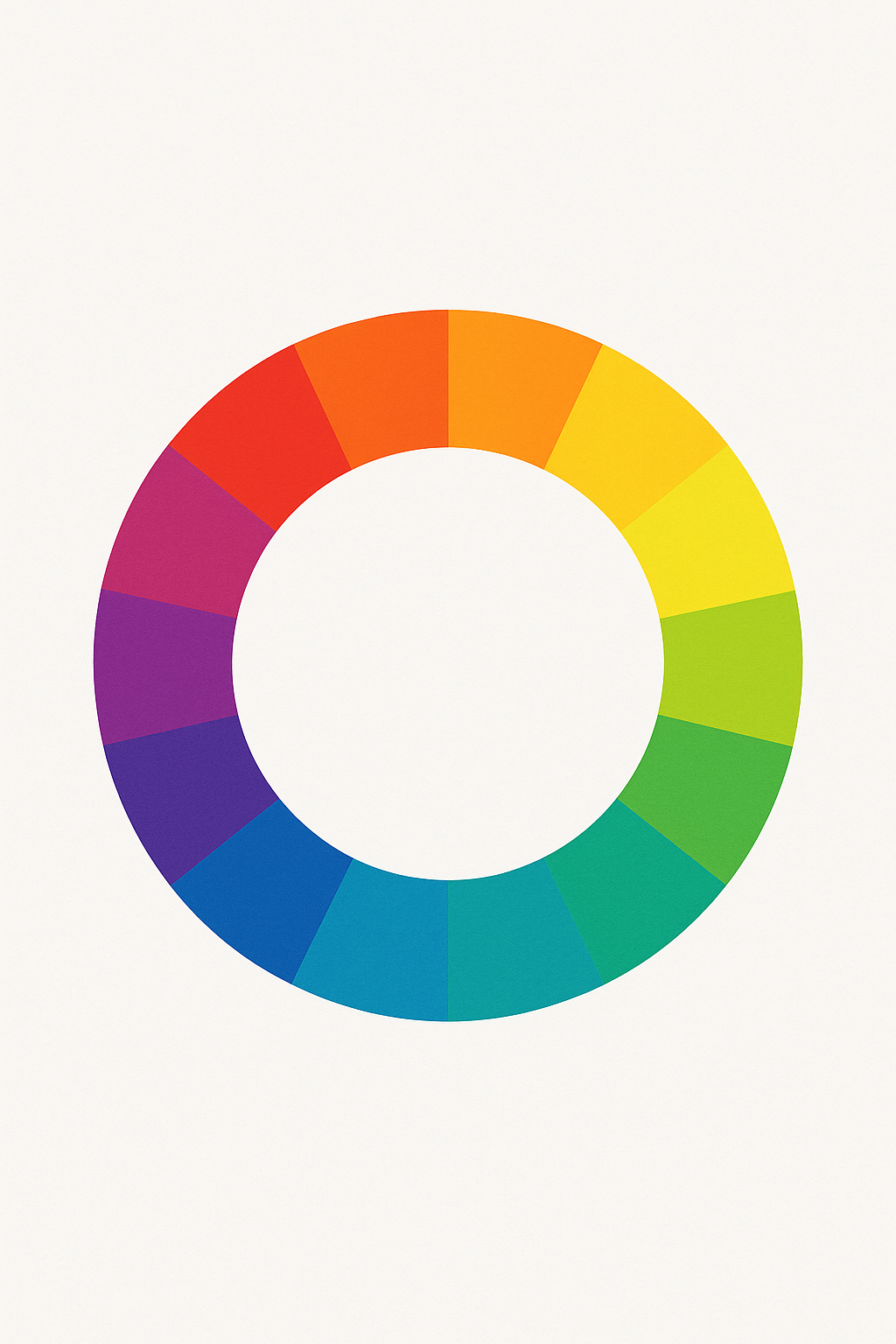
Color Theory and Emotional Impact
Colors make people feel something before they even know what they’re looking at. That’s why the smartest YouTubers don’t guess, they use color to control emotion and attention.
Color psychology isn’t just fluff from a design book. It’s why warning signs are red, hospitals lean toward blue, and fast food chains love yellow. When you’re choosing colors for your thumbnails, you’re not decorating, you’re persuading.
Here’s a cheat sheet of what each color actually says to your viewers:
🟥 Red - Urgency, Excitement, Energy

🟧 Orange - Enthusiasm, Warmth, Friendliness
Think of orange like your extroverted friend, it’s welcoming, energetic, and fun. Great for lifestyle channels, feel-good content, or anything personality-driven.
🟨 Yellow - Optimism, Alertness, Visibility
🟩 Green - Growth, Health, Calm
🟦 Blue - Trust, Stability, Professionalism

🟪 Purple - Luxury, Mystery, Creativity
🩷 Pink - Femininity, Comfort, Softness
⬛ Black - Power, Boldness, Sophistication
Black isn’t boring, it’s confident. It adds weight and authority. Use it for premium content, storytelling, or when your thumbnail needs contrast and punch.

⬜ White - Clarity, Simplicity, Freshness
Color Meanings Across Cultures
- Red
- Western audiences: Danger, urgency, anger
- China: Luck, celebration, success
- South Africa: Mourning
- India: Marriage, purity, fertility
- White
- Western: Cleanliness, simplicity, peace
- China, Korea, Japan: Death, mourning
- India: Mourning, spirituality
- Black
- Western: Power, luxury, also death
- Africa (varies by region): Masculinity, maturity, or mourning
- Thailand: Mourning
- Yellow
- Western: Optimism, warmth
- China: Royalty, power, but also adult content warnings
- India: Knowledge, joy
- Egypt: Mourning
- Purple
- Western: Royalty, creativity, wealth
- Brazil/Thailand: Mourning
- Catholic culture: Death or penance (especially during Lent)
What Should You Do?
You don’t need to be a cultural scholar, but you do need to know your audience.
- Check your analytics → Look at top geographies
- Adjust color choices → Especially for video topics with cultural or emotional weight
- Keep contrast king → No matter the culture, clear contrast still rules CTR
Contrast and Composition Are CRITICAL!
Good thumbnails don’t need to shout (so much stuff going on it looks desperate). They just need to stand out with elegance. And contrast is the best amplifier you’ve got.
Here’s how to make sure your thumbnail stops the scroll cold:
🌓 Background vs. Foreground Strategy
Your background should support, not compete with the focus of your thumbnail. That means using darker backgrounds for bright subjects, or soft backgrounds behind bold fonts or faces.
🔠 Size Matters (Yes, Really)
Text should be readable on a phone screen, period.
If viewers need to squint, you’ve already lost. Keep it big, bold, and brutal. 3–4 words is a proven formula.
Don’t write a novel on your thumbnail. Save the heavy lifting for the title itself, which an AI title generator can sharpen in seconds.
And images?
✍️ Font Choices: Clean Over Cool
Stick to simple, thick fonts.
Safe bets:
- Anton
- Bebas Neue
- Montserrat Bold
Make it bold, make it readable.
🎨 Using Complementary Colors (The Smart Way)
Complementary colors = visual punch.
These are colors that sit opposite each other on the color wheel. When paired, they create a bold, attention-grabbing combo.
Example combos:
- Blue + Orange → Tech & education with energy
- Purple + Yellow → Creative flair with high visibility
- Red + Green → Caution: can work, but also feels Christmas-y if not careful
Use one color for the background and its complement for the text or main image.
☀️ Light vs Dark Thumbnails
Both can work, but it depends on contrast.
- Dark thumbnails with bright text (yellow, white, neon green) can look bold and cinematic.
- Light thumbnails with dark text (black, navy, deep purple) feel fresh and modern.
What matters most is difference. If your thumbnail is mid-tone all over, it fades into YouTube’s grey background like it’s wearing camouflage.
🎯 The Power of a Limited Palette
Too many colors = chaos.
Your thumbnail turns into a confusing rainbow with no focal point. Sticking to just a few colors builds visual clarity and brand recognition.
Think MrBeast: blue, yellow, and red. Over and over again. It’s consistent. It sticks. It works.
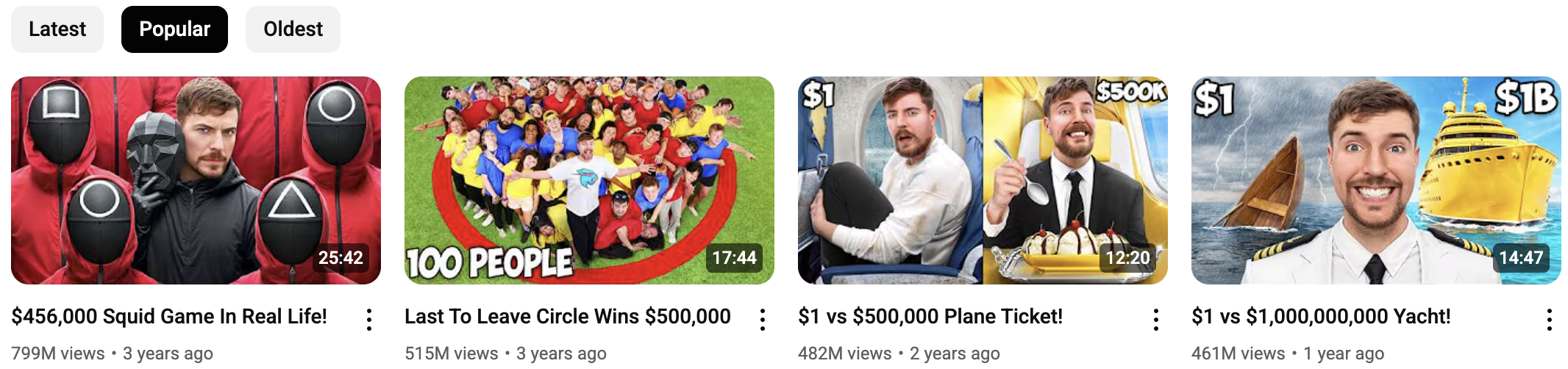
Same logic applies to you. Pick your brand colors, use them across thumbnails, and you'll train your audience to recognise your videos instantly.
BUT!!!
Keep in mind if you haven’t found a winning thumbnail formula, you need to keep experimenting with different thumbnails.
And ONLY then, can you stick with that style.
Proven Colors and Combinations by Niche
Using the wrong color combo is like showing up to a beach in a three-piece suit. Technically allowed, but you’ll look completely out of place. If you research your niche first, you'll spot the color patterns that dominate it and where the gaps are.
Here's how smart creators match their colors to their content, and win more clicks because of it.
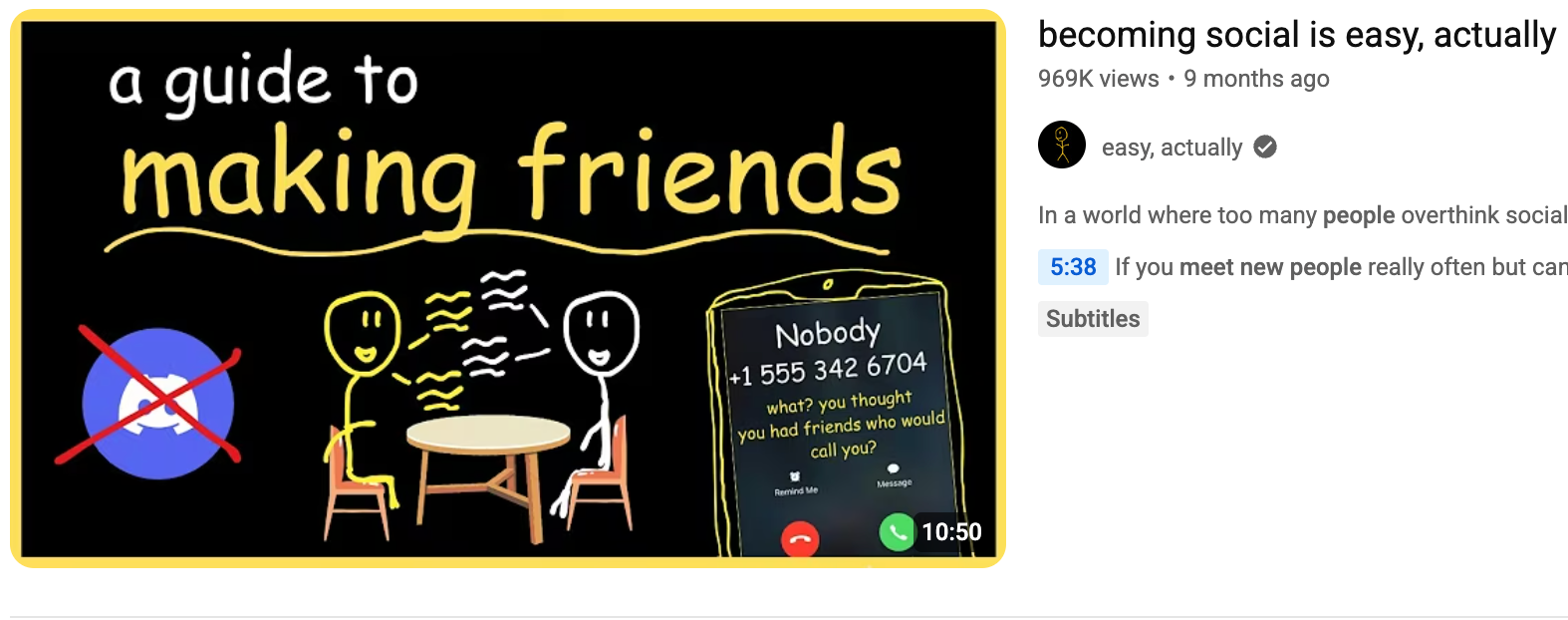
🎮 Gaming & Entertainment
Neon greens, electric blues, bright reds, dark backgrounds
Gaming thumbnails are loud, fast, and dramatic, just like the content. Neon and high-saturation colors create urgency and movement. Pair that with a dark background, and your character, weapon, or reaction face leaps off the screen.
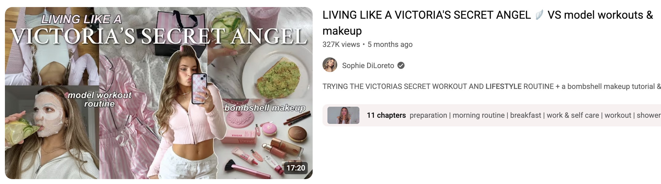
💄 Beauty & Fashion
Pinks, purples, oranges, golds, pastels
This niche is all about polish. Thumbnails should look intentional, elegant, and warm. Think of a luxury boutique’s Instagram feed. You want to scream “aesthetic” without looking too busy.
📌 Example:
- Soft pink or lavender background
- Foreground: Golden accents + clean white or soft coral text
It’s femininity meets sophistication. Great for makeup tutorials, outfit hauls, and skincare reviews.
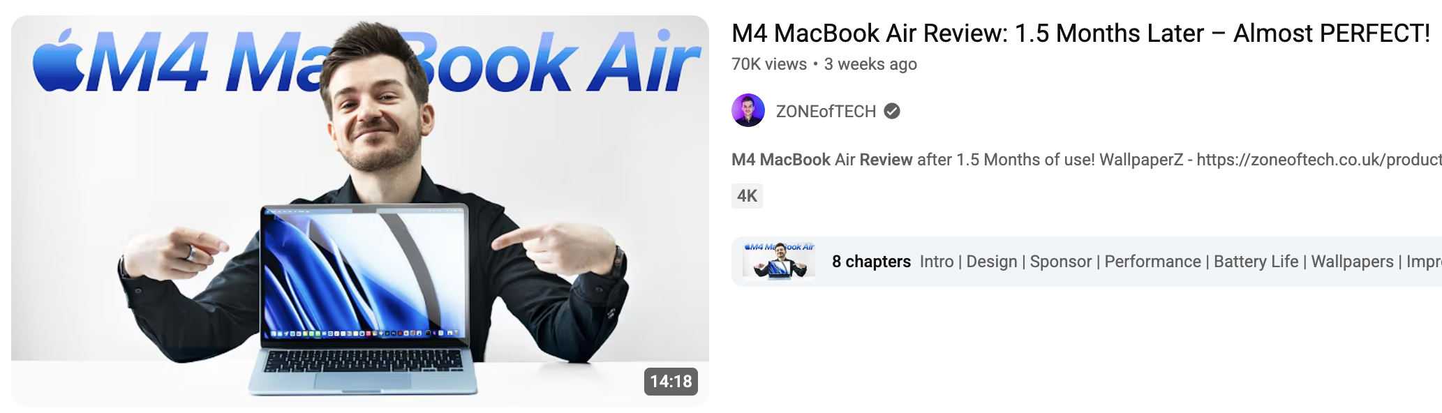
🧠 Tech & Electronics
Blues, blacks, greys, with orange or red accents
Tech thumbnails walk a fine line: they need to feel sharp and trustworthy without looking cold or dull. Blues and greys create authority, while a pop of orange or red draws the eye where it matters.
📌 Example:
- Sleek grey or black background
- Foreground: Bright orange arrow or red “X” to signal change or danger
Perfect for unboxings, reviews, and comparison content.
📘 Education & How-To
Blues, greens, white backgrounds, yellow highlights
Clarity is everything. These thumbnails need to look simple, calm, and smart. Blue and green build trust and competence, while white backgrounds keep it clean. A touch of yellow adds a “look here” moment without being aggressive.
📌 Example:
- White or soft blue background
- Foreground: Navy font + yellow circle or line for focus
This combo helps viewers feel safe clicking, ideal for tutorials, explainers, and productivity content.
✈️ Lifestyle & Travel
Vibrant natural tones, sky blue, leafy greens, warm oranges, pastels
This niche is emotion-driven. You’re selling a feeling: freedom, comfort, inspiration. Use real-world colors that evoke sun, sky, nature, and people. Pastels can also work well for softer, more intimate vlogs.
📌 Example:
- Scenic background (sunset, ocean, cityscape)
- Foreground: White or soft yellow text with orange accents
Let the image breathe. You don’t need to shout here, relatability is the secret sauce.
Viral Thumbnail Strategies
Viral thumbnails don’t happen by accident (they can sometimes). They follow patterns, and once you spot them, you can start using them too.
You’ve probably seen thumbnails that pull you in before you even read the title. That’s called packaging. Great thumbnails understand contrast, color psychology, and composition better than half the people in design school.
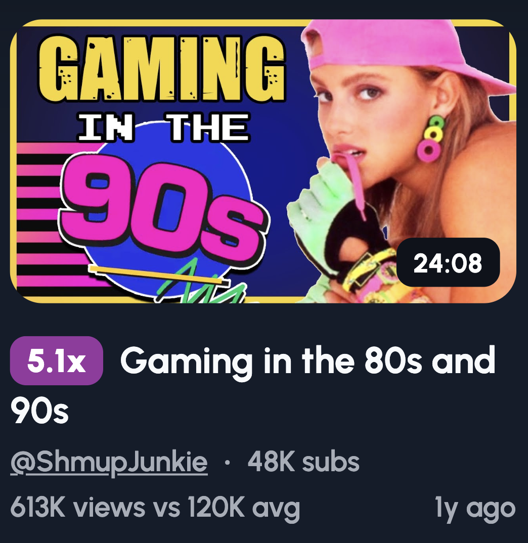
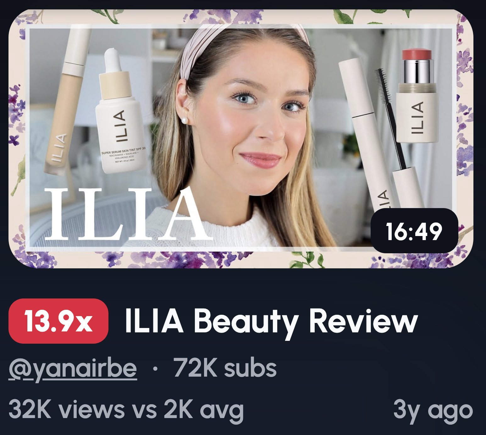
Pro Tip: Use the 1of10 tool to find outliers
- You can find outliers based on your channel to get ideas:
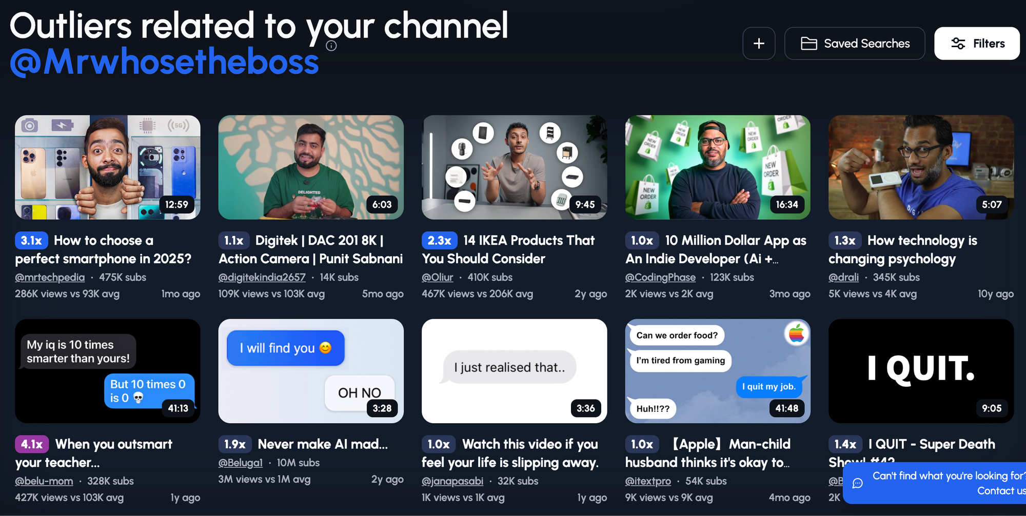
- You can also use the 'Random' feature to find outliers based on channels outside your niche for ideas:
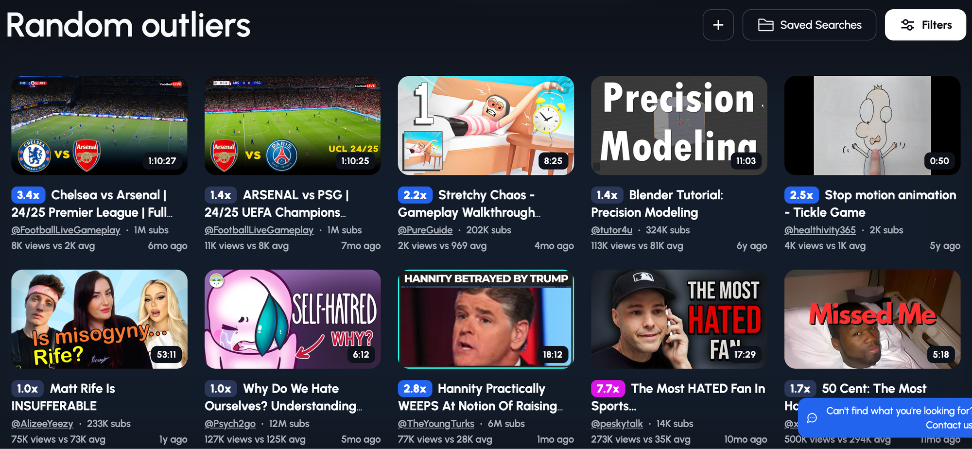
- And you have the option to apply filter to the results:
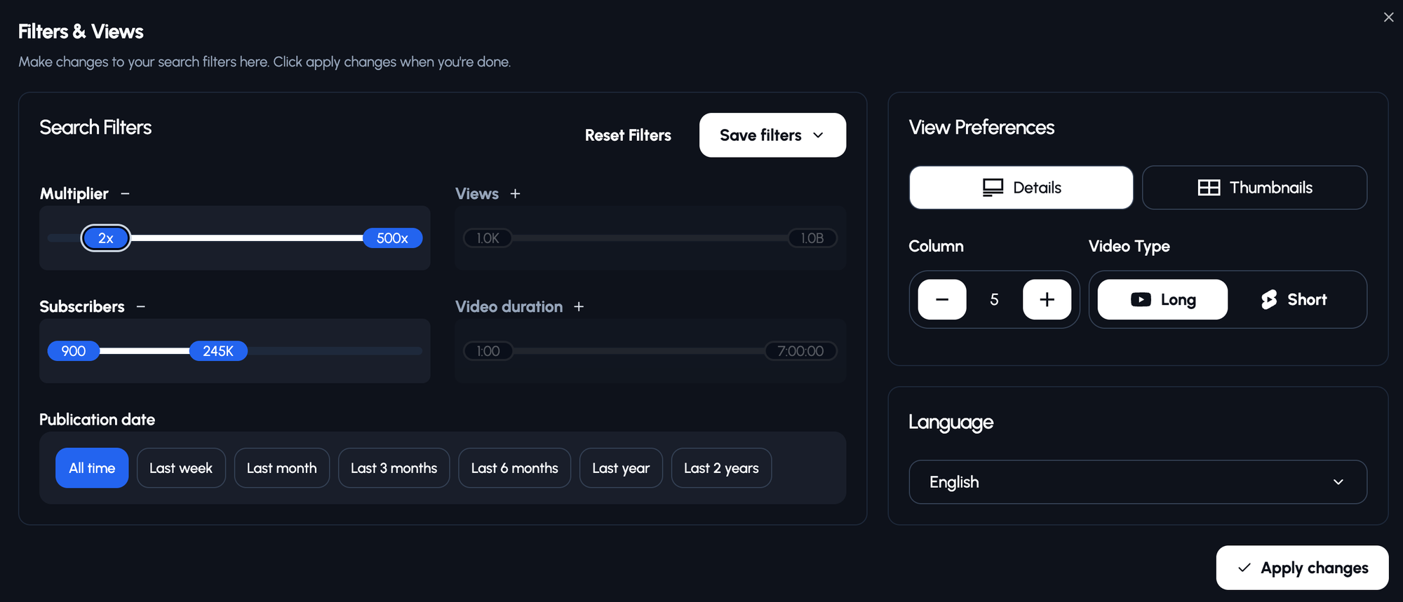
Let’s break it down.
✅ Great Thumbnails: What They Get Right
They scream “CLICK ME”.
Here’s what good thumbnails typically have in common:
- Clear contrast - Light text on dark background (or vice versa)
- Punchy colors - Yellow and red, purple and yellow, orange and navy
- Big readable text - 3–4 words max, no fluff
- Focused composition - One subject, one emotion, one purpose
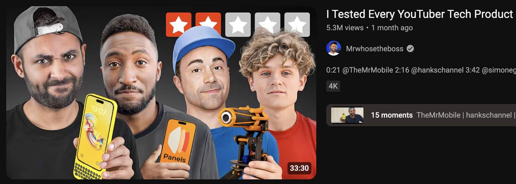
📌 Example combo: Yellow background + bold red text + zoomed-in shocked face = Feels urgent, high energy, impossible to ignore
❌ Bad Thumbnails: What They Get Wrong
These are the thumbnails people scroll past without even knowing they saw them.
Why? Because they’re forgettable. They blend into the feed.
Common mistakes:
- Low contrast - Grey text on grey background? Nope.
- Too much going on - Five faces, four fonts, three arrows, and a partridge in a pear tree.
- Weak font choices - Thin, curly, hard-to-read styles
- Overused colors - If everyone in your niche is using blue, your blue thumbnail won’t stand out
🔍 Stand-Out Techniques That Actually Work
You don’t have to reinvent the wheel, you just have to change the paint job.
Here’s how to make your thumbnails instantly more clickable:
✅ Use colors your competitors aren’t using
Look at the top 5 channels in your niche. Notice a pattern? If they all use dark blues, try bright orange. If they’re all minimal, go bold.
Example: In the beauty niche full of soft pastels, a bold red thumbnail can own attention.
✅ Make your subject unmissable
Zoom in. Crop tight. Let their expression or object fill the frame. Viewers shouldn’t have to guess what your video is about, they should feel it.
✅ Pick one focal color and one accent
Too many colors confuse the eye. A clean 3-color palette lets the key elements stand out and gives your brand a signature look.
💡Use 1of10 to Brainstorm Thumbnails Faster
Manually testing takes hours, 1of10 speeds it up.
If you're stuck staring at Canva wondering what to do next, 1of10 gives you actual thumbnail ideas that follow proven design patterns.
No more guesswork.
Step 1: Add your channel
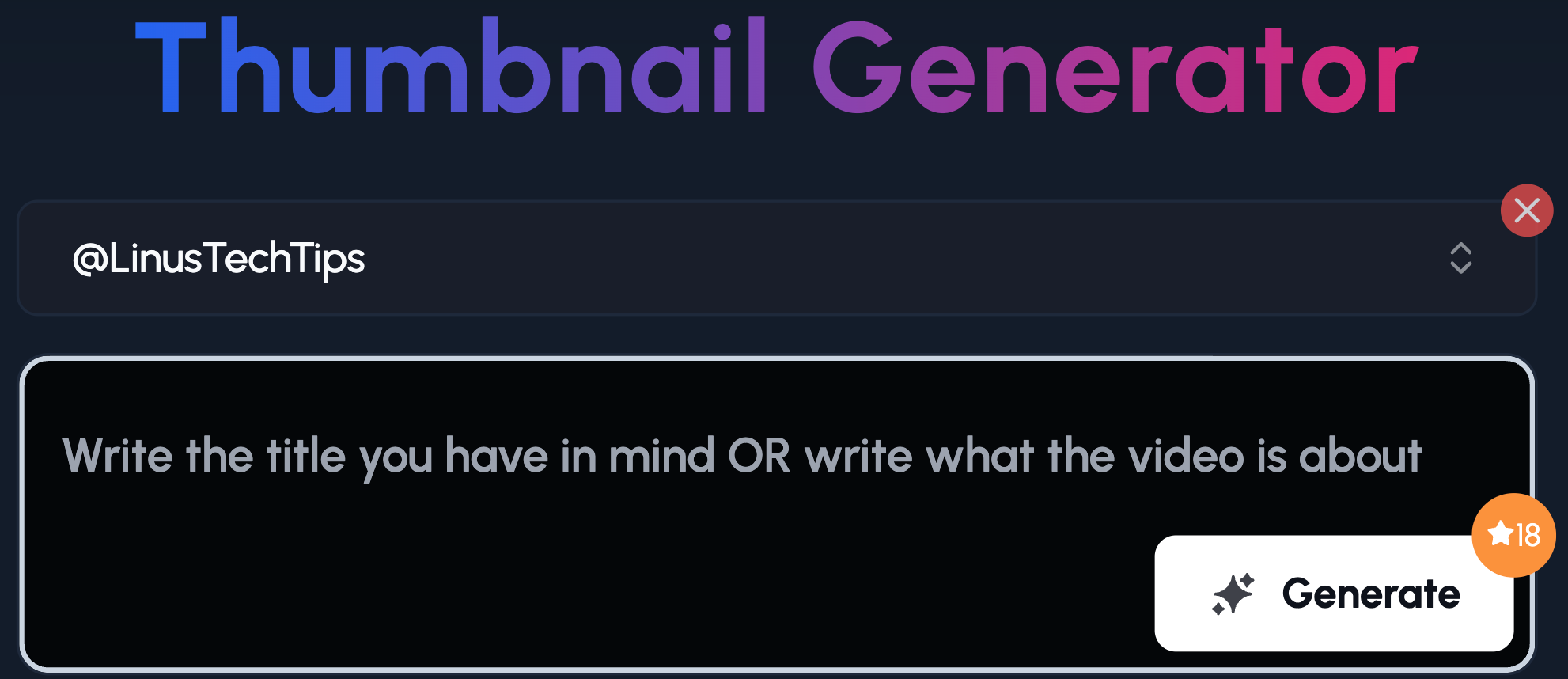
Step 2: Write your title OR give a more detailed prompt
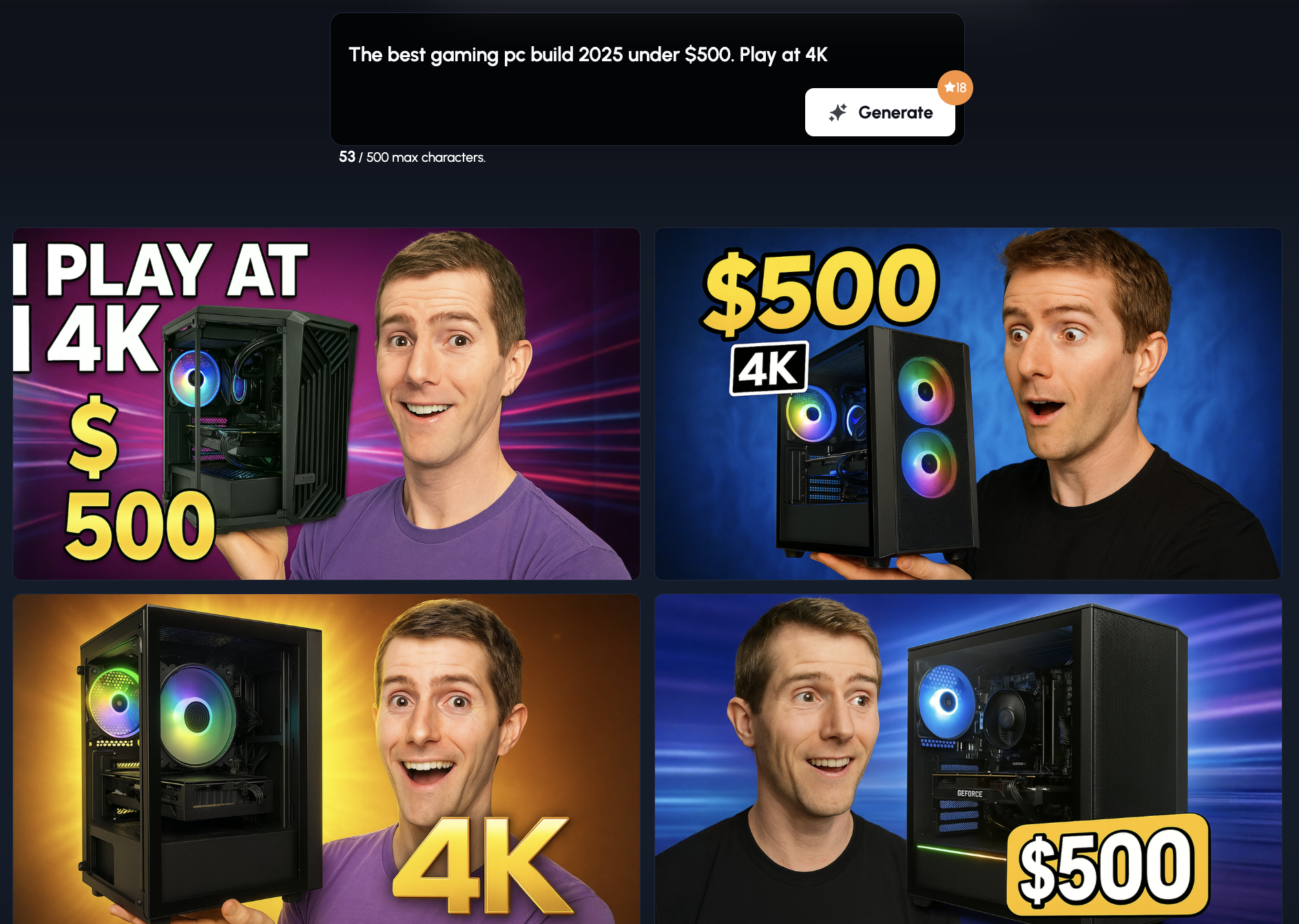
It will produce thumbnails based on your prompt and the channel's style.
If you don't want the person in the thumbnail and just use their style, you can exclude them in the prompt:
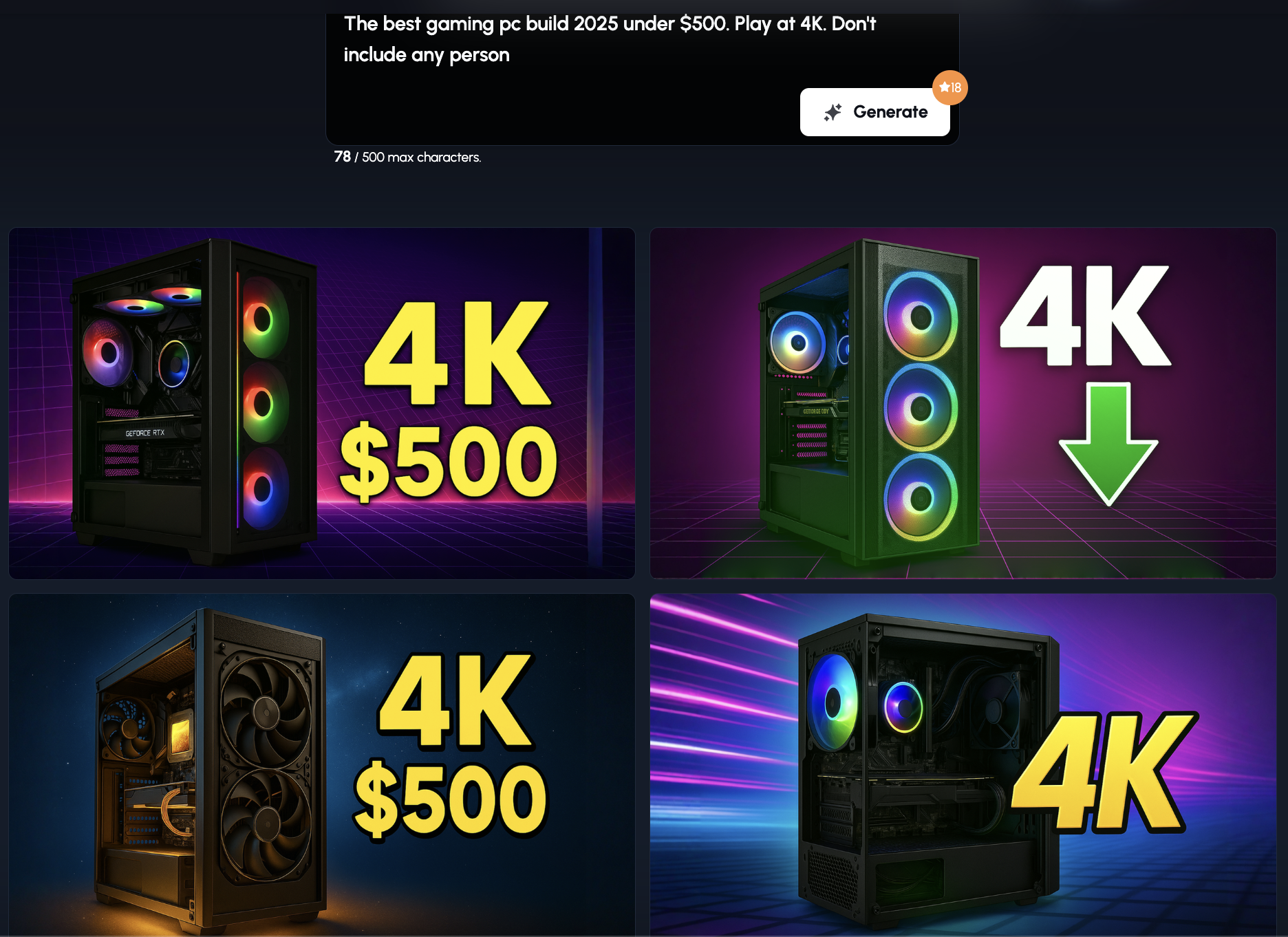
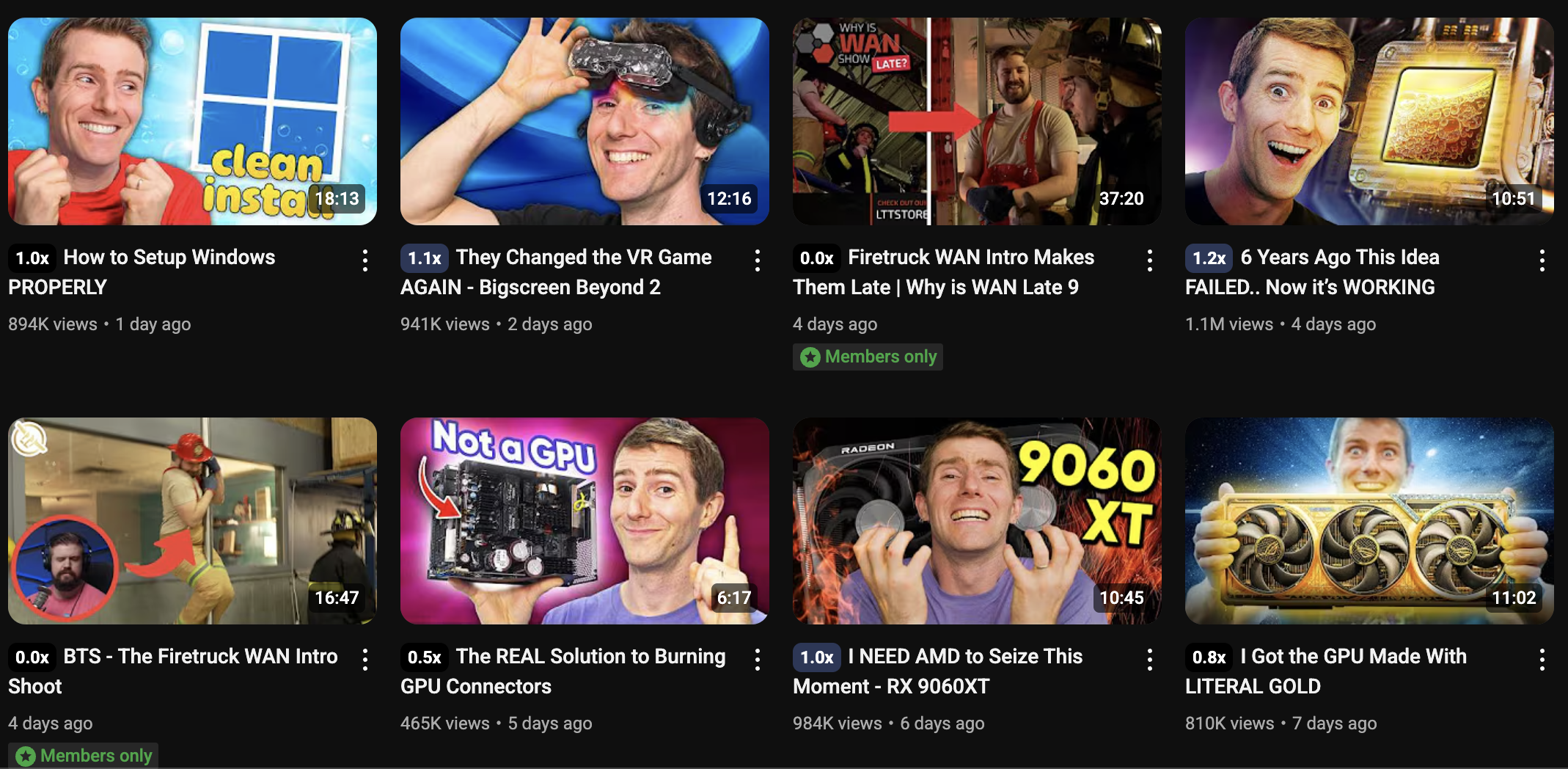
Here's the Linus Tech Tips channel:
Optimizing for Mobile First
If it works on mobile, it’ll work on desktop. Not the other way around.
Mobile viewers scroll fast. Your thumbnail needs to punch through at postage stamp size.
Text has to be large. Faces should be crystal clear. Colors? Simple and clear.
Color blind Accessibility - Don’t Leave ANY Clicks on the Table
That’s millions of potential viewers who might see your thumbnail as a foggy blend of unrecognizable shades. Not great for clicks.
What Colorblind Viewers Actually See
The most common types of color blindness affect red-green perception. That means:
- Red & green may look identical
- Blue & purple can blur together
- Low contrast becomes unreadable
How to Make Thumbnails More Accessible
Here’s how to keep it inclusive without sacrificing visual impact:
- Use high contrast between background and text (light vs. dark)
- Add outlines or drop shadows to text for better separation
- Don’t rely on color alone to show meaning, use arrows, icons, or shapes
3 Quick Tips for Thumbnail Success
You don’t need to be a Photoshop wizard to make thumbnails that work, you just need a few rules that never let you down.
These tips keep things simple, repeatable, and most importantly… clickable.
1.Use a Limited Color Palette
Too many colors = chaos.
You’re not designing a unicorn party invite. A focused palette keeps your thumbnail clean, easy to scan, and lets key elements shine.
2.Build a Recognisable Style
Use the same fonts and 1–2 signature colors to build recognition. But switch up the layout, subject, or dominant color often enough to keep it fresh.
📌 Example:
- Same font every video
- Color switch every 4–5 thumbnails
- Layout variation between face focus and object focus
Your audience should think, “Yep, that’s [your channel]”
3.Test, Tweak, Repeat
What worked last month might flop this week. Testing is how you stay sharp. And when a concept flops entirely, a YouTube idea generator gives you fresh ones to test without starting from zero.
🔥 Rapid testing idea:
- Post video with one thumbnail
- After 24–48 hours, switch to an alternate version
Tiny tweaks, like changing one color, object, or border can change everything.
The Bottom Line
Your Thumbnail Isn’t Just a Picture, It’s a Decision Trigger
Strategic color choices make your thumbnail stand out, stop the scroll, and get the click. Ignore them, and you're shouting into the abyss.
What grabs attention in the gaming niche may not work in skincare. What works today might flop tomorrow. So test. Tweak. Repeat.
It gives you plug-and-play ideas based on what’s already working, right now, today. So you can spend less time designing and more time growing your channel.
Because let’s face it: great content deserves to be seen. And it all starts with a thumbnail that gets clicked.
📌 Want help picking colors that actually work for your niche?
Make a thumbnail with AI using 1of10's generator and get real, proven templates in seconds.
No guesswork. Just clicks.