
7 PROVEN Types of Thumbnails for YouTube People LOVE
90% of top-performing YouTube videos use custom thumbnails [1].
Not random screenshots. Not blurry faces mid-sneeze. Actual thought-out thumbnails that earn the click.
- But if you’re overwhelmed by choices (faces vs text, arrows vs no arrows),
- or just want someone to say, “Hey, here’s what works, do this…”
You're in the right place.
In this guide, I’m going to walk you through:
- How to quickly make them with tools like 1of10 in 1 click
Let’s fix the “Why isn’t anyone clicking?” problem once and for all.
Type 1: Human Faces & Reactions
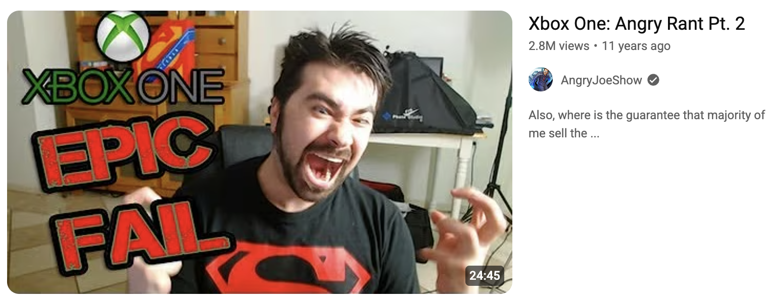
What it is
These thumbnails feature close-up shots of people showing strong emotions. Like a jaw-dropping surprise, full-on panic, or that “I just won the lottery” face.
Why it works
That’s not random. Our brains are hardwired to notice faces, it’s called face detection bias.
Where it works best
Perfect for:
- Gaming (shock face at a game twist)
- Vlogs (story-driven emotion)
- Education (teacher reacts to common mistake or myth)
Design tips
- Crop in tight on the face, don’t leave space for distractions.
- Go bold with contrast and saturation, make those eyes pop.
- Use emotions people instantly recognize (fear, joy, surprise = top performers).
- Add subtle motion blur or glow to increase perceived action.
How 1of10 can help
Type 2: Bold Text Overlays
What it is
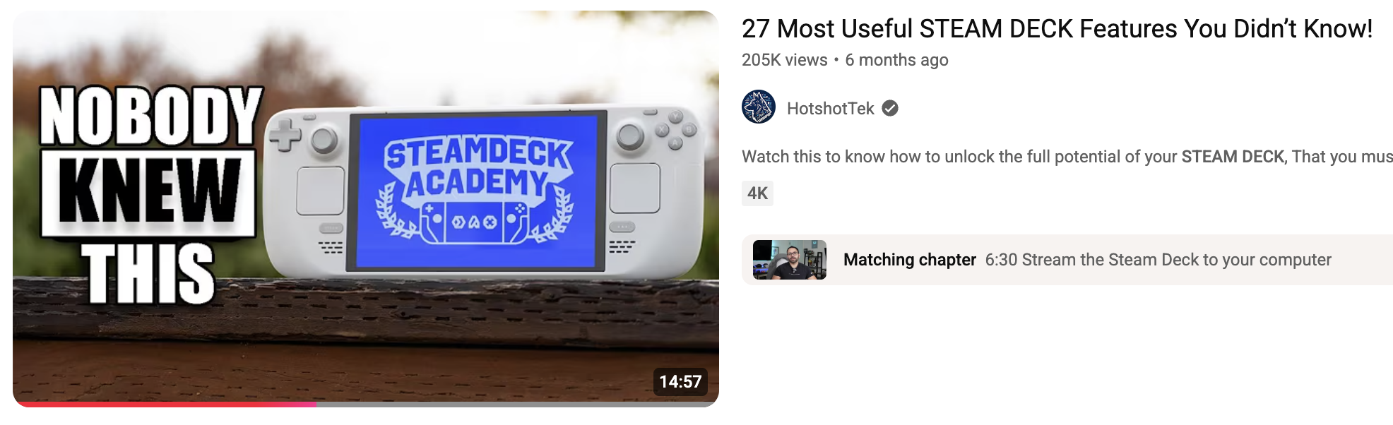
Thumbnails that use 1–4 punchy words in big, bold font, slapped right onto the image. Think: “DON’T DO THIS” or “$5 vs $500.”
Why it works
Big words = instant clarity.
Bold text stops the scroll and tells viewers what the video’s really about. The right phrase adds context or builds curiosity in half a second.
Especially when paired with a strong visual.
Where it works best
Crushes in:
- Tutorials (“Fix This Now”)
- Reviews (“Overpriced?” or “Worth It?”)
- Listicles (“Top 5 Mistakes”)
- Gaming (“NO WAY” or “1HP Clutch”)
Design tips
- Stick to 1–4 words, max. Less is more.
- Use thick, bold fonts like Anton, Impact, or Montserrat ExtraBold.
- Make sure text contrasts hard with the background, black on yellow, white on red, etc.
- Avoid placing text over a busy background. Blur or dim the image behind it if needed.
1of10’s thumbnail builder auto-generates high-contrast text overlays with optimized font size and word count based on your title. It even tests readability for mobile and desktop.
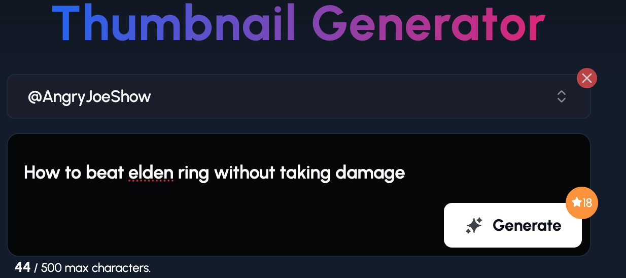
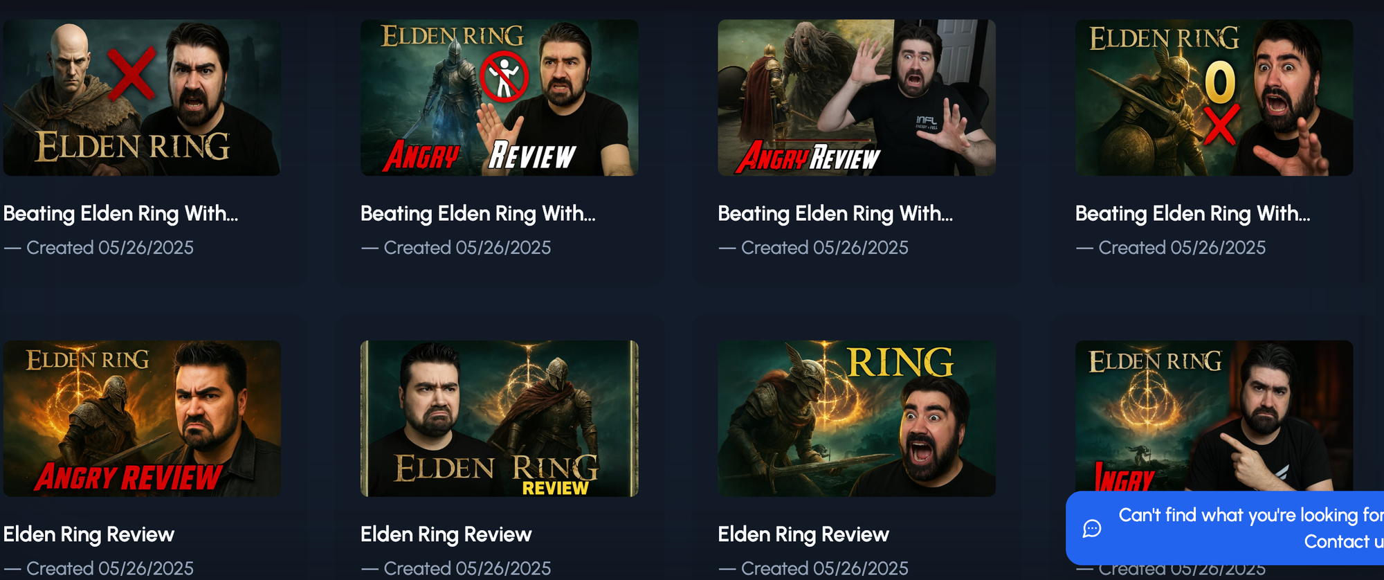
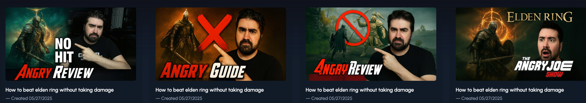
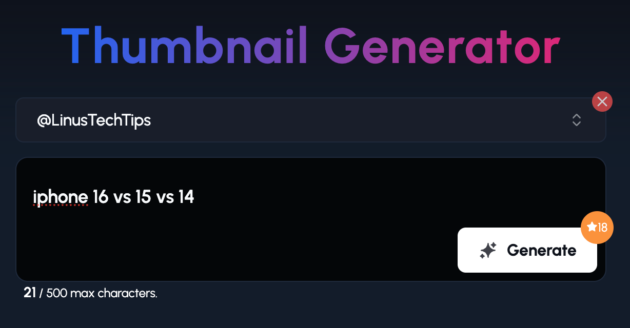
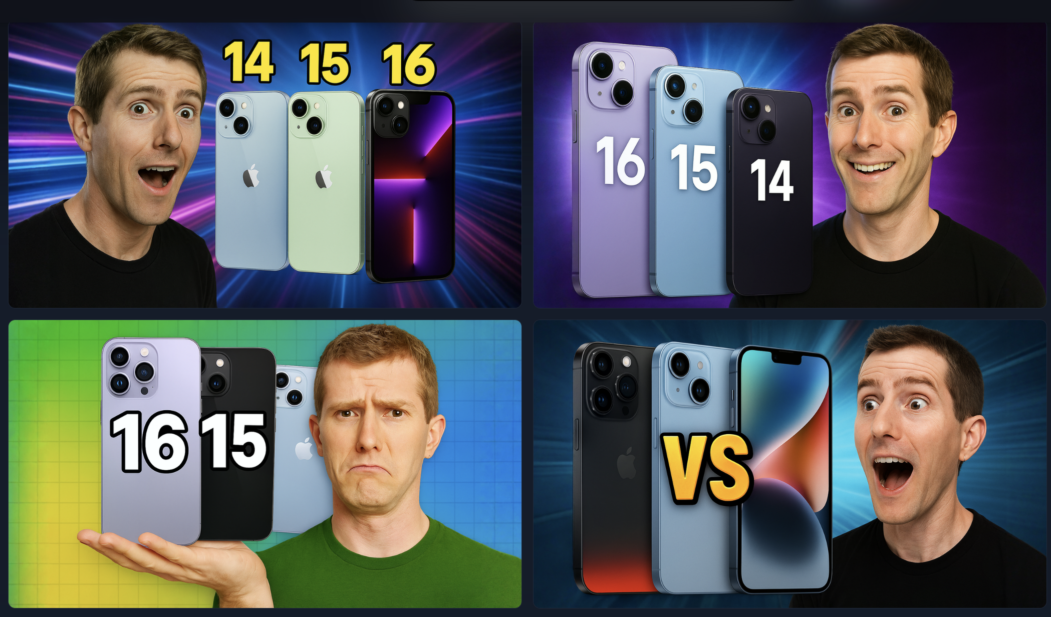
Let's say you're running the Mr Whose The Boss YouTube channel.
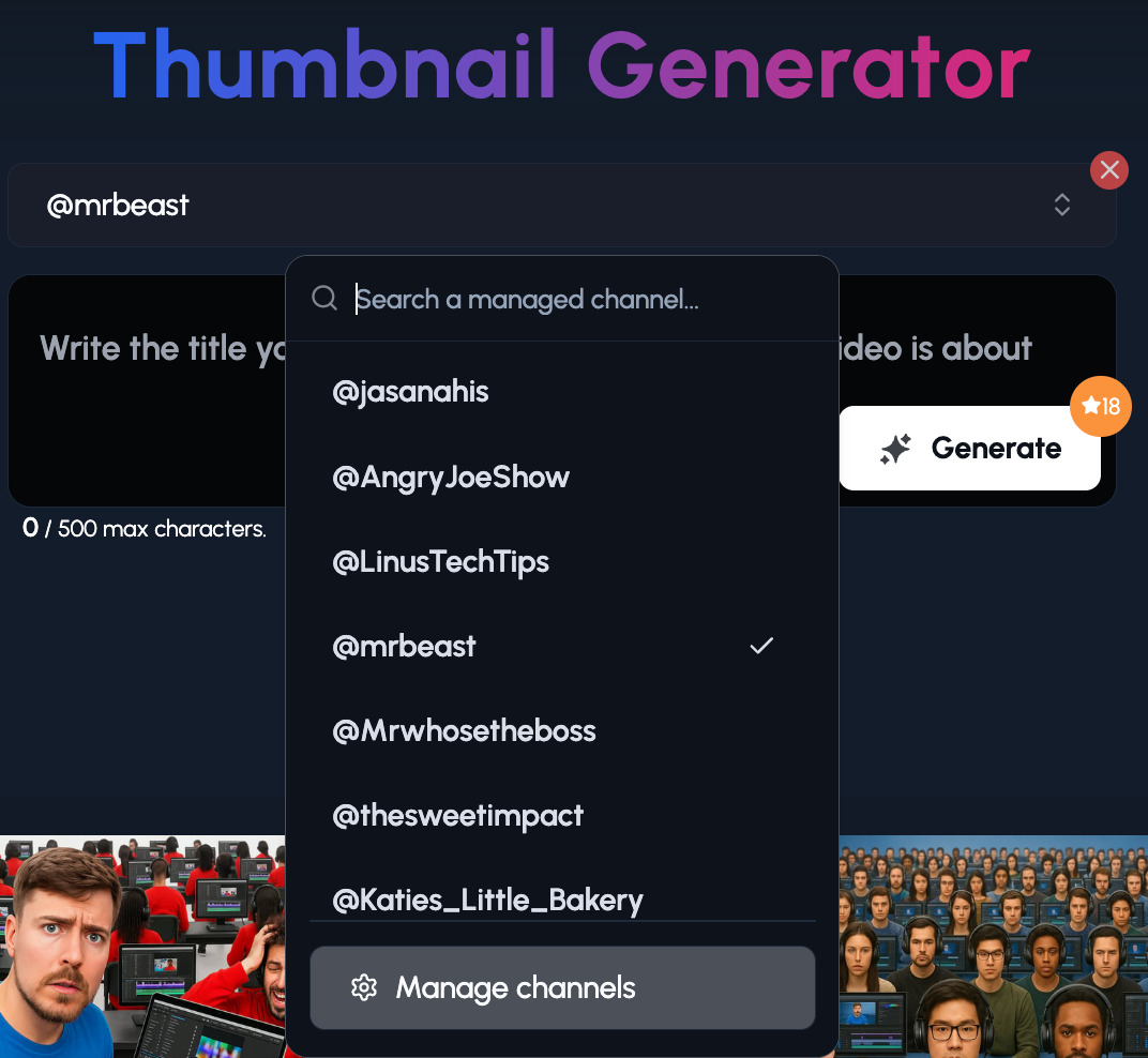
1. You simply add the channel to the Thumbnail Generator.
2. Then you give as much or as little instructions you want. It could be a video idea.
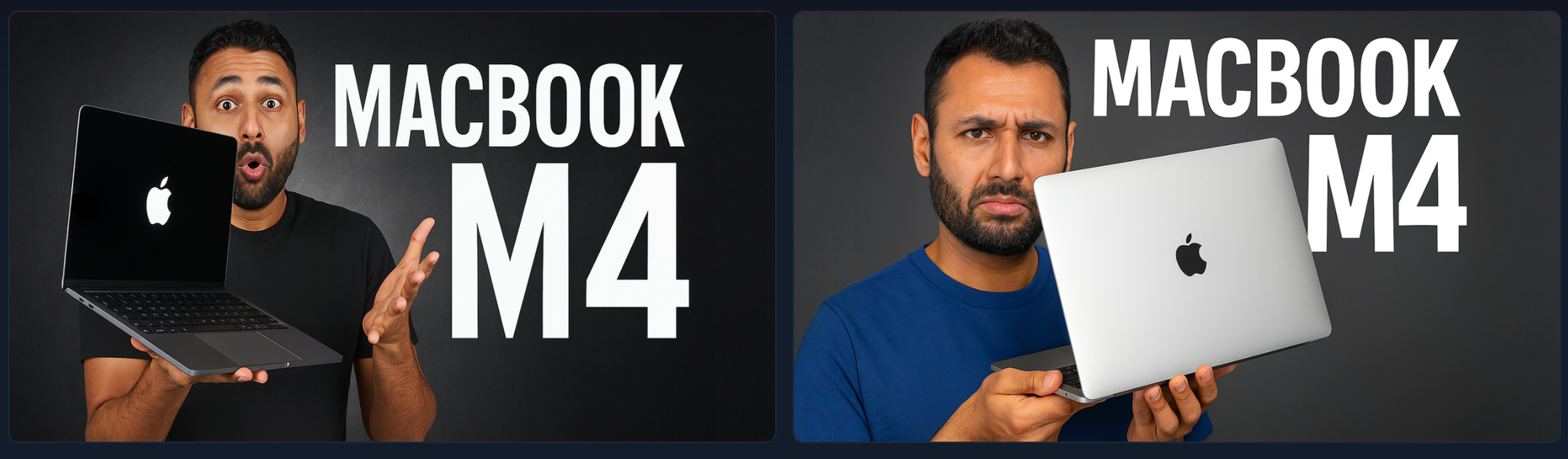
The tool has now produced thumbnails based on the 'bold text overlays' style, AND the Mr Whose The Boss style.
Type 3: Before & After Thumbnails
What it is
Why it works
- Before-and-after visuals create instant curiosity.
- Our brains are wired to spot contrast.
- We need to fill in the missing story.
Whether it’s a room makeover or a 30-day body transformation, the visual difference makes people want the details.
Where it works best
Ideal for:
- DIY & Home Improvement (old kitchen → new kitchen)
- Fitness (week 1 vs week 8)
- Beauty (bare face vs glam look)
- Product upgrades (cheap setup vs pro gear)
Design tips
- Use a vertical or diagonal divider line so it’s clear it’s a comparison.
- Label the sides, “Before” and “After” in bold, clean font.
- Don’t clutter. Make the transformation obvious at a glance.
- Keep lighting and angles consistent between the two shots.
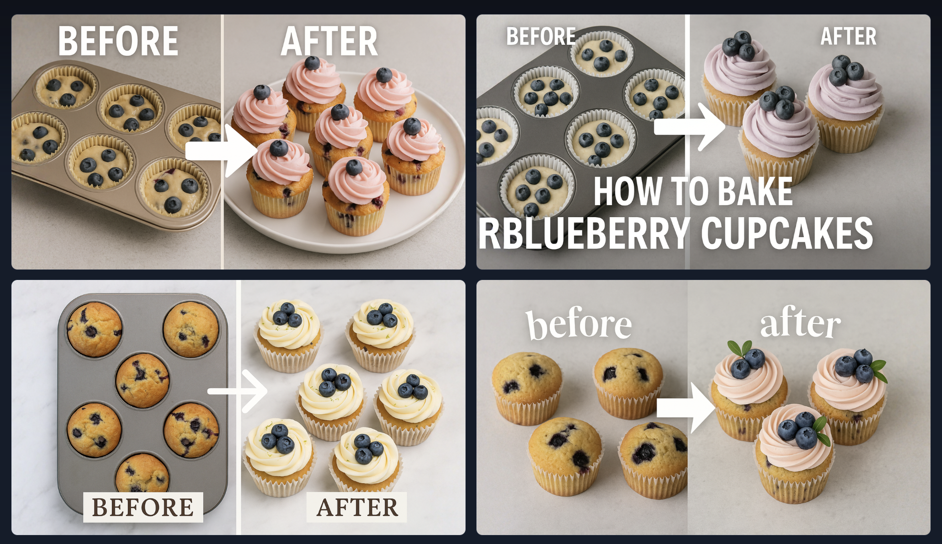
You can tell 1of10’s Ai Thumbnail Generator to create you a before and after style thumbnail.
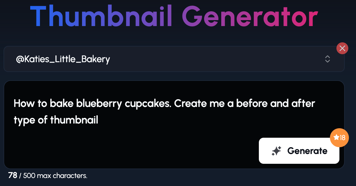
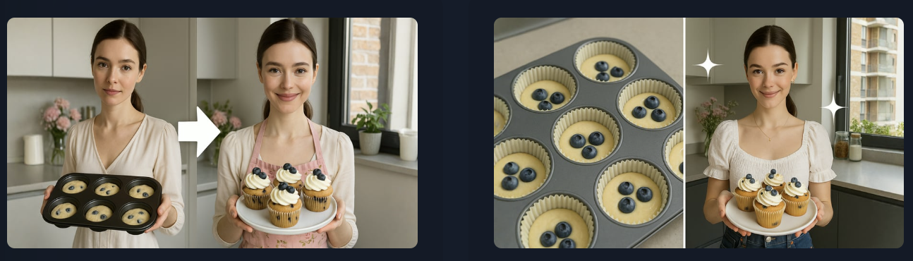
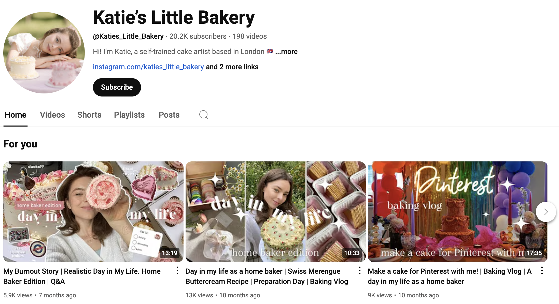
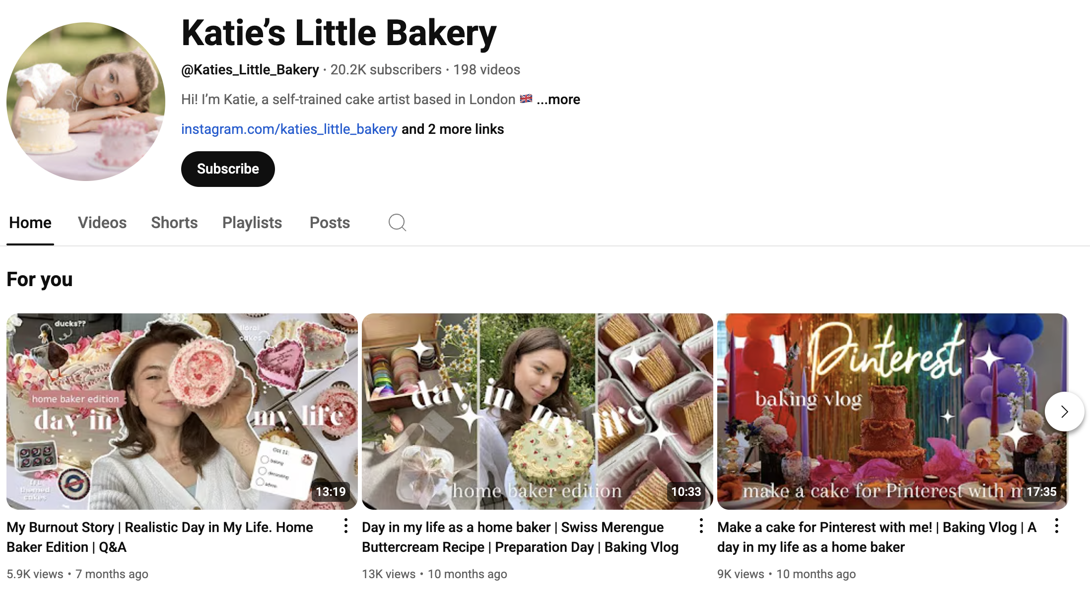
I used Katie’s Little Bakery YouTube channel as the inspiration.
Type 4: Versus / Comparison Layout
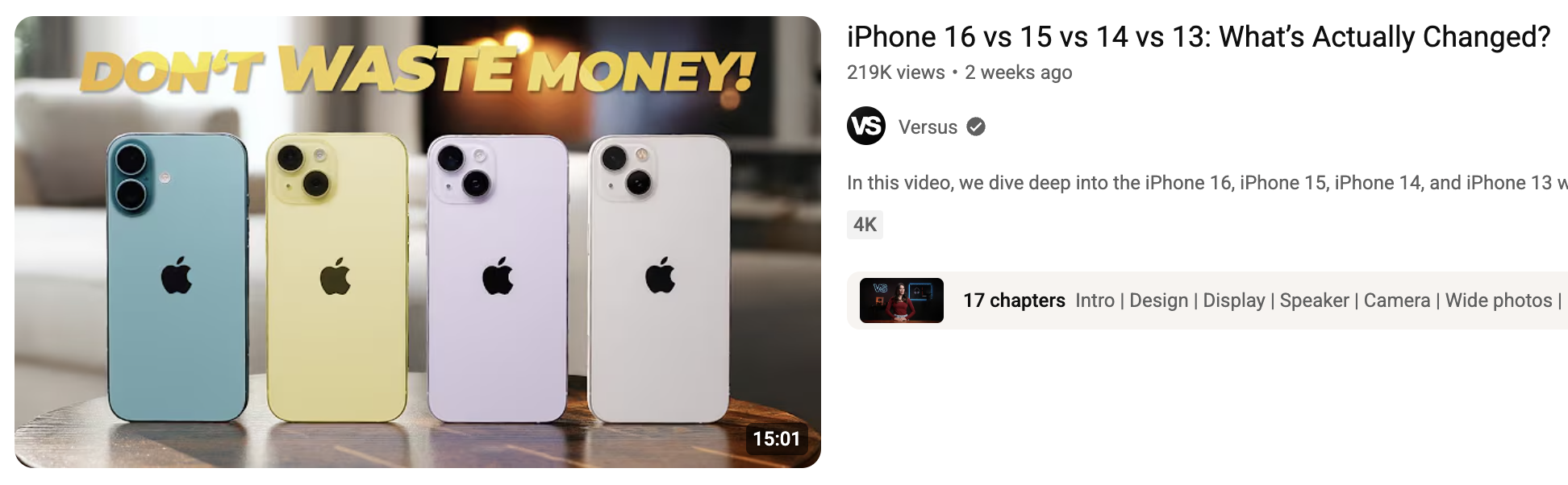
What it is
A thumbnail that pits two things against each other, side by side. Think “iPhone vs Android” or “Cheap Mic vs Studio Mic.”
Why it works
Versus thumbnails tap into decision anxiety.
Where it works best
Works perfectly in:
- Tech Reviews (“Mac vs PC”)
- Debates (“Is Ai Good Or Bad?”)
- Product Comparisons (“$200 Desk vs $2,000 Desk”)
- Gaming (“Which Character Is Best?”)
Design tips
- Use a bold “VS” or “V” in the middle.
- Color-code each side to make them distinct.
- Position the items facing each other (creates visual tension).
- Keep the background clean and let the objects pop.
You can tell 1of10’s Ai Thumbnail Generator to create you a 'VS' style thumbnail.
Type 5: Close-Up or Zoomed-In
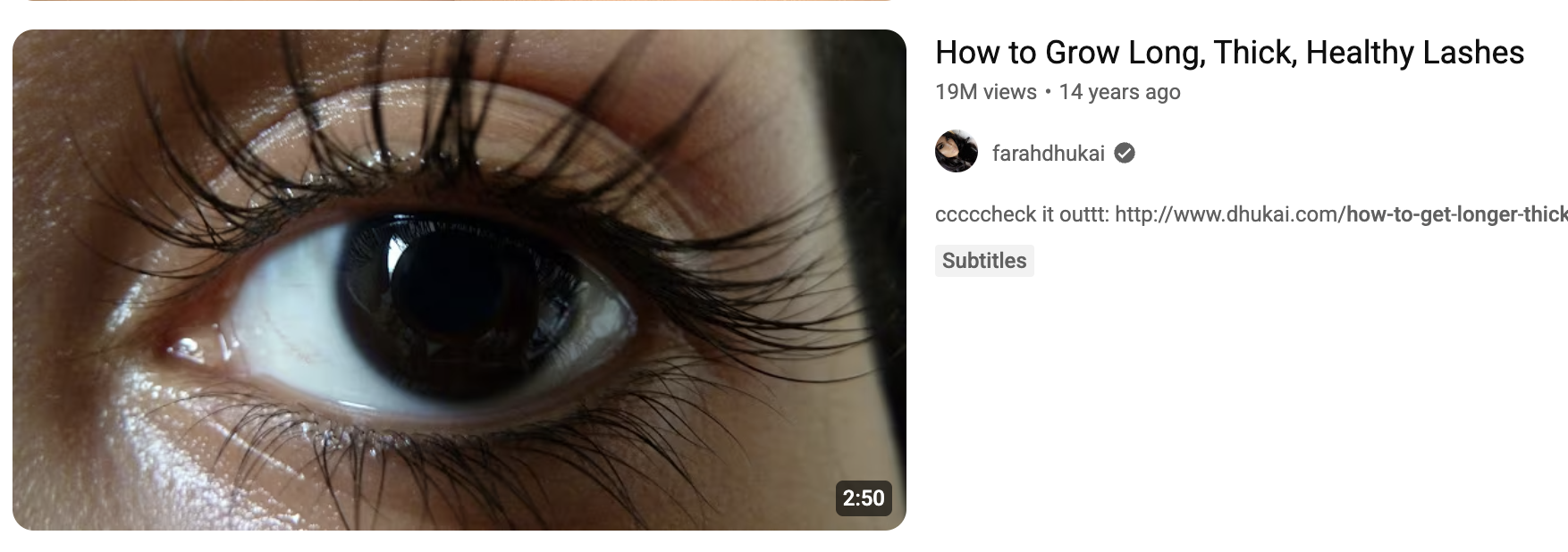
What it is
This style zooms way in on a face or object. Think pores, textures, or tiny details. It’s all about the close-up.
Why it works
They force the viewer to focus. The lack of background noise makes the image feel more intense and important. It also creates mystery.
Where it works best
Great for:
- Beauty (zoomed-in eyeshadow blend, skincare detail)
- Food (melty cheese pull, crispy edge of a steak)
- Crafts (needle threading, paint texture)
- Tech (close-up of a cracked screen, fingerprint scanner, hardware ports)
Design tips
- Crop tighter than feels comfortable, it should feel almost too close.
- Focus on texture, emotion, or contrast.
- Make sure the image quality is sharp, blurry close-ups kill clicks.
- Keep background elements minimal or completely removed.
You can tell 1of10’s Ai Thumbnail Generator to create you a 'Close-Up or Zoomed-In' style thumbnail.
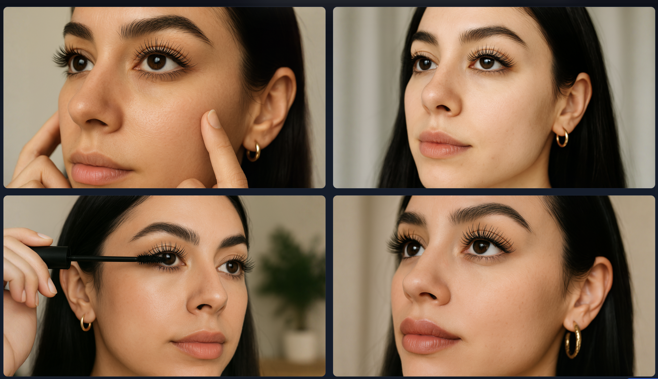
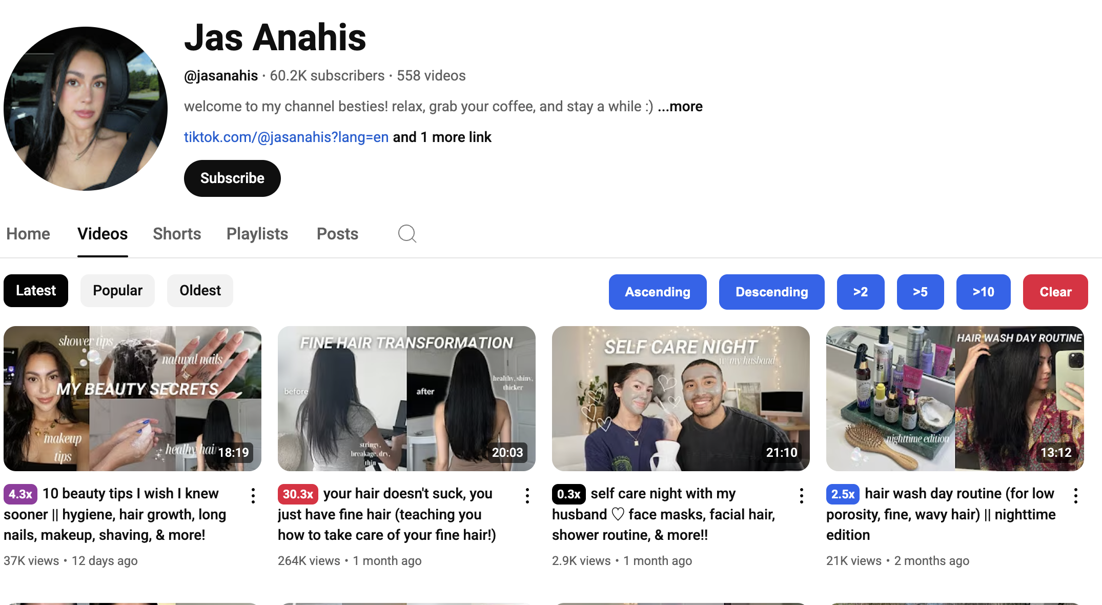
The Jas Anahis YouTube channel was used as the example:
Type 6: Branded Styles
What it is
These thumbnails use the same layout, fonts, and color palette across every video. Like a visual signature. You see the style, you know the creator.
Why it works
Branded thumbnails build trust and recognizability.
Familiarity breeds confidence. It also makes your channel look professional and cohesive.
Where it works best
Perfect for:
- Educational channels (tutorials, lessons, courses)
- Series content (e.g. “Episode 1, Episode 2”)
- Faceless channels (style becomes the face) - Check out our How to Start a Faceless Gaming Channel blog
- Coaching or business channels (building authority)
Design tips
- Pick two fonts and three brand colors, and stick with them.
- Use the same placement for text, face, or object in every video.
- Consider using a logo, watermark, or icon that appears consistently.
- Keep layout simple so it’s recognizable even at small sizes.
1of10’s thumbnail generator will automatically analyze your thumbnails and create thumbnails based on your style.
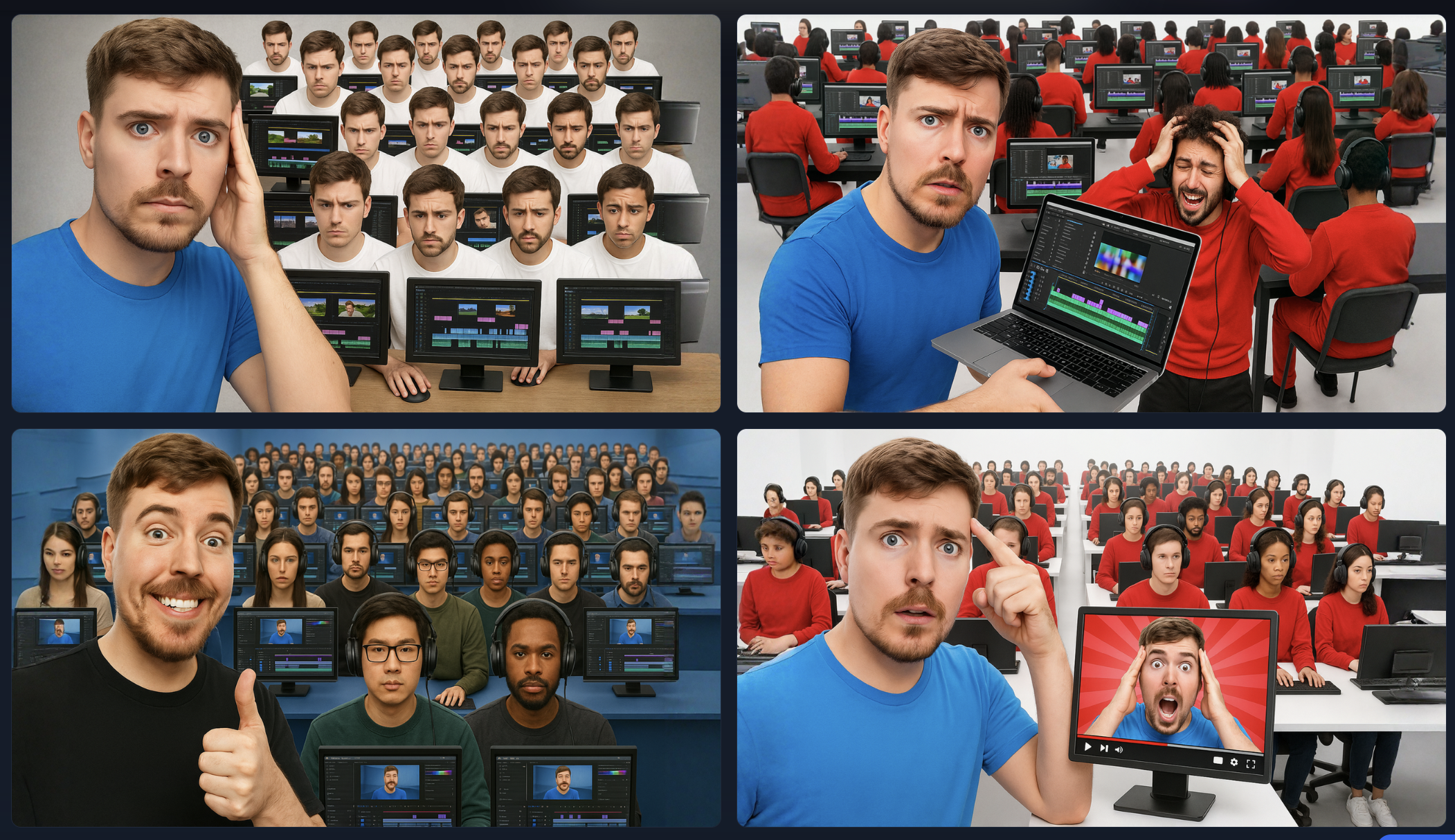
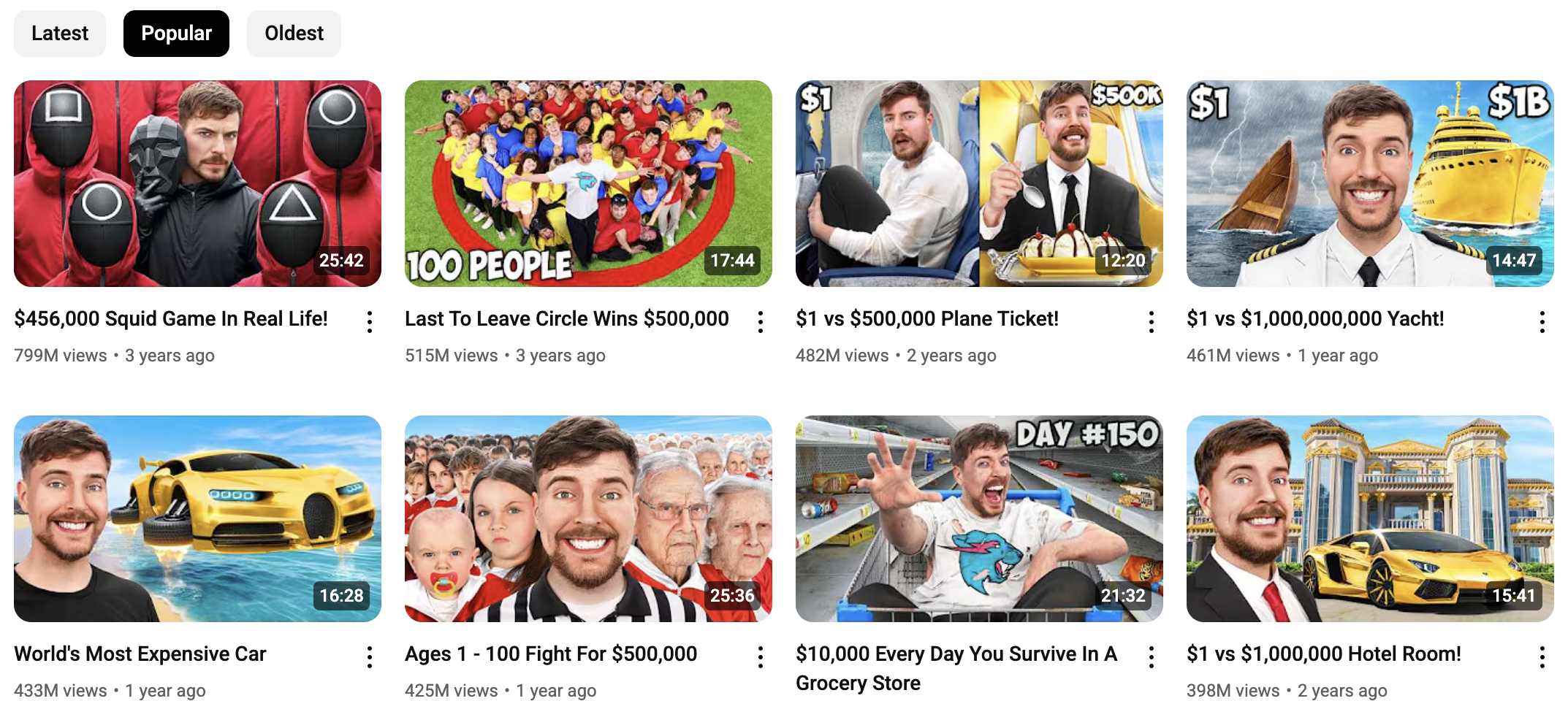
It's taken Mr Beast's branding style and created thumbnails based on it.
Type 7: Action or Candid Shots
What it is
These thumbnails freeze a high-intensity moment, like a skateboard mid-air, a water balloon bursting, or someone’s face mid-reaction. No posing. Just bam, raw energy.
Why it works
Action shots inject movement and urgency into a still image.
Where it works best
Best used in:
- Sports (slams, jumps, wipeouts)
- Gaming (boss fights, clutches, chaos)
- Travel (zip-lining, cliff diving, fast transitions)
- Experiments (explosions, reactions, things flying everywhere)
Design tips
- Capture motion blur or freeze-frame intensity, make it look like it’s mid-action.
- Use bright, energetic colors to match the energy of the moment.
- Zoom in on the subject, too wide, and it loses punch.
- Avoid clutter. Make the subject and motion the star.
How to Create These Thumbnails Using 1of10
You don’t need Photoshop. You don’t need design skills.
You just need a thumbnail that makes people stop scrolling and say, “Yep, I’m clicking that.”
That’s where 1of10’s AI thumbnail generator comes in. It’s built for creators who want scroll-stopping thumbnails fast, without the guesswork.
Here’s how to make any thumbnail type:
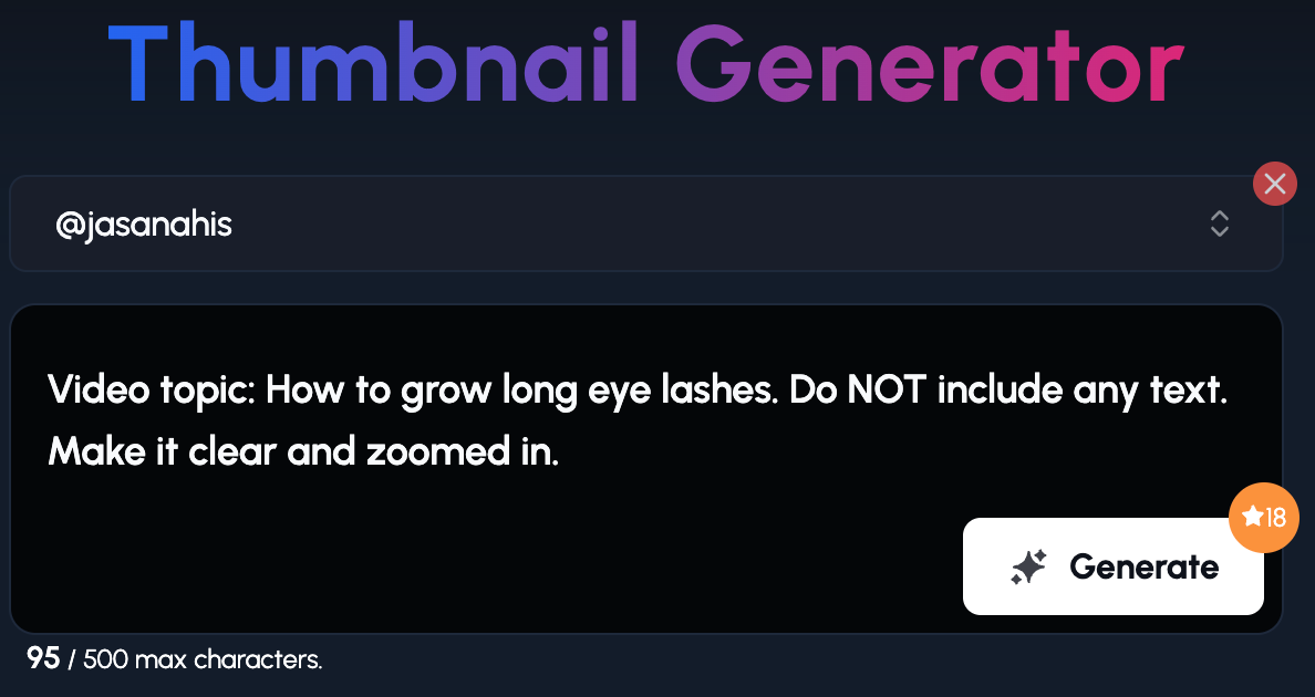
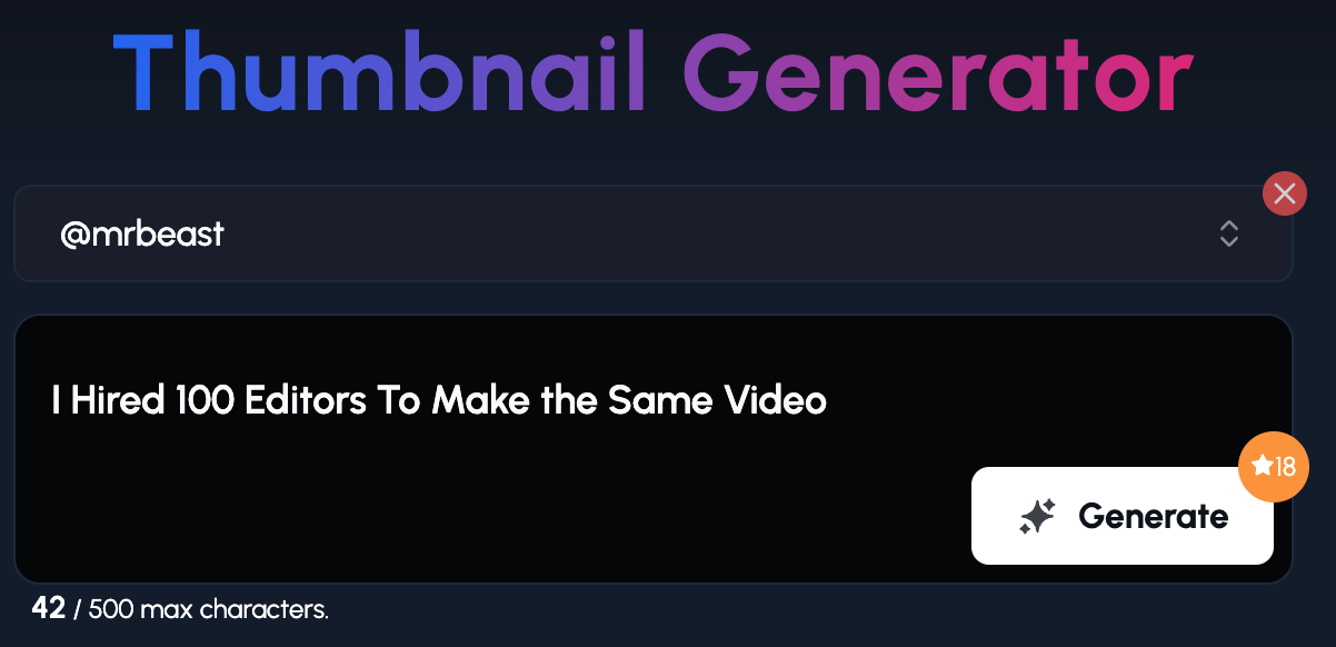
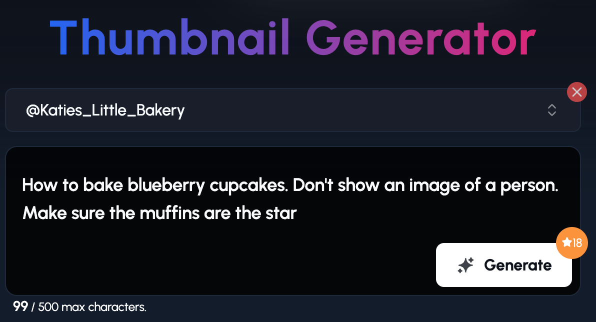
Step 1. Add your channel or a channel you want to base your thumbnail on:
Step 2. Add your title or give a more detailed explanation of what you want the thumbnail to be:
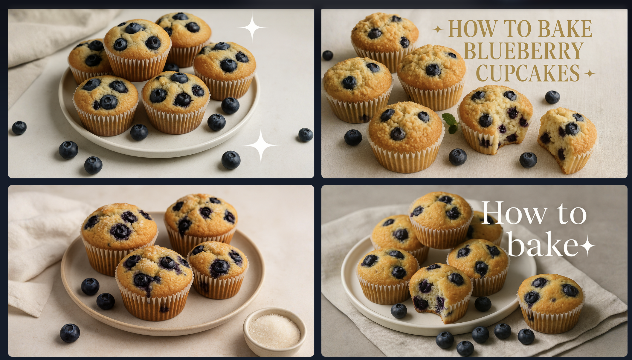
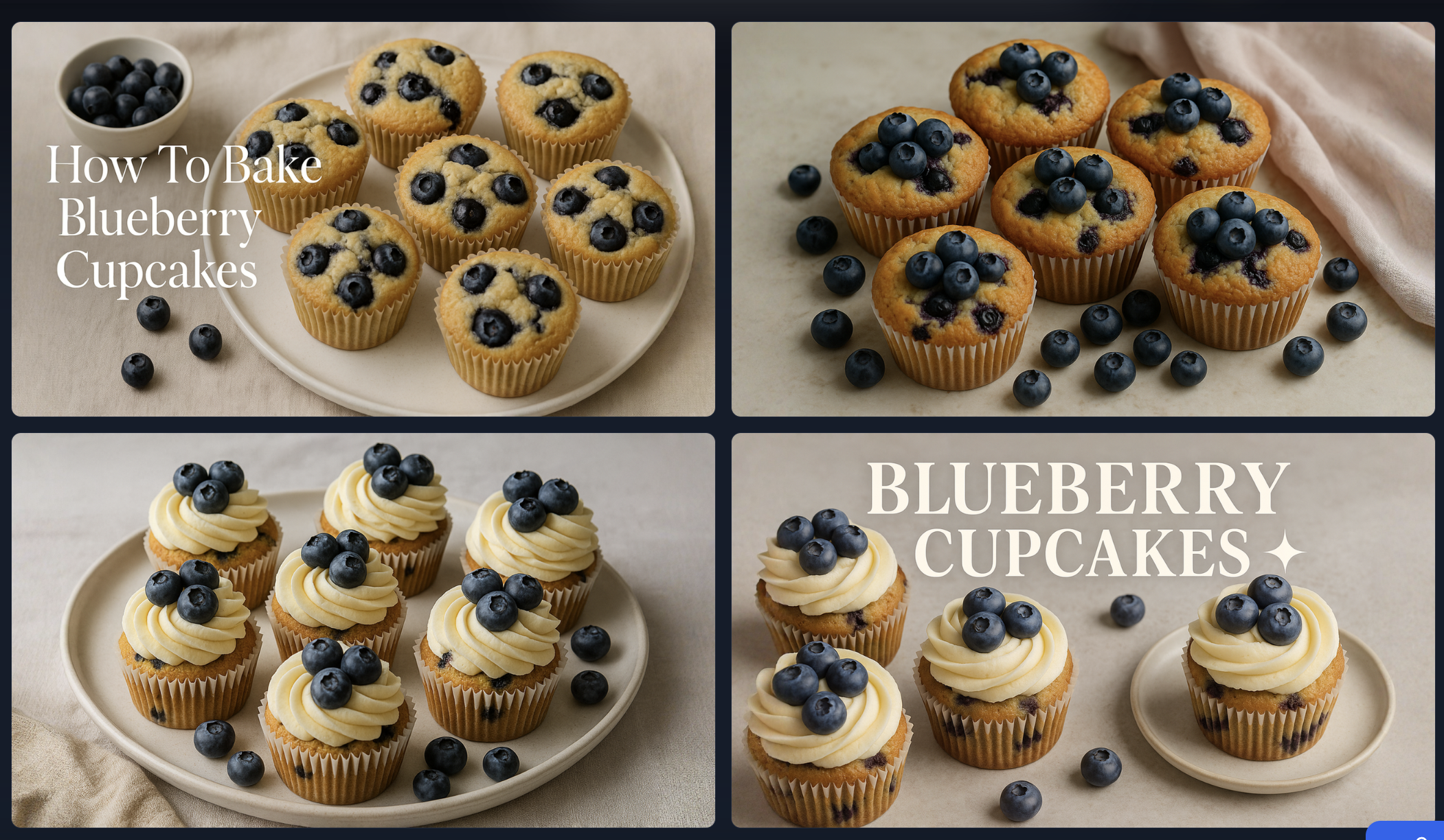
I used the Katie's Little Bakery YouTube channel as inspiration. I simply excluded her face by prompting it.
As you can see, 10f10 copied the styling like the font, and close-up shot type of style.
📱 Mobile First Optimization
Mobile users scroll fast, and thumbnails are tiny.
If yours looks like a Where’s Waldo puzzle, you’ve already lost the click.
On mobile, your thumbnail:
- Shows up smaller
- Competes with more noise (think WhatsApp messages)
So here’s what works:
- No clutter - keep it to the essentials
- Big faces, big text - if you have to squint, it’s too small
- Bold contrast - high brightness and color punch = visibility
🎨 Color Psychology: What Each Color Really Says
Your thumbnail’s colors can make someone feel something before they’ve even read a word or seen your face.
Here’s what the right color can trigger:
- Red + Yellow = Urgency, excitement, fast decisions (Used constantly by MrBeast - think fast food, fire, and flash sales)
- Green = Freshness, health, growth (Great for finance, food, nature, productivity)
- Blue = Calm, trust, reliability (Common in education, tech, tutorials)
- Purple = Creativity, mystery, luxury (Works well for beauty, lifestyle, or abstract topics)
Contrast is your best friend.
- Light text on dark backgrounds? ✅
- Dark text on light backgrounds? ✅
- Medium text on medium background? Hard pass. ❌