
YouTube Banner Size & Design: The Complete 2026 Guide
YouTube banner size questions are consistently in the top searches for new creators, and most of the answers online are either incomplete or formatted as a single number without the context that makes that number useful. This guide covers everything: the official dimensions, how the banner crops on each device, the safe zone, file requirements, design approaches, and how your banner connects to your thumbnails as part of a single visual identity.
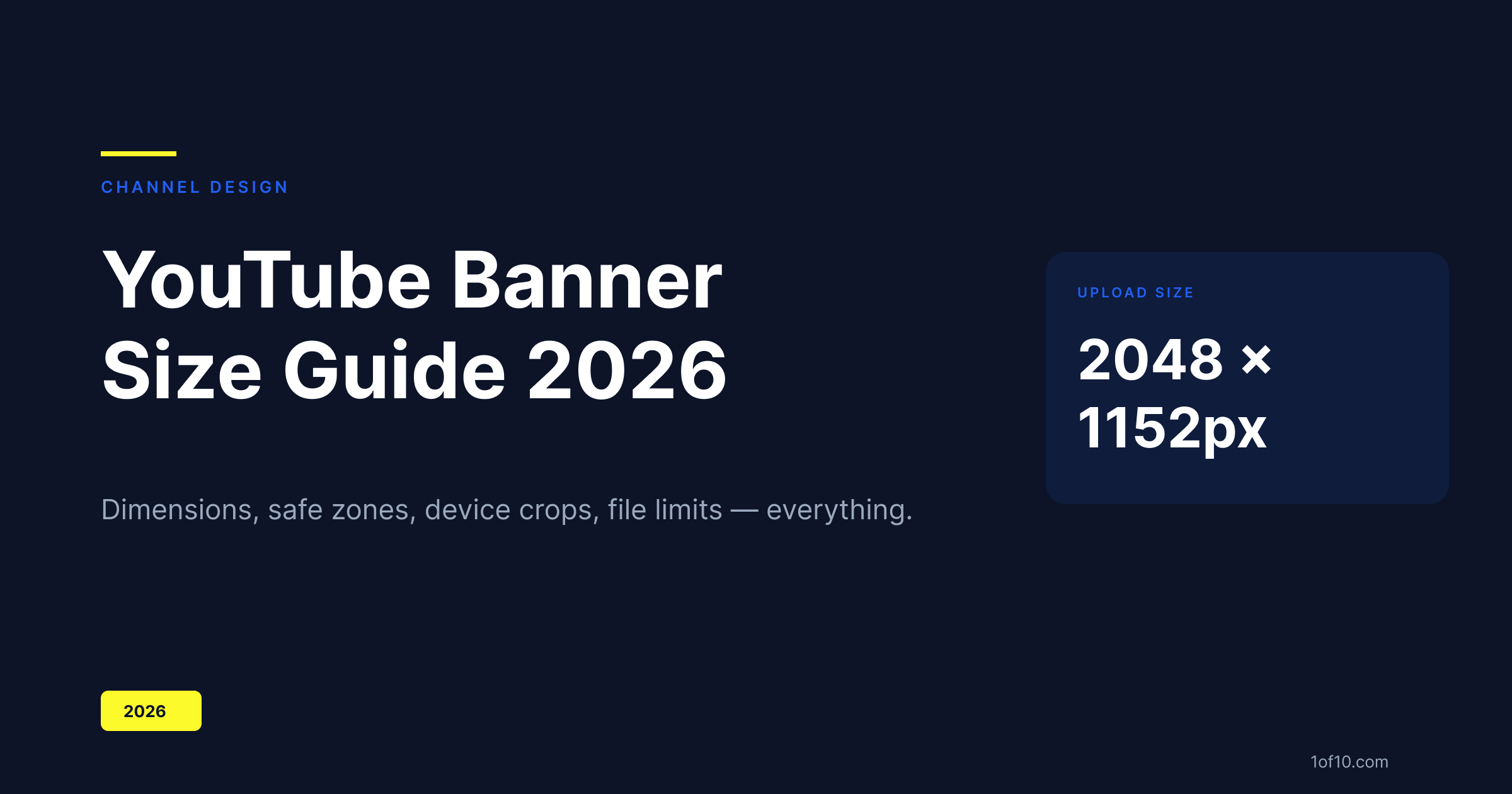
The official YouTube banner size: 2048 x 1152 pixels
Upload your banner at 2048 x 1152 pixels. This is YouTube's required upload dimension. Aspect ratio: 16:9.
YouTube recommends a minimum of 2048 x 1152, but this is a hard requirement in practice -- files smaller than 1024 x 576 (the stated minimum) will be rejected outright, and anything between the minimum and the recommended size will look soft on high-density displays.
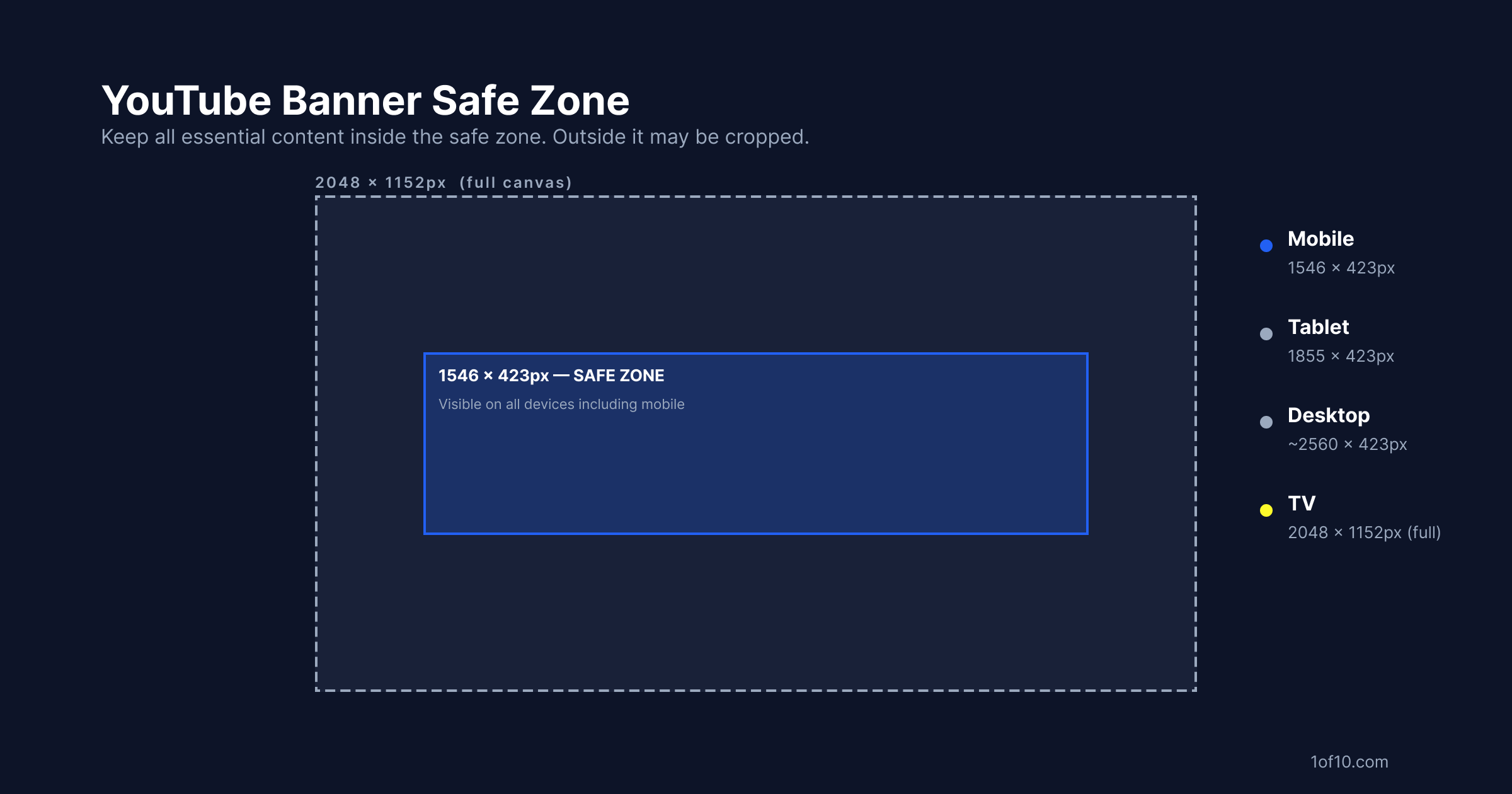
What happens to that 2048 x 1152 file on different devices:
- Desktop: YouTube displays the banner inside a header container that scales based on window width. The full image is never shown at once -- only the central portion is visible. At a 1280px wide window, you'll see roughly the central 2560 x 423px strip (scaled down).
- Tablet: shows approximately 1855 x 423 pixels
- Mobile: shows approximately 1546 x 423 pixels
- TV/Chromecast: shows the full 2048 x 1152 pixel image without cropping
The crop changes significantly between devices. The TV view shows your entire canvas; the mobile view shows only a horizontal strip through the center.
Safe zone explained: how the banner crops on mobile, desktop, and TV
The safe zone is the 1546 x 423 pixel area centered on your 2048 x 1152 canvas. Any element you want visible on all devices -- channel name, tagline, upload schedule, logo -- must live within this area.
Everything outside the safe zone is design territory for TV and desktop users only. Use it for background artwork, extended visuals, and brand environment -- but don't put essential information there.
| Device | Visible area |
|---|---|
| Mobile | 1546 x 423px (safe zone exactly) |
| Tablet | 1855 x 423px |
| Desktop | Up to 2560 x 423px (varies with window width) |
| TV | Full 2048 x 1152px |
Practical design approach: create your banner at 2048 x 1152. Set up a guide rectangle at 1546 x 423 centered on the canvas. Keep all critical content inside it. Fill the rest with background artwork that looks good on TV and desktop without carrying essential information.
1024 x 576 vs 2048 x 1152: which to use
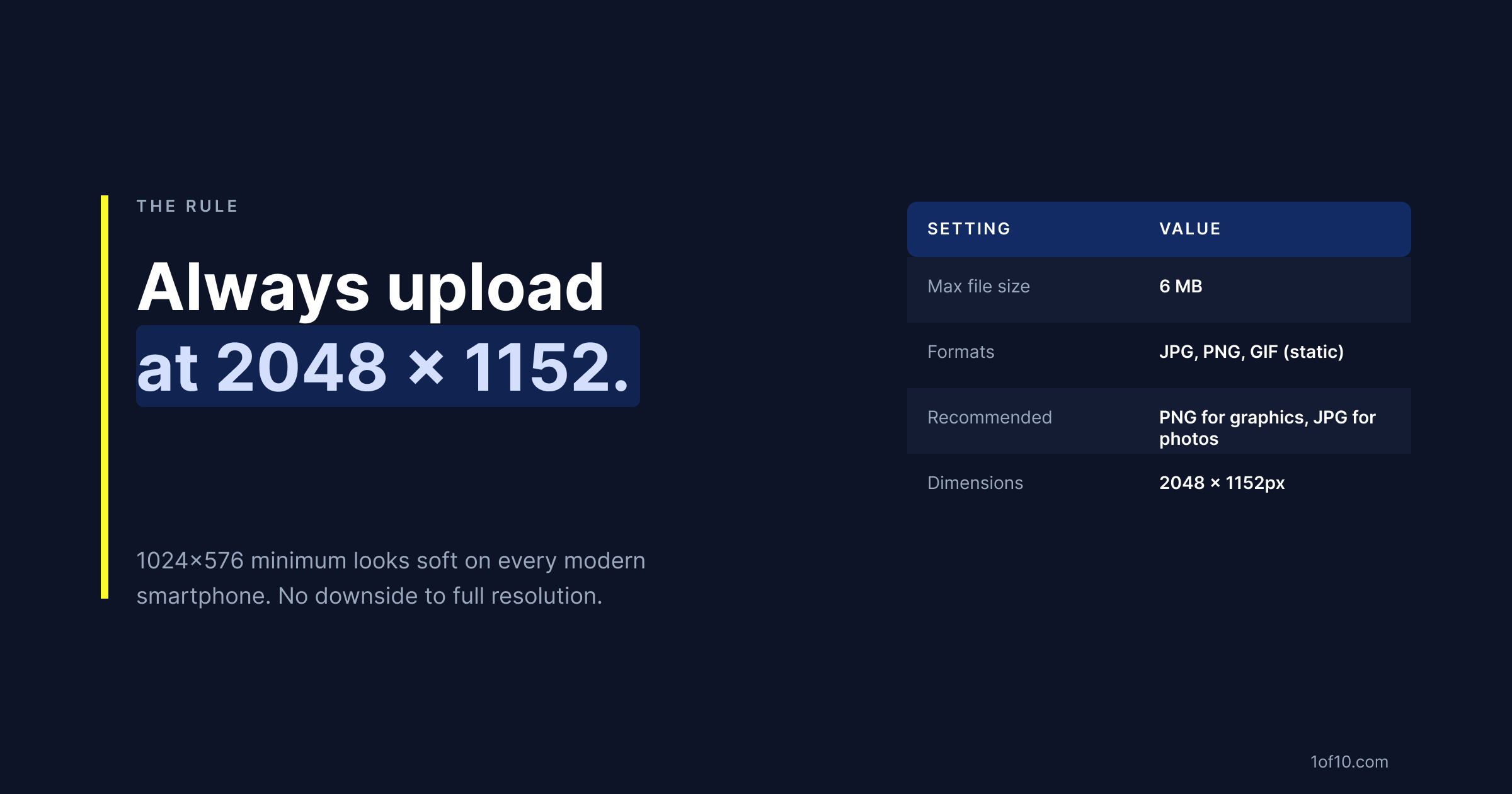
Always use 2048 x 1152. There is no reason to use the minimum.
1024 x 576 at 1x pixel density is what you're uploading. On a 2x display (standard on all iPhones and most modern Android phones), YouTube will render your 1024 x 576 banner at 2048 x 1152 pixels -- which means it's being upscaled by 2x, producing a blurry result.
On a 3x display (iPhone Pro, many flagship Android devices), the upscale is even worse.
A banner designed at 2048 x 1152 renders sharp at 1x and acceptable at 2x. There is no downside to uploading at full resolution. The 6MB file size limit is generous enough to accommodate a 2048 x 1152 PNG or JPG at any reasonable quality level.
File size, format, and upload limits
| Setting | Requirement |
|---|---|
| Maximum file size | 6 MB |
| Accepted formats | JPG, PNG, BMP, GIF (non-animated) |
| Recommended dimensions | 2048 x 1152px |
| Minimum dimensions | 1024 x 576px (do not use) |
Format guidance:
- PNG: Use for banners with text, logos, sharp-edged graphics, or flat color areas. PNG preserves edges without compression artifacts.
- JPG: Use for banners that are primarily a photograph or continuous-tone image. JPG at quality 90+ is visually lossless and will keep the file under 6MB.
If your PNG is coming in over 6MB, export as JPG at quality 90 – at that setting, the difference from PNG is invisible to viewers at banner display size.
Banner design ideas and examples
Five approaches that work across different channel types:
1. Name and tagline (universal)
Channel name in large text, centered in the safe zone. One-line tagline below. Solid color or subtle gradient background. Works for any niche. The risk is it looks generic -- add a strong color choice or bold font to differentiate.
2. Creator face (personal brand)
Creator photo positioned to the right side of the safe zone, where it crops gracefully on smaller screens. Channel name on the left. Highly effective for personal brand channels where the creator is the product. The face creates immediate recognition in the subscription feed.
3. Gradient split (brand identity)
Two-color gradient spanning the full banner width. Channel name centered in the safe zone. Bold, distinctive color choice becomes the channel's visual signature. Works especially well when the same colors appear in thumbnails -- consistency reinforces recognition.
4. Upload schedule (functional)
Post schedule displayed in the safe zone -- "New videos every Tuesday and Thursday." Reduces subscriber hesitation for viewers considering subscribing. Most effective for channels with a consistent, reliable posting schedule. Becomes a liability if you post irregularly.
5. Social proof (authority positioning)
Subscriber count, media mention, or credibility indicator inside the safe zone. Works for channels with a milestone worth citing ("500,000 creators served," "As seen in [Publication]"). Becomes dated quickly -- requires updating as the channel grows.
Banner and thumbnail consistency: building a recognisable channel
The fastest way to convert casual viewers into subscribers is instant recognisability.
Subscribers don't click just because a single thumbnail is good -- they click because they see your thumbnail in the feed and recognize it as yours before reading the title. That recognition comes from consistent visual identity across your banner and thumbnails.
A viewer who subscribes to your channel sees your banner when they visit your page. If your thumbnails share nothing visually with that banner -- different colors, different fonts, different aesthetic -- the experience is incoherent. Your channel looks like it can't decide what it is.
Three consistency rules:
- Same primary color. The dominant color from your banner should appear in your thumbnails. Not identically, but recognisably. The data on which colors drive the most YouTube clicks is niche-specific -- what works in finance does not work the same way in gaming.
- Same font family. Your thumbnail font should be the same family as the font on your banner. This is the single strongest visual consistency signal.
- Same composition logic. If your banner puts your face on the right and text on the left, carry that spatial logic into your thumbnails. Consistent composition becomes a visual fingerprint.
1of10's AI Thumbnail Maker applies your channel's established visual identity to every thumbnail it generates. If your channel has a defined color and font palette, 1of10 pulls from that data to generate thumbnails that are visually consistent with your brand -- not just individually good-looking. Pair it with YouTube Studio's native A/B testing to validate which branded variant actually drives more clicks from your audience.