
The Best YouTube Thumbnail Fonts for Higher CTR (2026)
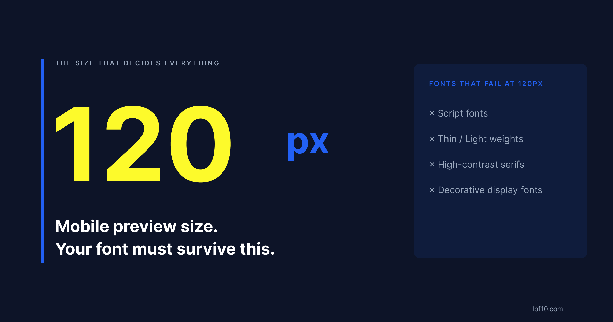
Your thumbnail text isn't read on your design canvas at 1280 x 720 pixels. It's read at 120 pixels wide on a phone, inside a crowded YouTube feed, by someone who hasn't decided yet whether your video is worth their time. At that size, font choice isn't aesthetics. It's readability, and readability is directly tied to click-through rate.
The fonts that appear consistently in high-CTR thumbnails share a measurable set of characteristics. This article breaks down exactly what those are, which fonts pass the test, which ones fail it, and how to pick the right combination for your channel.
Why font choice quietly decides whether your thumbnail gets clicked
When a viewer scrolls their YouTube feed, your thumbnail has about 0.3 seconds to register before they move past it. In that window, text on the thumbnail does two things: it adds a second signal beyond the image (it tells the viewer what this video is about), and it contributes to the visual weight and contrast of the thumbnail overall.
If the text is illegible, it fails at both. The thumbnail looks cluttered, the viewer can't parse the content signal, and the click doesn't happen.
Analysis of outlier videos -- videos that outperform their channel's average CTR by 3x or more -- shows a consistent pattern: thumbnails with 1 to 3 words of high-contrast, heavy-weight text outperform thumbnails with 4 or more words of thin text, even when the thin-text thumbnail is technically carrying more information. Legibility beats information density every time at thumbnail size.
The font you choose determines legibility before you've written a single word.
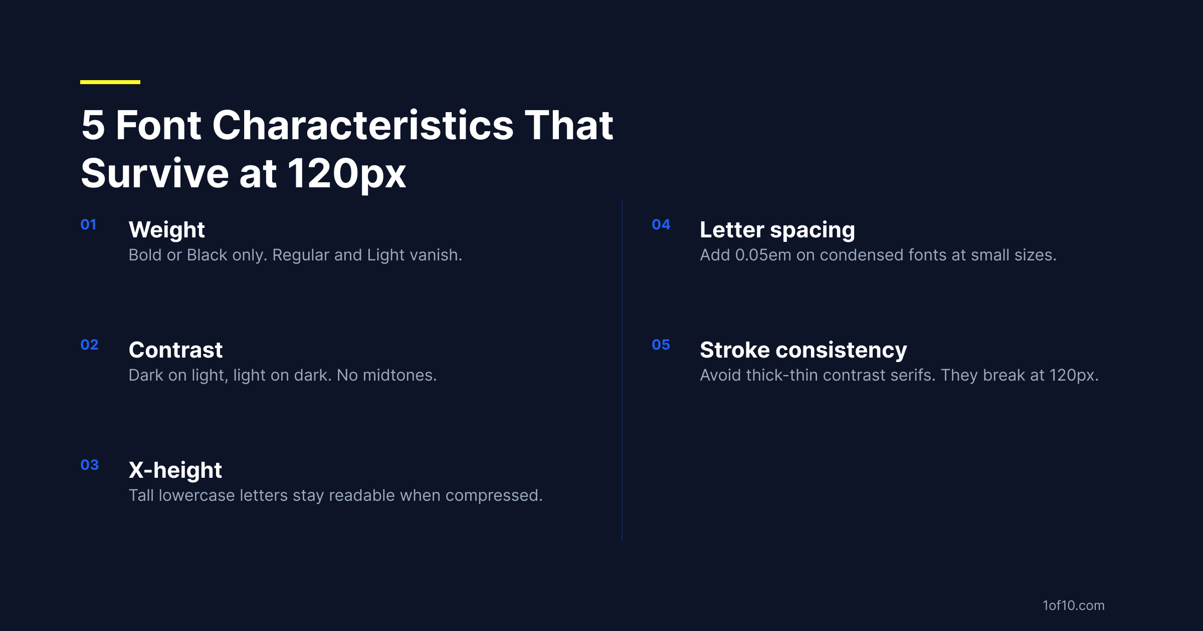
The 5 font characteristics that survive at 120-pixel mobile preview size
1. Weight
Use black or extrabold weights only. That means the heaviest variant in the font family -- Montserrat Black, not Montserrat Regular; Bebas Neue (which ships in one effective weight, bold) rather than a condensed option at regular weight.
Regular, medium, and light weights disappear at small sizes because their stroke widths are too thin to survive compression. If the font weight isn't bold or black, it doesn't belong in a thumbnail.
2. Contrast
Font color needs to contrast sharply with its background -- dark on light, or light on dark. No midtones, no "subtle" palettes, no matching the text color to the background image.
When text sits directly on a photo, this becomes critical. Text over a complex background is almost always unreadable without a shadow, outline, or translucent overlay behind it. A 2px drop shadow creates enough separation for white text on most background images. Without it, even a heavy font becomes hard to read. The choice of thumbnail color palette matters as much as font weight -- what can't be seen at 120px can't be clicked.
3. X-height
X-height is the height of lowercase letters relative to uppercase in a typeface. Fonts with a high x-height -- where lowercase letters approach the height of capitals -- stay readable at small sizes because the letterforms are larger relative to the overall text block.
Fonts with a short x-height lose their lowercase legibility quickly as size decreases. For any thumbnail text that mixes upper and lowercase, high x-height fonts are the safer choice.
4. Letter spacing
Tightly-tracked letters merge at small sizes. Condensed fonts with very tight default spacing can become unreadable at thumbnail scale even when they look fine large. The fix: add a small amount of letter spacing (0.05 to 0.1em) on secondary text, where sizes are smaller. The main hook text is usually large enough that tight spacing works fine.
5. Stroke consistency
Fonts built around dramatic thick-thin stroke variation -- Bodoni, Didot, high-contrast serifs -- look elegant at large sizes but break down at small ones. The thin strokes disappear, leaving only the thick parts of each letterform, which distorts the letters beyond recognition.
For thumbnail text, choose fonts with consistent stroke weight throughout: geometric sans-serif, heavy slab serif, or condensed display fonts.
10 fonts proven to lift CTR on YouTube thumbnails
These fonts appear consistently across high-CTR thumbnails in multiple categories. All are available in major design tools and on Google Fonts.
1. Impact
The original YouTube thumbnail font. Heavy, compressed, fully uppercase. Excellent contrast from the stroke weight. Reads at any thumbnail size.
The knock: it's been used so widely it can feel generic. In niches where it's still dominant (gaming, reaction content) it works. In categories that have moved to cleaner aesthetics (finance, wellness, tech), there are better options.
2. Bebas Neue
Impact's cleaner replacement. Fully uppercase, tight spacing, heavy weight. Where Impact reads aggressive, Bebas Neue reads controlled. Free on Google Fonts.
Best for: tech, personal brand, business, educational content.
3. Montserrat Black
Geometric sans-serif with high x-height and clean letterforms. The Black weight is heavy enough for thumbnail use, and it works in both uppercase and mixed case -- making it more versatile than all-caps options.
Best for: lifestyle, fitness, business, general-purpose channels.
4. Anton
Similar to Impact in weight and compression, but slightly more refined letterforms. A better choice than Impact when you want aggression without crudeness.
Best for: news commentary, finance, motivational content.
5. Oswald Bold
Condensed sans-serif with a slightly editorial feel. Use the Bold weight, not Regular -- the Regular weight is too light for thumbnail use. Holds up well at small sizes.
Best for: educational content, news, documentary-style thumbnails.
6. Barlow Condensed Bold
More personality than Oswald while staying highly legible. Slightly wider default letter spacing makes it readable even in smaller text blocks.
Best for: automotive, sports, travel, channels with a strong visual identity.
7. Roboto Condensed Bold
Neutral, authoritative, universally legible. Default choice for channels that want to communicate information cleanly without a strong typographic personality.
Best for: tutorial content, finance, data-driven channels, review content.
8. Nunito ExtraBold
Rounded terminals with heavy weight. Less aggressive than Impact or Bebas, which makes it feel approachable without losing legibility.
Best for: family content, entertainment, cooking, lifestyle channels.
9. DIN Condensed Bold
Industrial, engineering-influenced. Reads as technical authority at a glance.
Best for: automotive, hardware review, tech, manufacturing content.
10. Graduate
Slab serif with sports and collegiate associations. Heavy weight with strong visual presence.
Best for: sports content, challenge videos, competition formats.
Fonts to avoid: thin, decorative, and script families that vanish on mobile
Script fonts
Pacifico, Lobster, Dancing Script, Great Vibes -- all unreadable at thumbnail size. Script fonts require reading a continuous letterform, which is impossible when the whole thumbnail is 120 pixels wide.
If your brand uses a script font elsewhere, do not use it in thumbnails. Create a separate thumbnail-specific font identity. For a full breakdown of what else is suppressing your CTR, see why YouTube thumbnails don't get clicked.
Thin and light weights
Any font at its light or thin weight. Helvetica Neue Light, Lato Thin, Raleway Thin, and similar options all become ghost-text at thumbnail size. Even fonts that look strong in their heavy variants are unusable at thin weights.
High-contrast serifs
Bodoni, Didot, Playfair Display, Cormorant -- built around thick-thin contrast. The hairline strokes that make them elegant at large sizes vanish at thumbnail scale, leaving distorted thick-only letterforms.
Decorative display fonts
Fonts with complex letterforms, ornamental details, or extreme stylization. This includes blackletter (Fraktur-style), art nouveau, and most novelty display fonts. They're designed for large-format use only.
How to pair two fonts in one thumbnail without visual conflict
Limit thumbnail text to two fonts maximum. Three or more almost always looks cluttered even when each font is technically legible.
The pairing principle: one display font (the hook, the main message, large) and one functional sans-serif (secondary information, smaller).
Proven combinations:
- Bebas Neue + Montserrat: clean, versatile, works across most niches
- Anton + Roboto Condensed: fast, aggressive feel for high-energy content
- Barlow Condensed Bold + Open Sans: balanced, readable for mixed audiences
- Oswald Bold + Lato: editorial authority with readable supporting text
The weight rule: One font must be clearly dominant. If both fonts read at the same visual weight, the thumbnail has two headlines competing for attention. One font should be 2-3x the visual size of the other.
The category rule: Don't pair two fonts from the same category (two condensed sans-serifs, two slab serifs). Fonts from different categories are visually distinct enough to read as a deliberate pairing rather than an accident. Once you have a strong pairing locked, A/B test it against a single-font layout to confirm it actually lifts CTR before you commit it to your whole channel.
How 1of10's AI Thumbnail Maker selects fonts automatically from outlier data
Most creators choose thumbnail fonts based on what looks good in their design tool at full resolution. That's not the viewer's experience.
1of10 analyzes thumbnails from videos that significantly outperform their channel's average CTR -- the outliers. The AI identifies which font characteristics (weight, contrast, style, pairing patterns) appear consistently in the top performers for your specific niche. When you generate a thumbnail, 1of10 isn't applying a generic best practice. It's applying what's proven to get clicked in your category, based on data from channels already winning. For a look at which YouTube thumbnail trends are dominating this year, the data shows a clear shift toward high-contrast, face-forward layouts.
Generate your first AI-driven thumbnail at 1of10.com -- no design experience needed.