
YouTube Thumbnail Trends in 2026 (What's Driving Clicks This Year)
Every year, what makes a YouTube thumbnail get clicked shifts. Not dramatically – the fundamental physics of thumbnail design (contrast, legibility, emotional trigger) don't change – but the specific patterns that dominate in the algorithm at any given time do. 1of10 analyzes thumbnails from videos that outperform their channel average CTR by 3x or more. Here's what the data shows is winning clicks in 2026.
What changed in YouTube thumbnail design between 2025 and 2026
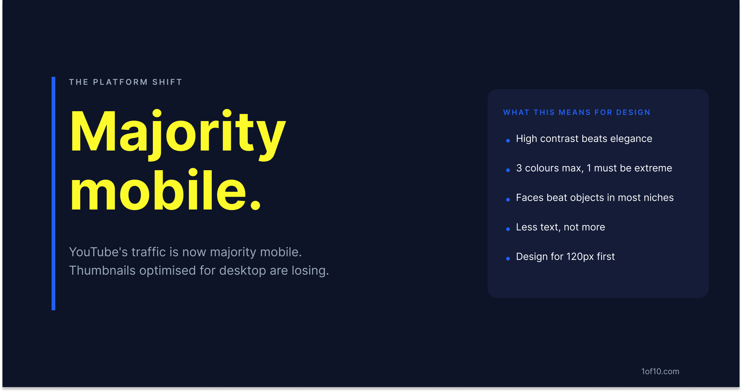
The clearest shift: thumbnail design is getting more aggressive at the expense of elegance. The clean, minimal aesthetic that peaked around 2023-2024 has been losing CTR to high-contrast, high-emotion thumbnails in most niches.
Two forces are driving this.
Feed density. More content competing for attention in the same scroll means subtle thumbnails lose. A thumbnail that might have stood out in 2022 by being calm and well-designed now disappears in a feed of 50 thumbnails all competing at maximum visual intensity.
Mobile-first behavior. YouTube's traffic is now majority mobile. Thumbnails optimized for desktop viewing -- with fine detail, muted tones, or elaborate compositions -- underperform at 120 pixels wide. The algorithm's CTR signal measures real clicks from real viewers, most of whom are on phones. Thumbnails that survive at 120px win the signal, which feeds more impressions, which compounds the advantage.
The result: channels optimizing for the desktop preview are falling behind channels optimizing for the phone feed. The benchmark CTR for YouTube thumbnails tells you exactly what a competitive click rate looks like in your category.
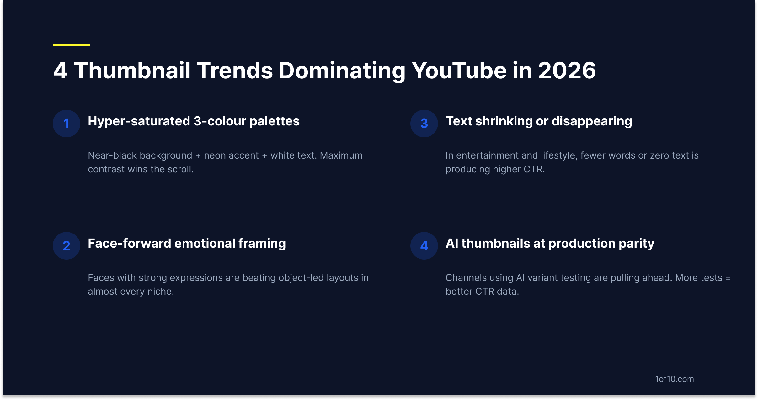
Trend 1: Hyper-saturated 3-colour palettes
The dominant color approach in 2026 outlier thumbnails is a 3-color palette with at least one neon or hyper-saturated color.
Common winning combinations:
- Near-black or deep navy background + neon yellow or electric blue accent + white text
- Bright orange subject on dark background with white text
- High-saturation red against white + black text overlay
The through-line is maximum contrast between each color. No muted tones, no 5-color gradients, no pastel palettes. Three colors, at least one extreme, and maximum separation between them. For niche-specific color data, the breakdown of best colors for YouTube thumbnails shows which palettes dominate in specific categories.
Why this works at phone scale: a 3-color high-contrast palette creates a strong visual signal in roughly the same time it takes the eye to register a face. In a feed of thumbnails, high-contrast palettes register faster than complex color environments. Register faster = more likely to get clicked.
This doesn't mean every thumbnail needs neon. It means the thumbnails that are winning are the ones where the color is doing heavy lifting on contrast and attention-grabbing, rather than aesthetic refinement.
Trend 2: Face-forward emotional framing replacing object-led layouts
In 2025, object-led thumbnails -- a product, a chart, a location shot, a piece of equipment -- were still competitive in several niches. In 2026 outlier data, face-forward thumbnails with exaggerated or emotionally clear expressions are dominant in almost every category, including niches where you'd expect the object to be the focus: finance, technology, DIY, home improvement.
The mechanism: human faces with strong emotional expressions trigger an automatic, pre-conscious click response. Viewers process faces faster than they process objects or text. In a feed where every video is competing for attention in under a second, a face with a clear emotion (shock, joy, intense concentration, disbelief) outperforms a well-composed product shot.
For creators in topic-led niches -- technology reviews, finance analysis, tutorial content -- this creates a practical question: do you show the thing, or do you show your face reacting to the thing? In 2026 data, the face reacting to the thing wins more often.
The outlier detection approach: find the videos in your niche that are outperforming their channel average. Look at the thumbnail composition split. If face-forward thumbnails are dominating the top performers in your category, that's your signal to test the format.
Trend 3: Text shrinking or disappearing entirely
Counter-intuitive but consistent in the 2026 data: the highest-CTR thumbnails are using less text than they were in 2023, and in some niches the top performers have eliminated text entirely.
This runs counter to the conventional wisdom that thumbnail text adds clarity and helps the algorithm understand the video topic. That may be true for SEO-adjacent signals, but it appears to be false for CTR at the viewer level. In entertainment, lifestyle, gaming, and reaction content categories, thumbnails with zero text are appearing at the top of the outlier distribution.
Why this is happening: when you add text to a thumbnail, you're making a bet that the text helps. But text also adds visual complexity. A face with a powerful expression on a clean background often generates a stronger click instinct than the same face plus a text overlay that describes what the face is reacting to. The text interrupts the emotional trigger. The psychology behind high-CTR thumbnails covers why faces and emotional signals drive clicks the way they do.
This trend does not apply uniformly. Educational content, tutorial content, and information-dense categories (finance, law, medical) still need text to give the viewer enough context to decide if the video answers their question. But if you're in a category where the emotional image alone carries the content signal, test removing text.
Trend 4: AI-generated thumbnails reaching production parity with human designers
The quality gap between AI-generated thumbnails and human-designed ones has effectively closed in 2026. This is visible in the data: channels using AI thumbnail generation tools are appearing in the top-CTR performers across multiple niches, not as outliers but as a consistent pattern.
What "parity" actually means here isn't just visual quality -- it's iteration speed. AI tools let you generate and test more variants per video. More variants per video means more data on what actually gets clicked in your specific niche. The channel testing 5 thumbnails per video will always generate better CTR data than the channel using the one thumbnail the creator liked best at design time.
The compounding effect: better data from more tests leads to better thumbnail decisions over time. Channels using AI generation for variant testing are pulling ahead of channels doing one-design-at-a-time not because any single AI thumbnail is better, but because they're running faster experiments. YouTube Studio's native A/B test makes those experiments straightforward -- no third-party tools needed.
How to apply this year's trends to your next thumbnail in 30 seconds
The most common mistake when consuming thumbnail trend research is trying to apply broad patterns directly to your channel. These trends are averages across categories. Your specific niche may be six months ahead or behind the overall pattern. The finance niche and the gaming niche are not running the same trend cycle.
The only data that matters for your thumbnails is what's getting clicked on videos your specific audience watches.
1of10 pulls outlier video data from your niche and generates thumbnails designed around what's actually working for channels competing in your category -- not general 2026 trends, not what worked for someone else's channel two years ago. The system identifies your niche's current top-performing thumbnail patterns and generates variants that match them.