
Best YouTube Thumbnails: 6 Rules That Earn the Click
What separates the best YouTube thumbnails from the rest? 6 proven rules that drive clicks, based on what actually works on the platform.
The best YouTube thumbnails don't win design awards. They win clicks.
A thumbnail's job isn't to look beautiful in a portfolio. It's to stop someone mid-scroll, communicate a reason to watch in under a second, and accurately represent the video behind it.
The difference between a 3% and a 7% click-through rate (CTR) on the same impressions is more than double the views. And that's before the algorithm boost: YouTube reads strong CTR as a signal to push the video to more impressions, compounding the gap further. That gap is almost entirely packaging.
These 6 rules separate high-CTR thumbnails from the rest. They're principles based on patterns that consistently drive clicks and retention across niches, channel sizes, and content formats.
TL;DR: Best YouTube Thumbnails
- The best YouTube thumbnails use exactly one focal point (a face, object, or text hook) so the viewer's eye knows where to land in under a second.
- Faces with exaggerated emotion consistently outperform neutral expressions and faceless designs, because the brain is hardwired to detect faces before any other visual element.
- High-contrast color pairings and bold outlines are a legibility requirement, not a style choice, since over 70% of YouTube watch time happens on mobile screens at 120-150 pixels.
- Thumbnail text should be capped at 3-5 words and add context the title doesn't cover, never repeat what the title already says.
- The thumbnail must honestly represent the video's content, because misleading thumbnails tank retention and damage the channel's recommendation standing over time.
- Want the fastest path from idea to a finished, high-performing thumbnail? Try 1of10's AI thumbnail generator free.
Rule 1: One Focal Point, Not Three
The viewer's eye needs exactly one place to land. A face, an object, or a text hook. Not all three competing at equal size and prominence.
When multiple elements fight for attention, the brain can't process any of them in the fraction of a second it takes to decide whether to click. Visual hierarchy is the design term for this, but the practical rule is simpler: if you squint at the thumbnail and can't immediately tell what the "one thing" is, remove or de-emphasize elements until you can.
A real-world example shows the gap clearly:
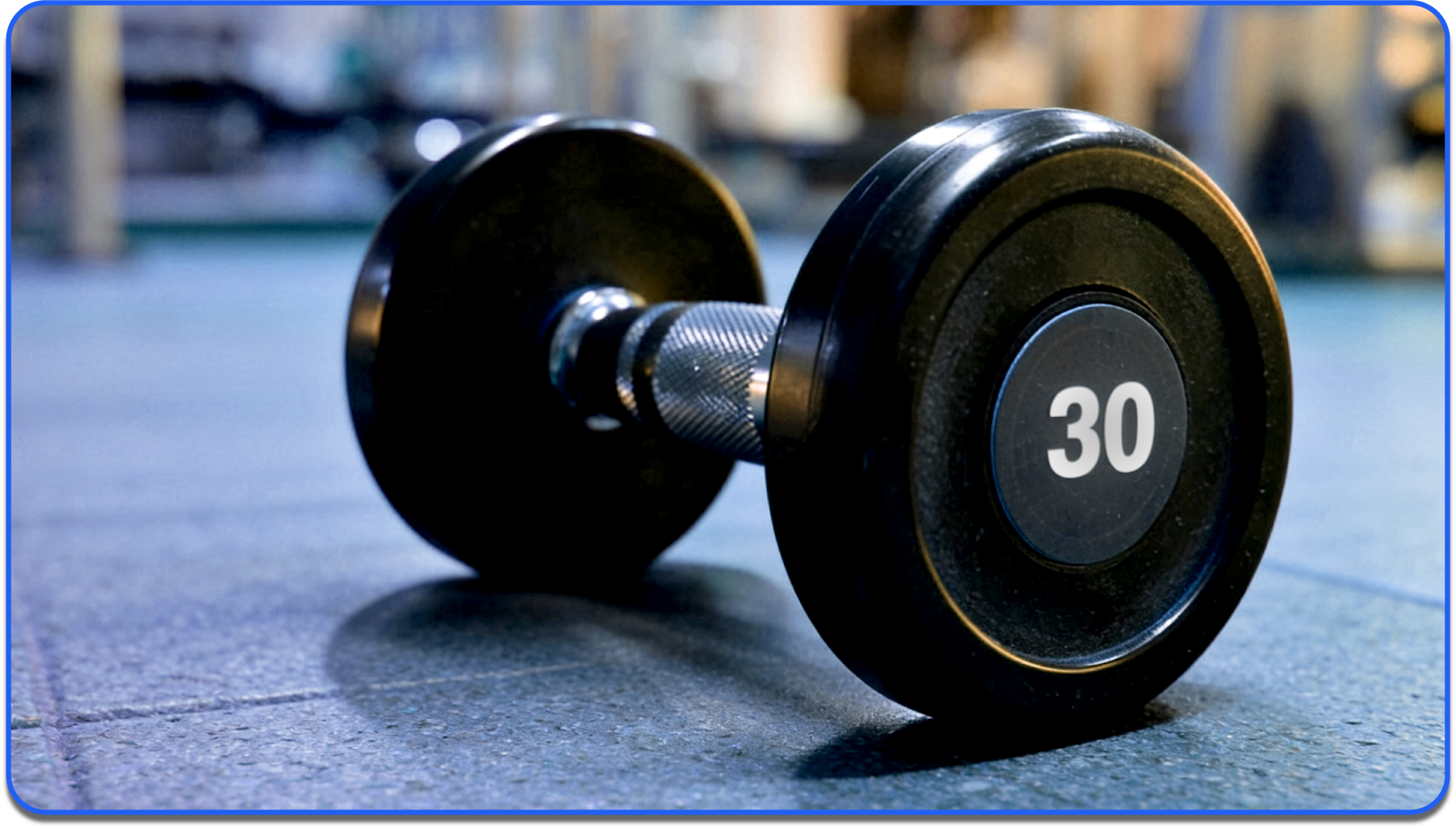
- Best-Performing Thumbnail From a Fitness Channel: A single close-up of a dumbbell with the number "30" in bold. No background clutter, no competing elements.
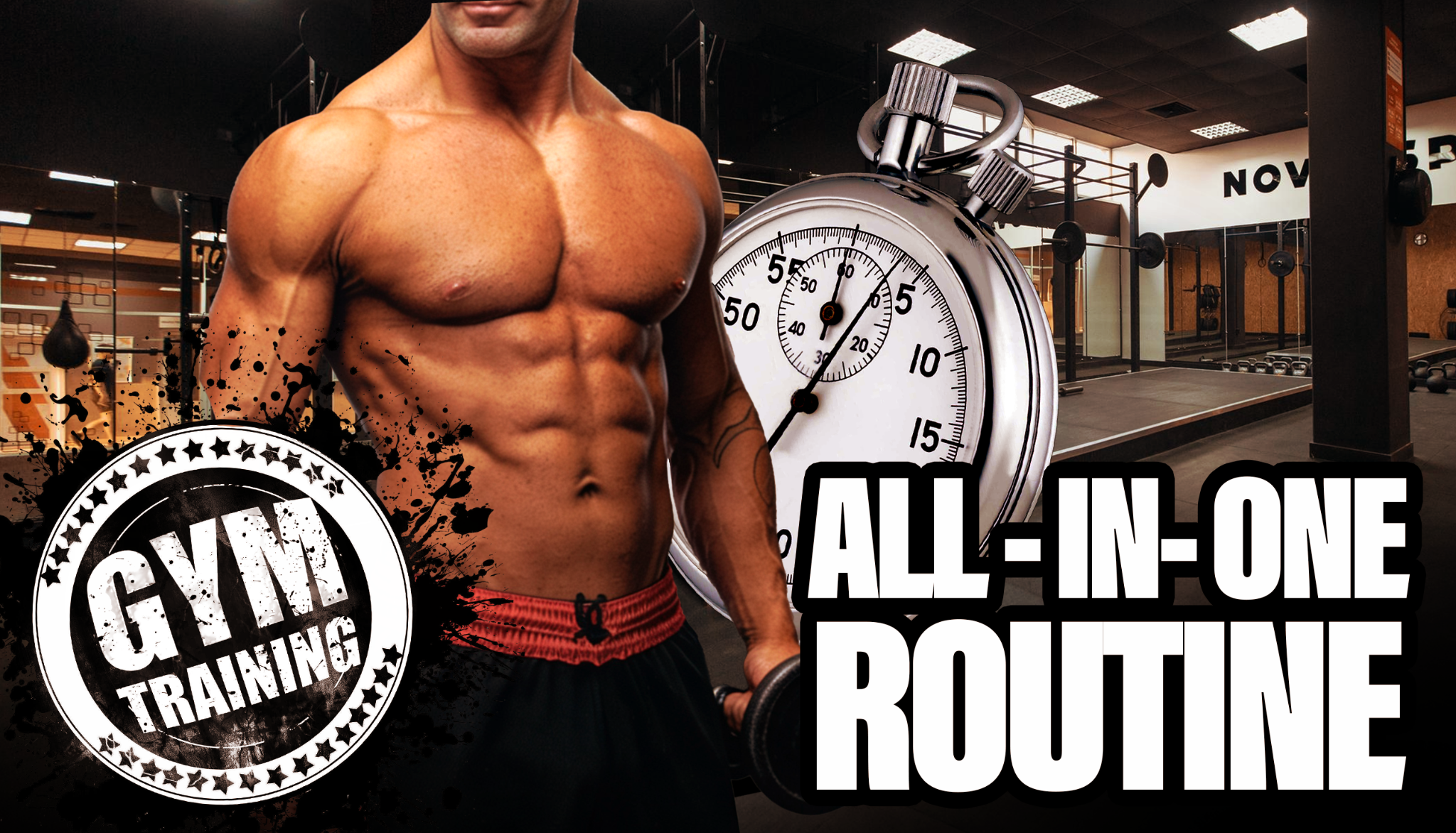
- Worst-Performing Thumbnail From the Same Channel: A person, a gym, text, a logo, and a timer all in one frame.
Same topic, five times the visual noise, half the CTR.
One subject. One message. One reason to click. Everything else is competing for attention you don't have time to give.
Rule 2: Faces and Emotions Outperform Everything
The human brain is hardwired to detect faces before any other visual element. This is called face detection bias: a cognitive shortcut where the brain prioritizes facial recognition, even in a crowded visual field.
Thumbnails with a human face, especially one showing an exaggerated emotion, consistently outperform thumbnails without faces.
The key word is "exaggerated." Neutral expressions don't register at thumbnail size. A slight smile disappears at 120 pixels. Shock, joy, confusion, and surprise all read clearly because the features are stretched far enough to communicate at small scale.
If the emotion feels over the top in a full-size photo, it's probably about right for a YouTube thumbnail.
Faceless channels are the exception, but the principle still applies. Objects, scenes, and visual hooks replace the face, and the same rule holds: one dominant visual element with an implied emotional charge.
Examples:
- A broken gadget
- A massive pile of something
- A dramatic before-and-after split
The emotional trigger shifts from "I see a person reacting" to "I need to know what happened here."
An education channel tested the same video with two thumbnails. One showed the host with wide eyes and an open mouth. The other showed a clean graphic with text only. The face version pulled 2.4x higher CTR. The content was identical.
Rule 3: Contrast That Survives the Shrink
YouTube thumbnails are designed at 1280 x 720 pixels but consumed at 120-150 pixels on mobile. Over 70% of YouTube watch time happens on phones. Anything that doesn't survive the shrink to mobile preview size is invisible.
This means high-contrast color pairings are a requirement, not a stylistic choice.
The rules:
- Light text on dark backgrounds
- Dark subjects on light backgrounds
- Bold outlines around the main subject to separate it from the background
- Zero reliance on subtle gradients, fine details, or low-contrast tones that merge together at small sizes
What works and what fails:
- Pairings That Survive: Yellow on black, white on deep blue, red on white.
- Pairings That Fail: Gray on slightly-darker-gray, pastel on pastel, dark red on dark brown.
For more on which specific color combinations drive the highest CTR, see the guide on the best colors for YouTube thumbnails.
The fastest quality check: shrink the thumbnail to roughly 120 pixels wide and squint at it. If you can still identify the subject, read the text, and understand the emotional tone, the contrast works. If the composition dissolves into a blur of similar tones, boost the contrast before publishing.
Rule 4: Text That Adds Context, Never Repeats the Title
The thumbnail and title are consumed as a pair on every YouTube surface. They sit directly next to each other in search results, on the homepage feed, and in the suggested videos sidebar. If the thumbnail text says the same thing as the title, one of them is wasted.
The best click-worthy thumbnails use text to add a dimension the title doesn't cover. If the title says "I tried the hardest recipe on YouTube," the thumbnail text shouldn't say "HARDEST RECIPE." It should say "8 HOURS" or "FAILED?" or show the finished result with no text at all.
The title carries the topic. The thumbnail text carries the emotional hook, the specific number, or the curiosity gap that makes the viewer need to know more.
A few rules to follow:
- Cap thumbnail text at 3-5 words. Anything longer becomes unreadable at mobile size
- Use a bold, sans-serif font with high contrast against the background
- Place it where it doesn't cover the subject's face or the focal point
A tech channel's title reads "Is the new tablet worth it?" The best-performing thumbnail shows the tablet with "$1,200" in large text. The price creates a second curiosity layer the title alone doesn't provide. The viewer now has two reasons to click: is it worth it, AND is it worth that much?

Rule 5: The Thumbnail Must Deliver on Its Promise
CTR is only half the equation. A thumbnail that earns a click but doesn't match the video content tanks viewer retention. YouTube's algorithm reads low retention as a signal to stop recommending the video.
Over time, misleading thumbnails damage the channel's entire recommendation standing.
The best YouTube thumbnails are the most compelling version of the truth. Not a fabrication. Not an exaggeration the video can't support. The most click-worthy honest frame of what the video actually delivers.
This is the rule that separates sustainable growth from short-term spikes. A misleading thumbnail might pull strong CTR on day one, but retention drops, recommendations dry up, and the video underperforms within a week. A thumbnail that earns the click AND keeps the viewer builds compounding algorithmic momentum.
Ask one question before publishing: if someone clicks this thumbnail and watches the first 30 seconds, will they feel like they got what the thumbnail promised? If the answer is yes, publish it. If not, the thumbnail is overselling, and the video will pay for it in retention.
Rule 6: Study What Actually Worked, Not What Looks Good
Rules 1 through 5 are the foundation. They'll get you from bad thumbnails to good thumbnails. But the gap between "good" and "best" requires a different kind of input: data about what actually drove clicks on YouTube, not what looks good in theory.
Most YouTube thumbnail tips are based on aesthetic intuition. "Use bright colors." "Add a face." "Make the text bold." These principles are valid, but they're generic. They don't tell you which bright colors, which facial expressions, or which text placements drove clicks on videos in your niche.
The best thumbnails are modeled on outlier videos: videos that outperformed their channel's average by 10x or more. Outlier thumbnails share visual patterns that generic YouTube thumbnail design advice doesn't capture, because the patterns are niche-specific, format-specific, and audience-specific.
Compare the difference:
- Generic Advice: "Use a shocked face and bold text."
- Outlier-Data Insight: "A curiosity expression (not generic shock) in the left third, paired with the specific tool or object the video addresses in the right third, plus 2-3 words combining a number and a friction term like '3 hours wasted,' on a saturated yellow or red background."
Working with outlier data isn't about copying the highest-CTR thumbnail you can find. Most outliers won because of a combination of factors, and the thumbnail was only one of them.
Before letting any outlier influence your design, run it through three filters:
Did the Thumbnail Actually Drive the Result?
Strong videos can carry weak thumbnails. To separate luck from craft, look for patterns that repeat across multiple outliers in different niches and formats.
If the same composition, expression, or text treatment shows up over and over on unrelated channels, the thumbnail is doing real work. If a treatment only appears once, the video probably succeeded for a different reason and the thumbnail is the wrong thing to copy.
Does the Packaging Hit One of the Three Pillars of Attention?
Outlier thumbnails, paired with their titles, almost always trigger one of three reactions:
- Fear: A negative emotion, usually around loss, mistakes, or things going wrong
- Intrigue: An open curiosity loop the viewer needs to close to feel resolved
- Desire: A depiction of the outcome the audience is already chasing
If a thumbnail doesn't hit one of these, it's not stopping the scroll for a reason that will hold up at scale.
What's the Specific Pattern Break?
Outliers stop the scroll because they break a pattern in their feed.
Common breaks include unusual color (saturated yellow against muted blues), unconventional composition (text where text doesn't usually go in the niche), an element no one else is using, or a social-proof signal that subverts expectations.
If you can't articulate the pattern break in one sentence, the thumbnail probably isn't the reason for the outlier performance, and copying it won't make yours an outlier either.
Once a thumbnail passes all three filters, it earns the right to influence your design.
Even then, the goal is adaptation, not replication: same composition with different elements, same elements with different composition, or both, depending on how far the inspiration sits from your niche. Direct copies stop being pattern breaks the moment too many people use them.
This is the difference between designing from intuition and designing from evidence.
1of10's AI thumbnail generator is trained on YouTube outlier data from 62 billion views. It produces finished, production-ready thumbnails based on the visual patterns behind videos that actually outperformed, not generic image models or stock-photo aesthetics.
The outlier finder lets you see which videos in any niche are overperforming right now, so you can reverse-engineer their packaging before you design your own.
Rules 1-5 give you the principles. Rule 6 is how you go from good to outlier.
Try 1of10's AI thumbnail generator free. No credit card, 60 credits included.
How to Create a Good Thumbnail (Quick-Start Summary)
Knowing what makes a good YouTube thumbnail is the first half. Making one is the second.
The short version:
- Plan the click hook before opening any tool
- Set up a 1280 x 720 canvas
- Choose a strong base image (staged photo, not a random video frame)
- Add 3-5 words of text that complement the title
- Design for contrast at mobile preview size
- Generate or export and upload to YouTube Studio
Start Making Thumbnails That Earn Clicks and Keep Viewers
The best YouTube thumbnails combine click-earning packaging with honest representation of the video. Rules 1 through 5 are the foundation every creator needs. Rule 6 is the edge that separates good thumbnails from outlier ones.
If you want finished thumbnails built on what actually performs on YouTube, try 1of10's AI thumbnail generator free. 60 credits, no credit card, and thumbnails trained on outlier data from 62 billion views.
FAQs About YouTube Thumbnail Best Practices
What Makes a Good YouTube Thumbnail?
One clear focal point, an expressive face or visual hook, high-contrast colors that read at mobile size, short text that adds context beyond the title, and accurate representation of the video content. The best thumbnails earn the click and keep the viewer.
How Do I Make My YouTube Thumbnails Get More Clicks?
Apply the squint test: shrink to mobile preview size and check if the composition still reads. Use one focal point, exaggerated emotions, and text that creates a curiosity gap the title doesn't. A/B test thumbnail variations using YouTube's built-in Test & Compare feature and keep the winner.
What Are the Best YouTube Thumbnail Tips?
Use a single focal point, not multiple competing elements. Pair exaggerated facial expressions with high-contrast colors. Keep text to 3-5 words and never repeat the title. Make sure the thumbnail accurately represents what the video delivers. Test variations and track CTR over time.
Do Thumbnails Really Affect Views?
Yes. Thumbnails are the primary driver of click-through rate, which determines how many impressions convert into views. The difference between a 3% and a 7% CTR on the same number of impressions is more than double the views. Thumbnails are the single highest-leverage element a creator controls.
Should I Use Text on My YouTube Thumbnail?
Usually, yes, but keep it short. 3-5 words maximum. The text should add context, emotion, or a specific detail that the image alone doesn't communicate. Never repeat the video title. If the image tells the full story on its own, skip text entirely.
Can AI Make Good YouTube Thumbnails?
Yes. AI thumbnail generators like 1of10 produce finished, production-ready thumbnails trained on YouTube outlier data. The best AI tools generate thumbnails based on what actually drove clicks and retention on the platform, not generic image generation from stock-photo datasets.