
Thumbnail Tester: Preview and Rate Thumbnails Before Upload
Free thumbnail tester: preview your thumbnail in the real YouTube home feed, sidebar, and mobile before upload. Plus a 5-point rating rubric that predicts CTR.
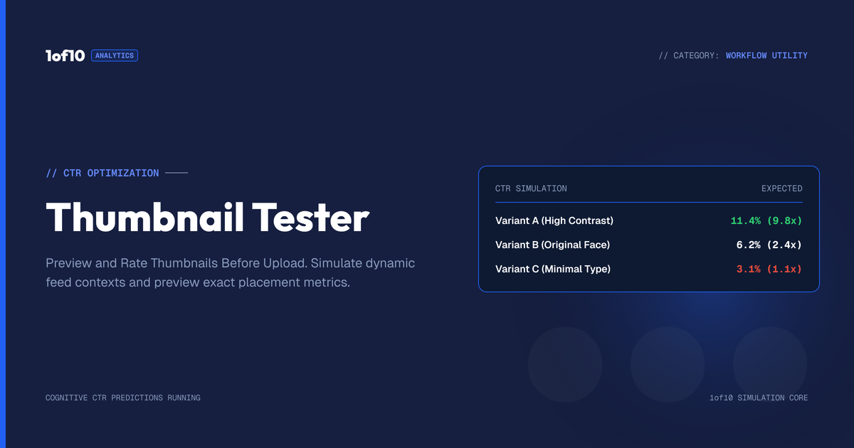
Thumbnail Tester: Preview and Rate Thumbnails Before Upload
A thumbnail tester shows your thumbnail inside a realistic YouTube layout before you publish, so you judge it the way viewers will actually see it: 300 pixels wide in a crowded home feed, 168 pixels in the suggested sidebar, surrounded by competitors. 1of10's free thumbnail preview tool does exactly this in your browser, no signup needed.
Most creators rate their thumbnails at full size on a design canvas. Viewers never see that version. They see a small rectangle for a fraction of a second, and YouTube reports that half of all channels earn a click-through rate between 2% and 10% on that glance, per YouTube's own CTR documentation. Testing before upload is how you land at the top of that range instead of the bottom.
This guide covers why pre-upload testing matters, how to preview in real contexts, a 5-point rating rubric you can run in 2 minutes, when to move to live A/B testing, and the failure patterns a tester catches most often.
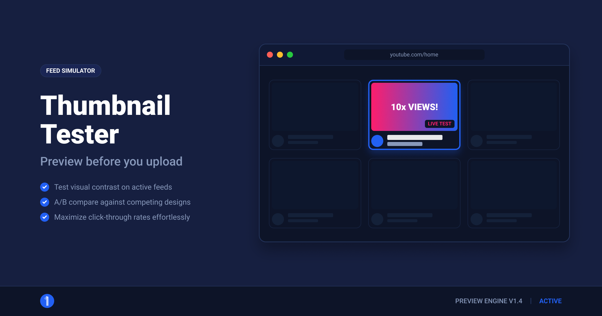
Why Test a Thumbnail Before Upload?
Because the thumbnail decides whether the video gets a chance at all. YouTube's system offers your video as an impression; the thumbnail and title convert that impression into a view. Everything downstream, watch time, session starts, recommendations, sits behind that first click.
The economics are blunt:
- CTR compounds. At 1,000,000 impressions, the difference between a 3% and a 5% CTR is 20,000 extra views before the algorithm reacts at all. Strong early CTR also earns more impressions, so the gap widens.
- The first hours weigh most. YouTube pushes new uploads to a test audience quickly. A thumbnail that underperforms in that window digs a hole the video may never climb out of. Our guide on what counts as a good click-through rate breaks down the benchmarks by surface and channel size.
- Post-upload fixes are slower. You can swap thumbnails after publishing, and sometimes should. But a pre-upload test costs 2 minutes; recovering a botched launch costs days.
A thumbnail tester does not guarantee a winner. It reliably catches losers, and removing losers before they cost you impressions is most of the game.
How Do You Preview a Thumbnail in Real YouTube Contexts?
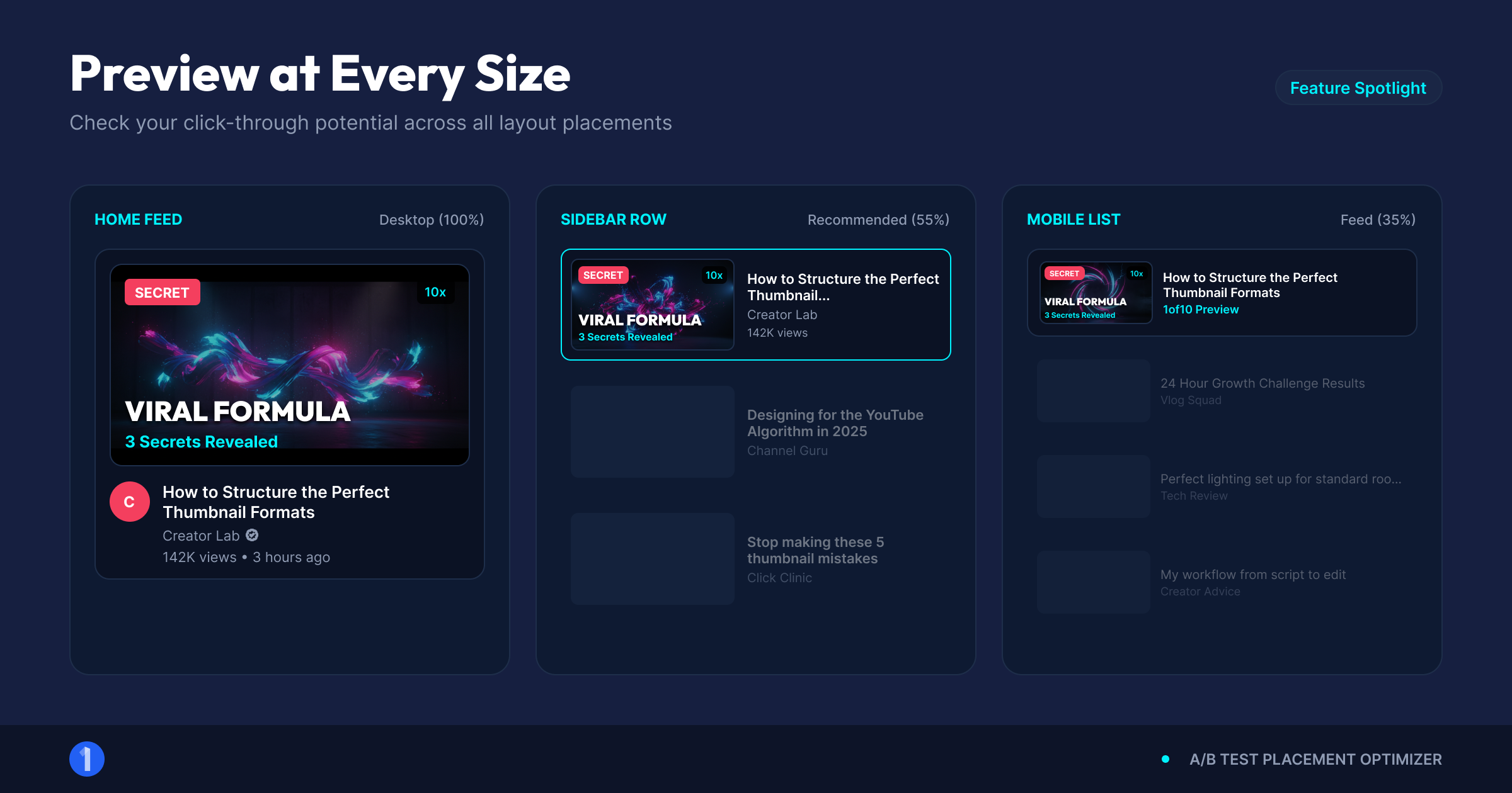
Upload your image to a preview tool and view it at the exact sizes and placements YouTube uses. The 1of10 thumbnail preview tool renders your thumbnail in the three contexts that matter, alongside real videos, so you see it competing rather than posing alone.
Walk through all three:
- Home feed, desktop. Your thumbnail renders around 300 to 360 pixels wide in a grid of rivals. This is the beauty-contest view: does your image pull the eye when nothing about it is special by default?
- Suggested sidebar. Roughly 168 pixels wide next to a playing video. This is where fine text and small faces die first. Most binge sessions run through this column, so failing here is expensive.
- Mobile feed. Near full-width of a phone screen but viewed at arm's length, thumb moving. Over 70% of YouTube watch time happens on mobile devices, per YouTube's official press stats, so this is the majority context, not an edge case.
Judge each context for 2 seconds, then look away. That mimics real scroll behavior better than staring.
Two practical tips. First, test against the actual competition: open your niche's home feed results next to the preview and compare honestly. Second, test your title with the thumbnail, because the pair is one unit. A thumbnail that repeats the title wastes its space; a pair that splits the job (emotion in the image, specifics in the text) wins more clicks.
What Should a Thumbnail Tester Actually Check?
A good thumbnail tester answers one question: does this image survive contact with a real feed? That breaks into three checks, and the tool half of testing covers the first, while the rubric below covers the rest.
- Size truth. The image must be judged at 120 to 360 pixels wide, not at the 1280x720 canvas size you designed at.
- Context truth. It must be seen against real neighboring thumbnails, because contrast is relative. A red thumbnail in a feed full of red thumbnails is camouflage.
- Speed truth. It must communicate in under 2 seconds, because that is the attention you get.
Any thumbnail tester, rater, or preview tool that shows your image alone, large, and untimed is flattering you, not testing you.
Tester, rater, or preview tool: what is the difference?
The names blur together, but three distinct jobs hide behind them:
- A preview tool renders your image at real YouTube sizes and placements. It answers "what will viewers actually see?" This is the non-negotiable step, and it is what the free 1of10 tool does.
- A thumbnail rater scores the image against design criteria: element count, contrast, text legibility, face prominence. Some tools automate a score; the 5-point rubric below does the same job manually and more honestly, because you rate it in context.
- A thumbnail tester, used precisely, measures audience response. Before upload, that means glance tests with real humans. After upload, it means YouTube's Test & Compare with real impressions.
You need all three jobs done. Preview for truth in rendering, rating for design discipline, testing for audience verdicts. One tool name rarely covers all of it, which is why the workflow below chains them in order.
One more rendering check while you are in the preview: flip between light and dark mode. YouTube's dark theme is the default for a huge share of viewers, and a thumbnail with dark edges that looked crisp on white can melt into a dark UI. Strong subject-background separation survives both.
The 5-Point Thumbnail Rating Rubric
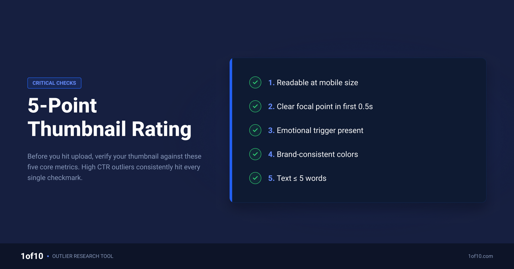
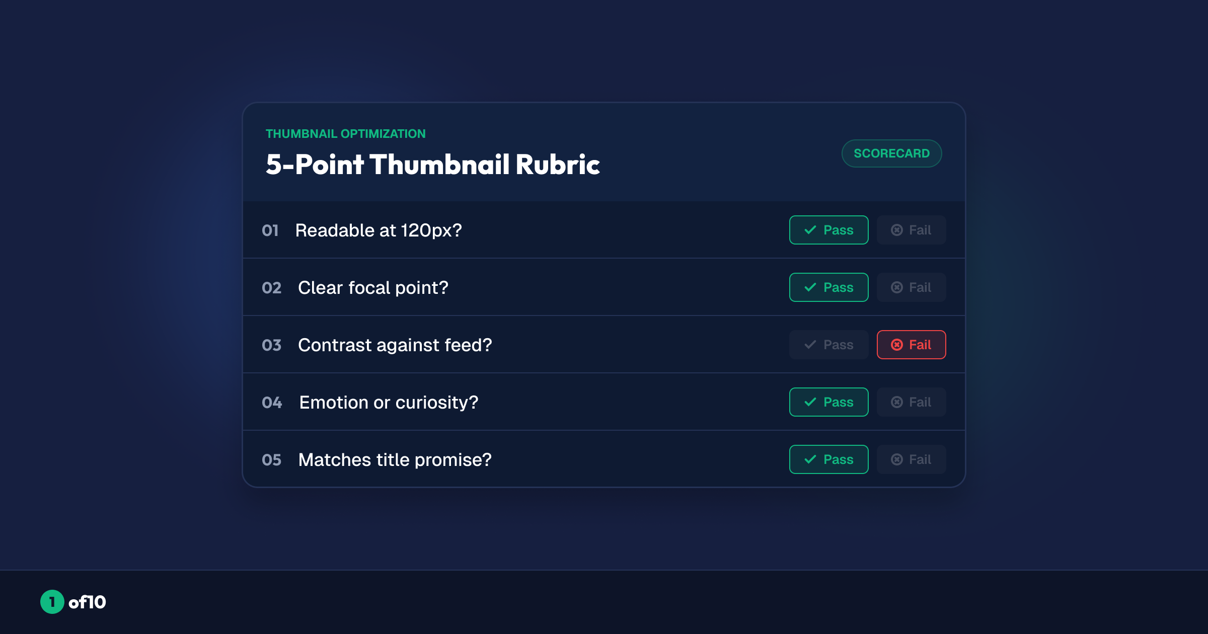
Preview tools show you the thumbnail; a rubric tells you what to look for. Run these 5 checks on the preview. Score each pass or fail. Anything under 4 out of 5 goes back to the editor.
1. The 3-element rule
Count the distinct things in your frame: a face, a prop, a text block, a background subject. Three or fewer is the target. Every added element shrinks the others and splits attention. The thumbnails that dominate our outlier database are brutally simple: one emotion, one object, one promise. If you cannot say what the single focal point is, viewers cannot find one either.
2. Contrast that survives shrinking
Squint at the sidebar-size preview. Do the subject and background still separate? High contrast between subject and background, and between the thumbnail and YouTube's white or dark UI, is what makes an image pop at 168 pixels. Muddy midtones merge into gray mush at small sizes. Our breakdown of the best colors for YouTube thumbnails covers which combinations hold up.
3. Face size and readable emotion
If the thumbnail uses a face, the face needs to be big enough that the expression reads at feed size. A rough rule: the head should fill at least a quarter of the frame height, and the emotion should be identifiable at the mobile preview in one glance. A tiny full-body figure communicates nothing. Exaggerated, genuine expressions outperform neutral ones because emotion is the fastest signal the brain processes, a pattern we unpack in the psychology behind high-CTR thumbnails.
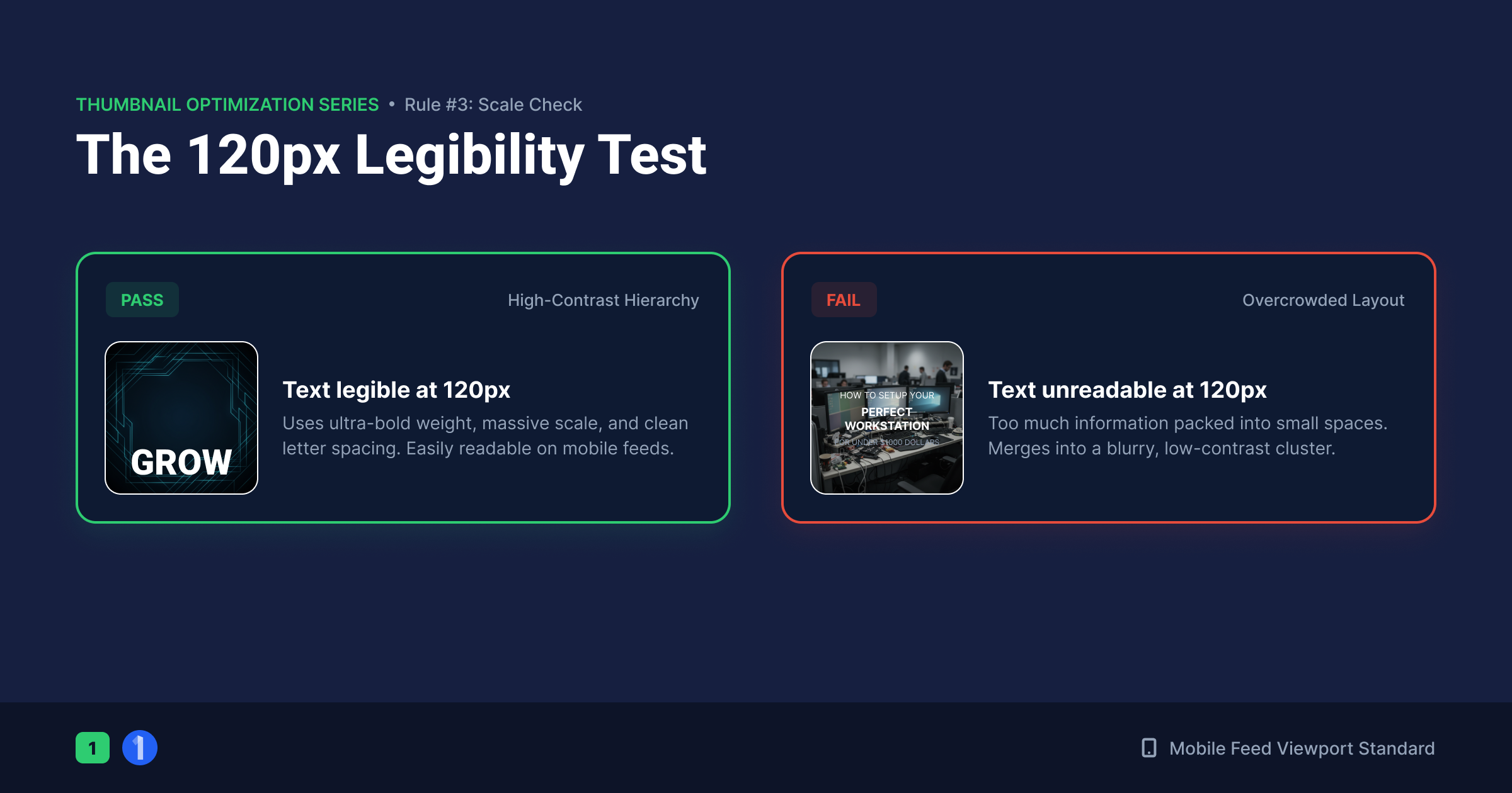
4. Text legible at 120 pixels
View the smallest preview. Can you read every word without leaning in? If not, the text is decoration, not communication. Practical limits: 3 to 5 words maximum, thick bold sans-serif, strong outline or backing shape, and never overlapping the bottom-right corner where the duration badge sits.
5. The glance test
Show the preview to someone for 2 seconds, hide it, and ask two questions: what was it about, and would you click? If they cannot answer the first, the thumbnail fails on clarity. If they answer the first but shrug at the second, it fails on curiosity. You need both: instant comprehension plus an open loop the video promises to close.
Rate 2 to 3 candidates, not 1
A rubric works best comparatively. Make 2 or 3 genuinely different candidates (different concept, not different font), score all of them, and upload the top scorer. Generating real alternatives is the bottleneck for most creators, which is where 1of10's Thumbnail Generator earns its place: it produces 2 to 12 distinct variations from a title, sketch, or reference image, so you always have candidates to test rather than one image you are emotionally attached to.
What About A/B Testing After Upload?
Pre-upload testing filters candidates; post-upload testing picks the champion with real audience data. YouTube's built-in Test & Compare feature, available in YouTube Studio, lets you run up to 3 thumbnails against each other on a live video. YouTube splits impressions between them and reports a winner based on watch time share, not raw CTR, which protects you from clickbait that wins clicks but loses viewers.
Use both stages, in order:
- Before upload: preview and rubric-score candidates, kill the weak ones.
- At upload: load your best 2 or 3 survivors into Test & Compare.
- After the test: let it run long enough to collect meaningful impressions, then apply the winner.
Test & Compare has real limitations (minimum data requirements, watch-time-based verdicts that can read "no clear winner", and no title testing bundled with it), and getting clean results out of it takes some setup. We keep this section short because our full guide on how to A/B test YouTube thumbnails covers the entire workflow: setup, duration, reading ambiguous results, and when to override the verdict.
The one-line summary: the pre-upload thumbnail tester decides what enters the tournament, Test & Compare decides who wins it.
How Do Outlier Thumbnails Tell You What to Test?
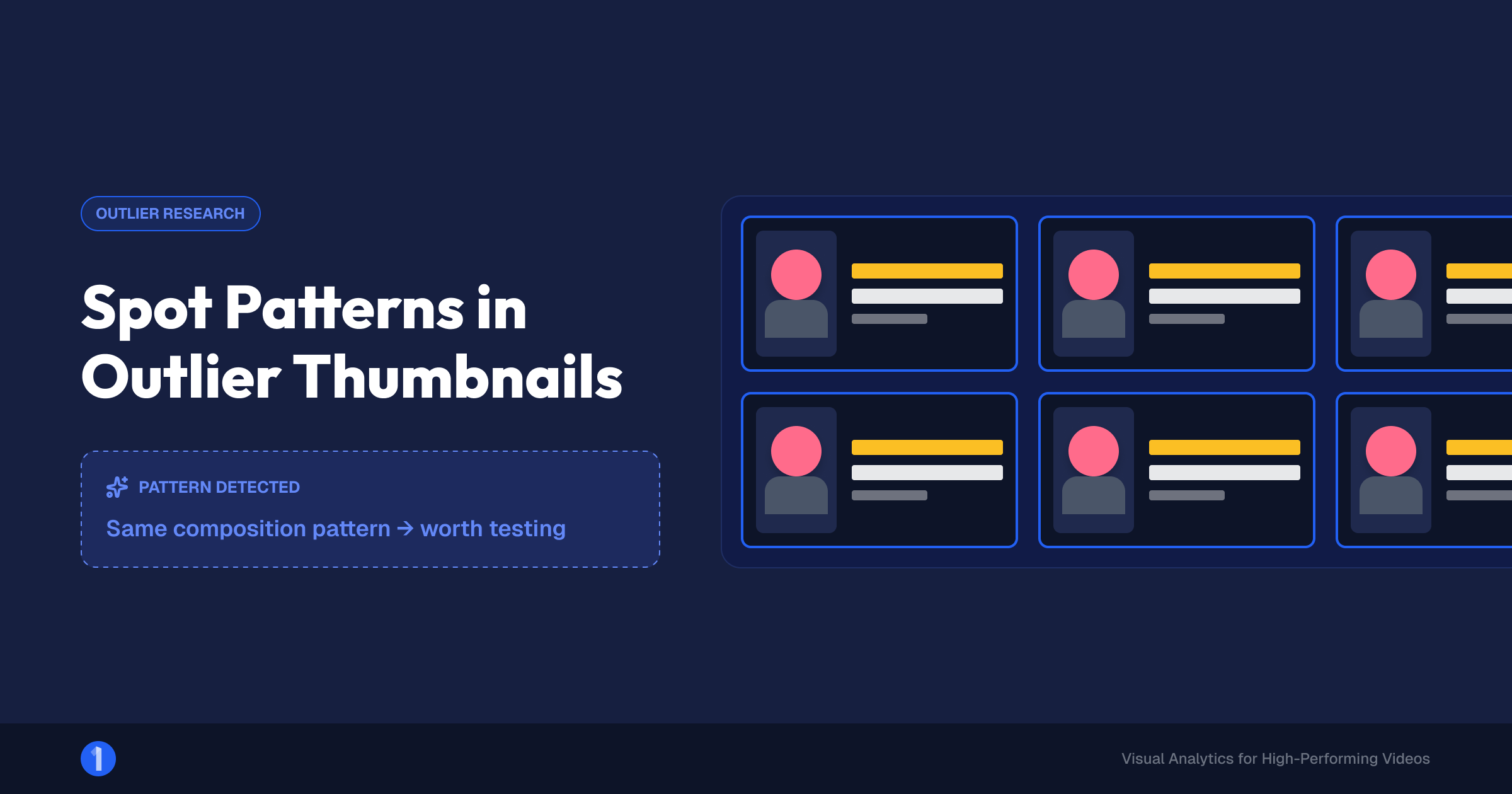
Testing without a hypothesis is guessing with extra steps. The strongest hypotheses come from thumbnails that already overperformed in your niche, and that is what outlier analysis surfaces.
An outlier is a video performing far above its channel's normal baseline, 10x to 100x the channel average. When a video outperforms its own channel that hard, packaging is usually a big reason. Those thumbnails are your test inspiration, and 1of10 gives you three ways in:
- Thumbnail Search finds videos by what is visually inside the thumbnail. Search the visual concept you are considering (a shocked face next to a red arrow, a split-screen comparison) and see how it performed across the platform before you bet an upload on it.
- Similar Thumbnails takes a winning thumbnail and shows you others with matching style, composition, and elements, each with performance context. Patterns that repeat across multiple outliers are formats, not flukes.
- The Outlier Finder scans millions of channels for the overperformers in the first place, so your swipe file starts with proven winners instead of big-channel noise.
The workflow: pull 5 to 10 outlier thumbnails in your niche, identify the shared pattern (face size, color scheme, text style, composition), build your candidates around that pattern, then run them through the preview tool and rubric. Now your thumbnail test compares informed bets instead of random guesses.
6 Common Failure Patterns a Thumbnail Test Catches
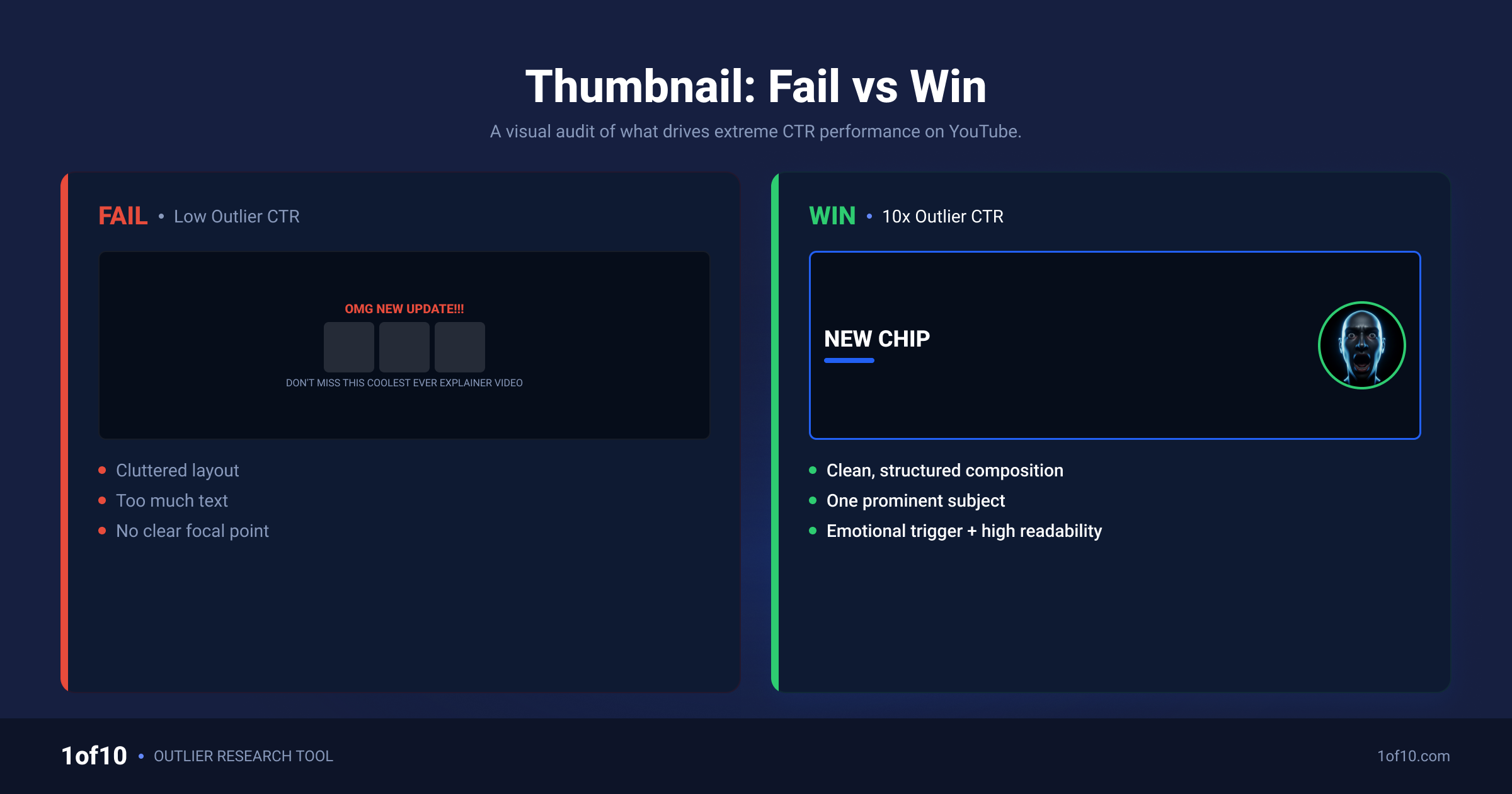
Run enough previews and the same failures appear on repeat. Check your candidates against this list before scoring:
- The shrink casualty. Gorgeous at 1280 pixels, illegible at 168. Fine detail, thin fonts, and busy backgrounds are the usual causes. This is the single most common failure, and the entire reason preview tools exist.
- Title echo. The thumbnail text repeats the title word for word. The pair occupies twice the space to deliver one message. Split the job: image carries emotion, text carries the hook the title does not say.
- The clone. The thumbnail matches your niche's dominant style so closely it disappears into the feed. Preview against real competitors; if you have to hunt for your own thumbnail, viewers will not bother.
- Corner blindness. Key text or a logo parked in the bottom-right corner, exactly where YouTube overlays the duration badge. Keep that zone clear.
- Emotional flatline. A technically clean frame with a neutral face and no tension. Clarity without curiosity earns comprehension and no click.
- The lie. A thumbnail that promises what the video does not deliver. It may win the click and then lose the viewer in 20 seconds, and Test & Compare's watch-time verdict will punish it. If your thumbnails click but views collapse, start with our guide on why your YouTube thumbnails are not working.
Test Before You Upload, Every Time
The routine takes 5 minutes once it is habit. Make 2 or 3 real candidates. Drop each into the free thumbnail preview tool and view it at feed, sidebar, and mobile sizes. Score the 5-point rubric. Upload the winner, and when the stakes justify it, let Test & Compare settle the final call with live data.
Creators who test before upload are not luckier. They just stop publishing their misses.
FAQ
How do I test my YouTube thumbnail before posting?
Upload the image to a free thumbnail tester like 1of10's preview tool, then view it at real YouTube sizes: the home feed, the suggested sidebar, and mobile. Check that the focal point, faces, and text stay clear at every size, compare it against real competing thumbnails in your niche, and run a 2-second glance test with someone who has not seen it.
Does YouTube have a built-in thumbnail tester?
Yes, but only after upload. YouTube Studio's Test & Compare feature runs up to 3 thumbnails on a live video, splits impressions between them, and picks a winner based on watch time share. It cannot preview a thumbnail before publishing, so creators pair it with a pre-upload preview tool: preview to filter candidates, Test & Compare to crown the winner.
What is a good CTR for a YouTube thumbnail?
YouTube reports that half of all channels see a click-through rate between 2% and 10%. Where you should sit in that range depends on impressions volume and surface: browse features usually run lower than search, and small audiences swing harder. Track your own baseline per video type and treat beating your baseline, not a universal number, as the win condition.
How many elements should a thumbnail have?
Three or fewer distinct elements is the working rule: for example, one face, one object, one short text block. Every extra element shrinks the rest and splits attention during the fraction of a second viewers give a feed. If you cannot name the single focal point of your thumbnail instantly, cut elements until you can.
Can I change my thumbnail after uploading without losing views?
Yes. Swapping a thumbnail never deletes views or watch time, and refreshing a weak thumbnail can revive impressions on an underperforming video. YouTube re-evaluates the new packaging as it serves fresh impressions. For a controlled swap, use Test & Compare so real audience data, rather than a hunch, decides whether the new version stays.
Related: YouTube Thumbnail Downloader: Get Any Thumbnail in HD