
YouTube Thumbnail Size Guide (2025)
Best Dimensions for Clicks, Visibility, and Growth
Want more views on YouTube? Start with your thumbnail. It’s the first thing viewers see. And if it’s the wrong size or looks janky, they’re scrolling right past it.
Let’s fix that.
Here’s everything you need to know about the perfect YouTube thumbnail size, plus how to design thumbnails that actually drive clicks.
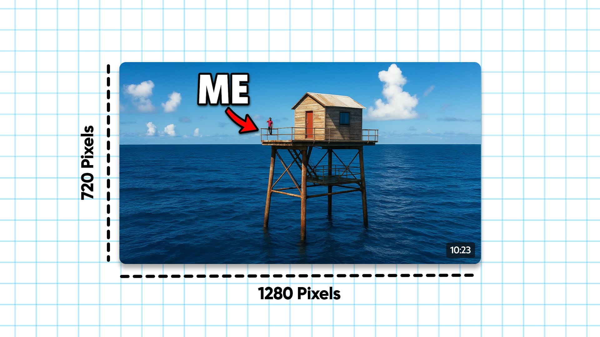
Quick Answer: The Best YouTube Thumbnail Size
Use this. Every time.
- Size: 1280 x 720 pixels
- Aspect Ratio: 16:9
- Minimum Width: 640 pixels
- File Types: JPG, PNG, GIF, BMP
- Max File Size: 2MB
- Safe Zone for Text: Center 1235 x 338 pixels
These are YouTube’s official specs. Stick to them and your thumbnail will look clean on every screen, phone, tablet, laptop, smart fridge, whatever.
Why Thumbnail Size Actually Matters
A wrong-sized thumbnail won’t just look off. It can tank your click-through rate.
- Too small? It gets pixelated.
- Wrong ratio? Cropped weird.
- Text too close to the edge? Cut off.
Viewers won’t stick around to figure it out. YouTube won’t recommend it either.
Get the size right and you instantly look more pro, which means more clicks, more views, and a better shot at growth.
What Happens When You Use the Right Size
It’s not just about fitting the frame.
Perfectly sized thumbnails:
- Show up clearly in search results and suggestions
- Load faster (especially on mobile)
- Look good next to other big creators
- Get more engagement from new viewers
It’s a low-effort, high-upside move. And once you set your template right, it becomes automatic.
Inside the Dimensions: What You Need to Know
Here’s the breakdown of what matters inside the 1280 x 720 size:
- Safe Zone for Text: The central 1235 x 338 area is where your most important stuff should go. That’s what shows up no matter the screen or preview layout.
- High Resolution Matters: Don’t upscale a tiny screenshot. Start big. Design at full res.
- Keep File Size Small: Stay under 2MB. Big images take longer to load. On slow devices, your thumbnail might not even show.
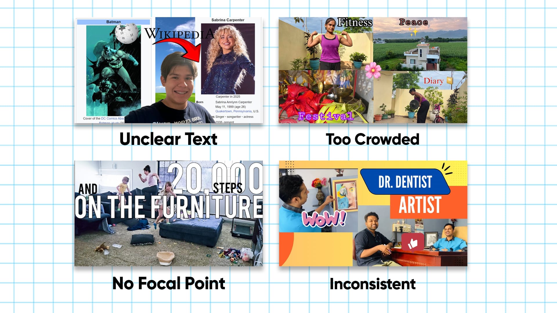
Common Mistakes That Kill Your Thumbnails
Let’s save you the pain.
1. Overcrowding
Trying to cram in too much text, too many faces, or every element of your video? Looks messy. Viewers won’t know where to look.
2. Tiny or unreadable text
If they can’t read it at a glance, it’s wasted space. Your font should be legible even on the smallest screen.
3. No focal point
Your thumbnail needs one thing that instantly grabs attention. Could be a face, an object, a reaction, but it can’t be 12 things.
4. Inconsistent style
Random fonts and colors every video? No visual identity = no brand recognition.
Thumbnail Design Best Practices
Use these and you’ll be ahead of 90% of YouTubers. You can go through all of our other blogs of which go into more detail for specific aspects of creating a banger of a thumbnail, but here are the basics.
- High contrast colors: Think light text on dark background or vice versa.
- Bold, readable fonts: Big, clear, and short. No full sentences.
- Faces with emotion: Shock, surprise, happiness. Viewers click on faces.
- Visual curiosity: Show the outcome, not just the setup. Make people want to find out what’s going on.
If you’re not sure where to start, look at MrBeast, Airrack, or Ryan Trahan. Reverse-engineer what they do. Then do it faster with AI.
What Tools Should You Use?
You don’t need Photoshop. You don’t need to be a designer. You just need something that helps you move fast.
Our pick: 1of10’s Thumbnail Editor
It’s built for YouTubers. Drop in your video idea or title, and it gives you a pro-level thumbnail, sized perfectly, in seconds. Or use the editor to tweak it yourself, take away things, add in things, the world is your oyster.
Other tools that can help:
- Canva: Great templates, drag-and-drop, easy to use. The downside is that 60% of creators say they spend more time going through templates than actually creating the thumbnail.
- Figma: Better for teams or precise control
- Photoshop: Only if you know what you’re doing (and like pain)
A/B Testing: Don’t Guess, Know
YouTube lets you test thumbnails now. Use that.
Upload two options. YouTube splits the traffic. The one with higher CTR wins.
Run experiments with:
- Face vs no face
- Text vs no text
- Bright color vs muted tone
- Zoomed crop vs wide shot
Keep track of what works, then double down on it.
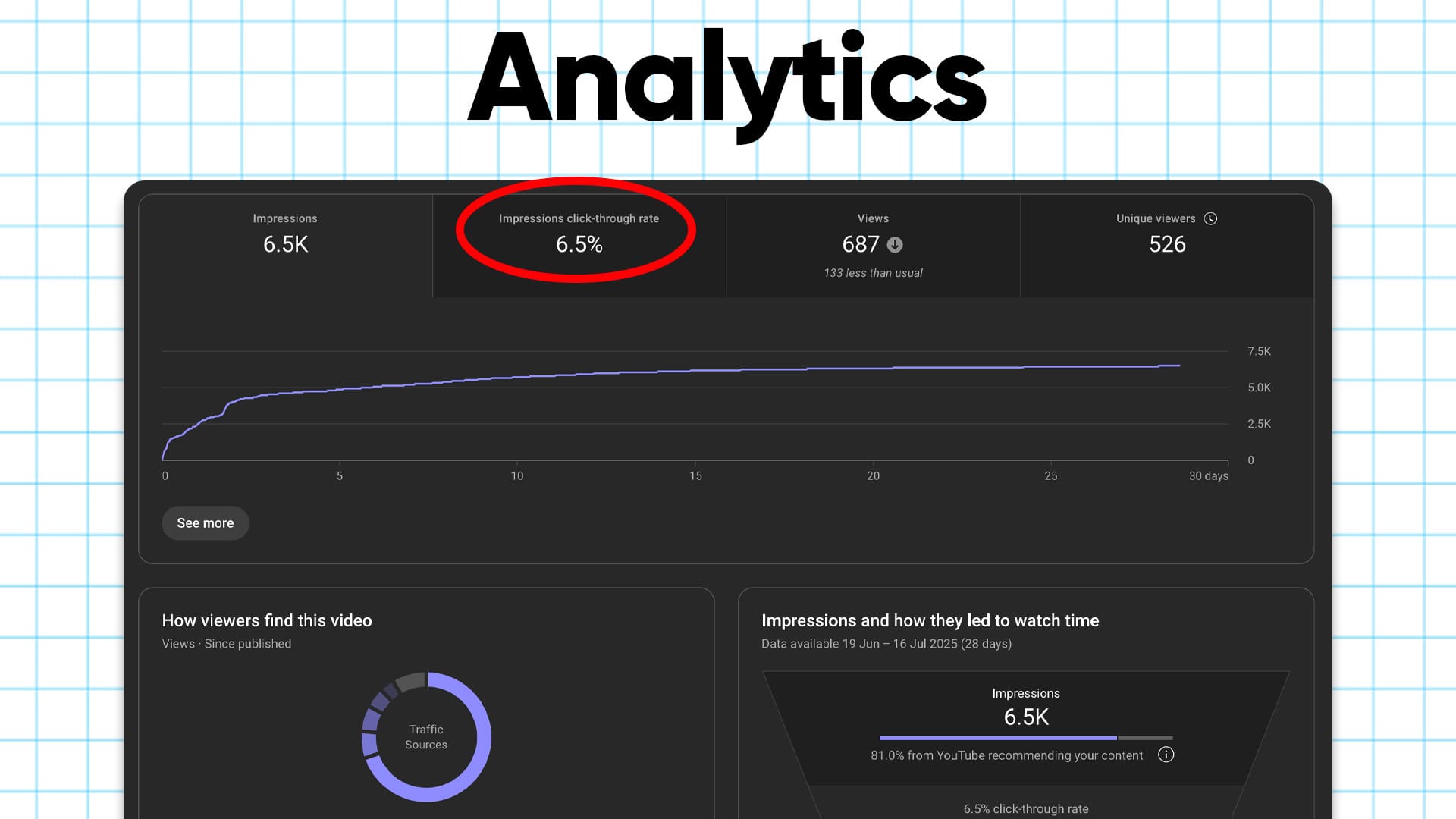
Use YouTube Analytics to Track Performance
Your job isn’t done when the video goes live. That’s when the data starts rolling in.
Track:
- CTR: Are people clicking when they see it?
- Average view duration: Are they sticking around after clicking?
- Traffic source: Where’s it working best, home, search, suggested?
Low CTR? Time to try a new thumbnail. High CTR but high bounce? Your thumbnail might be misleading. Fix it and reupload.
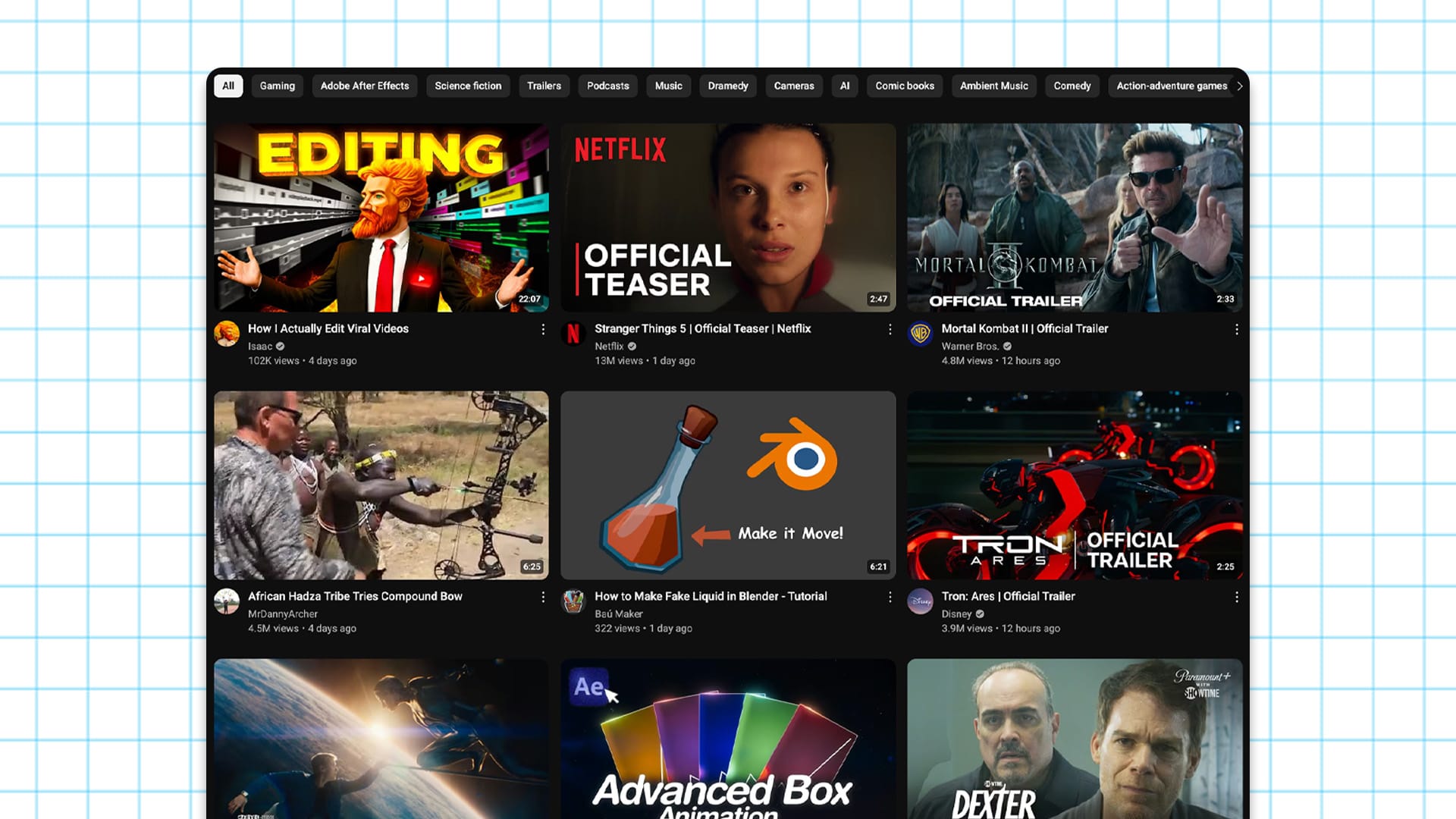
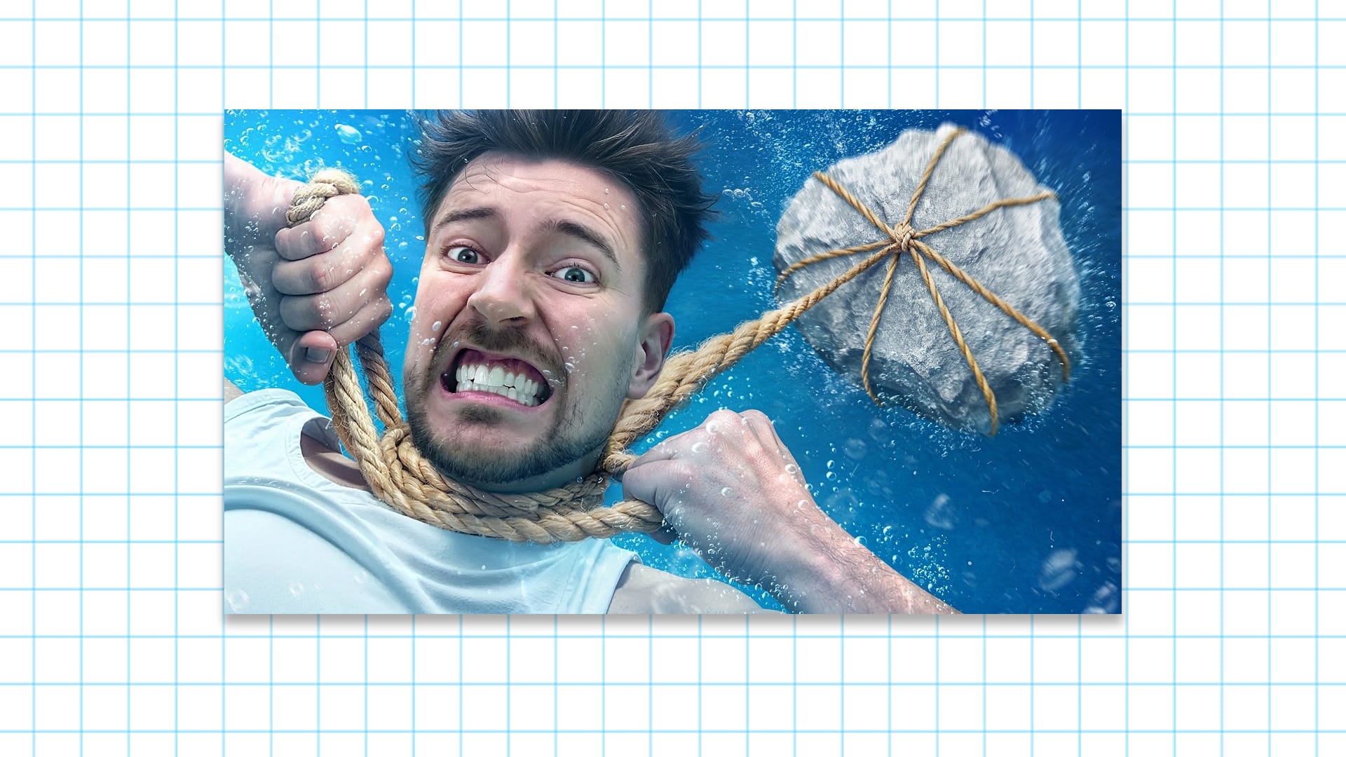
Real Examples: Thumbnails That Work
MrBeast
Big faces, bright contrast, one emotional moment. You always know what you’re getting.
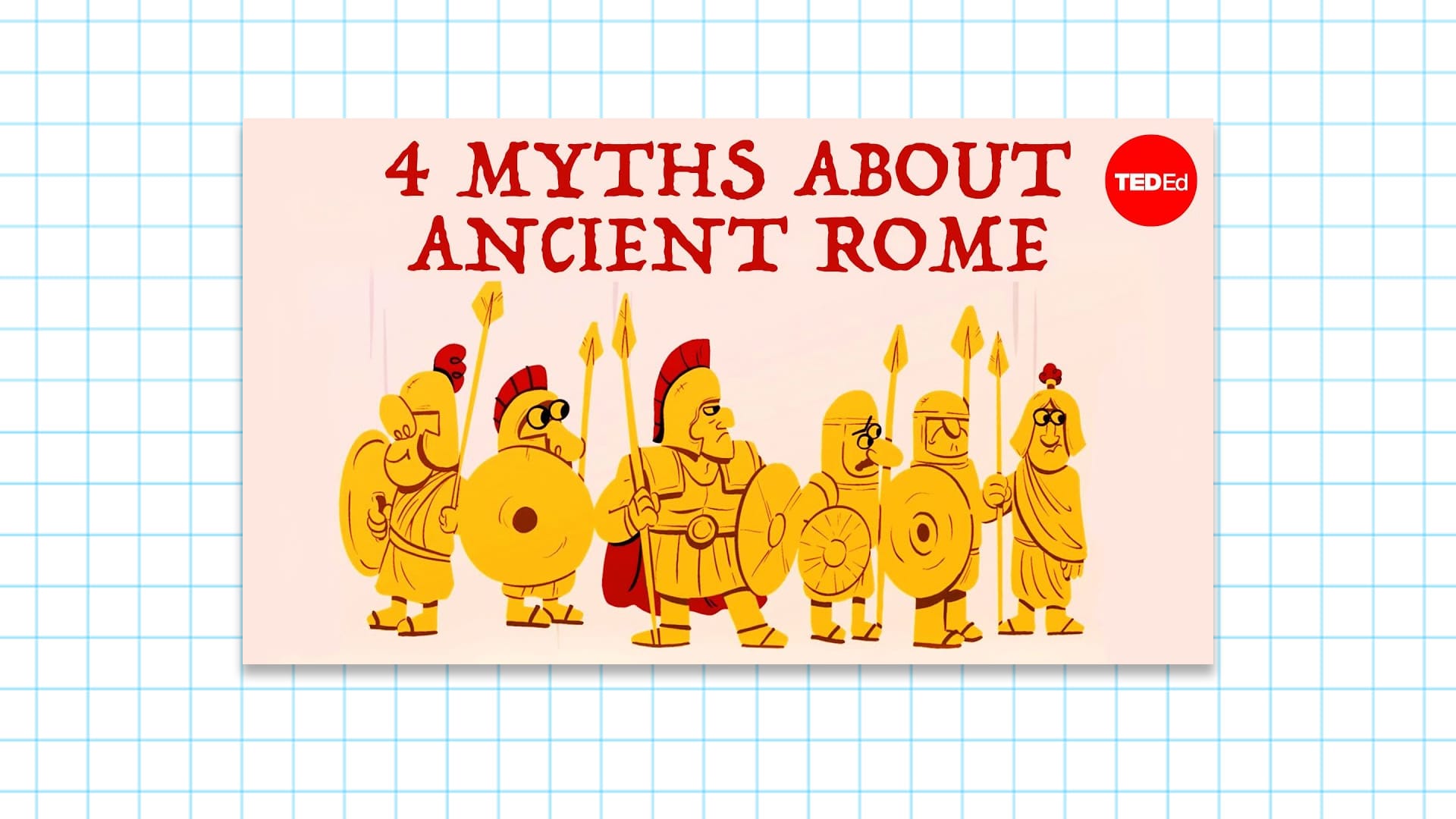
TED-Ed
Clean illustrations, branded text, always on-brand. You instantly recognize them in the feed.
Colin and Samir
Minimalist, strong identity, consistent style. It builds trust and familiarity.
Take notes. Steal like a creator.
Make It Easy: Use a Tool That Handles the Size For You
If you’re tired of Googling “YouTube thumbnail size” every time, just use a tool that already has it built in.
Use the 1of10 Thumbnail Editor
It’s easy, fast as hell, and built specifically to help YouTubers grow.
You’ll never mess up your thumbnail size again, and you’ll get more clicks while you’re at it.