
How to Make Thumbnails Like MrBeast (My Shortcut Method)
To create MrBeast thumbnails, use bold, saturated colors that pop on mobile screens, show exaggerated facial expressions that trigger instant emotions, and tell one clear story that creates curiosity. Keep text under 5 words or skip it entirely, this always leaves viewers wondering "what happens next?" This isn't art, it's science.
Here's the truth: you're not missing some secret Photoshop skill. You're missing the psychology behind what makes people click. MrBeast didn't become YouTube's king by accident, he cracked the code on viewer behavior. And I'm about to show you exactly how his thumbnail strategy works.
No more guessing games. No more watching your quality content get ignored. By the end of this post, you'll have a repeatable system that turns your thumbnails into click magnets.
MrBeast Thumbnail Psychology (Visual Strategy)
1. Colors: The Mobile Screen Advantage
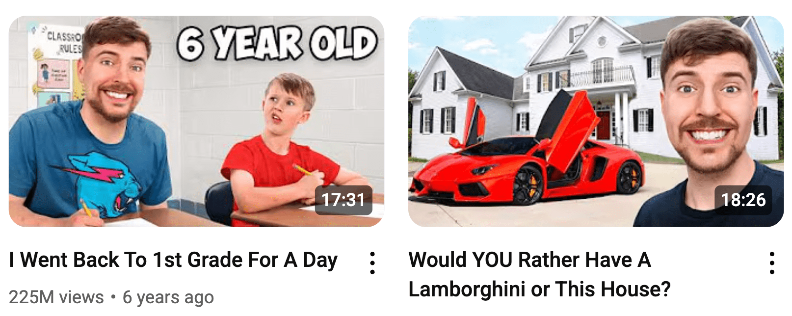
MrBeast uses four colors religiously: Blue, Red, Green, and Yellow. These aren't random choices.
Your thumbnail gets seen first on a phone screen. Dark reds and purples disappear into the background. Colors punch through the noise like a highlighter on white paper.
Think about it: when you're scrolling through YouTube at 11 PM with your phone brightness down, which thumbnail catches your eye? The one with subtle earth tones or the one with electric blue and bright orange?
2. Facial Expressions: The Emotional Trigger
MrBeast's face tells a story before you read the title. Shocked? Excited? Confused? Your brain processes facial expressions 60,000 times faster than text.
MIT study shows faces are processed in 100 milliseconds.
Here's what each expression signals:
- Wide eyes = "You won't believe this"
- Open mouth = "This is shocking"
- Pointing = "Look at this thing"
- Smiling = "This is fun"
Your expression becomes the viewer's first emotion.
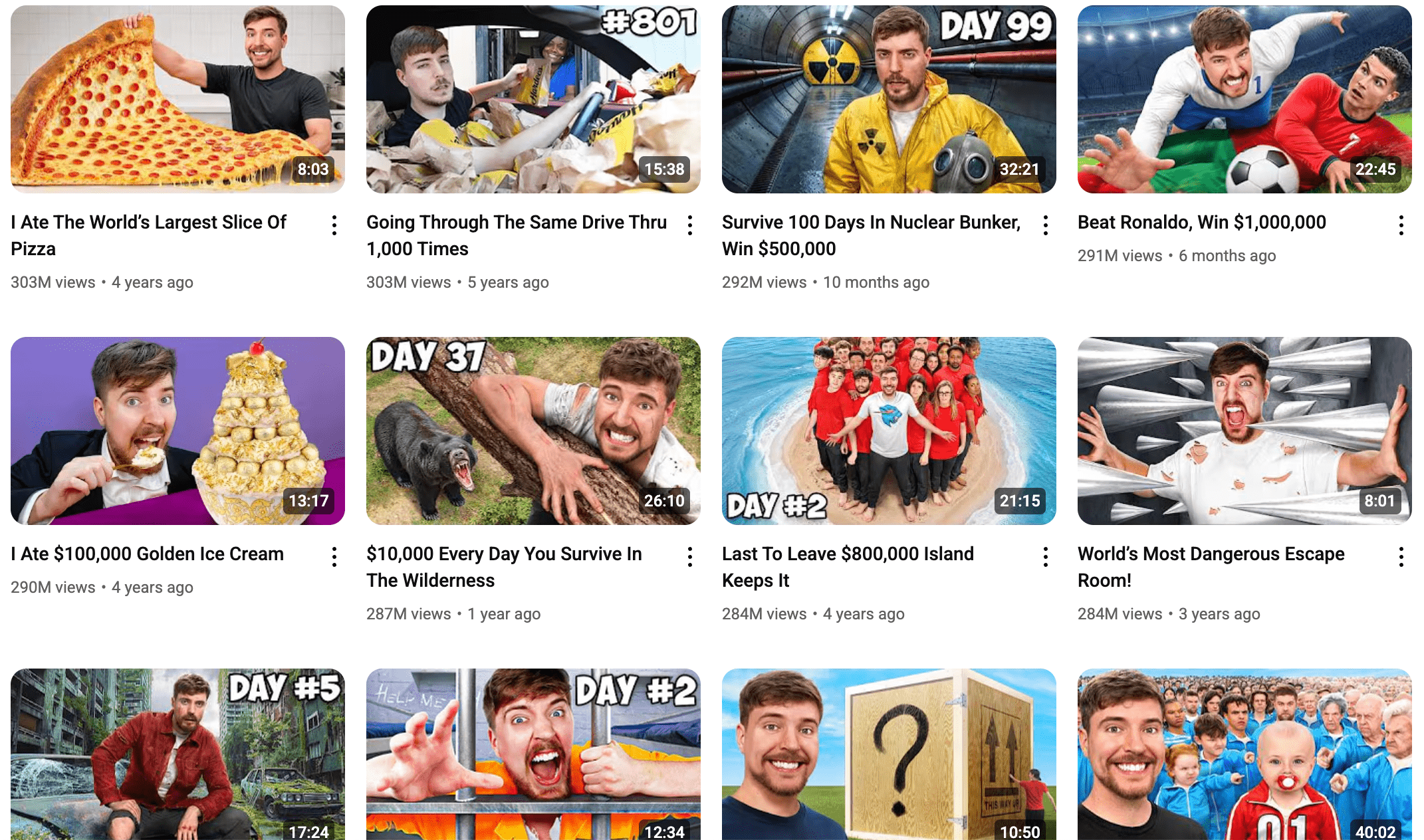
3. The One-Story Rule
Every MrBeast thumbnail tells one clear story. Not three stories. Not five elements competing for attention. One.
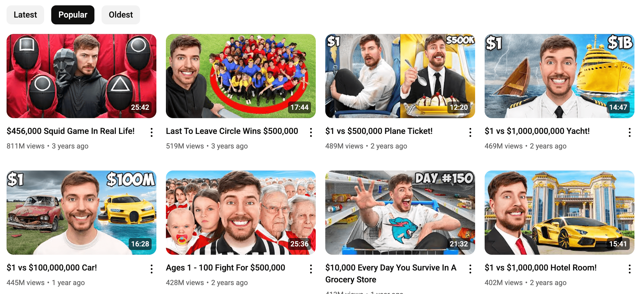
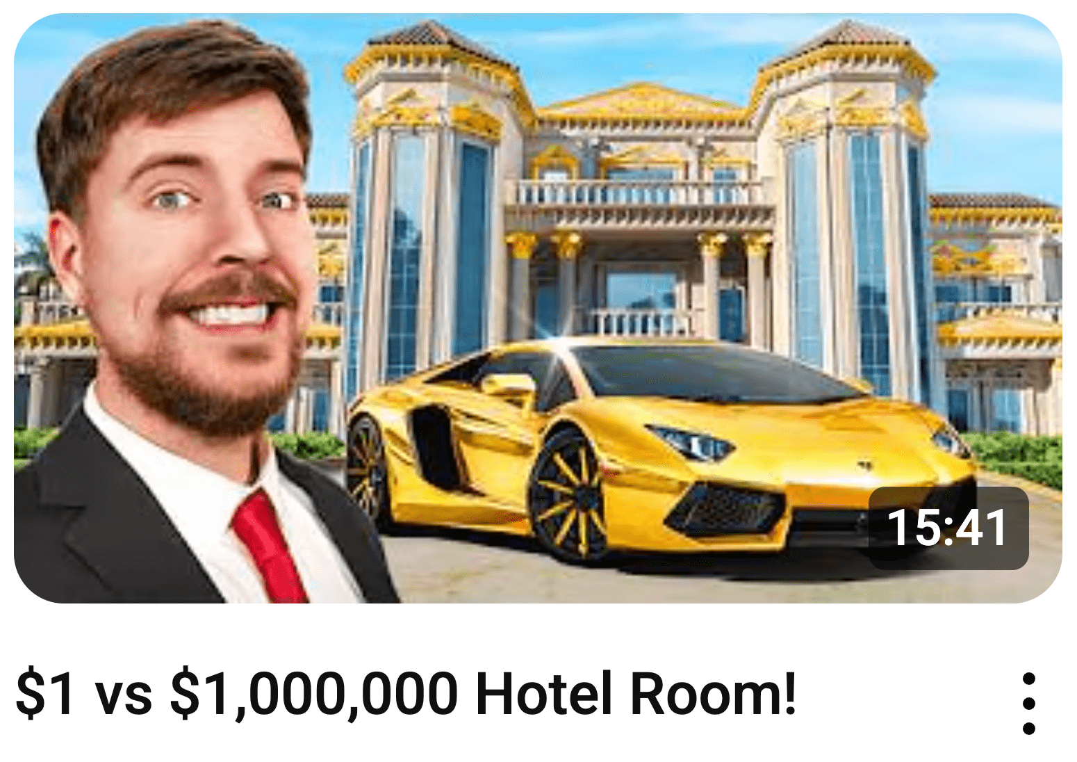
Look at his "$1 vs $1,000,000 Hotel Room" thumbnail. You see expensive stuff on one side, cheap stuff on the other. Done. Your brain gets it instantly.
Most creators try to cram everything into their thumbnail. Big mistake. Your viewer has 0.3 seconds to understand what they're clicking on. If they have to think, they'll scroll.
A Microsoft study shows human attention spans dropped to 8 seconds, with initial judgments made in 0.3 seconds.
4. The Curiosity Gap: Making Them Wonder
MrBeast thumbnails always leave something unsaid. They show enough to make you curious, not enough to satisfy that curiosity.
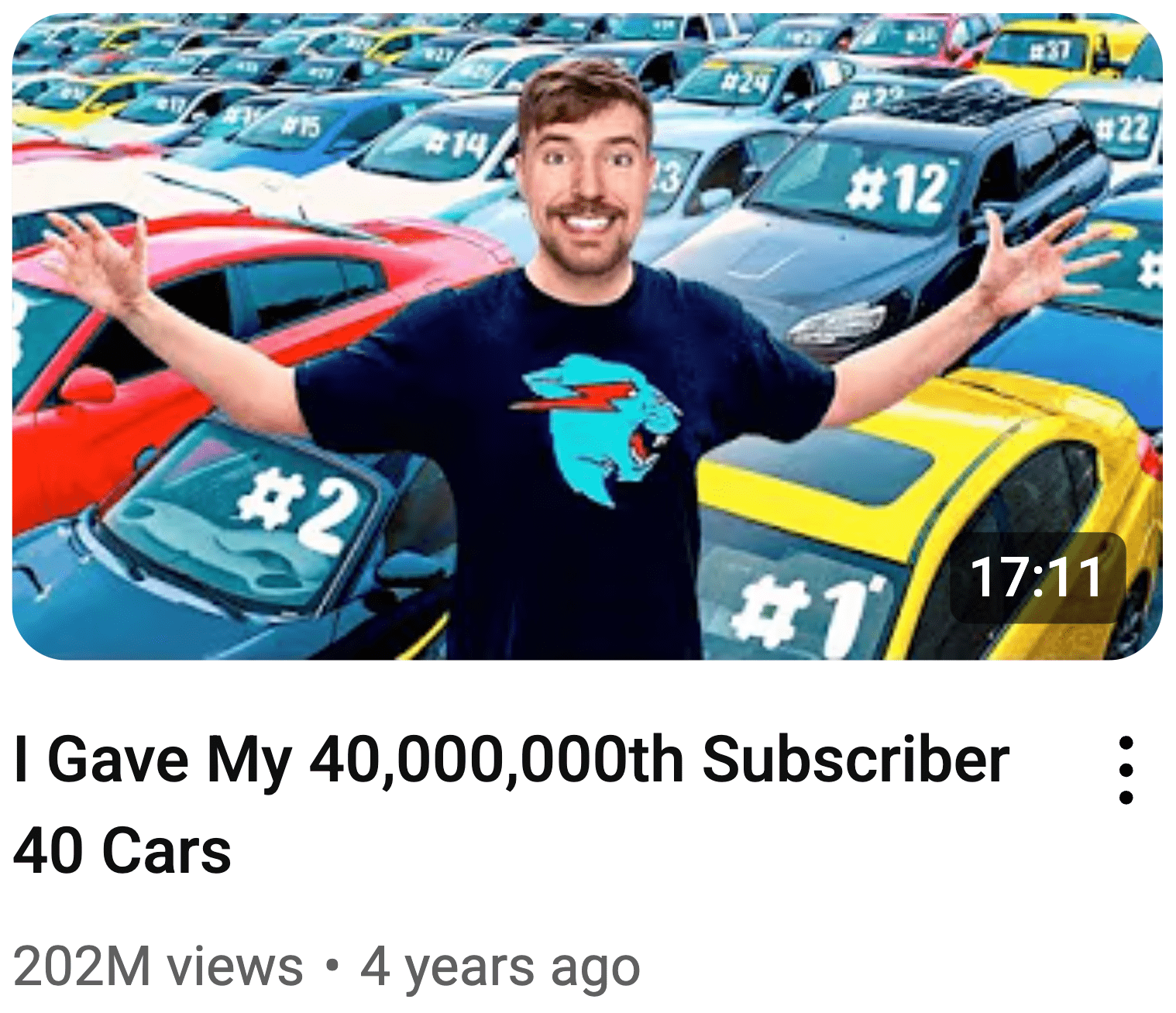
Take his "I Gave My 40,000,000th Subscriber 40 Cars" thumbnail. You see cars, you see celebration, but you don't see the actual moment of giving. That gap between what you see and what you want to know? That's the click.
Most creators give away the entire story in their thumbnail. They show the problem AND the solution. Why would anyone click if they already know the ending?
5. Text Strategy: Big, Bold, or Nothing
MrBeast uses text in two ways: make it huge and impossible to ignore, or skip it entirely.
When he uses text, it's massive. "FREE MONEY" takes up half the thumbnail. When he doesn't use text, the image tells the complete story.
Here's the rule: if your text isn't readable on a phone from arm's length, it's useless. Most creators use text that's too small, too fancy, or too much.
6. Brand Consistency: The Recognition Factor
Every MrBeast thumbnail feels like a MrBeast thumbnail. Same energy, same style, same approach. You could cover his name and still know it's his content.
Consistent visual branding increases recognition by 80%. Source: Lucidpress Brand Consistency Report
This isn't about copying his exact colors or fonts. It's about developing your own consistent visual language that viewers recognize instantly.
How to Make MrBeast Thumbnails Manually
Creating MrBeast-style thumbnails manually requires five specific steps: planning before filming, capturing high-quality source material, strategic editing to boost visual impact, adding minimal but bold text elements, and systematic testing to optimize performance.
Most creators work backwards. They film first, then scramble to make a thumbnail from whatever footage they have. That's like trying to build a house without blueprints.
Here's how to do it right:
Step 1: Plan Your Thumbnail Before You Hit Record
Your thumbnail isn't an afterthought, it's your video's movie poster. Plan it during your pre-production, not after editing.
Ask yourself three questions:
- What's the one emotion I want viewers to feel?
- What's the single story I'm telling?
- How will this look on a phone screen?
Write down your thumbnail concept before you film anything. Sketch it out, even if you can't draw. Stick figures work fine. The goal is clarity, not artistry.
Step 2: Capture Your Money Shot
Your thumbnail lives or dies at this moment. You need high-resolution, well-lit, perfectly composed source material.
Here's your shooting checklist:
- Resolution: Minimum 1280x720, shoot higher if possible
- Lighting: Bright, even lighting on your face (ring lights work great)
- Expression: Exaggerate everything by 50% more than feels natural
- Background: Clean and uncluttered, or completely removable
- Framing: Leave space around your subject for text and graphics
Take 20 shots, not 2. Your expression changes between frames, and you want options. Professional photographers take hundreds of shots for one perfect image.
Step 3: Edit Like Your Channel Depends on It (Because It Does)
Raw photos typically never work as thumbnails.
Boost Contrast First Your thumbnail competes with dozens of others on screen. Flat, low-contrast images disappear. Crank the contrast until your subject jumps forward.
Isolate Your Subject Remove or blur distracting backgrounds. Your viewer's eye should land on one thing immediately.
Increase Saturation (But Don't Go Crazy) Colors need to pop on mobile screens. Increase saturation by 20-30%, not 200%. You want vibrant, not radioactive.
Most creators stop here. That's a mistake. The magic happens in the details.
Step 4: Add Text That Demands Attention
Text on thumbnails follows one rule: go big or go home. If it's not readable from across the room on a phone, delete it.
Keep It to 5 Words Maximum "FREE MONEY" works. "How I Made Money Online With This Simple Method" doesn't. Your title already tells the full story. Your thumbnail text should be the hook.
Font Choice Matters Use thick, bold fonts. Avoid thin, decorative, or script fonts.
Color Contrast is Everything White text needs black outlines. Colored text needs contrasting backgrounds. If your text doesn't pop off the background instantly, fix it or remove it.
Arrows and Emojis: Less is More One arrow pointing to the important thing? Great. Five arrows and ten emojis? Looks like spam. Use them to guide the eye, not decorate the space.
Step 5: Test, Measure, Repeat
Here's where most creators fail. They create one thumbnail, upload it, and hope for the best. That's not a strategy, it's gambling.
Create 3-5 different versions of every thumbnail:
- Different facial expressions
- Different color schemes
- Different text placement
- Different story emphasis
When to Change: If your CTR is below your channel average after 24 - 48 hours, swap the thumbnail. Don't wait a week. The algorithm decides fast.
Shortcut: Use 1of10 to Create Thumbnails in 1 Click
Remember everything we just covered? The planning, shooting, editing, testing? What if you could skip 90% of that work and still get professional results?
That's exactly what 1of10 does. It's like having MrBeast's thumbnail team working for you 24/7.
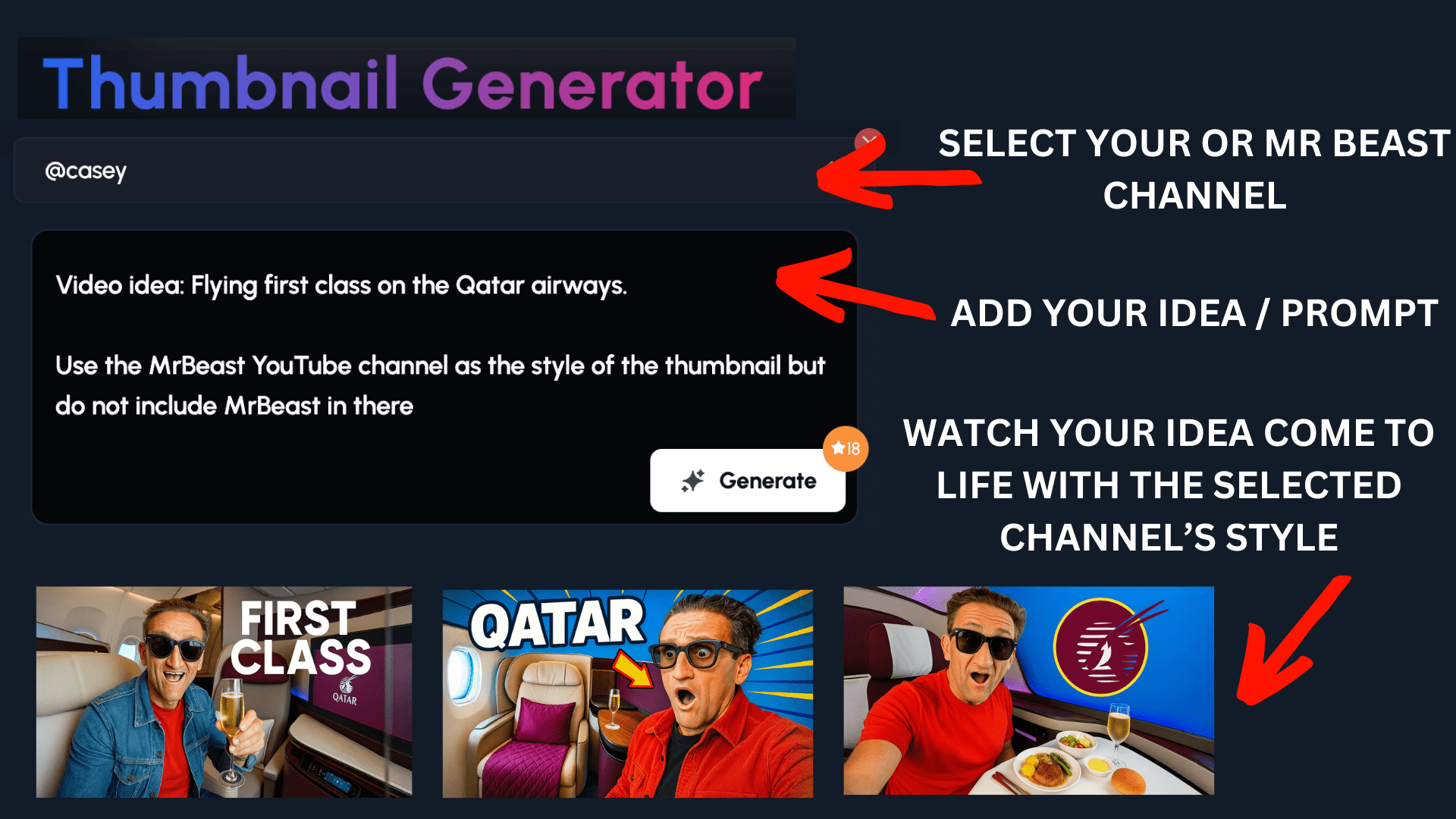
How 1of10 Works:

Step 1. Select your channel or the MrBeast channel
Step 2. Instruct 1of10 what you want (don't forget to tell it to use the MrBeast channel's style and not to include MrBeast's face)
Step 3. Click 'Generate' to watch your ideas come to life!
Conclusion: Your Thumbnail Strategy Starts Now
MrBeast-style thumbnails work because they follow psychology, not trends. Colors pop on mobile screens. Exaggerated expressions trigger emotions. Simple stories prevent confusion. Curiosity gaps create clicks.
You've got two paths forward:
Path 1: Manual Creation Follow the step-by-step process we covered. Plan before filming, capture perfect shots, edit for maximum impact, add bold text, and test relentlessly. It works, but expect to invest 4-5 hours per thumbnail.
Path 2: Let 1of10 Handle the Psychology Input your concept and get professional thumbnails in seconds. Same psychological principles, same proven formula, but without the learning curve or time investment.
Amazing for beginner and established channels.
FAQ
Can I create MrBeast-style thumbnails without showing my face?
Yes, you can create effective MrBeast-style thumbnails without showing your face by focusing on objects, text, and visual storytelling instead of facial expressions. The key is maintaining high contrast, bold colors, and clear emotional triggers through other visual elements like dramatic lighting, bold text, or compelling product shots.
MrBeast's face works because it conveys emotion instantly. But you can trigger the same emotional response with other elements. Think about unboxing channels that show hands opening packages, or cooking channels that focus on the food transformation.
The psychology stays the same: create curiosity, use colors, keep it simple. Instead of facial expressions, use dramatic lighting on objects, bold text that conveys emotion, or before/after comparisons that tell a clear story.
How important are expressions vs background context?
Facial expressions account for roughly 60% of a thumbnail's emotional impact, while background context provides the remaining 40% through storytelling and visual hierarchy. However, a clean, simple background that doesn't compete with your expression will always outperform a cluttered background, regardless of how good your facial expression is.
Your face triggers the immediate emotional response, but the background tells the story. If viewers can't process both quickly, they'll scroll past.
Think of your expression as the hook and your background as the context. "I'm shocked" (expression) + "because of this expensive thing" (background) = click. But if your background is messy or confusing, even the best expression won't save the thumbnail.
Does YouTube reward MrBeast-style thumbnails in the algorithm?
YouTube's algorithm doesn't specifically reward MrBeast-style thumbnails, but it heavily rewards high click-through rates and audience retention, which these thumbnails consistently deliver. The algorithm promotes videos that get clicked and watched, making effective thumbnail psychology essential for algorithmic success.
YouTube cares about one thing: keeping people on the platform. If your thumbnail gets clicks and your content keeps viewers watching, the algorithm will promote your video. It doesn't care what style you use.
MrBeast-style thumbnails work because they solve the algorithm's core challenge: getting people to click in the first place. Higher CTR leads to more impressions, which leads to more views, which signals to YouTube that your content is worth promoting.