
YouTube Thumbnail Ideas for Vloggers - 3X CTR
You've spent hours filming, editing, and perfecting your vlog. Then you finally upload it…
Crickets.
The hard truth: The algorithm didn't bury your video. People just scrolled right past it.
Your thumbnail is your vlog's first impression. It's the movie poster for a film nobody will watch if it looks boring.
The good news?
You don't need to reinvent the wheel every upload. I'm going to share proven thumbnail formulas you can steal, save, and reuse whenever you're stuck.
It gets better, I’ll also be sharing the best way to generate thumbnails with AI that actually gets clicks.
Reaction-Based Thumbnail Ideas
Humans are wired to read faces. A strong reaction stops the scroll because our brains want context.
Shocked reaction:
Wide eyes, open mouth. Screams "something unexpected happened."
Confused reaction: Furrowed brow, head tilt. Makes viewers want to explain it to themselves.
Regret or panic: Hands on head, stressed expression. Implies a story went wrong.
Over-exaggerated happiness: Huge grin, arms up. Pure positive energy pulls people in.
Deadpan humour: Blank stare, zero emotion. The contrast is funny and intriguing.
Text overlay idea: "I messed up" or "Wait what?"
Before and After Thumbnail Ideas
Transformation is satisfying. Our brains love seeing progress, and a clear contrast promises a payoff worth watching.
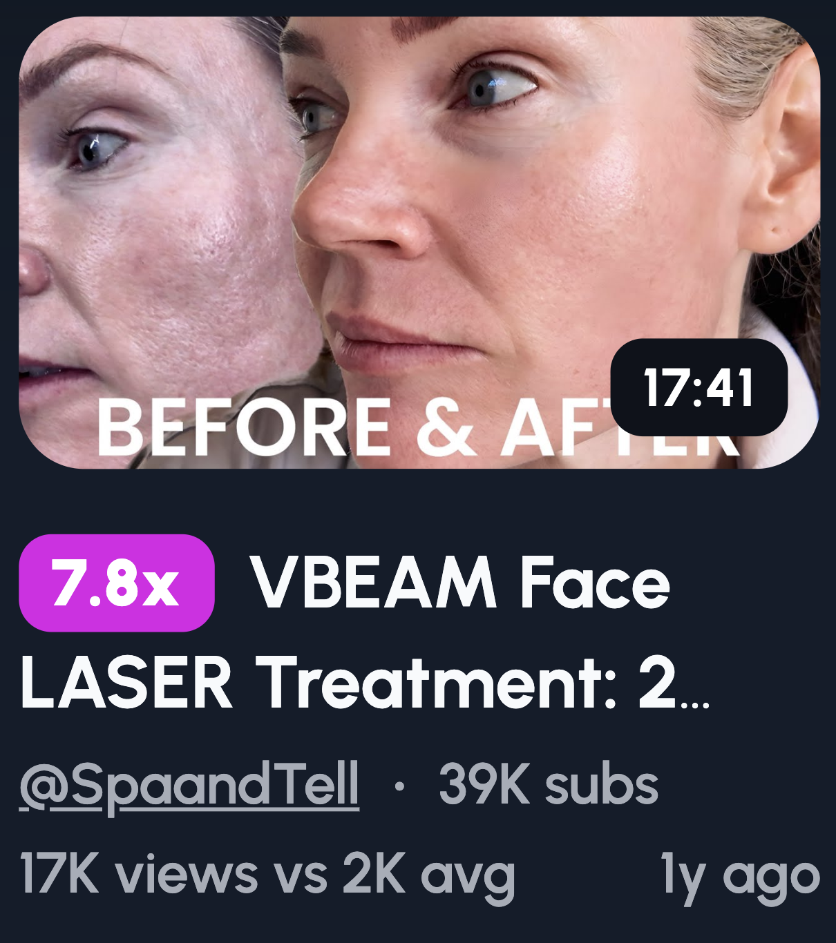
Split-screen layouts: Show both states side by side. Left is "before," right is "after." Simple and instant to understand.
Time-based contrast: Morning vs night, day one vs day thirty. Time passing implies a story.
Mood-based contrast: Tired vs energised, messy vs clean, stressed vs calm. Emotional shifts are relatable.
Why contrast drives curiosity: Viewers want to know how you got from A to B. The gap between images creates a question only your video answers.
Stick to one contrast. Two transformations muddy the message. One clear change hits harder and reads faster at small sizes.
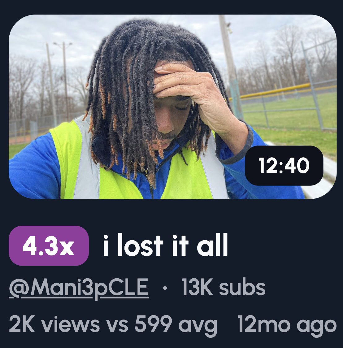
“Something Went Wrong” Thumbnail Ideas
Nobody clicks on a vlog where everything went perfectly. Chaos is interesting. Smooth sailing isn't.
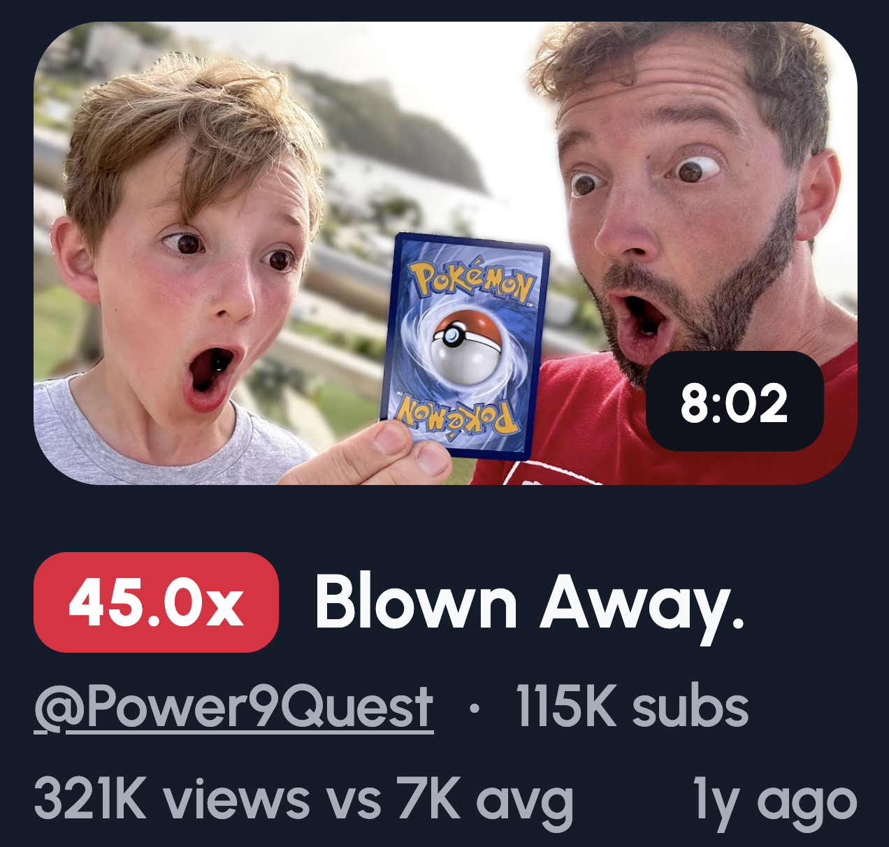
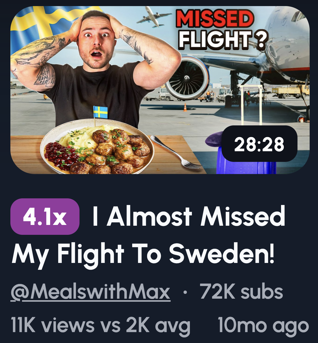
Missed flight: You at the gate, plane visible through the window, hands on your head. Instant story.
Broken object: Hold up the damaged item with a pained expression. Show the evidence.
Unexpected situation: Rain pouring on your picnic, flat tyre on a road trip, wrong food order. Real moments people relate to.
Mistake highlighted: Use a circle or arrow pointing at the problem. Directs the eye and adds "spot what went wrong" energy.
Why imperfection wins: Polished thumbnails feel like ads. Mistakes feel human. People connect with real over rehearsed.
Avoiding clickbait: The key is payoff. If your thumbnail teases a disaster, deliver that story in the video. Tease what actually happened, not what sounds dramatic. Trust is everything. Bait-and-switch kills your channel slowly.
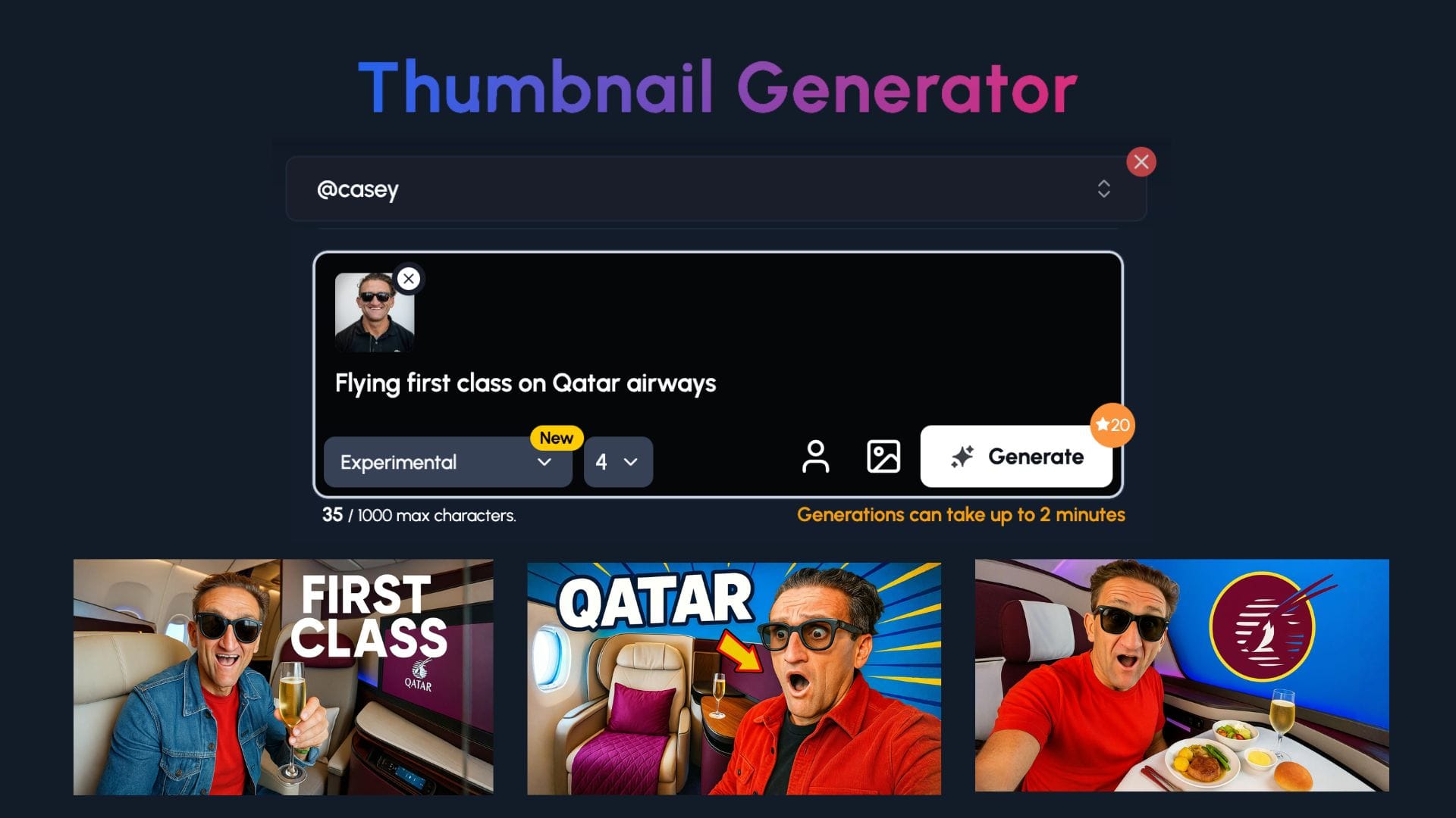
Use Our 1-Click Thumbnail Generator
The 1of10 thumbnail generator does the heavy lifting for you.
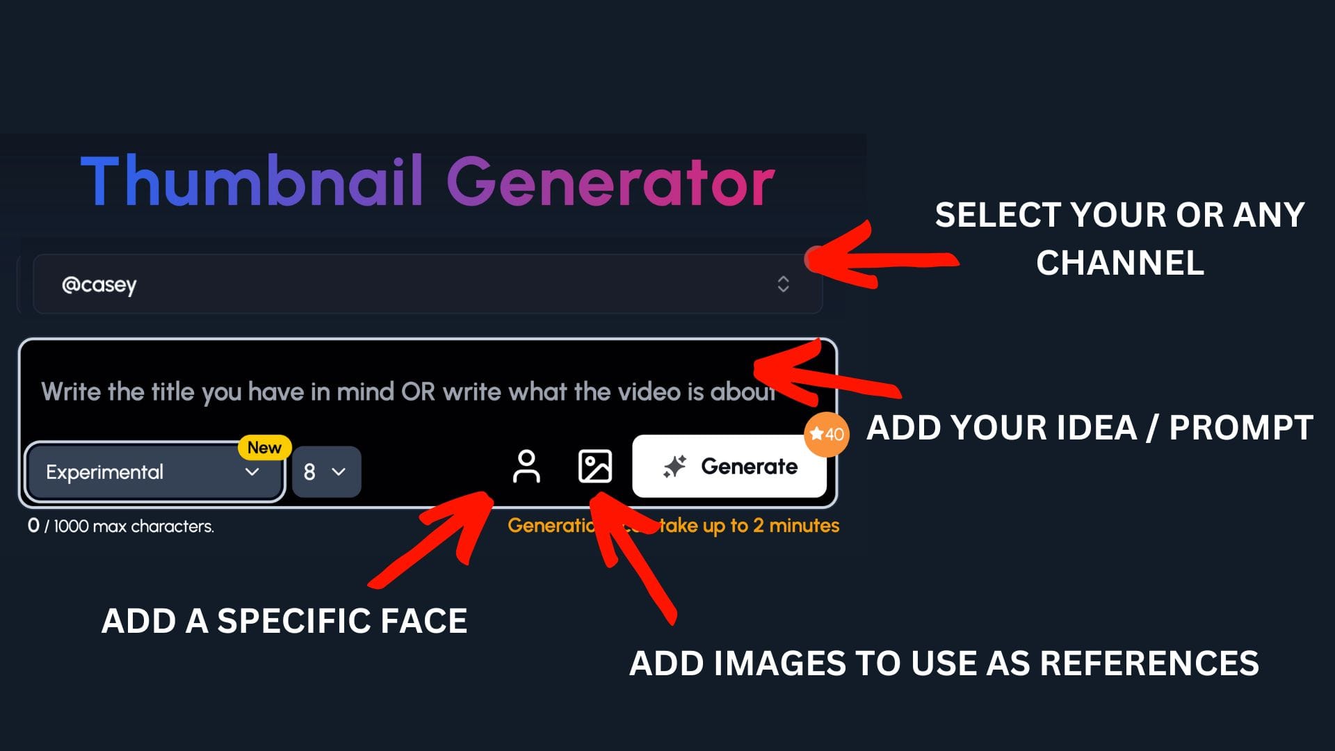
Step 1: Select your channel or a competitor's channel to help 1of10 get inspiration
Step 2: Decide if you want to upload your a specific face or add images to use as a reference - perfect for vloggers to upload themselves and scenes
Step 3: Write the title or describe your idea
Now watch you ideas come to life.
POV and In-The-Moment Thumbnails
POV thumbnails pull viewers into the scene. Instead of watching your life, they feel like they're living it.
Hands holding something: Coffee cup, plane ticket, steering wheel. Whatever you're holding becomes the focus and sets the vibe.
Looking down at feet: Standing on a cliff edge, sandy beach, city street. It grounds the viewer in your exact position.
Camera reflection: Mirror selfie, shop window, sunglasses. Adds a layer of authenticity and "caught in the moment" energy.
Walking away shot: You from behind, heading somewhere interesting. Creates mystery about where you're going.
Why POV increases immersion: It removes the barrier between viewer and creator. They're not watching you do something, they're doing it with you.
When this works best: Daily vlogs thrive on this style. Mundane moments feel cinematic. Grocery runs, morning walks, travel days. POV makes the ordinary feel worth clicking.
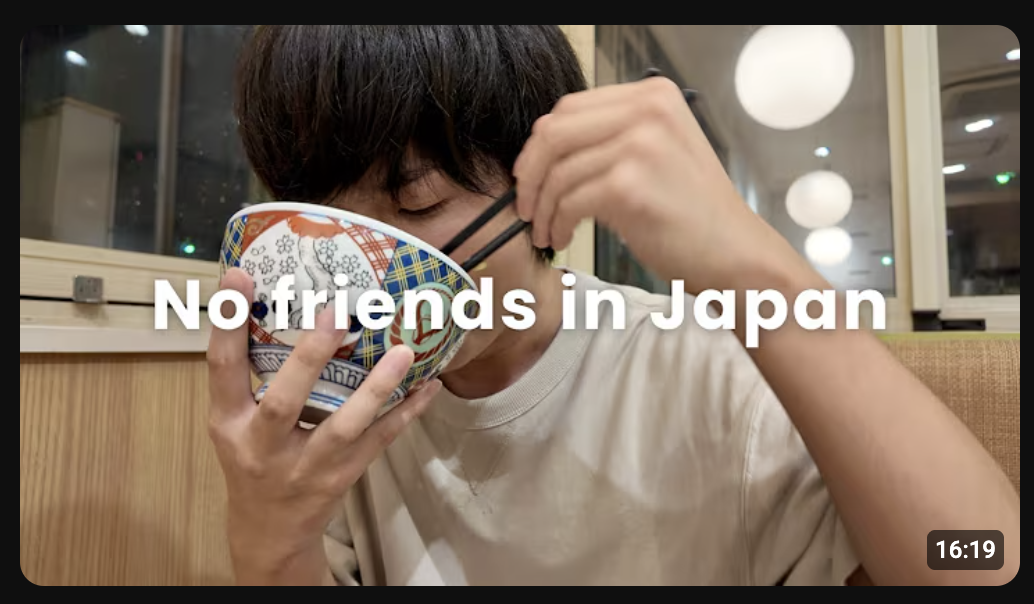
Minimal Text Thumbnail Ideas
Less text means faster reads. Your thumbnail has a split second to land. Don't waste it on a paragraph.
Short phrase examples: "I MESSED UP," "DID NOT EXPECT THIS," "LAST DAY HERE," "THIS WAS BAD," "NOT AGAIN." Short, punchy, emotional.
When to use text: Add words when the image alone doesn't tell the full story. If your face and setting already make sense together, skip the text entirely.
When to skip text: Strong visuals don't need explaining. A shocked face at the Eiffel Tower speaks for itself.
Font size tips: If you can't read it on a phone screen, it's too small. Thumbnails shrink. Your text shouldn't disappear.
Placement tips: Bottom corners or top third work best. Keep text away from your face. Never cover the focal point. White or yellow with a black outline stays readable on any background.
Location-Focused Thumbnail Ideas
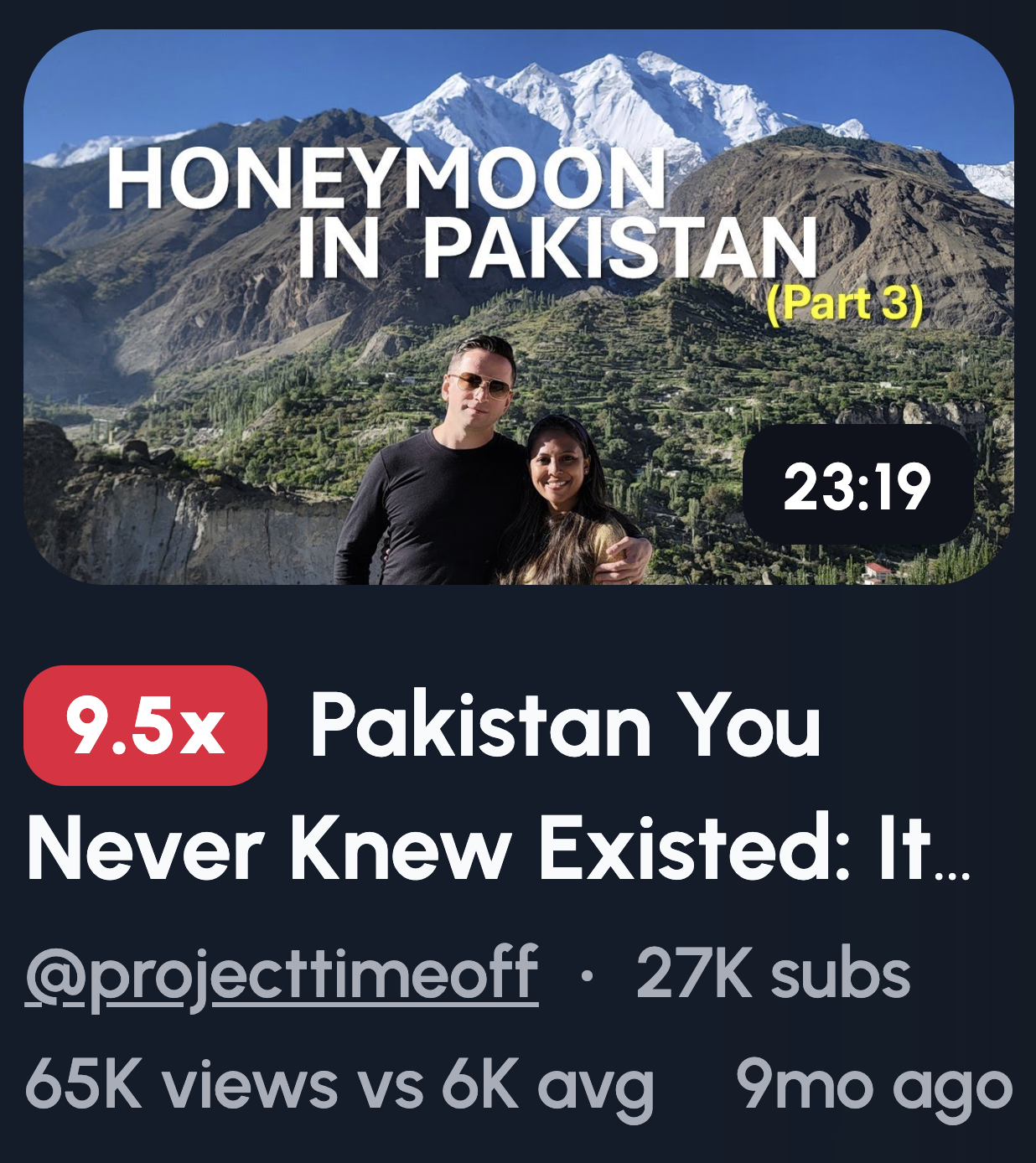
Sometimes the place is the star. Your face doesn't always need to dominate the frame, especially when the scenery does the heavy lifting.
You small in frame, big background: Stand tiny against a mountain, skyline, or vast beach. Scale creates awe.
Pointing at landmark: Direct attention to the main attraction. Your gesture tells viewers exactly where to look.
Empty vs crowded location: Show a famous spot deserted at sunrise or packed at midday. The contrast sparks curiosity about timing or secrets.
Why places outperform faces for travel vlogs: Viewers want to imagine themselves there. A stunning location sells the destination. Your reaction matters less than the view.
Keeping it readable on mobile: Simplify the shot. One clear focal point, not a busy landscape. Increase contrast so details pop on small screens. Avoid tiny text, it vanishes. If you include yourself, wear colours that stand out against the background.
Mystery Object Thumbnail Ideas
Curiosity gaps are powerful. Show viewers something incomplete, and they'll click to fill in the blank.
Object partially hidden: Hold something just out of full view. A gift half-unwrapped, a box lid cracked open. Tease without revealing.
Blurred object: Blur the key item while keeping your reaction sharp. The focus mismatch screams "what is that?"
Close-up crop: Zoom in so tight viewers can't identify the object. A weird texture, strange colour, or unusual shape invites guessing.
Why objects outperform explanations: Telling someone what happened kills intrigue. Showing a mysterious item lets their imagination run. They click to confirm their guess.
How not to overuse blur: Blur loses power fast if every thumbnail looks foggy. Save it for genuinely surprising reveals. If you blur boring stuff, viewers catch on and stop caring. Use it sparingly, only when the reveal actually delivers. One blurred object per month hits different than one per video.
Day-in-the-Life Thumbnail Ideas
Routines sound boring. But the right thumbnail makes your Tuesday look like a story worth watching.
Rushing with a clock: Hold a clock or show one in frame while you look panicked. Instant "running late" energy.
Coffee spills: Mid-disaster moments grab attention. A tipped cup, liquid mid-air, your horrified face.
Messy workspace: Papers everywhere, empty mugs stacked, chaos on display. Real life beats a pristine setup.
Gym bag on floor: Slouched next to your bag, exhausted expression. Shows the grind without saying a word.
How to show motion in still images: Capture mid-action shots. Hair flying, arms blurred, objects falling. Freeze the moment just before impact.
Why relatability drives clicks: Viewers see themselves in your mess. Perfection creates distance. A spilled coffee or chaotic morning feels familiar. People click because they think, "same." Shared experience builds connection faster than any polished highlight reel ever could.
Emotional Storytelling Thumbnails
Not every vlog needs drama. Sometimes the quietest moments connect deepest.
Lonely city shot: You alone on an empty street or bench. Solitude tells a story without words.
Thoughtful window look: Staring out, lost in thought. Viewers wonder what's on your mind.
Packed bags: Suitcase by the door, keys in hand. Implies change, endings, or new beginnings.
Quiet moments: Sitting with coffee, watching a sunset, head in hands. Stillness stands out in a sea of loud thumbnails.
When emotion beats spectacle: Big moments get clicks, but emotional ones build loyalty. Viewers who connect with your feelings stick around longer.
Why subtlety works for loyal audiences: Your regulars already trust you. They don't need hype. A softer thumbnail signals "this one's different" and rewards their attention. New viewers scroll past subtlety, but dedicated fans lean in. Save these for videos that genuinely hit deeper. Overuse waters down the impact.
Thumbnail Ideas for Faceless Vloggers
No face? No problem. You can still stop the scroll without ever showing who you are.
Hands and objects: Let your hands do the talking. Holding a passport, typing on a laptop, gripping a steering wheel. Actions speak.
Silhouettes: Your outline against a sunset, doorway, or window. Mystery without identity.
POV angles: First-person shots work perfectly here. Looking down at your shoes, out at a view, or at something you're holding.
Environment-led storytelling: Let the setting carry the narrative. A cosy desk setup, a rainy street, an empty cafe. The vibe becomes the star.
How to replace facial emotion visually: Use body language, color, and context. Slumped shoulders suggest defeat. Bright colours feel upbeat. A messy room implies chaos. Pair objects with situations, a broken phone next to a frustrated hand gesture. Emotion exists beyond the face. You just need to show it differently.
Common Vlog Thumbnail Mistakes to Avoid
A weak thumbnail tanks your video before anyone presses play. Dodge these CTR killers.
Too much text: If it reads like a sentence, you've lost. Three to four words maximum. Anything more gets ignored.
Multiple emotions: Pick one reaction. A confused and happy face together sends mixed signals. Viewers won't pause to decode it.
Overediting: Heavy filters, crazy borders, fifteen elements fighting for attention. Busy thumbnails get scrolled past. Clean wins.
Tiny subjects: If viewers squint to see you or the main object, it's too small. Thumbnails display tiny on phones. Fill the frame.
Thumbnail not matching title: Your thumbnail promises one thing, your title says another. Viewers feel tricked before clicking. Worse, YouTube notices the mismatch too. Both should tell the same story from different angles.
Fix these five, and you're already ahead of most creators uploading today.
Simple Thumbnail Testing Checklist
Before you upload, run through this. Five checks, five seconds, zero wasted clicks.
Passes 0.5 second glance test: Shrink your thumbnail to phone size. Look away. Glance back for half a second. Did you understand it? If not, simplify.
One emotion: Your face should show a single, clear feeling. Happy, shocked, confused, pick one. Mixed emotions confuse viewers.
One focal point: Where does the eye go first? If you can't answer instantly, there's too much going on. One subject, one focus. Remember, western audiences read from left to right.
Mobile readable: Most viewers scroll on phones. If your text disappears or details blur at small sizes, rework it.
Matches title promise: Read your title, then look at your thumbnail. Do they tell the same story? If they clash, trust breaks before the click happens.
Screenshot your thumbnail, send it to a friend, and ask what they think it's about. If they guess right, you're good.