
YouTube Thumbnail Ideas for Animators - Skyrocket Views
You've poured hours into every frame. The animation is smooth. The story hits. But the views? They're stuck while far worse content racks up millions.
It stings. And it's confusing.
Here's the truth: YouTube doesn't reward the best animations. It rewards the best-packaged ones. Your thumbnail is that package. It's the first impression, the hook, the reason someone stops scrolling and actually clicks.
This isn't another list of generic tips like "use bright colours" or "add text." I've put together animation-specific thumbnail ideas paired with the strategy behind why they work. You'll walk away with concepts you can actually use, not vague advice that leaves you guessing.
Your content deserves the clicks. Let's make sure it gets them.
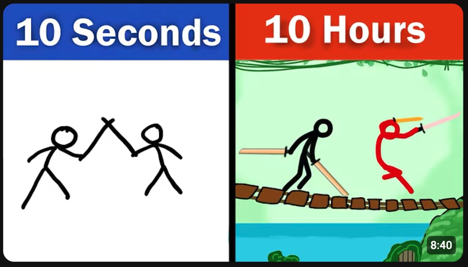
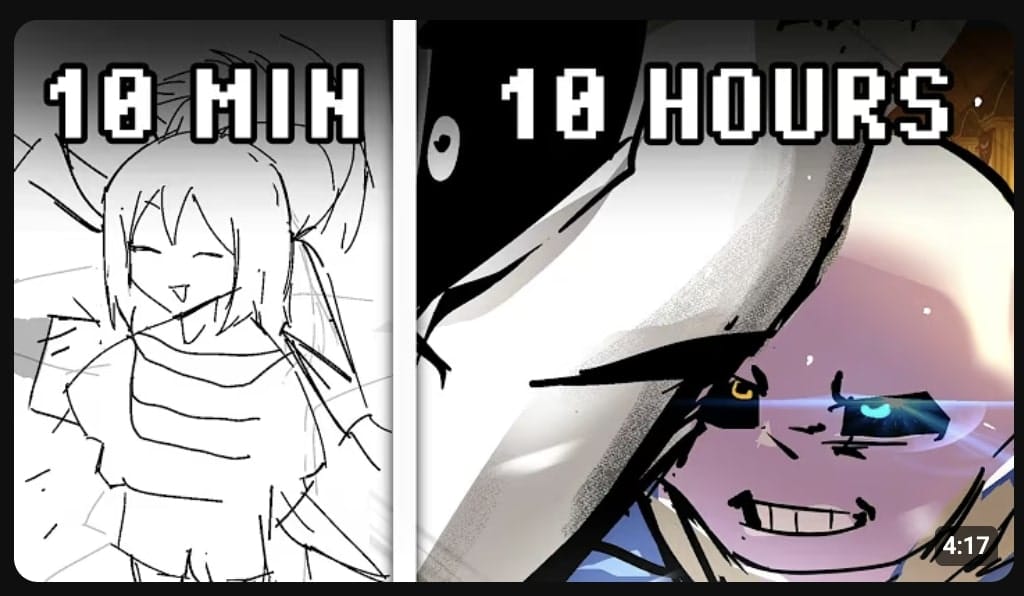
“Before vs After” Transformation
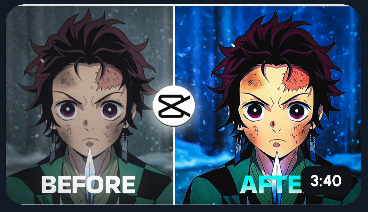
Split your thumbnail in half. Rough sketch on the left, polished frame on the right. Add bold text: "From THIS… to THIS!"
Why does this work? Our brains are wired for contrast. We spot differences instantly. This thumbnail shows your skill, teases the payoff, and creates curiosity in a single glance. Viewers want to see how you got there.
Hand Drawing a Character Mid-Stroke
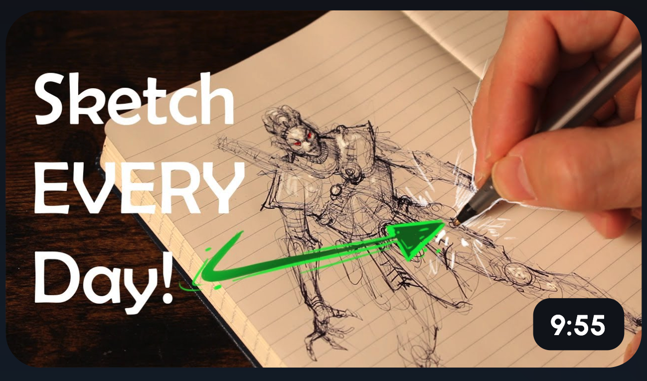
Show a hand holding a stylus, drawing a half-finished character. Add text: "Watch This Come Alive!"
Why does this work? It's a peek behind the curtain. Viewers see the process in action and feel invited into your creative world. It also builds anticipation, they want to see the finished result. Process content pulls people in because it feels real and unfiltered.
Exaggerated Reaction Faces
Use big, expressive eyes or shocked cartoon expressions as your thumbnail's focal point. Think wide eyes, dropped jaws, or over-the-top surprise.
Why does this work? Emotions are magnetic. Our eyes are drawn to faces, especially exaggerated ones. A dramatic expression hints at a story worth watching. It triggers curiosity, what happened to cause that reaction? This style is perfect for storytelling videos where tension and payoff are key.
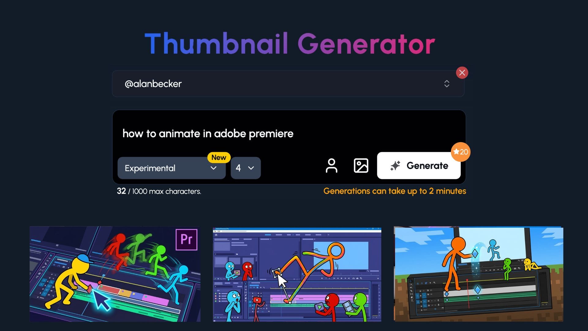
Use Our Viral Ai Thumbnail Generator
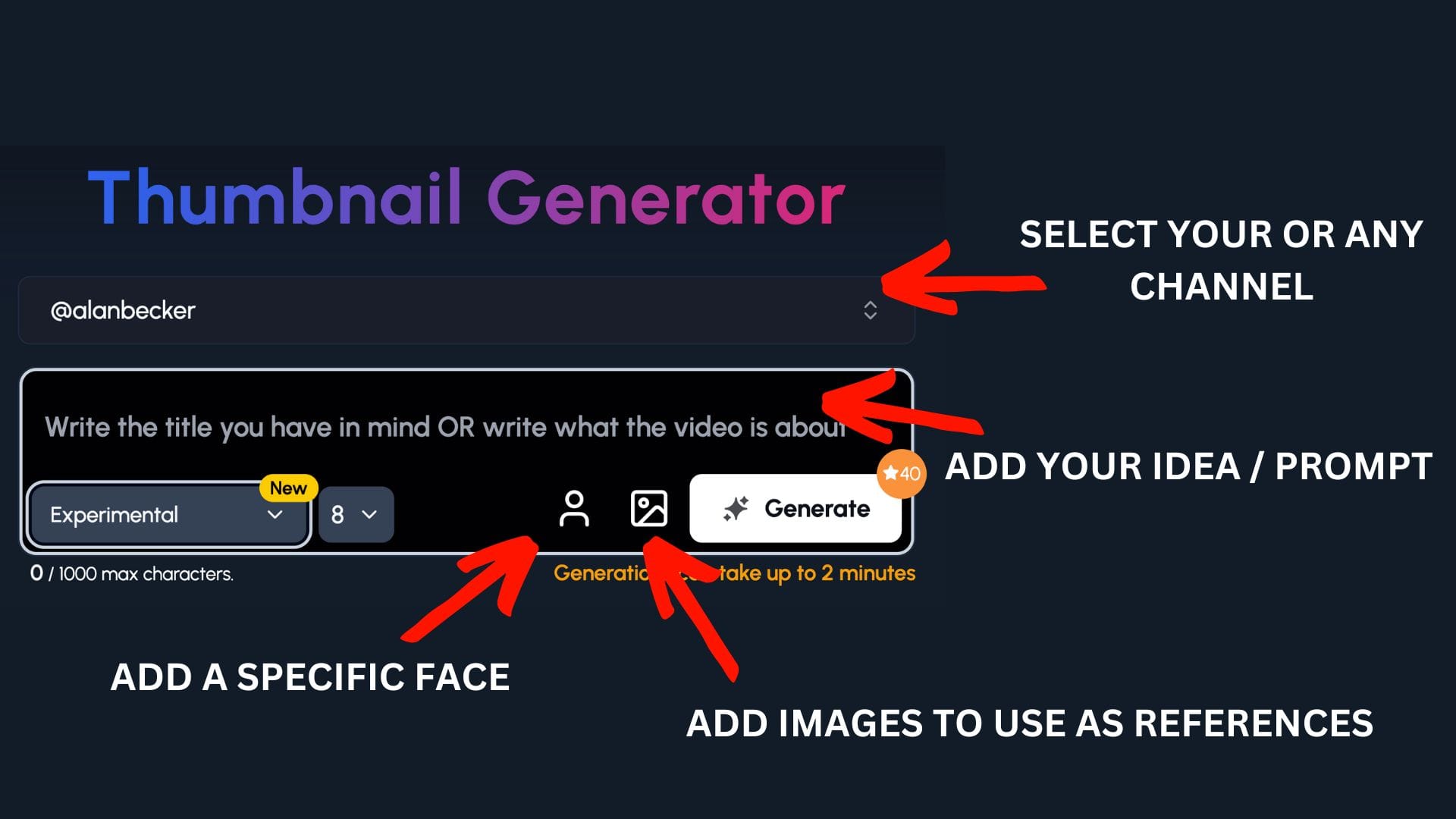
You already spend an insane amount of time creating your videos. So let 1of10 create the thumbnails for you.
Or at the very least, give you the ideas that you can take and run with.
Step 1: Select your channel or a competitor's channel to help 1of10 get inspiration
Step 2: Decide if you want to upload your a specific face or add images to use as a reference - perfect for animators to upload their character
Step 3: Write the title or describe your idea
Now watch you ideas come to life.
Frame-by-Frame Sequence
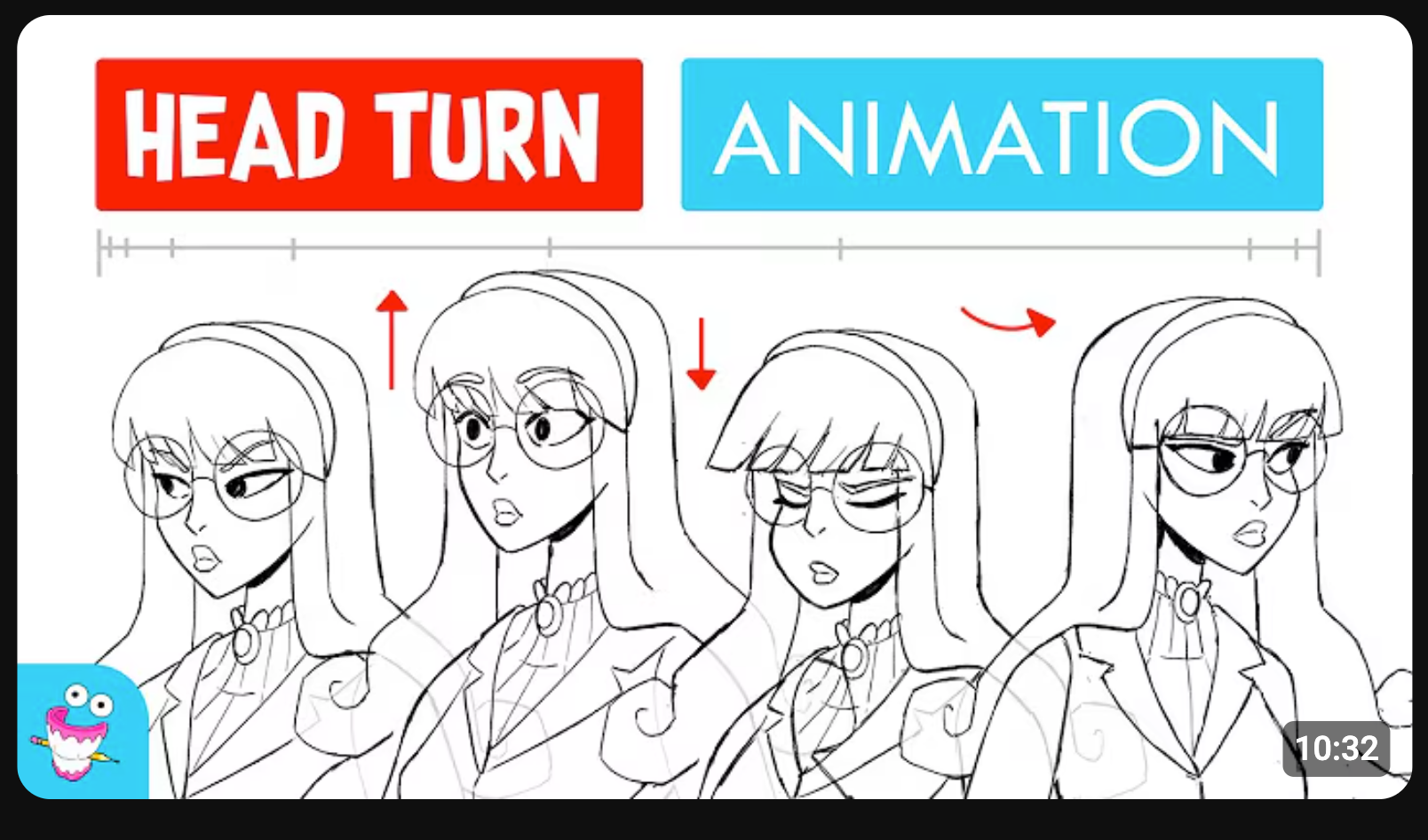
Line up frames showing your character moving from static to full motion. It tells a mini story in one image.
Why does this work? It gives viewers a taste of the animation itself. They see movement, progression, and skill at a glance. It's like a comic strip that hints at action. This format also stands out because many thumbnails are single images, not sequences.
You vs Your Old Art
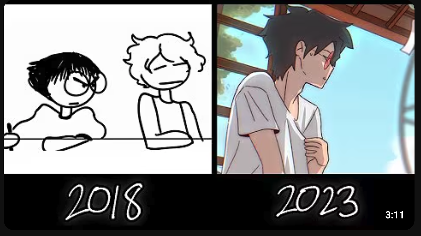
Place your old art next to your current work. Label it clearly: "2015 vs 2025" or "My First Animation vs Now."
Why does this work? People love a glow-up. A dramatic improvement sparks curiosity and respect. Viewers want to see the gap close in real time. It's relatable too, every artist remembers their cringy early work.
Extreme Close-Up Shot
Zoom in tight on the eyes, a facial expression, or a tiny detail in your animation. Fill the entire thumbnail with it.
Why does this work? Close-ups create instant emotional connection. A single tear, a furious glare, or a subtle smirk tells a story without context. It makes viewers feel something before they even click. Details also show off your skill in a way wide shots can't.
Character in Action Pose
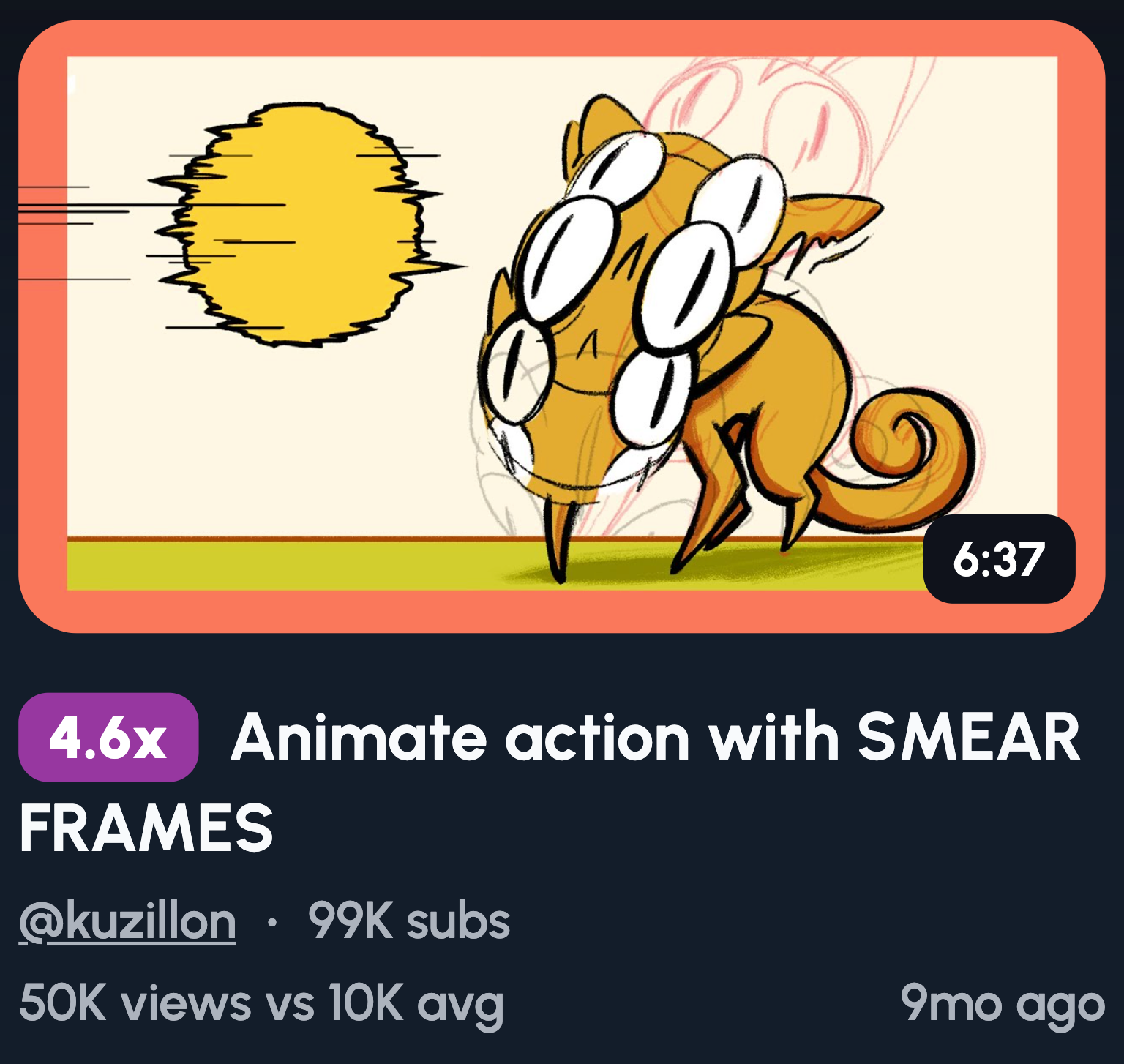
Freeze your character mid-movement with motion blur streaking behind them. Make it look fast, dynamic, and full of energy.
Why does this work? Action poses create tension and excitement. Viewers feel the movement even in a still image. This style works perfectly for tutorials, fight scenes, or anything with high energy. The motion blur adds polish and makes the thumbnail feel alive.
Minimalist Clean Look
Keep characters to a minimum on a plain, solid background. No clutter, no distractions, just your art front and centre.
Why does this work? Simplicity stands out in a sea of busy thumbnails. A clean look feels calm and intentional. It draws the eye straight to your character without competing elements. This style pairs perfectly with storytelling or relaxed, atmospheric videos.
Viral Trend Parody
Recreate a trending meme or viral moment in your own art style. Keep it recognisable but make it yours.
Why does this work? Familiarity breeds clicks. Viewers spot the reference instantly and want to see your spin on it. You're borrowing built-in curiosity from something already popular. It also shows personality and keeps your content feeling current and relevant.
“Fixing Your Animation” Style
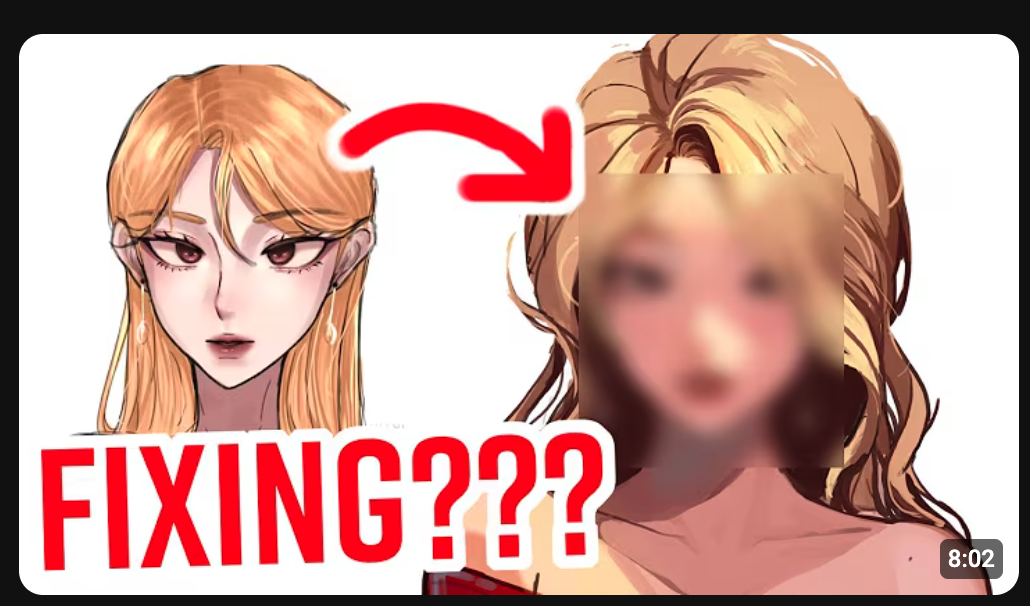
Show a viewer's submitted animation on one side and your improved version on the other. Label it clearly.
Why does this work? It's interactive content with built-in drama. Viewers love seeing transformations, especially when the original is rough. It positions you as an expert while creating a clear before-and-after payoff. This format crushes in art niches because the contrast is so satisfying.
Massive Contrast Colours
Use complementary colour pairs like orange and blue or purple and yellow. Make them bold and let them clash.
Why does this work? High contrast pops off the screen. Your thumbnail fights for attention against thousands of others, and strong colour combos win that fight. Complementary colours create visual tension that's hard to ignore. It's basic colour theory, but it works every single time.
Cartoon Shock Explosion
Add action lines, comic-style boom effects, and exaggerated physics around your character. Make it loud and chaotic.
Why does this work? It screams energy. This style feels native to animation, so it fits your content naturally. The visual chaos grabs attention and hints at exciting, fast-paced action inside. It's the thumbnail equivalent of a firework going off in someone's feed.
POV Shot of Animation Software
Show your screen with a cursor hovering over keyframes or the timeline. Make it look like you're mid-edit.
Why does this work? It promises practical value. Viewers know they're about to learn something useful. This angle works perfectly for tutorials or "how to animate" content. It also feels authentic and behind-the-scenes, which builds trust with your audience.
Animation Breakdown
Add arrows pointing to different parts of a character rig. Include text like "How It REALLY Works" to seal the deal.
Why does this work? It looks educational and valuable. Viewers see a promise of insider knowledge they can't get elsewhere. The arrows guide the eye and make the thumbnail feel structured. This format screams expertise and attracts people hungry to learn.
Animation Challenge
Add a timer overlay like "10 Minutes" and text that reads "Can I Animate THIS?" Make the stakes clear.
Why does this work? Challenges create instant tension. Viewers want to see if you succeed or fail. The time pressure adds drama and makes the content feel fast-paced. It's a proven format that works across YouTube, not just animation.
Over-the-Shoulder Desk Shot
Show your tablet, workspace, and a frame in progress from behind your shoulder. Keep it clean and natural.
Why does this work? It feels personal and authentic. Viewers get a peek into your real setup, which builds trust. This angle works great for tutorials or process videos. It also looks professional without feeling staged or over-produced.
Common thumbnail mistakes animators should avoid
Screenshot and hope. Grabbing a random frame rarely works. Quick fix: plan your thumbnail before you animate.
Too much detail, not enough focus. Cluttered thumbnails confuse the eye. Quick fix: one clear focal point, nothing more.
Tiny text that can't be read on mobile. Most viewers scroll on their phones. Quick fix: use large, bold text and test it at small sizes.
Trying to show the entire story. Your thumbnail isn't a synopsis. Quick fix: tease one moment, not the whole plot.
FAQ: YouTube thumbnails for animators
How important are thumbnails for animation channels really?
Thumbnails are one of the biggest factors in whether someone clicks. YouTube shows your content, but the thumbnail sells the click. A weak thumbnail means wasted impressions, no matter how good your animation is.
Is it better to use my face or just characters in thumbnails?
For most animators, characters work better. Your audience clicked for the animation, not you. Unless you've built a strong personal brand, lead with your characters.
Should I use text on my animation thumbnails?
Text works when it adds context or curiosity. Try to keep it to five words maximum. If your image tells the story, skip it.
Can I reuse the same thumbnail style on multiple videos?
Yes, consistency builds brand recognition. Viewers start spotting your content instantly. Just make sure each thumbnail still feels fresh and specific.