
Thumbnail Ideas for Teachers - Increase Click-Through-Rate
Your videos are helpful. Your students love them. But YouTube? It's giving you the cold shoulder.
You've put hours into lesson plans, explanations, and editing. Yet your click-through rate looks like a failed pop quiz. Meanwhile, some guy reviewing candy is pulling millions of views with a shocked face and bright colors.
Here's the thing: it's not your content. It's your thumbnail.
Teachers face a unique challenge on YouTube. You're competing for attention against entertainment channels that have mastered the art of the scroll-stopping image. Your thumbnail needs to say "I'm credible" and "I'm worth your time" without looking like a textbook cover from 1997.
The good news? You don't need design skills or expensive software. You just need the right formulas.
I'm going to show you thumbnail ideas that work for educators, ones you can replicate again and again.
Stop Doing This Thumbnails
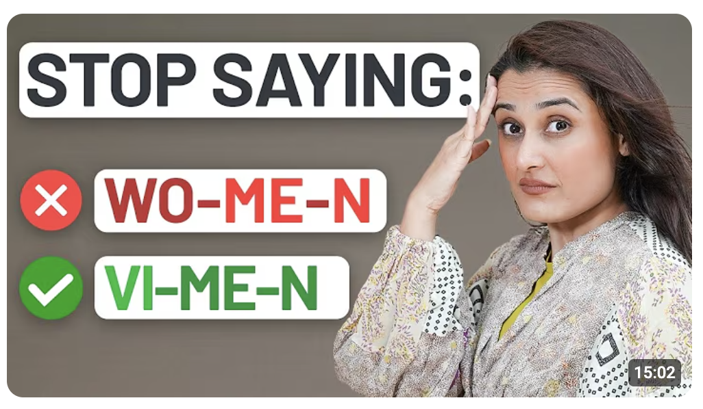
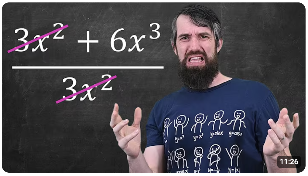
Fear of mistakes is a powerful motivator. When someone sees a "wrong" label on something they thought was right, curiosity kicks in. They need to know if they've been making the same error. It's the same reason people slow down to look at car accidents, except this one actually teaches them something.
These thumbnails work because they challenge assumptions. Nobody wants to feel like they've been doing something wrong for years.
Ideas to try:
- Add a big red cross over a common equation
- Cross out a grammar rule everyone thinks they know
- Add text like "You're doing this WRONG" with your face looking concerned
The visual cue does the heavy lifting. One glance tells viewers exactly what they're getting, a correction they didn't know they needed.
Before vs After Learning Thumbnails
Transformation thumbnails work because the brain processes comparisons instantly.
No reading required. Viewers see two states, before and after, and immediately understand the promise. You're showing them the gap between where they are and where they could be.
This format taps into aspiration. Students stuck in the "before" phase see themselves in that confused face or messy notebook. The "after" gives them hope that clicking will get them there.
Ideas to try:
- Split screen of a confused student on the left, confident one on the right
- Messy, chaotic notes versus a clean, color-coded summary
- A test paper marked "FAIL" transforming into one stamped "PASS"
- Scribbled math problem on one side, neat solution on the other
Keep the contrast obvious. Subtlety doesn't win on YouTube. Make the difference impossible to miss at a glance.
Exam & Revision Thumbnails
Exams trigger stress, and stress triggers clicks. Students searching for revision content are already feeling the pressure. Your thumbnail just needs to match that urgency. When they see exam-related visuals, their brain says "I need this right now."
These thumbnails work because they speak to a deadline. There's no "I'll watch this later" with exams. The emotional stakes are already high, so your thumbnail doesn't need to create urgency. It just needs to reflect it.
Ideas to try:
- Bold text saying "Easy Marks" with an arrow pointing to a specific topic
- A countdown timer next to a stack of notes or flashcards
- One exam question zoomed in with a circle around the tricky part
- A calendar with an exam date circled in red
Lean into the panic. Your thumbnail should feel like a lifeline, not a lecture.
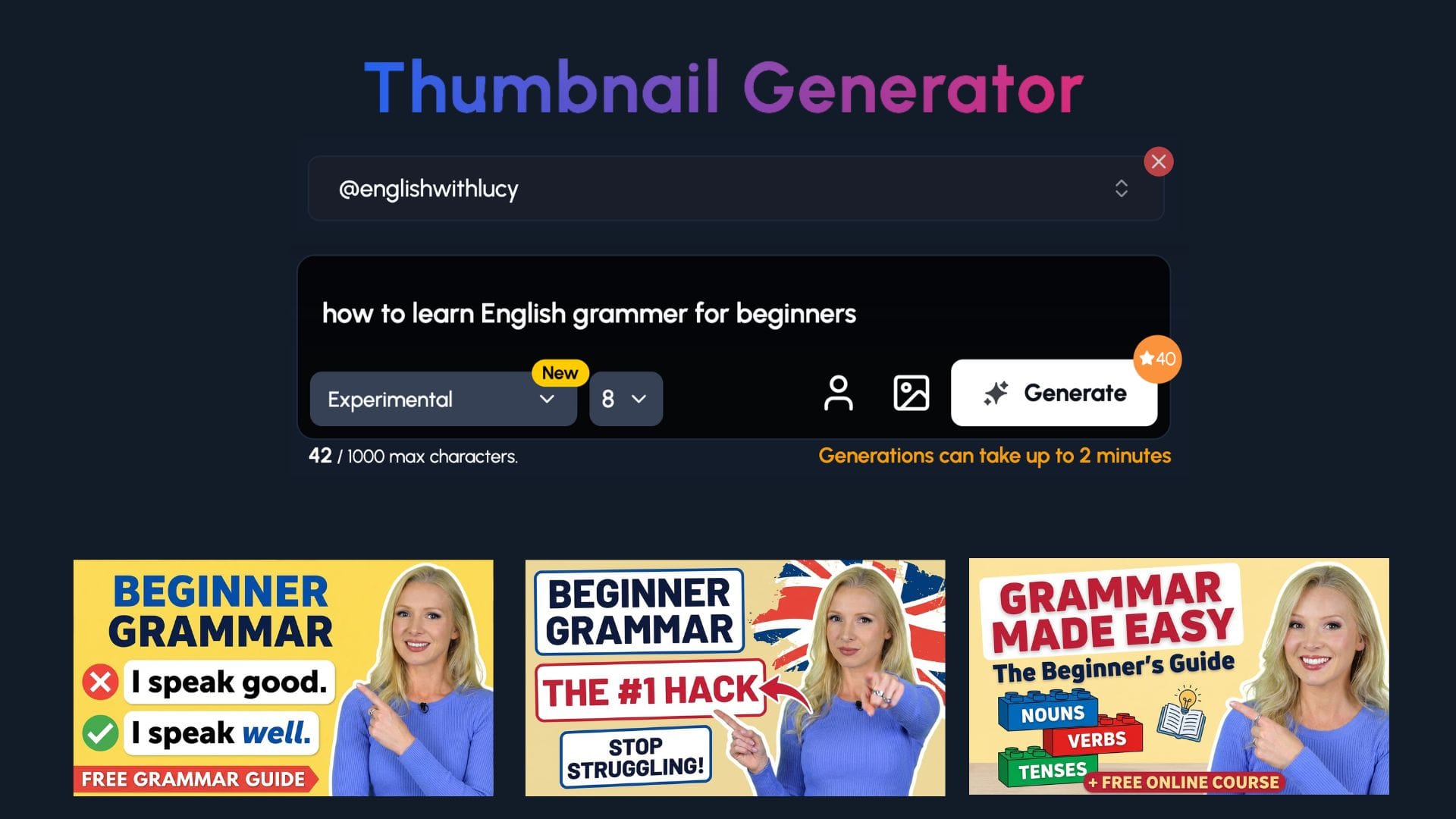
Create Thumbnails for Teachers in 1-Click
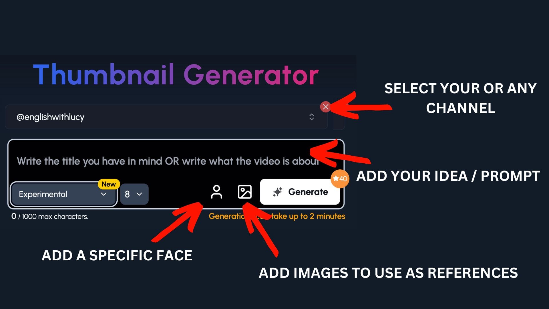
You've got lessons to plan and students to teach. Spending hours on thumbnails isn't realistic.
1of10 makes it simple. It's made for creators who'd rather spend time on their content than wrestling with graphics software.
Step 1: Select your channel or a competitor's channel to help 1of10 get inspiration
Step 2: Decide if you want to upload your specific face or add images to use as a reference - perfect for art channels to upload themselves and their work
Step 3: Write the title or describe your idea
Now watch you ideas come to life.
Common Mistakes & Misconceptions
Nobody wants to be wrong, especially in front of others. That fear is a powerful click driver. When your thumbnail hints that most people get something wrong, viewers need to check if they're one of them. It's like being told there's spinach in your teeth. You have to look.
This format works because it creates a knowledge gap. The viewer thinks they know the answer, but now they're not sure. That doubt is uncomfortable, and clicking is the only way to fix it.
Ideas to try:
- Text saying "Most students miss this" with an arrow pointing to a problem
- A multiple choice question with the wrong answer highlighted
- A big red "MYTH" stamp over a common concept or rule
- Your face looking skeptical next to a "fact" everyone believes
Make viewers question what they think they know. Uncertainty is the hook.
Simplifying Complex Topics
Complexity scares students away. Simplicity pulls them in. When a thumbnail shows a tangled concept made simple, it promises relief. Viewers think "finally, someone who can explain this without making my head hurt." That promise alone is worth the click.
Teachers have an edge here. You know exactly where students get stuck. Your thumbnail can show that you understand their confusion and have the fix.
Ideas to try:
- A messy, complicated diagram on one side, a clean simple version on the other
- One keyword circled in red with everything else faded out
- An arrow pointing at the "missing step" everyone overlooks
- A giant equals sign between a scary equation and an easy explanation
Your thumbnail should feel like a shortcut. Students don't want the long route. Show them you've already cleared the path for them.
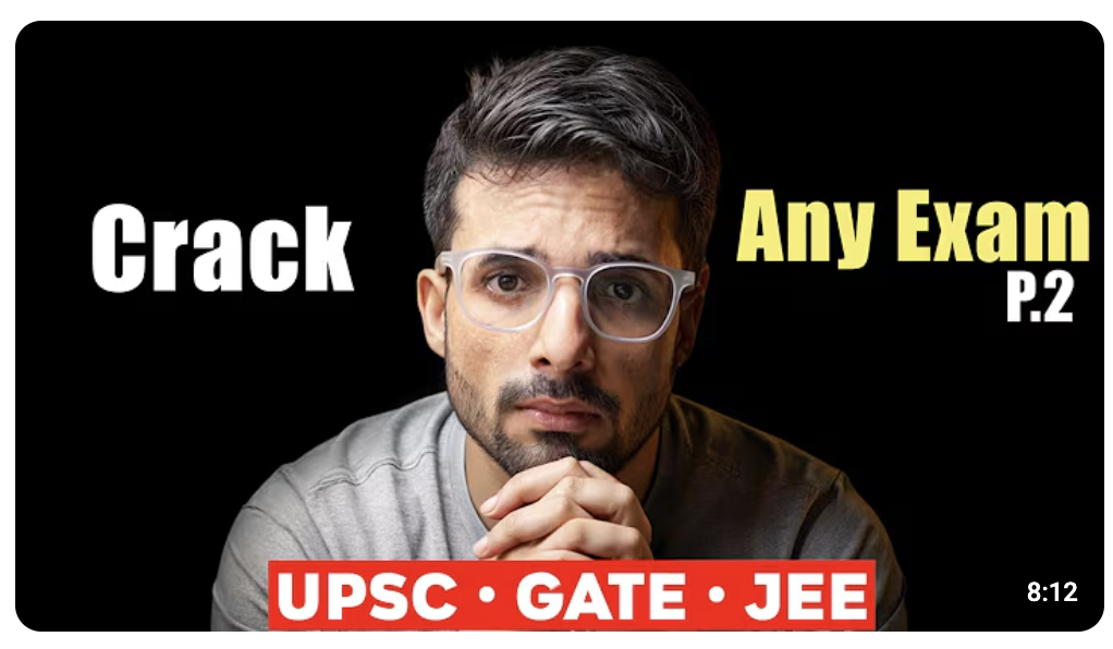
Teacher Reaction Thumbnails
Faces grab attention faster than text or graphics. It's hardwired into our brains. We look at faces before anything else, and expressions tell us how to feel about what we're seeing. A teacher's face on a thumbnail builds instant trust and curiosity.
Here's the key for educators: friendly expressions outperform aggressive ones. You're not a drama channel. Students want to learn from someone approachable, not someone yelling at them through the screen.
Ideas to try:
- A genuinely shocked expression next to a surprising fact or result
- A disappointed look paired with a common mistake
- A calm, confident face with text like "This is actually easy"
- A warm smile next to a topic students usually dread
Your face is your brand. Let it do the selling. Pick expressions that match your teaching style, and students will feel like they already know you before they click.
Subject-Specific Thumbnail Examples
Maths & Science
Numbers and diagrams are your best friends here. Maths and science thumbnails have an advantage, they're visual by nature. Equations, formulas, and diagrams give you built-in content to work with. The trick is making them pop instead of looking like a screenshot from a textbook.
Focus on one element. A thumbnail crammed with an entire equation sheet looks overwhelming. But a single formula with a bold correction? That's clickable.
Ideas to try:
- A common formula with a big red X through it
- A diagram with one label in bold while everything else stays faded
- A beaker or test tube with an unexpected result highlighted
- A graph with an arrow pointing at the part students always misread
Keep it clean. One concept, one visual hook. Let the simplicity do the work.
History & Humanities
History thumbnails need to answer one question: why should I care? Dates and events feel distant to students. Your thumbnail has to bridge that gap. Zoom in on a single moment or fact that feels relevant, and suddenly history isn't just old stuff that happened.
The "why this matters" framing works because it shifts perspective. You're not just teaching what happened. You're showing why it still matters today.
Ideas to try:
- A famous date zoomed in with dramatic text like "Everything changed"
- A historical figure's face next to a modern connection or comparison
- Text asking "Why does this still matter?" with an intriguing image behind it
- A timeline with one event circled and an arrow pointing at it
Make history feel urgent. Students scroll past thumbnails that look like museum exhibits. Give them something that connects the past to their world right now.
Languages & English
Grammar and spelling mistakes make people twitch. Use that to your advantage. A thumbnail with an obvious error highlighted begs to be clicked. Viewers want to confirm they'd spot it themselves, or they're worried they wouldn't.
Language thumbnails work best when they're relatable. Pick errors students actually make, not obscure rules nobody uses. The more common the mistake, the more people will feel personally called out.
Ideas to try:
- A sentence with one word circled in red, like "your" versus "you're"
- A split screen showing correct usage on one side, incorrect on the other
- A famous quote with one word swapped out wrong
Thumbnails Teachers Should Avoid
Good content can't save a bad thumbnail. You might have the best lesson on the internet, but if your thumbnail looks like a PowerPoint slide from 2005, nobody's clicking. Knowing what to avoid is just as important as knowing what works.
The biggest mistake teachers make? Treating thumbnails like lesson summaries. Your thumbnail isn't a syllabus. It's a billboard. One idea, one glance, one click.
What to avoid:
- Paragraphs of text. If viewers need reading glasses to understand your thumbnail, you've lost them.
- Tiny diagrams. That beautiful flowchart you made? It's invisible on a phone screen.
- Multiple ideas in one image. Pick one hook. One. Not three topics squeezed together hoping something sticks.
Think of your thumbnail as a movie poster, not the script. Less is more. If it takes longer than a second to understand, it's too complicated.