
Thumbnail Ideas for Educational Videos - 10X Clicks
You've got great content. Seriously. But your thumbnails look like they belong in a textbook, and YouTube's algorithm doesn't care about your GPA.
Here's the problem. Educational creators often make thumbnails that scream "boring lecture." Meanwhile, some guy reviewing candy is stealing all your potential viewers with a zoomed-in shocked face.
It's frustrating. You don't want to resort to clickbait. You've built credibility, and you're not about to throw it away for a few extra clicks. But you also can't keep getting buried by creators who treat every video like it's the end of the world.
So what actually works for education thumbnails? How do you grab attention without looking like a fraud?
That's exactly what I'm covering here. Real thumbnail ideas that get clicks, build trust, and don't make you cringe when you look at your own channel.
Curiosity-Driven Education Thumbnail Ideas
These work because they create a knowledge gap without killing your credibility. You're teasing insight, not drama.
Here are some ideas to try:
- "Why does THIS happen?"
- A cropped diagram with a missing piece
- "Nobody explains this"
- A blurred keyword with a question mark
- "You were taught this wrong"
The key is making viewers feel like they're missing something valuable. Not tricked into clicking. Point curiosity toward learning, and you'll attract the right audience.
Authority & Expertise Thumbnail Ideas

People click when they trust the teacher. If you look like you know your stuff, viewers will assume you do.
Here are some ideas:
- Confident face looking directly at the camera
- Minimal text like "The real answer"
- An "Exam Tip" or "Pro Method" badge
- Clean, academic-style layout
Forget the exaggerated shocked faces. For education, calm confidence beats drama. You're a trusted source, not a reality TV contestant.
Before vs After Learning Thumbnails
These work because they visually promise progress. Viewers see the transformation and want to experience it themselves.
Try these ideas:
- Confused expression on one side, confident on the other
- Messy notes vs clean notes
- Wrong answer crossed out, correct answer highlighted
- "Before learning X" / "After learning X" split
- Dark to bright color contrast
Make the contrast obvious. Remember, most people scroll on their phones. If the difference isn't clear on a tiny screen, it won't get clicked.
Create Thumbnails for in 1-Click
You've got the ideas. Now you need to actually make them.
Here's the problem, you're an expert in your field, not in Photoshop. And spending hours tweaking fonts and colors takes time away from what you're actually good at, teaching.
That's where 1of10 comes in.
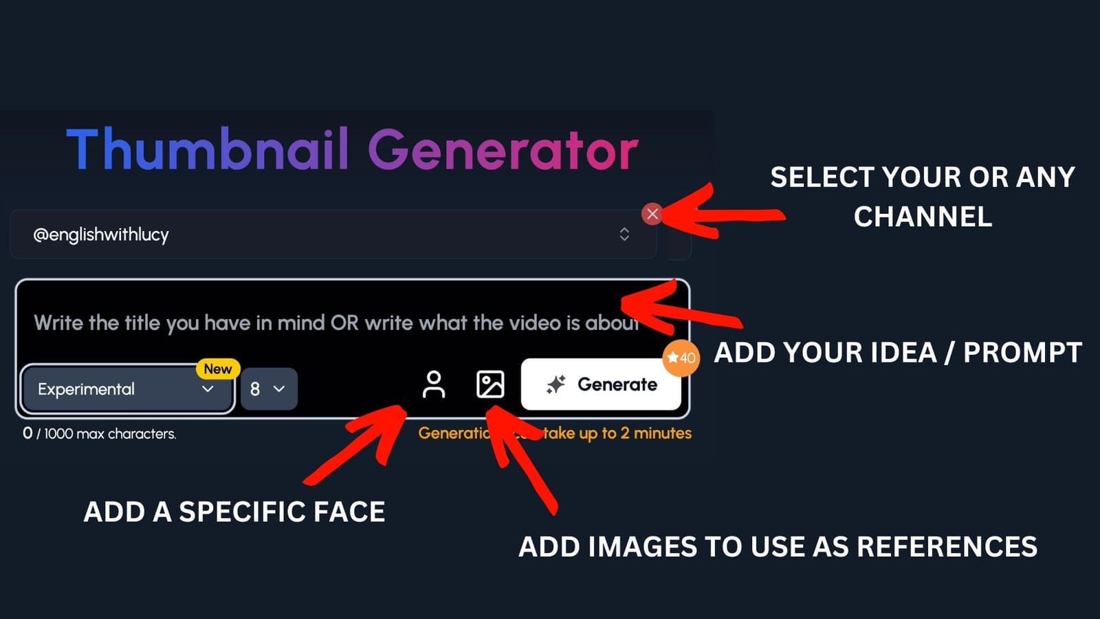
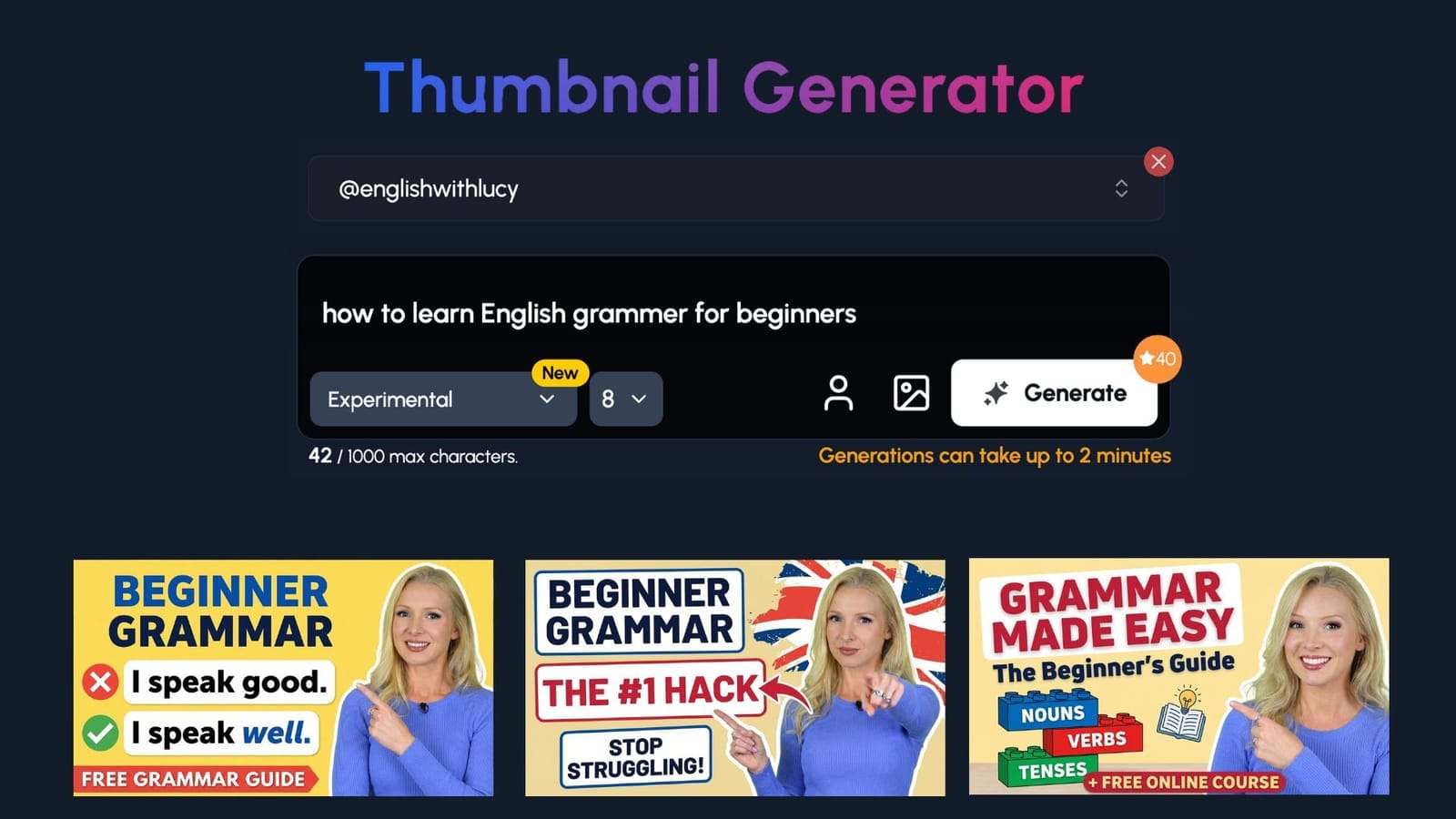
Step 1:
Select your channel or a competitor's channel to help 1of10 get inspiration
Step 2: Decide if you want to upload your specific face or add images to use as a reference - perfect for education channels to upload themselves and their work
Step 3: Write the title or describe your idea
Now watch you ideas come to life.
Simplification & “Explained Simply” Thumbnails

People want learning to feel easy. If your thumbnail looks simple, viewers believe the video will be too.
Here are some ideas:
- "Explained simply"
- "In 5 minutes"
- Complex diagram crossed out
- One icon paired with one word
- "No jargon"
Less is more here. The fewer elements on your thumbnail, the easier it is to process. A cluttered thumbnail signals a complicated video. Keep it clean, and you'll see more clicks.
Mistakes & Misconceptions Thumbnails
People click to avoid being wrong. No one wants to walk around believing something false, so they'll click to check themselves.
Try these ideas:
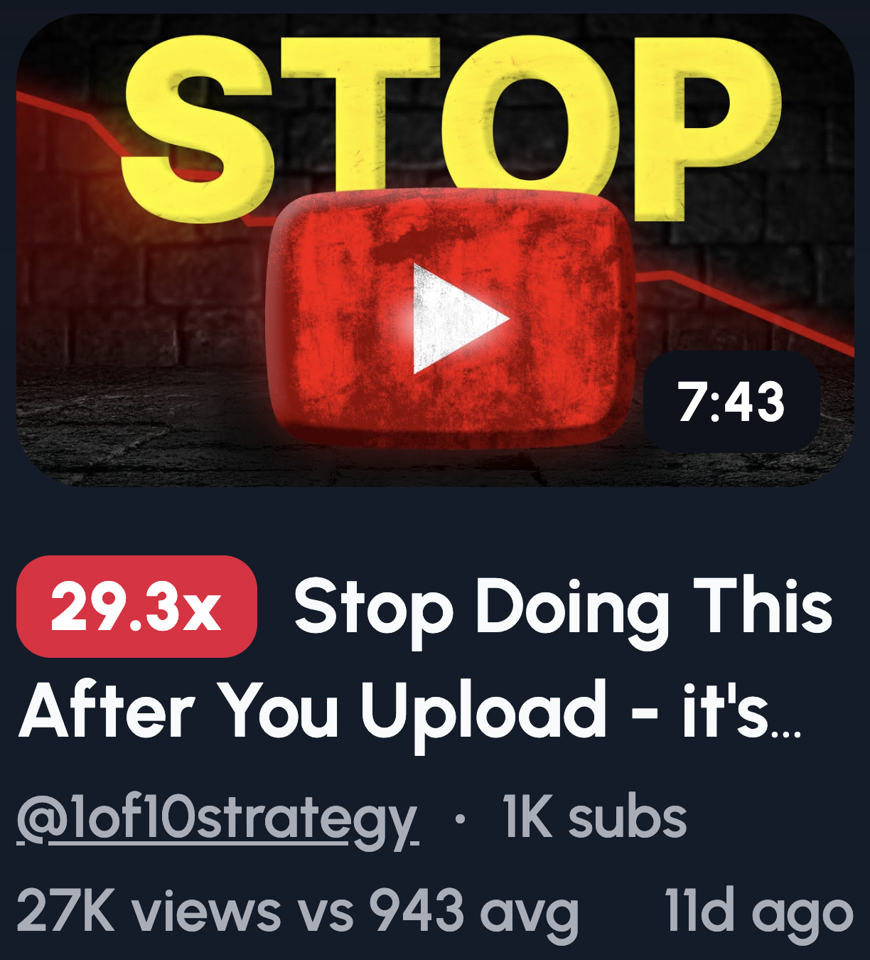
- "STOP doing this"
- Red X over a common belief
- "Most people get this wrong"
- "This ruins your understanding"
- Shocked reaction to an incorrect answer
One important note: attack the mistake, not the learner. You want viewers to feel curious, not stupid. Frame it as "here's what's wrong" rather than "here's why you're dumb."
Step-by-Step & Framework Thumbnails

These work because they promise structure and certainty. Viewers know exactly what they're getting, a clear path from A to B.
Here are some ideas:
- Step 1 → Step 2 → Step 3 layout
- Simple roadmap visual
- Numbered boxes
- "The only framework you need"
- Ladder or progression graphic
Show the steps visually instead of writing them out. A thumbnail with three numbered icons beats a wall of text every time. Keep it scannable, and viewers will trust the video is too.
Visual Examples & Proof Thumbnails
Learners want proof and application. They need to see that your method actually works before they commit to watching.
Try these ideas:
- Worked example circled
- Highlighted solution
- "Real exam question"
- Screenshot with the answer solved
- "Watch this example"
Focus on the result, not the process. Show the finished solution, the correct answer, the end goal. That's what pulls people in. They'll stick around for the "how" once they've seen the "what."
Subtle Reaction Thumbnails (Education-Friendly)
Faces attract attention without hurting credibility. Our brains are wired to look at faces first, so use that to your advantage.
Here are some ideas:
- Raised eyebrow
- Knowing smile
- Thoughtful pose
- "Ohhh" moment expression
- Looking at highlighted text
Ditch the classic YouTube shocked face. You know the one, mouth wide open, eyes bulging. It works for prank channels, not education. A subtle, genuine expression builds trust while still grabbing attention.
Course & Series-Based Thumbnail Ideas
Consistency builds trust and binge viewing. When thumbnails look connected, viewers recognize they're part of something bigger.
Try these ideas:
- Lesson numbers
- Same layout, new topic
- Progress bar
- Course title badge
- Consistent colors across the series
Here's the thing: consistency beats creativity for course content. You want viewers to instantly know this video belongs to a series they're following. A recognizable template does that faster than a flashy one-off design.
Common Thumbnail Mistakes Education Channels Make
Knowing what works is only half the battle. You also need to know what's killing your clicks. Here are the most common mistakes education channels make, and how to fix them.
Too much text
Your thumbnail isn't a title card. If you're cramming full sentences onto it, you've already lost. Most viewers scroll on mobile, which means they've got about one second to process your thumbnail.
Teaching instead of teasing
This is a big one. Your thumbnail's job isn't to explain the video. It's to make people curious enough to click. If you're giving away the answer in the thumbnail, why would anyone watch? Tease the value, don't deliver it upfront.
Low contrast designs
If your thumbnail blends into the background, it's invisible. Dark text on dark backgrounds, muted colors, subtle gradients, they all kill visibility. You're competing against thousands of other videos. High contrast makes you stand out in a crowded feed.
Tiny fonts
If viewers have to squint, they won't. Your text needs to be readable on a phone screen, not just a desktop monitor. Bump up that font size and test it on mobile before publishing.
Overly academic visuals
Charts, graphs, and textbook-style layouts might feel on-brand for education. But they scream "boring lecture" to casual scrollers. Your content can be academic. Your thumbnail shouldn't look like homework.
The fix for all of these? Simplicity. Strip away the clutter, increase the contrast, and remember that your thumbnail is a billboard, not a syllabus.