
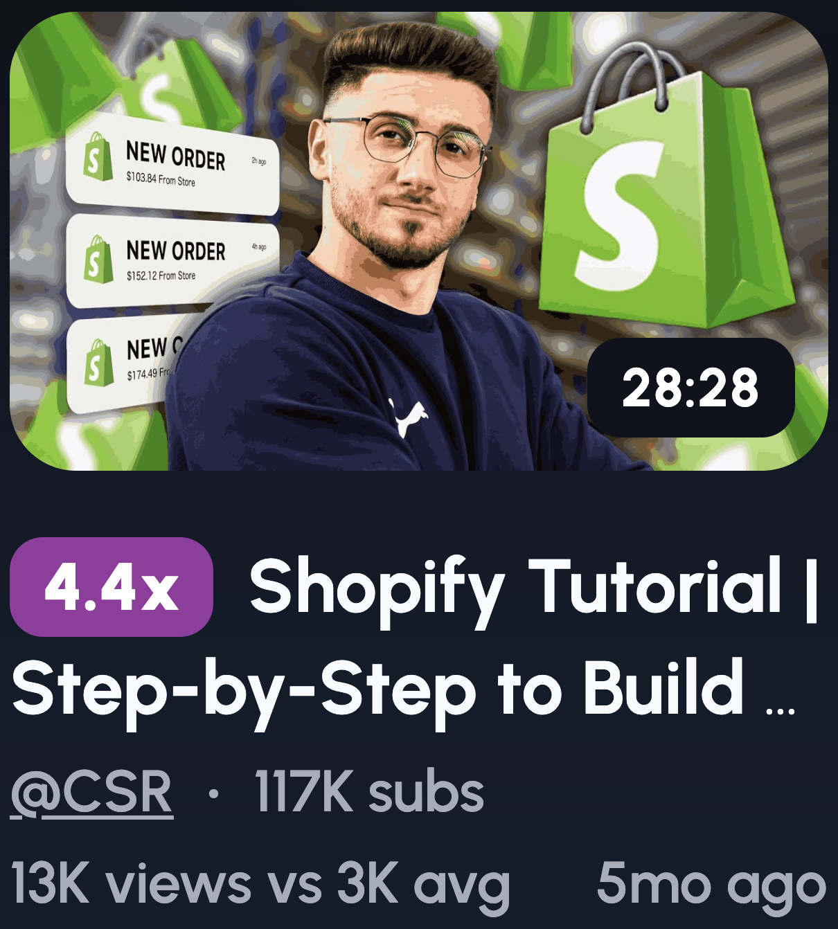
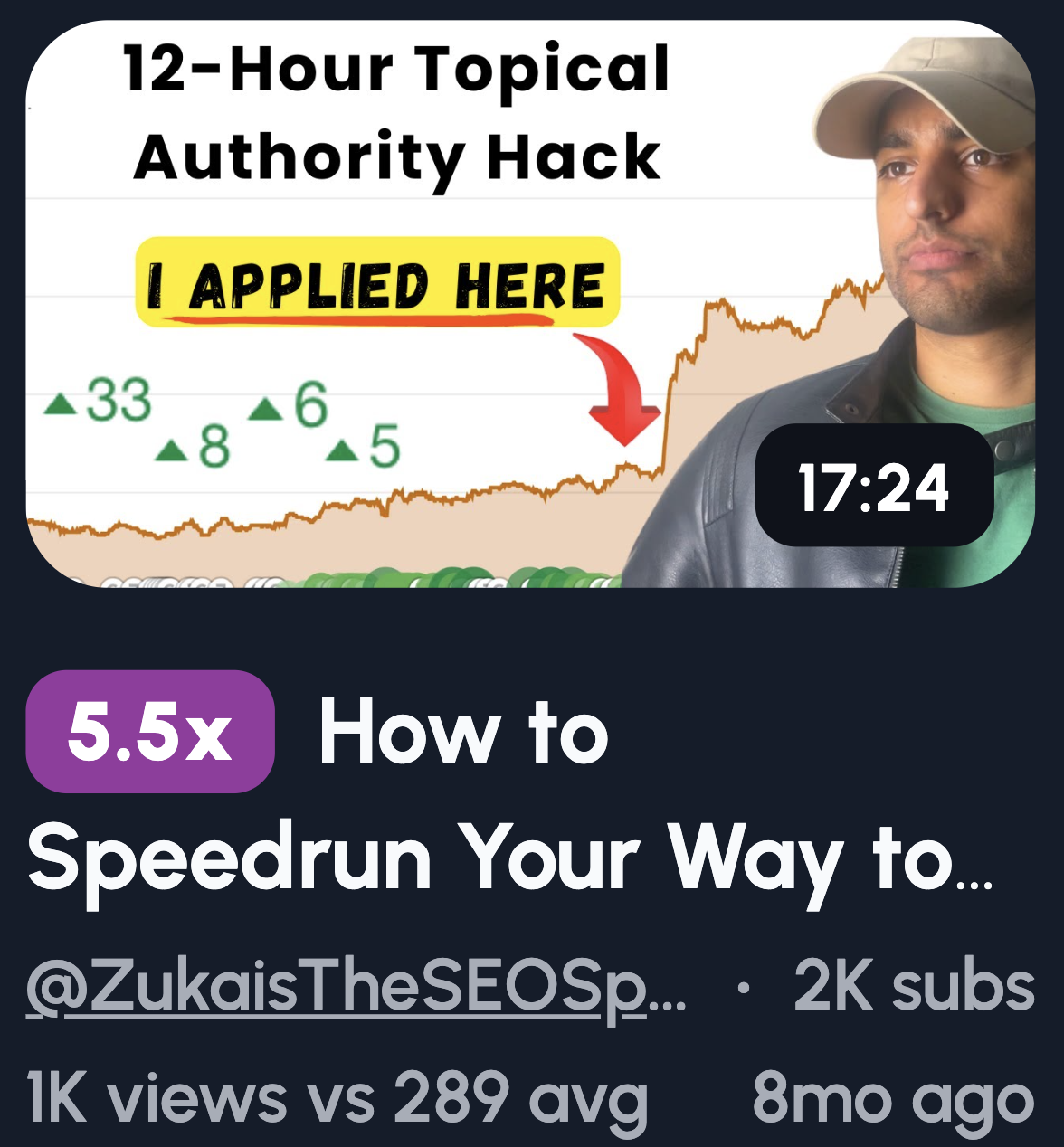
YouTube Thumbnail Ideas for Digital Marketing Channels
You've spent hours on research, scripting, and editing. Then you upload a thumbnail that looks like every other marketing video on YouTube. It blends in. It gets ignored. And your video dies in the algorithm.
Here's the frustrating part. You know thumbnails matter. But you're stuck between two bad options: go full clickbait and look like a scam, or play it safe and get buried.
Big creators with massive audiences can get away with lazy thumbnails. You can't. You need to earn every single click.
The good news? You don't need a design degree or a personal brand with millions of subscribers. You just need the right approach.
Let me show you what actually works.
Problem & Mistake-Based Thumbnail Ideas
People hate making mistakes. It's human nature. Problem-based thumbnails tap into that fear, and that's why they get clicks. Viewers want to know if they're doing something wrong before it costs them time, money, or both.
Here's a few ideas to try:
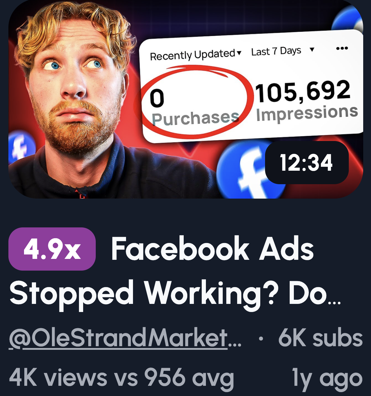
- "STOP Doing This" + crossed-out graph: Instant pattern interrupt. The crossed-out visual screams "you're messing up."
- Website dashboard + red: Red signals danger. Pair it with poor metrics and viewers feel the urgency.
- "Why Your Ads Fail" text: Direct and personal. It calls out the exact pain.
- Broken funnel visual: Marketers live and die by funnels. A broken one hits home.
- Shocked reaction + blurred analytics: Curiosity plus emotion. They'll click to see what went wrong.
Results & Proof Thumbnail Ideas
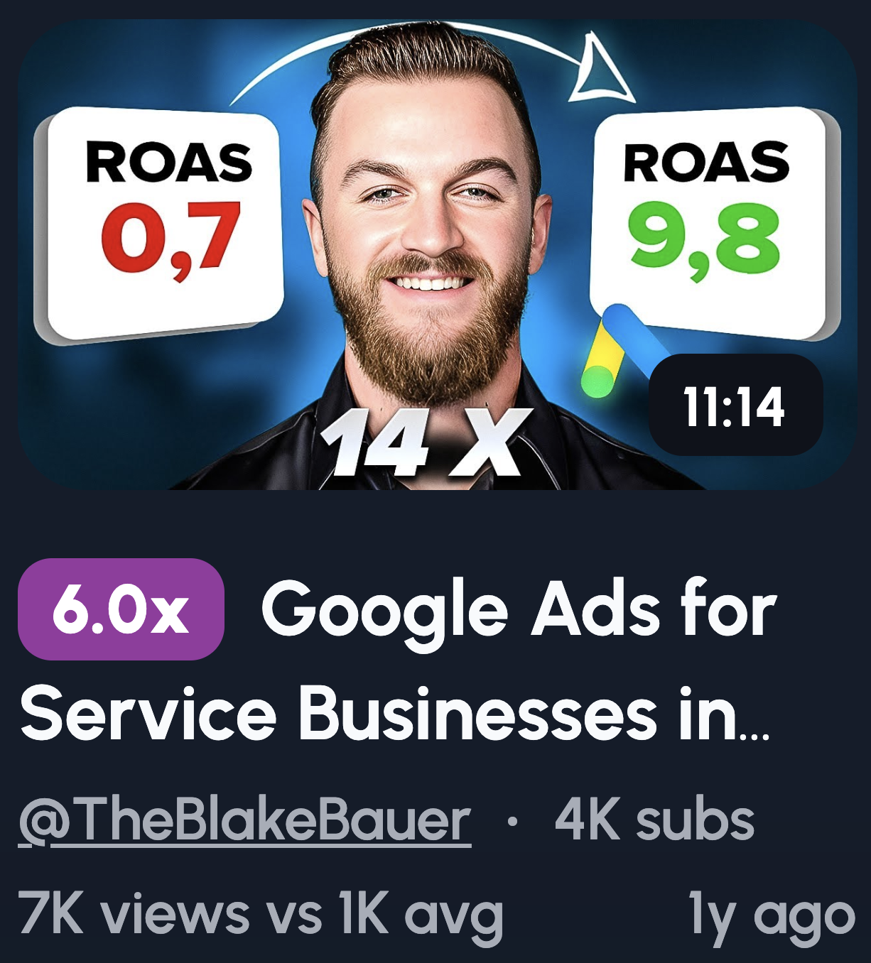
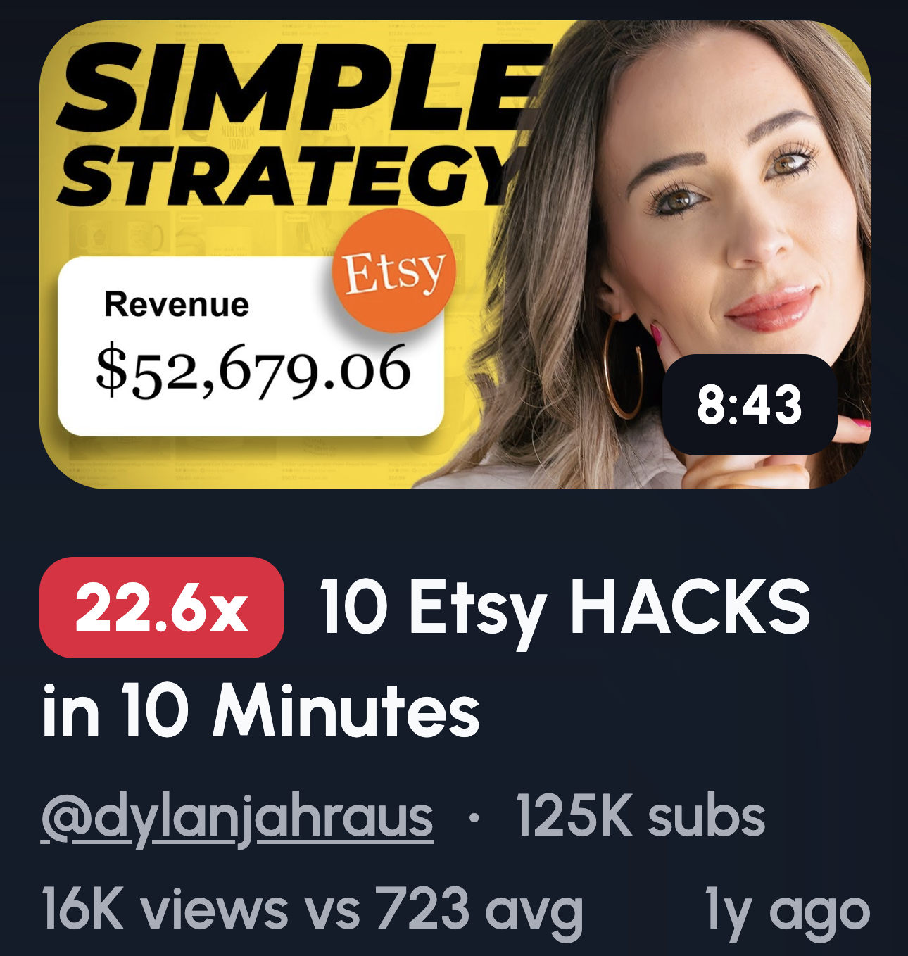
Numbers don't lie. That's why results-based thumbnails work so well. They show proof that something actually worked, and viewers click because they want the same outcome.
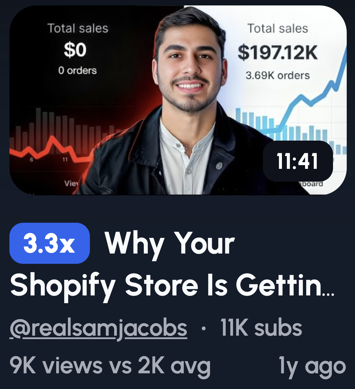
- Traffic graph shooting up: Growth is visual. An upward line tells the whole story in a split second.
- "0 → 100K" number visual: Transformation spelled out. It's specific, believable, and aspirational.
- Revenue screenshot (blurred) + arrow: Real results feel tangible. The blur adds intrigue without looking boastful.
- "+327% CTR" stat: Odd numbers feel more credible. This specificity builds trust.
- Before vs After analytics: Classic format, but it works. Viewers instantly see what's possible.
Curiosity & Pattern-Break Thumbnails

Curiosity is a powerful itch. These thumbnails open a loop in the viewer's brain that they can't close without clicking. It's psychology doing the heavy lifting for you.
- "Nobody Talks About This": Exclusivity sells. Viewers feel like they're about to learn a secret.
- Blurred dashboard + arrow: The blur hides just enough. They have to click to see the full picture.
- "This Shouldn't Work…": Contradiction sparks interest. If it shouldn't work, why does it?
- Question mark over key metric: Unanswered questions are irresistible. The brain craves resolution.
- Hidden setting highlight: Everyone wants the shortcut others missed. This promises exactly that.
Make Digital Marketing Thumbnails in 1-click
Coming up with thumbnail ideas is one part. Actually making them is another headache entirely.
If you're not a designer, you've probably wasted hours wrestling with Canva templates or watching Photoshop tutorials. And even then, the result looks... fine. Not great. Just fine.
That's where 1of10 comes in to save the day.
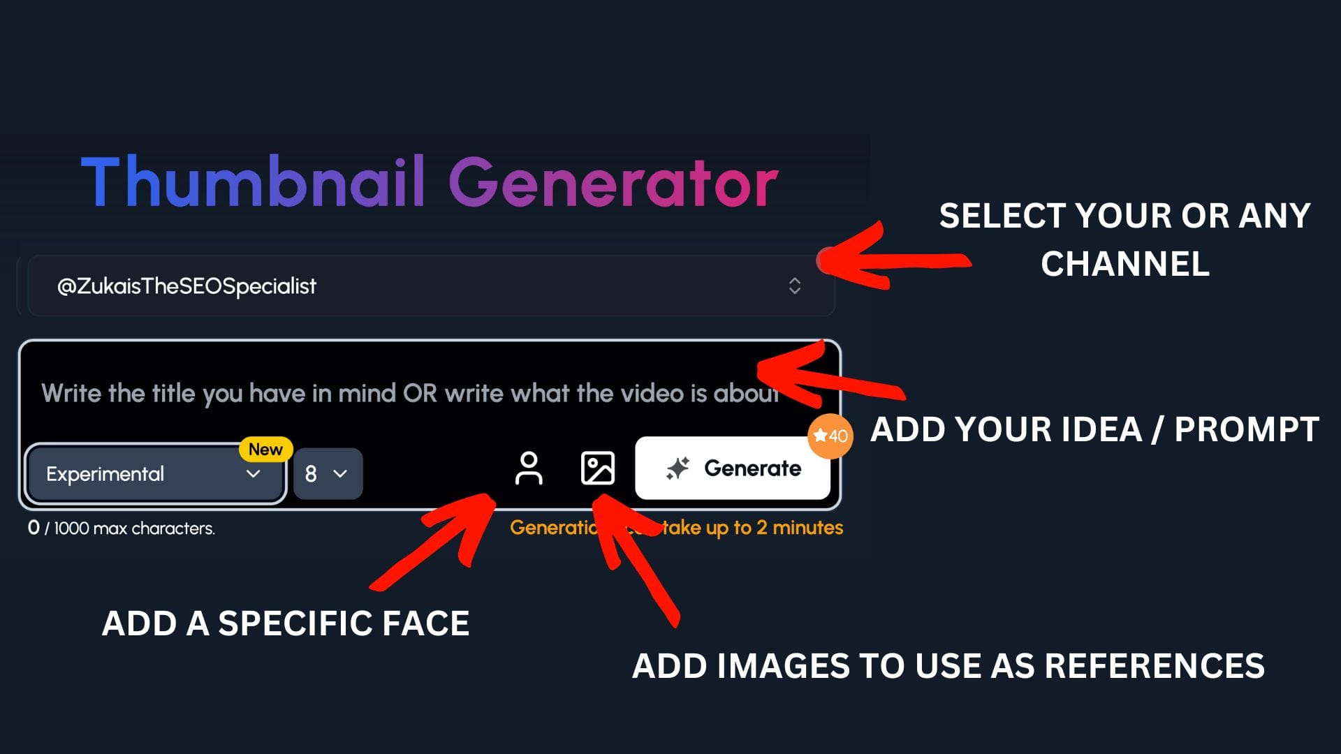
Step 1:
Select your channel or a competitor's channel to help 1of10 get inspiration
Step 2: Decide if you want to upload your specific face or add images to use as a reference - perfect for digital marketing channels to upload themselves and their work
Step 3: Write the title or describe your idea
Now watch you ideas come to life.
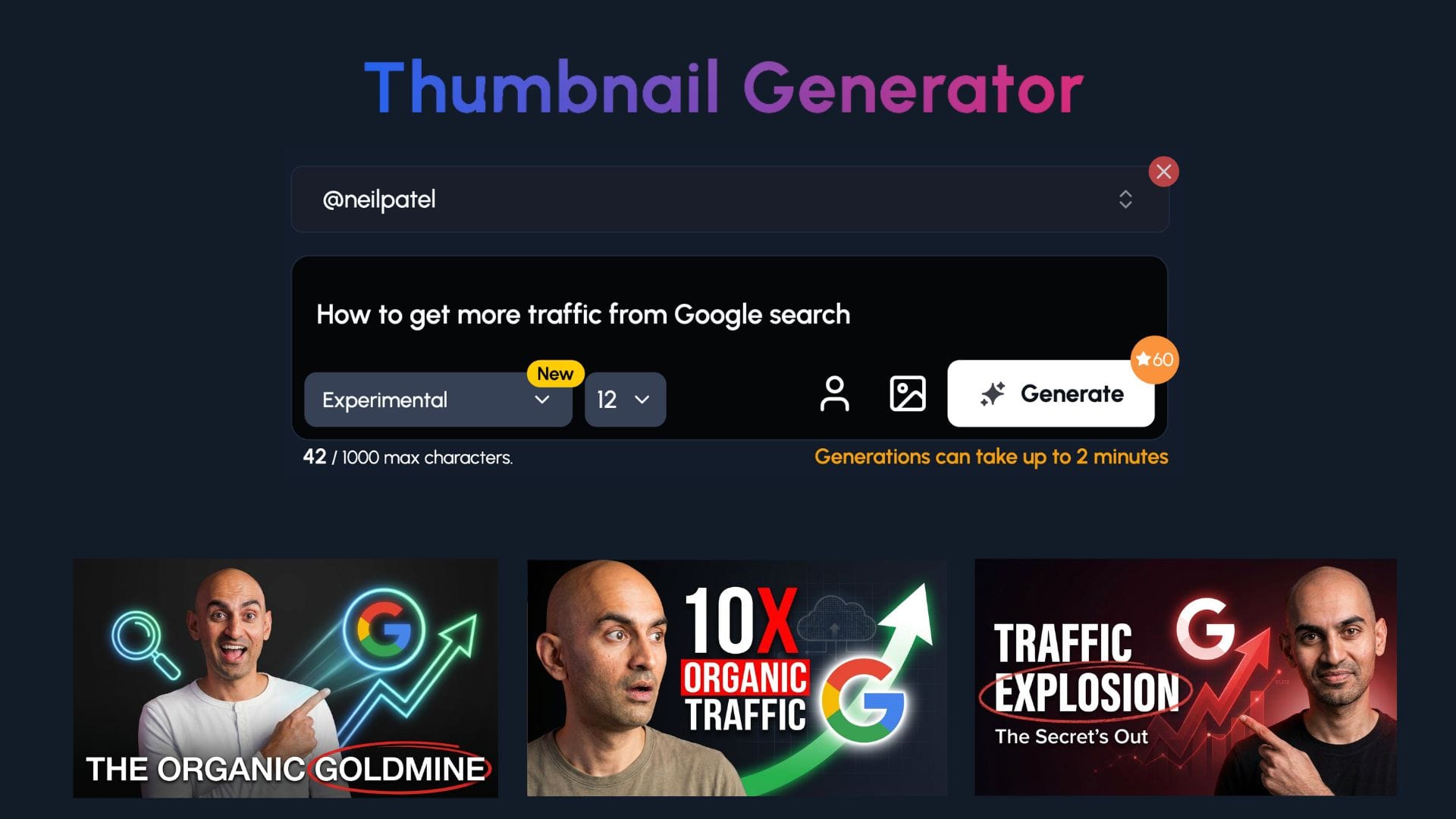
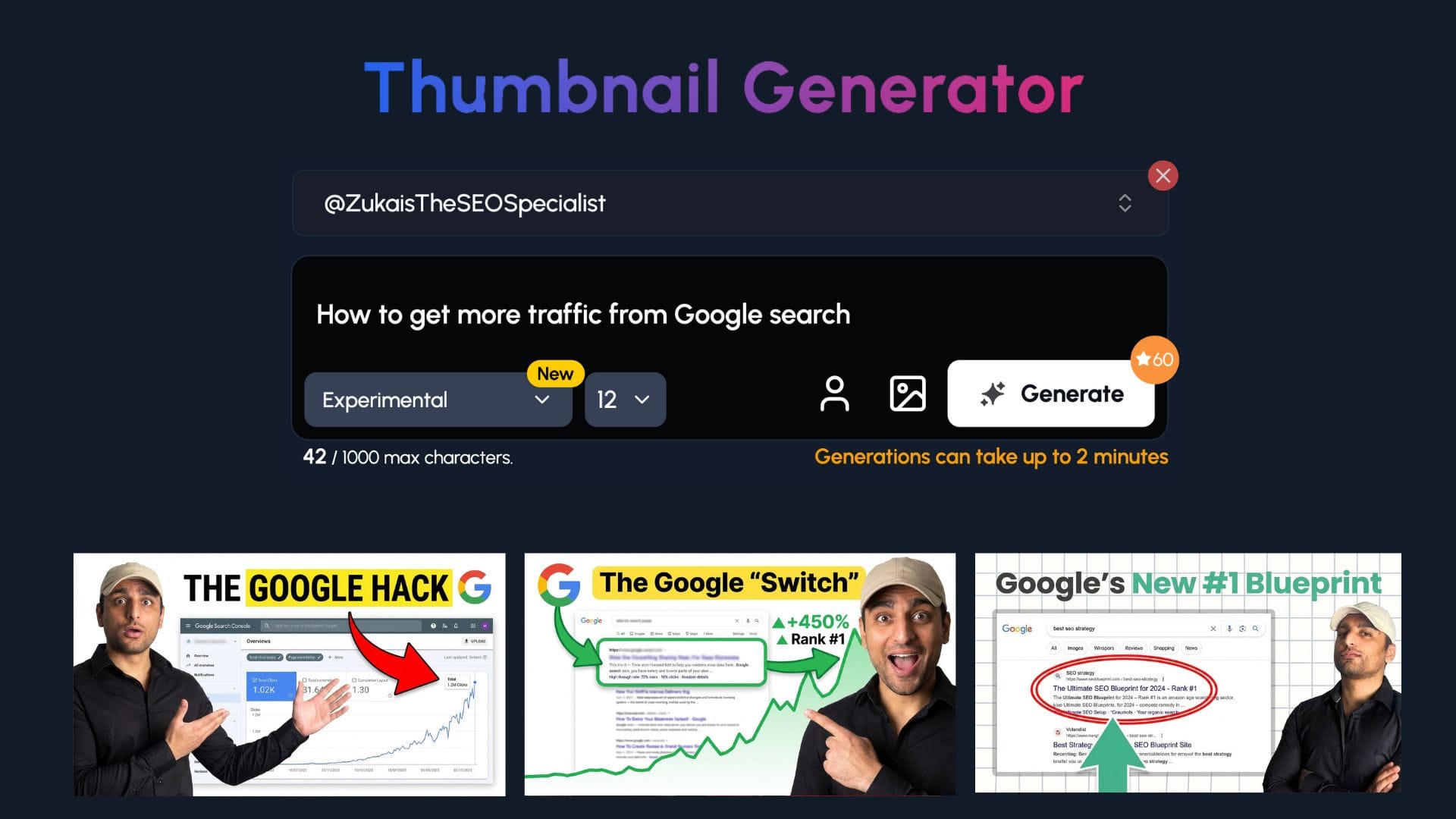
As you can see, 1of10 has taken the style of each channel and generated thumbnails based on their formatting.
You can give the tool as much or as little direction as you'd like.
Authority & Expertise Thumbnail Ideas
People want to learn from someone who knows their stuff. Authority thumbnails build trust before the video even starts. They signal credibility, and credibility gets clicks.
- Confident face + clean background: Simple but effective. A clean look says "I'm a professional, not a gimmick."
- Laptop + analytics dashboard: Shows you're in the trenches. Real tools, real work.
- "8 Years of SEO" badge: Experience speaks louder than promises. A specific number adds weight.
- Whiteboard strategy sketch: Teaching vibes. It positions you as the expert with a plan.
- Minimal face + keyword (SEO / ADS / AI): Less noise, more focus. The keyword tells viewers exactly what they'll learn.
Simple Framework & Process Thumbnails

Confusion kills clicks. Framework thumbnails promise structure and simplicity. Viewers know exactly what they're getting, a clear path from A to B.
- "3 Step SEO Plan": Steps feel manageable. Three is the magic number, not too long, not too short.
- Funnel diagram: Many marketers think in funnels. This visual speaks their language instantly.
- Checklist visual: Checklists promise order. They say "follow this and you'll get results."
- A → B → C arrows: Linear progress is satisfying. It shows a logical journey.
- "Do This First" text: Priority cuts through overwhelm. Viewers want to know where to start.
Comparison & Versus Thumbnail Ideas
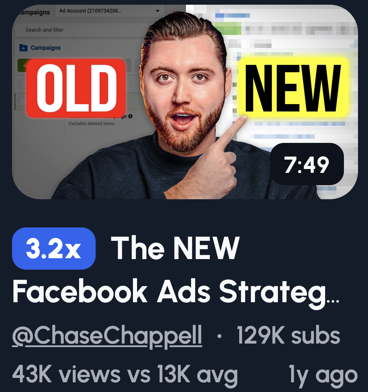
People love a good showdown. Comparison thumbnails force a choice, and that tension drives clicks. Viewers want to know which side wins before they pick one.
- SEO vs Ads: The eternal debate. Marketers have strong opinions, so they'll click to validate theirs.
- Old Strategy vs New Strategy: Nobody wants to be left behind. This creates urgency to stay current.
- Tool A vs Tool B: Buying decisions are stressful. Viewers click hoping you'll make the choice easier.
- AI vs Human: Timely and polarizing. Everyone's wondering where they stand.
- Free vs Paid traffic: Budget matters. This speaks directly to creators watching their spend.
Tool & Tactic-Focused Thumbnails

Everyone wants a shortcut. Tool-focused thumbnails promise exactly that. They say "use this and get results faster," and that's hard to scroll past.
- Dashboard zoom-in: Specificity builds trust. A close-up shows you're about to reveal something useful.
- Tool logo + "Use It Like This": Familiar logos grab attention. The text promises a practical takeaway.
- Highlighted setting: Hidden features feel like gold. Viewers click to make sure they're not missing out.
- Keyword list screenshot: Data is persuasive. A real screenshot looks like proof, not fluff.
- "Free Tool" badge: Free is magnetic. It removes the risk and makes clicking a no-brainer.
Minimal Thumbnail Ideas
Clutter kills thumbnails. Minimal designs cut through the noise because they're easy to process. Viewers scroll fast, so less is often more.
- Couple word only: "CTR" / "LEADS": One word, zero confusion. It hits the pain point instantly.
- Face + single emotion: Emotion is universal. A clear expression connects faster than any text.
- One arrow + one object: Simple visuals guide the eye. No guessing what the video's about.
- Black background + bold text: High contrast demands attention. It stands out in a sea of busy thumbnails.
- No screenshots: Clean beats cluttered. Sometimes removing elements makes the message stronger.
Reaction & Emotion-Based Thumbnail Ideas
Emotion beats logic often. We're wired to read faces before anything else. A strong reaction creates instant curiosity and tells viewers something important happened.
- Shocked face + blurred analytics dashboard: Surprise is contagious. Viewers want to know what caused that reaction.
- Confident smirk + "I Told You" text: Smugness sparks curiosity. They'll click to see if you were right.
- Frustrated expression + red down arrow: Relatable pain. Viewers who've felt this will want the solution.
- Relieved face + green upward graph: Relief signals a win. It promises a happy ending worth watching.
- Eyebrows raised + question mark over metric: Subtle intrigue. The raised brows say "wait, what?"
One quick tip: exaggerated expressions outperform subtle ones. Keep the face large and readable on mobile.
“One Insight” or “Hidden Lever” Thumbnail Ideas
Digital marketers are drowning in information. A thumbnail that promises one powerful insight feels like a lifeline. One thing to focus on is easier to digest than ten.
- One circled metric + "THIS" text: The circle draws the eye. "THIS" says everything you need is right here.
- Single toggle or setting highlighted: Hidden settings feel like cheat codes. Viewers click to grab the advantage.
- "1 Change" text on a plain background: Simplicity sells. One change feels doable, not overwhelming.
- Arrow pointing to a tiny overlooked detail: Small details feel like secrets. The arrow says "you missed this."
- Minimal design with only one focal point: One focus point means zero confusion. The message lands instantly.
Keep it clean. Extra text or elements dilute the single-lever promise.
Common Thumbnail Mistakes Digital Marketers Make
Even great content dies with a bad thumbnail. These mistakes tank your CTR and leave your videos buried. Here's what to avoid.
Too Much Text
Your thumbnail isn't a billboard. Cramming in five lines of text makes it unreadable, especially on mobile. Viewers scroll fast. If they can't understand your thumbnail in half a second, they're gone.
Screenshots Without Context
A raw screenshot of Google Analytics means nothing to a stranger. It's just a blob of numbers and lines. Without a visual cue like an arrow or circle, viewers don't know what they're supposed to look at. Context turns confusion into curiosity.
Over-Branding
Nobody cares about your logo. At least not yet. Slapping your brand name or watermark on every thumbnail eats up valuable space. That space should be selling the click, not your ego. Save branding for your channel banner.
Trying to Look "Professional" Instead of Clickable
Here's a trap marketers fall into. They want to look polished and credible, so they create clean, corporate-looking thumbnails. The problem? Those blend into the background. YouTube isn't LinkedIn. Attention beats aesthetics every time.
Explaining the Whole Video in the Thumbnail
Your thumbnail isn't a summary. It's a teaser. If you give away everything upfront, there's no reason to click. The goal is to spark curiosity, not satisfy it. Leave a gap that only the video can fill.