
Find DATA BACKED Podcast Thumbnail Ideas
I get it. You're a podcast host, not a graphic designer. You've got enough on your plate without learning Photoshop or spending hours second-guessing font choices. But here's the thing: your thumbnail is the first impression. It's the bouncer at the club. It decides who gets in and who walks past.
The good news? You don't need a design degree to create scroll-stopping thumbnails. You just need a system. And that's exactly what I'm about to show you.
I’ll also show you a tool that will create your click-magnet thumbnails in moments.
Let's turn those boring thumbnails into click magnets.
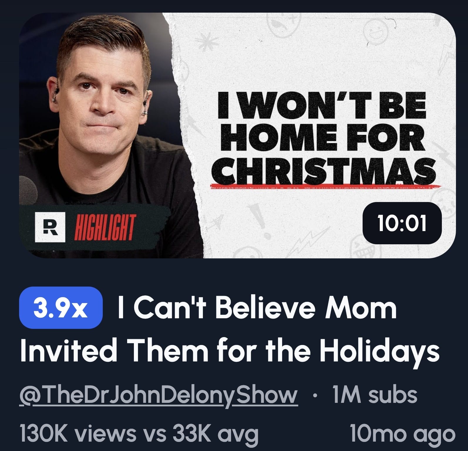
1. Big Expressive Face + Shocked Reaction
A close-up face showing genuine shock or surprise triggers an instant emotional response in viewers. Our brains are hardwired to read facial expressions, and when we see someone reacting strongly to something, we instinctively want to know what caused it. This creates curiosity that's almost impossible to ignore, making viewers click to find out what's happening.
It's psychology, plain and simple.
When someone scrolls through YouTube, they're bombarded with dozens of thumbnails. Most blur together. But a human face, especially one showing raw emotion? That stops the scroll.
Here's how to nail this style:
Get uncomfortably close. I'm talking crop-the-forehead close. Fill that thumbnail with your guest's face. Their expression should be so big it practically jumps off the screen.
Pick one strong emotion. Shock works brilliantly, but so does excitement, disbelief, or even concern. Whatever you choose, make it genuine. Fake expressions look fake, and viewers can smell it from a mile away.
Keep your background bold but simple. A solid color or subtle gradient works best. You want the face to be the star, not competing with a busy background.
Add short text if needed. Three to five words max.
The key is authenticity. Catch your guest mid-reaction during recording. Those unscripted moments of genuine surprise? That's your gold.
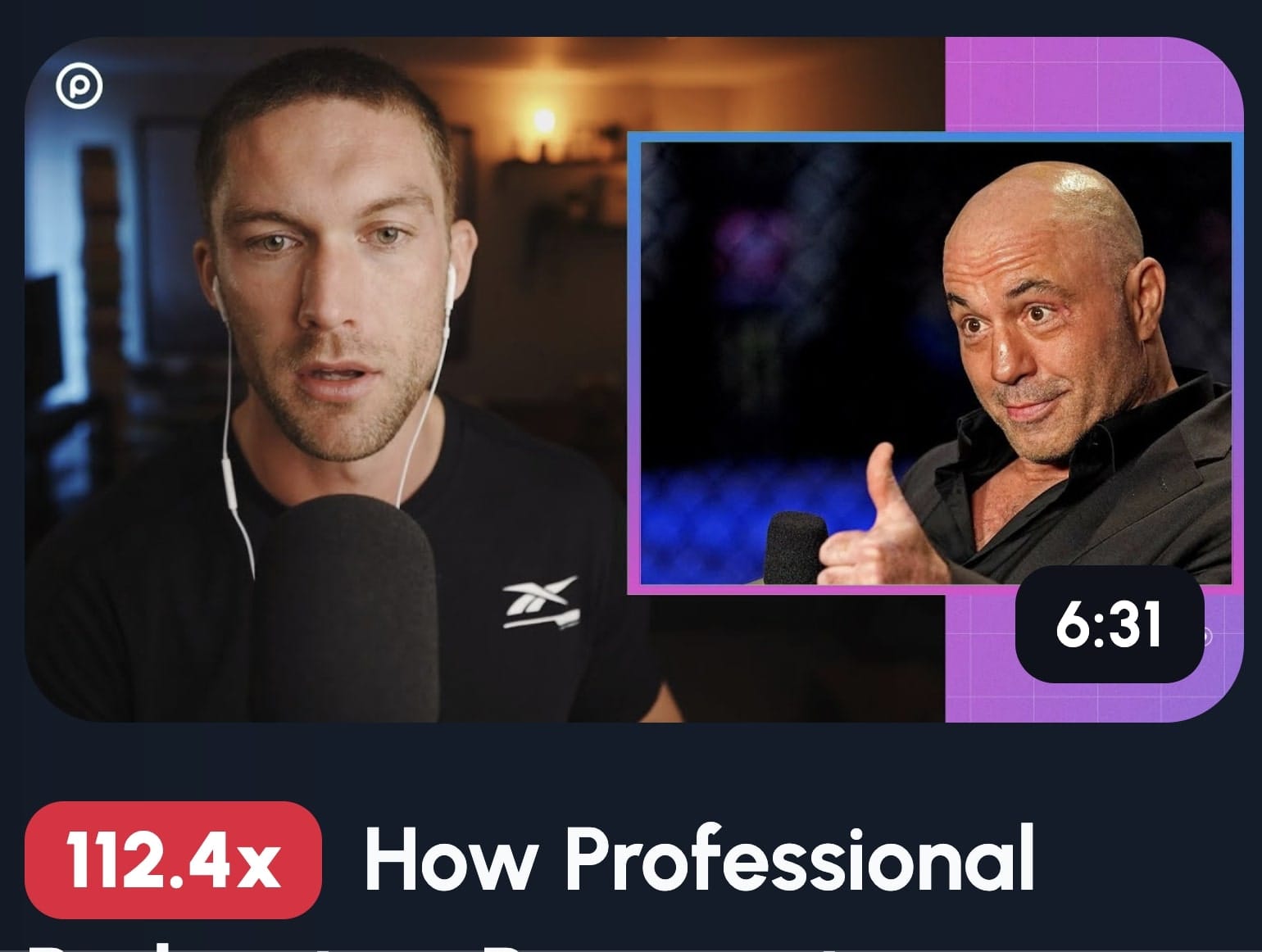
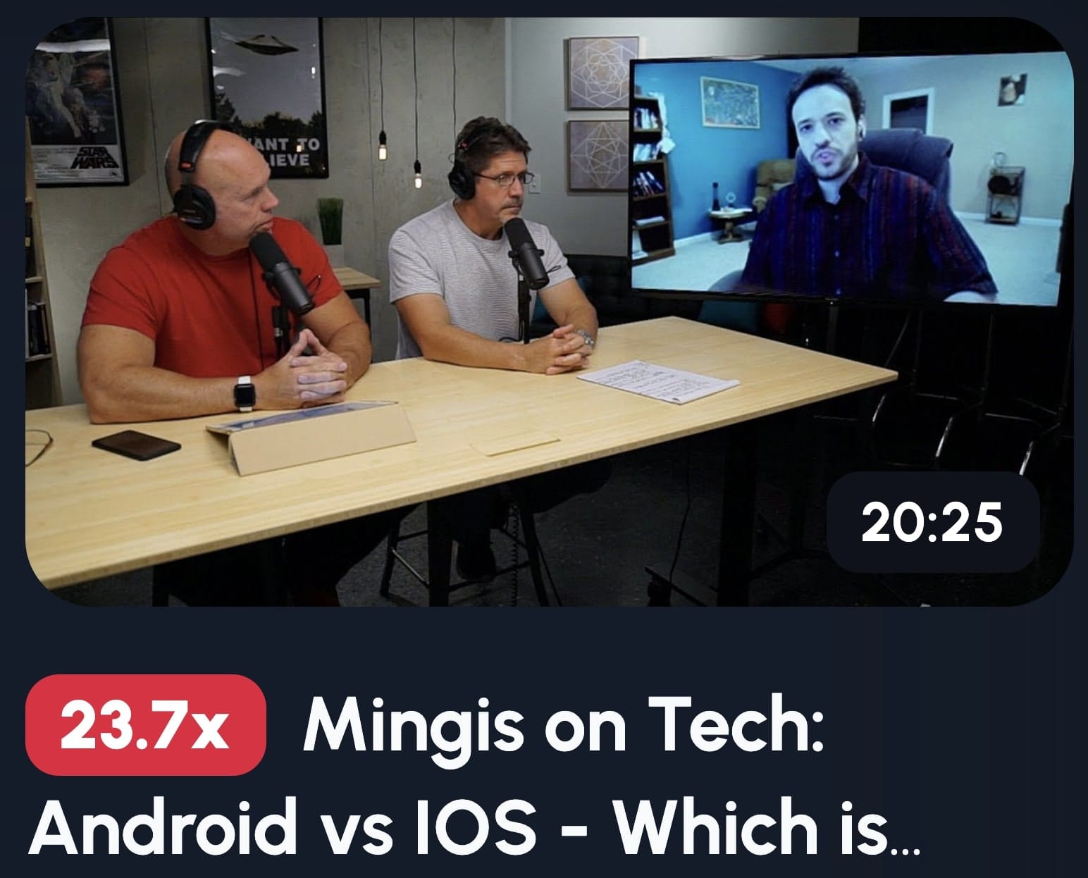
2. Host & Guest Conversation Shot
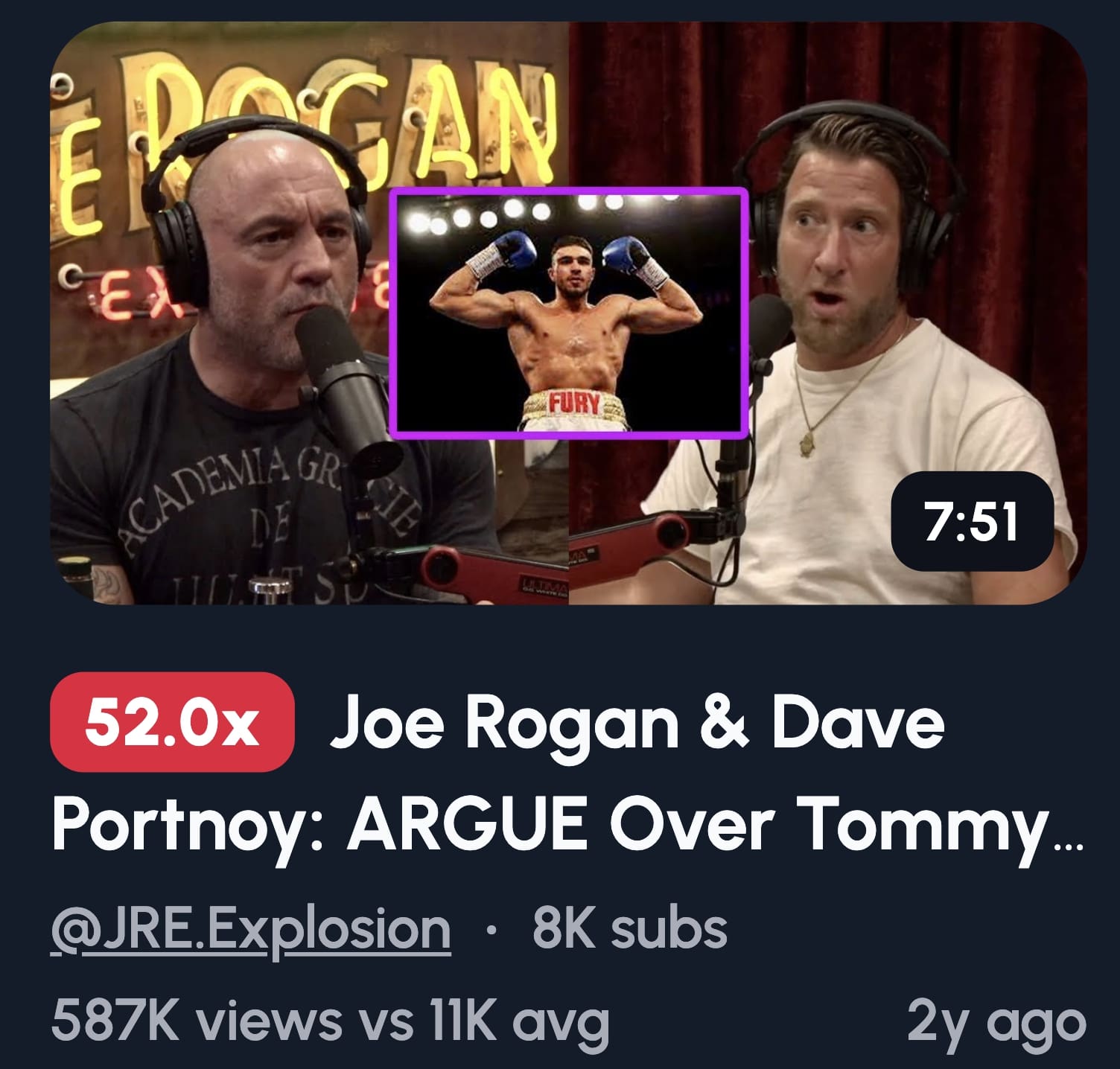
Showing two people in a thumbnail immediately signals "conversation" to viewers, which is exactly what podcasts are about. This format builds trust because it shows authenticity, there's a real discussion happening between real people. It also differentiates your content from solo talking-head videos, making it clear viewers are getting multiple perspectives and dynamic interaction.
This thumbnail style works because it mirrors what people expect from podcasts: dialogue, not monologue.
Here's how to set it up:
Position both people facing each other, not the camera. This creates a natural, candid feel. You want viewers feeling like they're eavesdropping on something interesting.
Lighting matters more than you think. Both faces need to be clearly visible. No shadows hiding half your guest's face. Invest in basic ring lights.
When should you use this? Interviews, guest series, or debate episodes. Basically, anytime the conversation itself is the draw. If your guest has name recognition, this format lets you show them off while keeping your branding consistent.
3. Before vs After (Problem vs Solution Split)
Contrast imagery works because our brains are built to spot differences instantly. When you show a clear before and after split, viewers immediately understand there's a transformation story, and they want to know how it happened. This format taps into curiosity and the desire for improvement, making it one of the highest-performing thumbnail styles for engagement.
Transformation sells. Always has, always will.
Here's how to build it:
Split your thumbnail down the middle. The left side shows the problem, the right side shows the solution. Make the contrast obvious, you want viewers to see the difference in half a second.
Use clear labels. Numbers work beautifully here: "$0 to $100K" or "10 subs to 100K subs." Keep it simple and scannable.
Color coding helps too. Dull, dark colors for the "before" side. Bright, vibrant colors for the "after."
This format works brilliantly for success stories, growth journeys, or any episode where someone overcame something significant. The transformation is the hook. Show it clearly, and people will click to hear the story behind it.
4. Host in Action (Studio or Mic Shot)
Showing yourself in your actual recording environment builds authenticity and brand recognition. Viewers see you at the mic or in your studio setup and immediately think "real podcast, real content." This consistency helps people recognize your videos instantly as they scroll, which is crucial for building a loyal audience that clicks without hesitation.
Authenticity beats polish every single time.
This thumbnail style says "I'm here, doing the work, having real conversations." It's personal. It's genuine. And in a sea of clickbait, that matters.
Here's how to nail the shot:
Position yourself at an angle, not straight-on. Side profiles or three-quarter angles look more dynamic than staring directly at the camera. You want "caught in the moment," not "school photo day."
Light your face properly. Soft, even lighting works best. No harsh shadows that make you look like you're recording in a cave.
Show your mic prominently. It's a visual cue that screams "podcast." Bonus points if your branding or logo is visible in the background.
7. Mystery or Curiosity Hook
Curiosity creates psychological tension that our brains desperately want to resolve. When you tease something without revealing it, you create an information gap that viewers feel compelled to fill. This drives clicks because people can't resist finding out what they're missing, it's the same reason cliffhangers work in TV shows.
But here's the catch: curiosity without payoff is just clickbait.
Here's how to build curiosity the right way:
Use a blurred object or face. Show just enough to make people wonder, but not enough to satisfy their curiosity. The blur itself becomes a question mark.
Add teaser text carefully. "You won't believe..." can work, but it's overused. Try "Wait until you hear..." or "Nobody talks about..." instead. Make it feel personal, not generic.
The warning is real: if your episode doesn't answer the question or reveal the mystery early enough, viewers will click away. You'll get the initial click, but your watch time will tank.
The Psychology Behind Clickable Podcast Thumbnails
Your brain makes decisions in milliseconds. That's all the time your thumbnail gets.
Faces trigger instant responses
Humans are obsessed with faces. When you see someone shocked, your brain mirrors that emotion. It's called emotional contagion, and it's involuntary. Eye contact creates connection, your brain interprets it as someone trying to tell you something important.
Colors aren't just pretty
Red creates urgency. Blue signals credibility. Yellow screams optimism.
Curiosity drives everything
Your brain hates information gaps. "Why I Quit My Job" is informative but flat. "I Walked Out, Here's What Happened" creates tension your brain needs to resolve.
That's the difference between thumbnails people see and thumbnails people click.
How to Tell a Story Through a Thumbnail
Great thumbnails aren't random. They're mini movie posters that tell a story in a single frame.
You've got half a second to communicate what your episode is about AND make someone care. That's not enough time for paragraphs. You need visual shorthand that hits instantly.
Split screen screams transformation
Before and after isn't just showing two states. It's telling the story of change. Left side: struggle. Right side: success. Your brain fills in the journey automatically.
A microphone in two halves signals debate
Split a mic down the middle with two different colors or two people on either side. You're showing conflict. The visual tension mirrors the conversational tension.
A person pointing creates revelation
Someone pointing at the camera or text says "pay attention to THIS." It signals a secret being shared, something important being revealed.
Describe emotion visually, not literally
Don't write "This Changed Everything" next to a neutral face. Show the change. Conflict? Opposing body language. Surprise? Hands on face, eyes wide. Curiosity? Blur something, use shadows.
The thumbnail should communicate the emotional journey, not just the topic.
Creating a Podcast Worthy Thumbnail in 1 Click
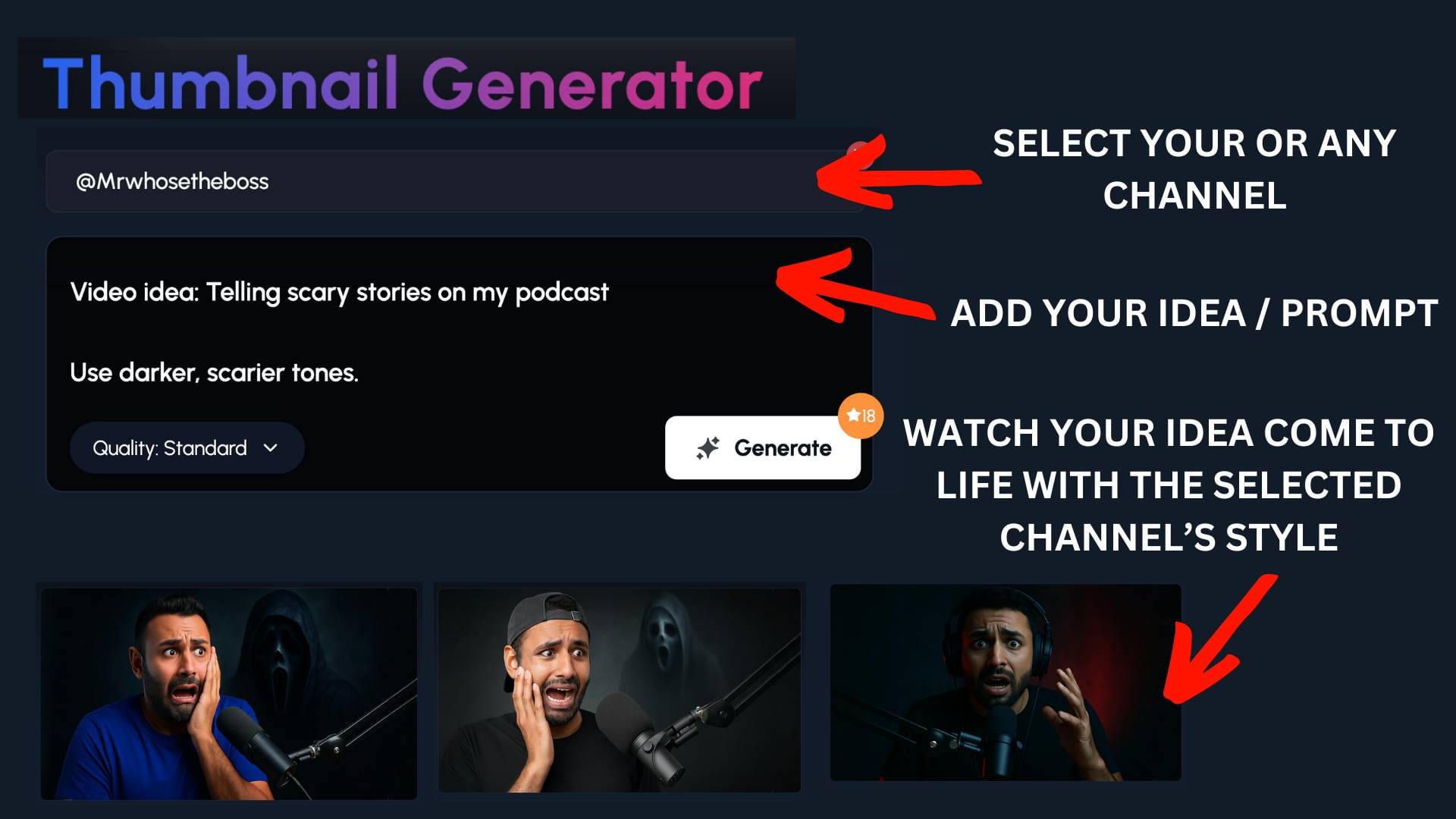
Designing thumbnails that actually work takes skill, time, and a deep understanding of what makes people click.
That's where 1of10's thumbnail generator comes in. It doesn't just slap text on a generic template. It studies high-performing thumbnails across YouTube, takes inspiration from your channel, and identifies what's driving clicks in your niche, generating designs that match those winning patterns.
Think about it: you could spend two hours tweaking fonts, colors, and layouts in Canva, or you could get multiple professional-quality options in seconds. Options that are built on what's actually working, not what looks pretty.
The best part? You don't need to be a designer. The AI understands contrast, readability, and visual hierarchy. It knows what pops in a crowded feed and what gets ignored.
One click gets you thumbnails that stand out, drive clicks, and help your podcast videos actually get discovered. While other creators are stuck in design paralysis, you're already uploading and growing.