How to NEVER Make Bad Thumbnails Again
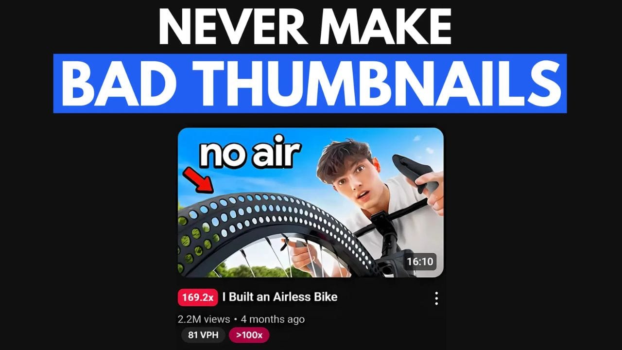
Brandon Voloch's YouTube video exploded in views thanks to a perfect "glance test" thumbnail. It's simple, uses minimal elements, and complements the title "I Built an Airless Bike." Learn more about these thumbnail secrets and Brandon's journey to success!
Brandon Voloch recently released a video that blew up, reaching 169 TIMES his usual views. The secret? A “1of10” thumbnail that checked all the right boxes.
Today, we’ll reveal what those boxes are:

1. The Glance Test ✅
The first key to Brandon's success is his understanding of the "glance test." When scrolling through countless thumbnails, viewers make split-second decisions. Brandon's thumbnail excels at this test, immediately capturing attention with its simplicity and power. It's a testament to the effectiveness of a well-designed thumbnail in a crowded digital landscape.
By focusing on a strong visual message and keeping the design clean and uncluttered, Brandon's thumbnail stands out and encourages viewers to click. This demonstrates the importance of creating thumbnails that are not only visually appealing but also highly effective in attracting attention and driving engagement.
Furthermore, Brandon's ability to adapt popular thumbnail styles to his own unique brand has contributed to his success. By taking inspiration from successful creators and tailoring the approach to his content, he has created thumbnails that resonate with his audience and drive views.
2. 3 Elements or Less ✅
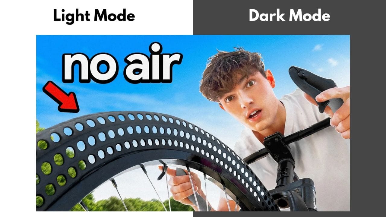
You might have heard of the "3 elements or less" rule, but Brandon's thumbnail is a great example of minimalism done right. It actually includes FOUR main elements, yet it remains clean and visually appealing. This demonstrates that while simplicity is important, it's not about strict adherence to a rule. Instead, it's about carefully selecting the right elements and using them effectively.
- The Airless Tire Bike
- The Red Arrow
- Text
- His Face
While simplicity is often key, Brandon's thumbnail demonstrates that it's not solely about minimalism. It's about selecting the right elements and utilizing them effectively. By focusing on the core message and presenting it visually, he creates a compelling thumbnail that captures the viewer's attention.
Brandon's thumbnail serves as a reminder that effective visual design is about balance and clarity. By carefully selecting and arranging elements, creators can create thumbnails that stand out and drive significant engagement.

3. Title-Thumbnail Compatibility ✅
A good thumbnail is only part of the challenge, the title needs to work together with it to tell an interesting story that grabs the viewer's attention. Brandon’s video is titled “I Built an Airless Bike,” and the thumbnail perfectly complements this. Here’s how:
- The Title: It clearly explains what the video is about, which is important for setting expectations.
- The Thumbnail: It visually reinforces the title, showing the airless bike tire and text that reinforces it.
The synergy between a YouTube video's title and thumbnail is crucial for capturing viewer attention and driving clicks. When these two elements work together, they encourage users to click and watch.
A well-crafted title clearly communicates the video's content, while a visually engaging thumbnail reinforces this message. Together, they significantly impact a video's performance.
By aligning the title and thumbnail, creators can improve their video's discoverability in search results and increase its chances of being recommended to relevant viewers.
4. Optimizing for Dark Mode Users ✅
Brandon leveraged the fact that 80% of YouTube users prefer dark mode to his advantage. His thumbnails utilize high contrast between light and dark elements, ensuring they stand out even more in dark mode. The bold, bright text is easily readable on smaller screens, further enhancing visibility.
By optimizing his thumbnails for dark mode, Brandon significantly increased their visibility and click-through rate. This simple yet effective strategy emphasizes the importance of understanding user preferences and tailoring content accordingly.
In addition to dark mode optimization, Brandon's success can be attributed to his ability to tap into niche interests and create visually appealing content. By focusing on unique topics and using eye-catching visuals, he has been able to attract a dedicated audience and stand out in a crowded market.

5. Taking Inspiration ✅
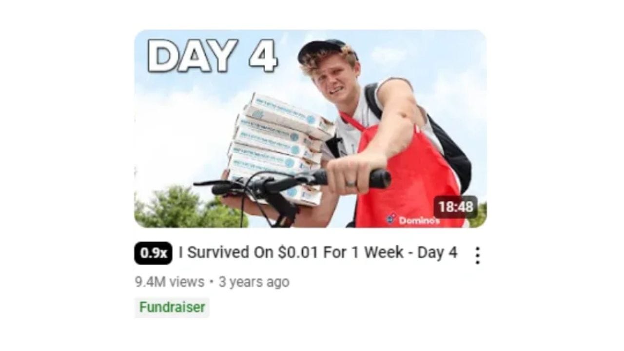
In an upcoming 1of10 podcast interview, Brandon revealed that he was inspired by Ryan Trahan’s popular series, specifically the “I Survived On $0.01 For 1 Week - Day 4” thumbnail. But Brandon didn’t just copy the idea, he adapted it to fit his unique content.
Ryan’s was straightforward, fun, and easy to understand. While the thumbnails are similar, Brandon added his own twist by aligning them with both the content and his brand.
By taking inspiration from successful creators and adapting their techniques to his own style, Brandon has been able to create a visually appealing and effective thumbnail that resonates with his audience.
You can find inspiration from other creators and boost your views by using the 1of10 app, available at 1of10.com.

Brandon Voloch, a rising YouTube star, recently won a $10,000 grant from us. His unique approach to content creation, focusing on niche topics like airless bikes and 3D-printed houses, has set him apart from other creators.
In his interview with us, Brandon shared valuable insights into his success. He emphasized the importance of niching down and focusing on a specific audience. Additionally, he highlighted the power of strong visuals and consistent content creation. By sharing personal stories and leveraging current trends, Brandon has been able to connect with his audience and build a loyal following.
Brandon's journey is an inspiration for aspiring YouTubers. By following his advice and consistently creating high-quality content, you can achieve similar success.
You can check out the full episode here.
Thanks for reading till the end! 🎉 If you want to learn more about the 1of10 tool or download our free Chrome extension.
