How To Make Viral Thumbnails: From A $100K/Year Designer

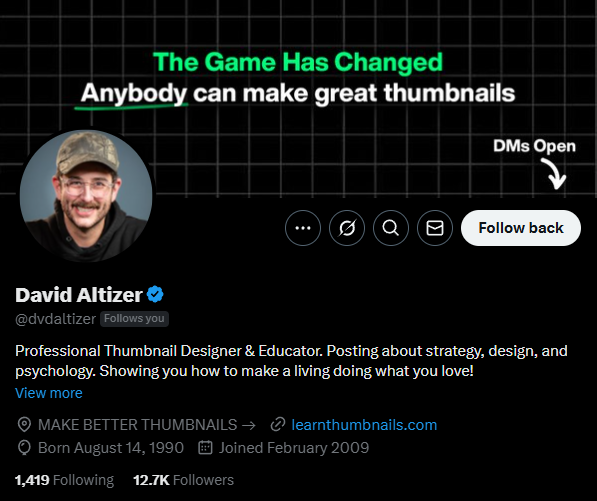
David Altizer had no graphic design background, yet in one year, he built a six-figure business designing thumbnails for top YouTubers. This is how he made it happen, and what every creative can learn from his journey.

It’s easy to look at a polished YouTube thumbnail and think, “Cool image.” But behind the best ones? There’s real thinking. Real testing. And often, a career-changing strategy.

That’s what makes David Altizer’s journey so valuable, not just for thumbnail designers, but for anyone building in the creator space.

A year ago, David had no formal design background. Today, he works with creators like Curtis Connor and Max Fosh, charges $500+ per thumbnail, and earns six figures a year from design alone. His secret isn’t fancy software or a magic algorithm. It’s a set of principles he applies over and over, and generously shared in a recent interview.

Here are 10 lessons from David that can help you get better at YouTube, whether you design thumbnails, create content, or lead strategy behind the scenes.


One Year, Six Figures: What You Can Learn from David Altizer’s Journey

You don’t need a design degree or a decade of Photoshop experience to succeed in the YouTube thumbnail world. What you do need is a strong understanding of storytelling, composition, and how YouTube works, and David Altizer is a clear example of that.

A screenshot of the Adobe Photoshop CC interface. In the center, an image of a desert landscape under a partly cloudy sky is being edited. The landscape features a dirt road running through dry, scrubby terrain with rocky hills in the background. Three cows are walking along the road. A large, semi-transparent orange circle is overlaid on the sky, partially obscuring the clouds. On the right side of the Photoshop window, the "Layers" panel is visible, showing three layers: "sun" (likely the orange circle), "landscape," and "sky" (the original background layer). The "sun" layer is currently selected. Other Photoshop panels such as "Color" and "Swatches" are also visible on the right. The top menu bar displays standard Photoshop options like "File," "Edit," "Image," "Layer," etc. The toolbar on the left provides various selection and editing tools. The overall view shows an image manipulation process where a circular element representing the sun is being added or adjusted within the landscape scene.
Editing an image in Adobe Photoshop.

A year ago, he wasn’t a thumbnail designer. He was a filmmaker and former YouTuber who understood the full content pipeline: ideas, production, editing, and publishing. When he pivoted into thumbnail design, he leveraged all of that context, and within a month, he was working with top creators and charging premium rates.

Here’s what you can learn from how he made it happen:

1. Use the skills you already have, even if they’re not “design” skills

David didn’t start with a graphic design background. What gave him an edge was his eye for composition and deep understanding of how YouTube videos are structured. He knew how to frame a shot, what kind of image sells an idea, and how viewers respond to certain visuals.

If you’ve worked in video, photography, or even copywriting, you may already have more of an advantage than you think. It’s not about being the most technically advanced Photoshop user, it’s about knowing how to tell a visual story quickly.

2. You don’t need years of experience, but you do need speed and results

David’s first thumbnails weren’t perfect, but they worked. He focused on building a strong portfolio quickly and publicly shared his work on Twitter. That visibility helped him land clients, fast.

A screenshot of David Altizer's Twitter profile. The banner at the top features the text "The Game Has Changed" in white and "Anybody can make great thumbnails" in a light green, stylized font against a dark background with a grid pattern. His profile picture shows David Altizer, a white man with a mustache and a baseball cap, smiling. His name "David Altizer" is displayed prominently below the banner, followed by his handle "@dvdaltizer" and the text "Follows you" in smaller gray text. His bio reads: "Professional Thumbnail Designer & Educator. Posting about strategy, design, and psychology. Showing you how to make a living doing what you love! View more." Below the bio are links to "MAKE BETTER THUMBNAILS" leading to "https://www.google.com/search?q=learntumbnails.com." His birthdate is listed as "Born August 14, 1990" and he "Joined February 2009." At the bottom, it shows he is following "1,419" people and has "12.7K Followers." The profile also displays icons for tweets, a community, search, notifications, messages, and a "Follow back" button. The "DMs Open" indicator with a downward arrow is visible on the right side of the banner. The overall profile indicates that David Altizer is an expert in creating effective thumbnails and educates others on the subject.
The Twitter profile of David Altizer, a Professional Thumbnail Designer & Educator.

He also got faster. A thumbnail that once took him 8 hours now takes two. That speed matters, especially when working with multiple creators and handling last-minute edits.

3. Charge based on impact, not time

One of the biggest mindset shifts for creative freelancers is pricing your work based on value, not how long it takes. David now charges $500–600 per thumbnail, not because each one takes days to make, but because they contribute to high-performing videos and generate thousands (or millions) in revenue.

Early on, he started at $200 and increased as he gained more clients, built a track record, and saw results from A/B tests. If you’re helping creators get more views, higher click-through rates, or better retention, your work is directly tied to their growth. Price accordingly.

4. Share your process, not just your portfolio

What helped David stand out was not just the finished thumbnails, it was the behind-the-scenes thinking. He explained why he made certain choices, what tools he used (like Generative Fill or Magnific), and how he approached layout, subject focus, and realism.

A screen capture showing a software interface with a blue frame. The main part of the screen displays an image of two young men standing in shallow water, holding a large catfish. The man on the left is wearing a camouflage wetsuit and looking surprised, while the man on the right is wearing a black wetsuit and smiling broadly. The background shows a lake or river with trees on the far bank and a partly cloudy sky. To the left of the image is a dark sidebar with various controls and options, including "Magic Spot," "Style Transfer," "Magnify Upscaler" highlighted in red, "Input Image" with an "Upload" button, "Scale Factor," "Optimized for," "Standard," and a "Prompt" field. Sliders for "Creativity," "HDR," "Resemblance," and "Fractality" are also visible. At the top right, a circular inset shows a man with glasses and a cap, wearing headphones and speaking into a microphone, suggesting he is part of a podcast. The word "Tutorials" is visible in the top right corner of the main interface. At the bottom, a banner reads "1 OF 10 PODCAST." The overall scene indicates a process of enhancing or upscaling the image of the fishermen and their catch, possibly for use in a podcast or tutorial.
Using AI image upscaling software during a podcast.

If you want to grow in this space, don’t just post final thumbnails. Share your thinking. Explain how you made it. Help others learn, and clients will notice.


The Fast Track to Working With Top Creators (Without a Big Following)

One of the most common assumptions in creative work is that you need a massive audience or years of experience to land high-profile clients. David Altizer proves otherwise.

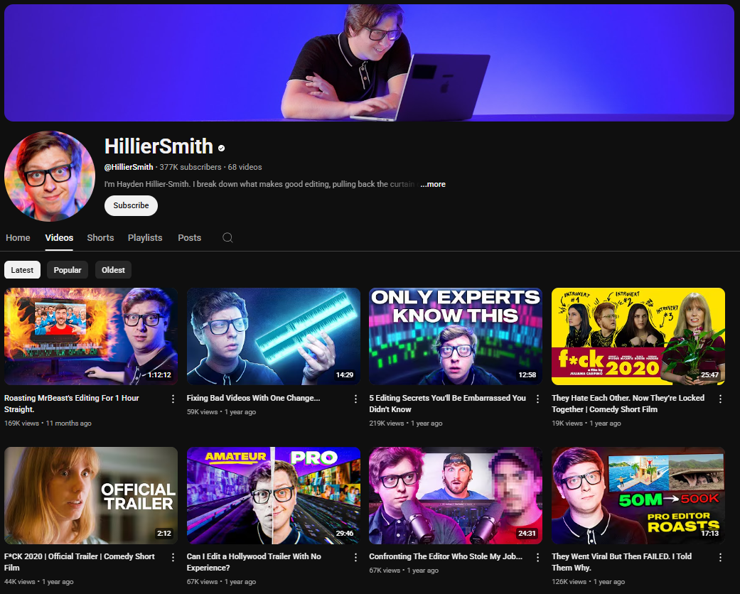
Within a month of deciding to become a thumbnail designer, he was already working with creators like Curtis Connor, Max Fosh, and Hayden Hillier-Smith. How? Not through a viral moment, but by being visible, prepared, and easy to trust.

A dark-themed YouTube channel page for Max Fosh. The channel banner features Max Fosh wearing glasses and being wrapped in red tape, with the text "MAX FOSH LOOPHOLE" in white and red. It also promotes his "WORLD ISN'T TOUR 2024/2025" with a website link. The profile picture is a cartoonish red drawing of Max Fosh wearing glasses. The channel name "Max Fosh" is in white letters, followed by a black dot. Below is the channel username "@MaxFosh", the subscriber count (4.59 million), and the video count (310). The banner also includes the text "Subscribe if you're a silly billy ...more" and a "Subscribe" button. The channel page displays tabs for "Home," "Videos," "Shorts," "Playlists," "Posts," "Store," and a search icon. Below these tabs are sorting options for "Latest," "Popular," and "Oldest." The video thumbnails showcase Max Fosh in various comedic and often outlandish situations, with titles like "I Shredded A Yellow Card In Front Of 90,000 People," "I Lived In A Bowling Alley Until I Scored A Perfect Game," "I Technically Became The World's Youngest Grandpa," "I Got Fired From The World's Silliest Jobs," "I Hired A Church Choir To Start Offensive Football Chants," "I Hired A F1 Driver To Beat My Friends At Go Karting," "I Broke Into YouTubers Houses To Roast Them," and "I Made A Sign More Famous Than The Hollywood Sign."
The YouTube channel of Max Fosh, known for his comedic and often absurd videos, with 4.59 million subscribers.

Here’s how you can use the same principles to grow faster than most people think is possible.

1. Make it easy for people to find (and trust) your work

David didn’t pitch hundreds of creators. He shared high-quality examples on Twitter, including thumbnails he had made and the results they drove. That visibility created momentum. His clients came to him.

A screenshot of a Twitter post by David Altizer (@dvdaltizer). The tweet includes a thumbnail image on the left and text on the right. The thumbnail shows a man with a beard and a furry hat, wearing an orange jacket and black pants, standing in a snowy landscape at night. Behind him is a partially built structure made of large, clear ice blocks, illuminated by a warm-toned lamp placed on one of the blocks. A long, jagged ice tool leans against the structure. The background shows snow-covered ground and dark, blurry trees. Above the thumbnail, text reads "I made this thumbnail for my friend @mevalleen." Below the thumbnail, David Altizer comments, "The crazy thing is... only his face and beard is from the original asset." The tweet also includes a timestamp "4:34 PM Apr 10, 2025" and shows 3,200 views, along with standard Twitter interaction icons (retweets, likes, etc.). Another user, David Alt... (@dvdalt...), comments on the original asset being too dark and the shadows being clipped, but praises the final image as "really amazing" and mentions the effort involved in cutting ice blocks by hand. The post highlights David Altizer's thumbnail design skills and the contrast between the original and final image.
David Altizer shares a thumbnail he designed for his friend Mevalleen, featuring an ice structure in a snowy setting.

If you want clients, don’t keep your work in a folder. Put it where creators are already looking, on platforms like X (Twitter), Discord, or LinkedIn. But don’t just post designs. Explain what problem it solved. Share how you improved the click-through rate. Make the value of your work obvious.

2. Relationships matter more than cold outreach

David’s first thumbnail opportunity came through a friend, Hayden Hillier-Smith, who took a chance on him because of a prior connection. That referral led directly to more clients.

A dark-themed YouTube channel page for HillierSmith. The channel banner features Hillier Smith wearing glasses and working on a laptop, with a purple and blue gradient background. The profile picture shows Hillier Smith also wearing glasses and smiling. The channel name "HillierSmith" is in white letters, followed by a black dot. Below is the channel username "@HillierSmith", the subscriber count (377K), and the video count (68). The banner also includes the text "I'm Hayden Hillier-Smith. I break down what makes good editing, pulling back the curtain ...more" and a "Subscribe" button. The channel page displays tabs for "Home," "Videos," "Shorts," "Playlists," "Posts," and a search icon. Below these tabs are sorting options for "Latest," "Popular," and "Oldest." The video thumbnails feature Hillier Smith and often relate to video editing tips, challenges, and comedic short films, with titles like "Roasting MrBeast's Editing For 1 Hour Straight," "Fixing Bad Videos With One Change...," "5 Editing Secrets You'll Be Embarrassed You Didn't Know," "They Hate Each Other: Now They're Locked Together | Comedy Short Film," "PCK 2020 | Official Trailer | Comedy Short Film," "Can I Edit a Hollywood Trailer With No Experience?," "Confronting The Editor Who Stole My Job...," and "They Went Viral But Then Failed. I Told Them Why."
The YouTube channel of HillierSmith, focused on video editing and the creative process, with 377K subscribers.

This doesn’t mean you need to already be in the circle. But it does mean that the fastest path is often through shared trust. Start engaging with creators, editors, and strategists online. Comment thoughtfully. Join spaces like Thumbnail Thursday. Over time, your name becomes familiar, and when someone needs help, you’ll be top of mind.

3. Don’t wait for permission to create examples

Before David was officially hired, he was already making thumbnails and showing what he could do. Many new designers hold back, thinking they need paid work to prove themselves. But some of the best portfolios come from self-directed projects.

Pick a creator you admire. Don’t copy their current style, reimagine a thumbnail based on one of their past videos. Use your face or your own assets. Show what you’d do differently. And explain why.

Even better, offer a test. If the creator likes your approach, they might try it. If it performs, you could have a client overnight.

4. Good clients value clarity over complexity

David’s early success wasn’t just about design, it was about communication. He took rough ideas and turned them into focused concepts. He listened carefully. He stayed within timelines. He didn’t overcomplicate things.

If you want to attract top-tier clients, focus on being reliable, clear, and fast. There are plenty of talented designers. The ones who get referred are the ones who make the process easy.


Think Like a Viewer, Build Like a Creator

The best creators don’t build in a vacuum, they build in response to what their audience is already saying. And the ones who monetize fastest are usually the ones who figure that out early.

That’s exactly what David Altizer did. He didn’t guess what his audience wanted. He paid attention to what they were already asking for, then made products, templates, and resources around those needs.

Whether you're a designer, strategist, or YouTuber, this approach is one of the most powerful ways to grow your impact and income. Here’s how to apply it.

1. Your comment section is market research

If you’re consistently getting the same types of questions, that’s not random. That’s data.

In David’s case, people were constantly asking how to edit thumbnails, how to improve composition, what tools to use, or how he made a specific image. He took those questions seriously. And instead of replying one by one, he created resources, tutorials, and live sessions to help more people at once.

A screenshot of several YouTube comments.  Top Comment by @lmnopzyk (2 days ago): "This was fantastic! Please do more examples" with 1 like and a reply option. Second Comment by @AWildOnesie (7 days ago): "On thumbnail #8, I think adding a coffee into the civilian's hand would've maybe been a funny/cool way to show that it's a civilian!" with 1 like, a reply option, and one reply visible from the commenter. Third Comment by @skdesignspsd (11 days ago): "Appreciate the feedback from the top thumbnail designers out there ❤️" with 5 likes, a reply option, and one reply visible from the commenter. Fourth Comment by @LOOWEE (12 days ago): "Even if it's a classic concept we want MORE vids like that! Thanks for the roast and advices Dill and David! 🔥" with 1 like, a reply option, and one reply visible from the commenter. Bottom Comment by @DereksLawnRescue (11 days ago): "I watched the video twice. Once so I could properly implement the tips I was given on, and a second time so I could write down all the great advice through the rest of the video" with 2 likes, a reply option, and one reply visible from the commenter. The comments collectively express positive feedback on the video's content, with users appreciating the examples, offering suggestions, and requesting more videos on similar topics. The mention of "thumbnail designers" in one comment and the suggestion related to a thumbnail in another indicate the video likely pertains to visual content creation.
A collection of YouTube comments expressing appreciation and requesting more content.

This isn’t just about building a product. It’s about spotting signals early. If your audience is struggling with something, even if it seems obvious to you, there’s likely demand for a solution.

2. Don’t assume you need to “invent” something

A lot of creators feel pressure to build something brand new. In reality, most successful tools or services are just clearer, more focused versions of existing ideas.

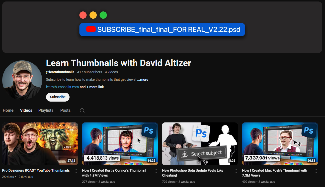
David didn’t create a groundbreaking new design tool. He made a thumbnail grid overlay and shared it on his site, because it solved a common problem: checking mobile cropping and composition in real time. That small tool got shared widely and became a staple in his workflow (and others’ too).

If you’re getting the same question twice, you have a reason to turn it into something tangible.

3. Build in public, and let your audience shape the result

David used his audience not just as customers, but as collaborators. When he shared tools or templates, he asked for feedback. When people pointed out bugs or tweaks, he fixed them fast.

A dark-themed YouTube channel page for "Learn Thumbnails with David Altizer." The channel banner is a simple dark background with three colored circles (red, yellow, green) in the top left, mimicking a closed window's traffic light indicator, and a blue rectangle with white text "SUBSCRIBE_final_final_FOR REAL_V2.22.psd" in the top center, suggesting a design file. The profile picture shows David Altizer wearing a cap and smiling. The channel name "Learn Thumbnails with David Altizer" is in white letters. Below is the channel username "@learnthumbnails", the subscriber count (417K), and the video count (4 videos). The banner also includes the text "Subscribe to learn how to make thumbnails that get views! ...more" and a link to "https://www.google.com/search?q=learnthumbnails.com" along with a "Subscribe" button. The channel page displays tabs for "Home," "Videos," "Playlists," "Posts," and a search icon. Below these tabs are the channel's uploaded videos. The thumbnails showcase David Altizer demonstrating thumbnail creation processes, often using Adobe Photoshop, with titles like "Pro Designers ROAST YouTube Thumbnails," "How I Created Kurtis Conner's Thumbnail with 4.8M Views," "New Photoshop Beta Update Feels Like Cheating!," and "How I Created Max Fosh's Thumbnail with 7.3M Views."
The YouTube channel of David Altizer, focused on teaching how to create effective thumbnails.

This created a loop of trust and responsiveness. People felt heard. And when something worked well, they shared it, helping him grow without needing paid ads or big launches.

If you’re building something, even small, talk about it as you go. Share rough versions. Show how it solves real problems. You don’t need a finished product to start momentum.


Price Based on Value, Not Time

When David Altizer started charging for thumbnails, he began at $200 each. Within a year, he was charging $500–600 per thumbnail, sometimes more. That kind of pricing growth wasn’t just about getting faster or more skilled. It was about understanding the real value of what he was delivering.

If you're a creative (designer, editor, strategist), you’ve probably undercharged at some point. Here’s how to shift your mindset, and pricing, to reflect the true value of your work.

1. The value isn’t the thumbnail. It’s the outcome.

A well-designed thumbnail isn’t worth hundreds because it looks nice. It’s worth that because it gets clicked. Because it drives views. Because it changes the trajectory of a video.

A YouTube video thumbnail featuring three main subjects. On the left, a police officer in a bright yellow jacket with "POLICE" printed on the back and a traditional police hat is facing away from the viewer, looking towards the center. In the center is a brown cow with a white patch on its face, wearing a halter. On the right stands Max Fosh, a young man with glasses, wearing a white shirt, a maroon vest, and holding a large, frothy glass of beer. He is looking towards the camera with a slight smile. The background is blurry but appears to be an outdoor urban setting with cars and buildings. The video duration "9:08" is visible in the bottom right corner of the thumbnail. Below the thumbnail, the video title "I Broke Silly Laws In Front Of The Police" is in white letters. Below the title are the view count "7.4M views" and the upload date "1 year ago." The image suggests a humorous and potentially provocative video where Max Fosh interacts with the police in an unconventional way, possibly involving the cow and the beer.
Max Fosh seemingly tests the boundaries of unusual laws in front of law enforcement.

One of David’s thumbnails helped generate over 6 million views for a client. Another became the foundation for a whole content style shift. When your work contributes to revenue, audience growth, or business results, it’s not just a file. It’s leverage.

Creators aren’t paying you for hours. They’re paying you for results.

2. Fast doesn't mean cheap

David now builds thumbnails in 1–2 hours that used to take him eight. That speed isn’t a reason to lower his rate, it’s proof of his experience.

A common trap is thinking, “Well, this only took me an hour, so I shouldn’t charge much.” But in most cases, the client doesn’t care how long it took, they care about what it does.

If your work helps them get better results, price accordingly. Efficiency is a strength, not a discount trigger.

3. Your best clients aren’t price-sensitive

David talked about something many freelancers figure out the hard way: the clients who pay the least often expect the most.

There’s nothing wrong with smaller creators or early-stage clients. But as you grow, your energy is better spent with people who value your time and trust your process. These clients don’t want 10 rounds of revisions. They want a professional to take the reins and deliver something strong.

David now turns down high-maintenance clients, even if they’re willing to pay more, because they drain his energy and slow down his best work.

Bonus: Make it easy to say yes

One tactic that’s worked well for David is offering alternate versions (for A/B testing) at a discounted rate. If the main thumbnail is $500, he offers a variant for $250, using the same core assets. That doubles the client’s chance of success and boosts his earnings without doubling the workload.

A white rectangular graphic with rounded corners and a light gray grid pattern in the background. Across the top are three large, black capital letters: "A" on the left, "B" in the center, and "C" on the right. Below each letter is a black line art illustration of a video player. Each player has a rectangular screen with a right-pointing triangle (the play button) inside. Below the screen is a horizontal bar representing the progress bar, with a circular handle indicating the current playback position.  Player A: The handle on the progress bar is positioned at the far left, indicating the beginning of the video. Player B: The handle on the progress bar is positioned in the center, indicating the video is halfway through. Player C: The handle on the progress bar is positioned near the far right, indicating the video is nearing its end. The image presents three different states of a video player, likely for illustrative or comparative purposes.
Three variations of a video player icon.

If you’re looking for ways to raise your rates, bundle smarter. Price based on outcomes. And work with clients who know the difference between cost and value.


How to Work Faster Without Losing Quality

One of the most impressive parts of David Altizer’s workflow is how he’s managed to dramatically speed up his process, without sacrificing results. A thumbnail that used to take him 8 hours now takes about 1 or 2. And the quality? Arguably better than ever.

If you’re a designer, creator, or freelancer trying to produce more without burning out, here’s how he does it, and how you can apply the same principles.

1. Create Your Own Efficiency Tools

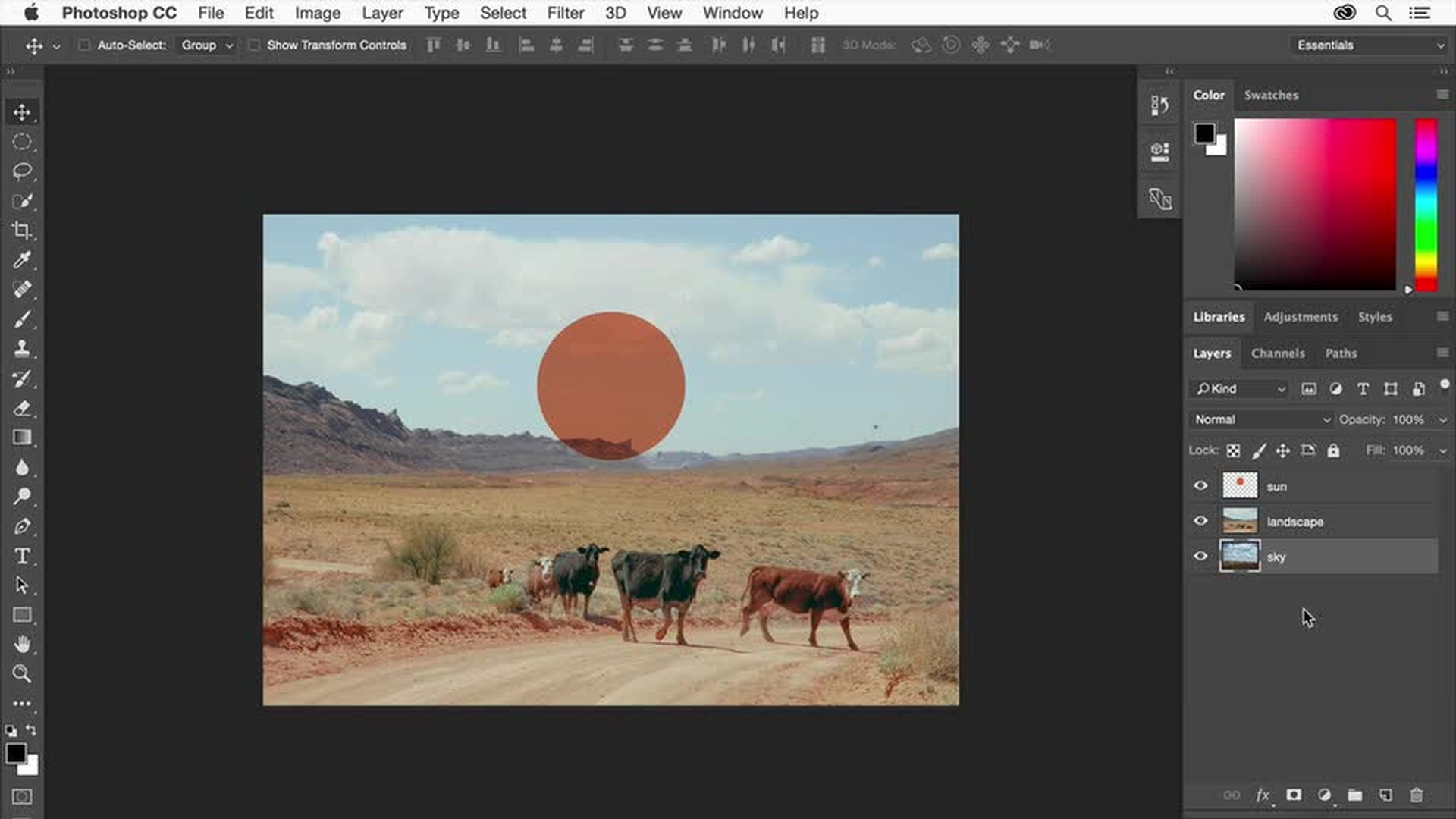
David uses Photoshop for every thumbnail, but what sets him apart is how he’s built a repeatable, personal toolkit inside it. His favorite? A PSD overlay showing exactly where the mobile and desktop timecodes will appear on a YouTube thumbnail.

A screen capture showing the Adobe Photoshop interface with a blue frame. The central focus is on the image being edited, which is the thumbnail of Max Fosh's video featuring a police officer, a cow, and Max Fosh holding a beer. The image has a slightly desaturated or muted color palette. On the right side, a circular inset shows a man with glasses and a cap, wearing headphones and speaking into a microphone, indicating he is likely part of a podcast. Within the Photoshop interface, a "Select" dropdown menu is open, showing various selection options. The "Layers" panel is also visible on the right, along with adjustment controls for "Light," "Color," and "Details." At the bottom, a banner reads "1 OF 10 PODCAST." The overall scene suggests a live or recorded process of editing the YouTube thumbnail using Photoshop, possibly with commentary or discussion happening during the podcast.
Editing Max Fosh's thumbnail in Photoshop during a podcast.

Why it matters: timecodes often block key details (like text or faces), especially on mobile. David’s simple guide helps avoid that mistake before it happens. No uploading and re-checking. No wasted revisions.

Lesson: Build small tools that work for your process. If you find yourself repeating something more than twice, template it, save it, or automate it.

2. Zoom Out Early and Often

While editing, David constantly zooms out to see his thumbnails at smaller sizes. Why? Because that’s how they’ll be seen on YouTube, tiny, crowded, and surrounded by competition.

A screen capture showing the Adobe Photoshop interface with a blue frame. The central focus is on a smaller version of the thumbnail image being edited, featuring a police officer, a cow, and Max Fosh holding a beer. The image appears to be undergoing adjustments within Photoshop. On the right side, a circular inset shows a man with glasses and a cap, wearing headphones and speaking into a microphone, indicating he is likely part of a podcast. Within the Photoshop interface, the "Camera Raw Filter" window is open, with adjustments being made to "Light," including "Exposure," "Contrast," "Highlights," "Shadows," "Whites," and "Blacks." Curves adjustments are also visible. At the bottom, a banner reads "1 OF 10 PODCAST." The overall scene suggests a live or recorded process of refining the lighting and color of the YouTube thumbnail using Photoshop's Camera Raw Filter, possibly with commentary or discussion happening during the podcast.
Max Fosh's thumbnail in Photoshop during a podcast.

Looking at your design full-screen in Photoshop is misleading. It’s too clean, too isolated. Zooming out forces you to design for real-world conditions, not an ideal environment.

Tip: Always preview your work at 10–15% scale before calling it done.

3. Let AI Handle the Tedious Stuff

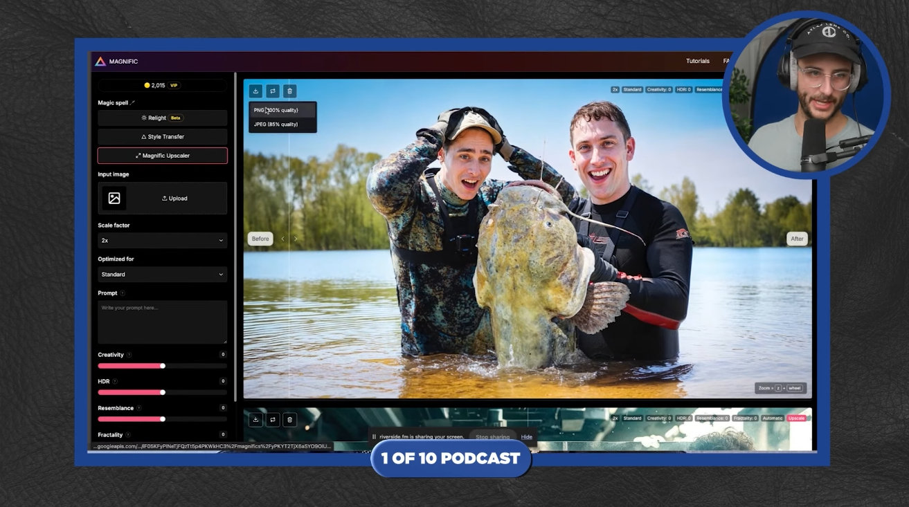
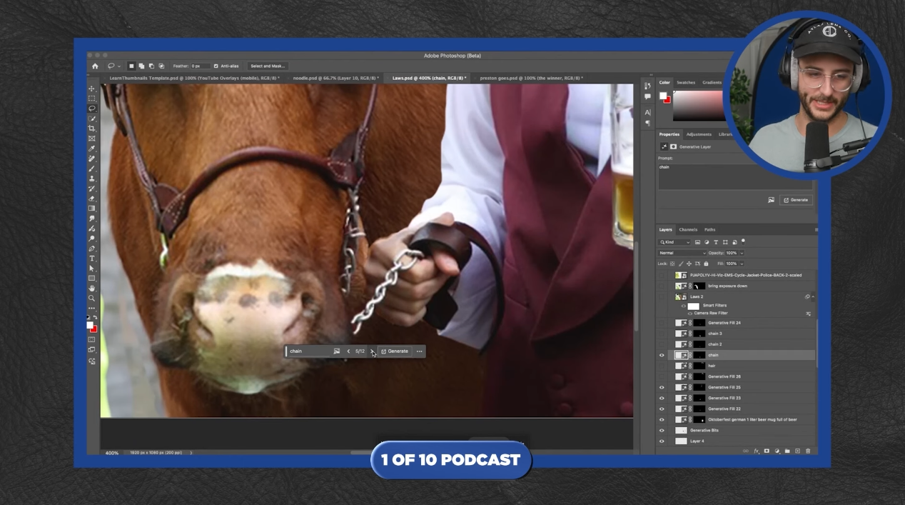
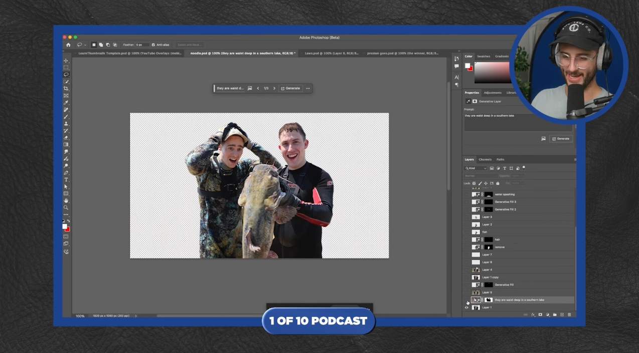
David openly credits tools like Photoshop’s Generative Fill and Magnific for cutting his production time in half, especially on complex edits like reconstructing backgrounds, removing objects, or fixing hair edges.

He doesn’t rely on AI for creativity. He uses it to accelerate tasks that used to take forever. The result? He gets to spend more time making creative decisions, and less time clicking around.

A screenshot of an image editing interface, predominantly dark gray. The central image shows two silhouetted figures standing in shallow, murky water of what appears to be a lake, with a blurred background of trees and lighter-colored water. The figures are mostly masked out with a checkered pattern, indicating a selection or area for AI-powered content generation. Above the central image is a text input box where the prompt "they are waist deep in a southern lake" has been entered. To the right of the prompt box are buttons for "Cancel" and "Generate." The interface suggests that the user is providing a text prompt to instruct an AI to fill or modify the selected area within the existing image, aiming to depict the two figures as being waist-deep in a southern lake environment.
Using AI to generate content within an image.

The key lesson here: automation doesn’t replace your craft. It frees up your brain for the parts only you can do.

4. Don’t Overwork It

David’s most popular thumbnails aren’t the most edited ones. In fact, one of his best-performing thumbnails took just 30 minutes to make, because the concept was already strong.

More editing doesn’t always mean more impact. Instead of obsessing over micro-adjustments, focus on the one big visual idea: is it clear, interesting, and clickable?

High-effort thumbnails can still underperform if the concept doesn’t land. Save your energy for the parts that matter most.


Better Thumbnails Start with Better Ideas

No amount of editing can save a weak concept. That’s why some of the best thumbnail designers, like David Altizer, focus as much on what the thumbnail shows as how it looks.

You don’t need to be a Photoshop expert to make effective thumbnails. What you need is a strong idea, one that sparks curiosity, stands out visually, and delivers on its promise.

Here’s how to build better ideas before you even open your design software:

1. Start With the Video’s Core Emotion

Before you start designing anything, ask: What do I want the viewer to feel when they see this thumbnail?
Confusion? Surprise? Awe? Laughter?

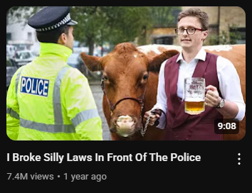
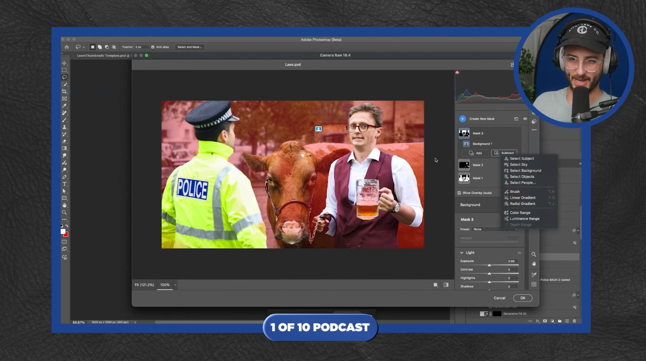
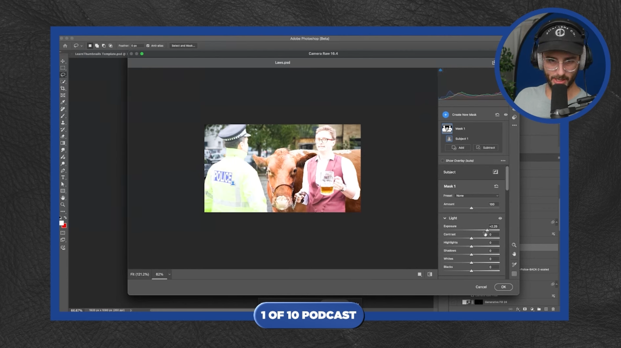
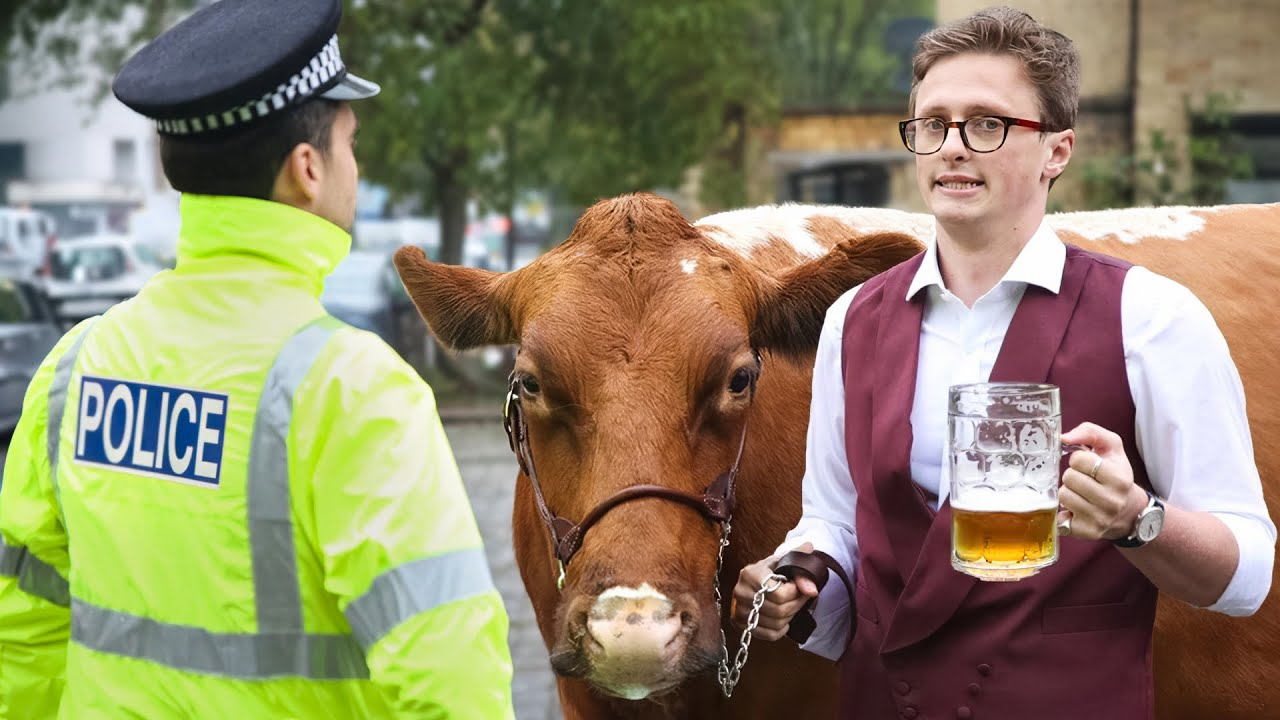
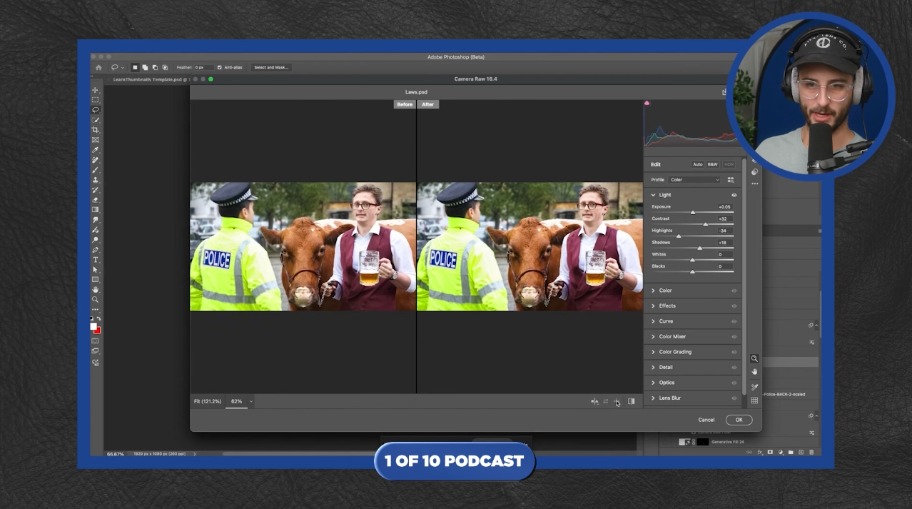
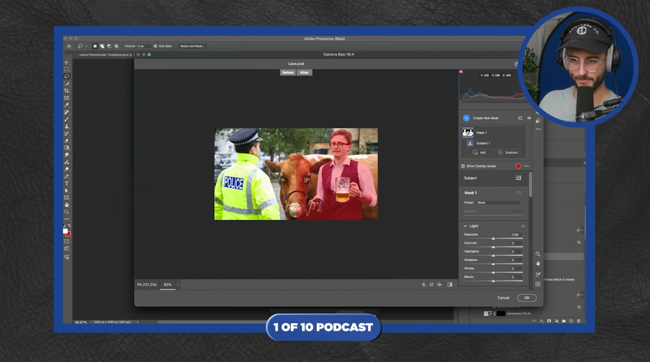
For example, a creator walking a cow down a busy city street is funny because it’s so absurd and unexpected. That’s what makes you click. David knew the image alone was strong enough to carry the thumbnail, so he kept the edits minimal and let the emotion speak for itself.

A medium shot of three figures against a blurry urban background. On the left, a police officer in a bright yellow fluorescent jacket with "POLICE" printed in black on the back and a traditional black police cap is facing slightly to the right, looking towards the center of the frame. In the center is a brown Ayrshire cow with white markings on its face and sides, wearing a brown leather halter. Max Fosh, a young man with short brown hair and red-framed glasses, stands on the right, holding a large, frothy glass of beer in his right hand and the cow's lead rope in his left. He is wearing a white collared shirt, a maroon vest, and a watch on his left wrist, and he is looking towards the camera with a slight smile. The background is out of focus but shows parked cars and buildings, suggesting a street scene. The lighting is natural and bright, illuminating the subjects clearly. The overall scene has a slightly comedic and unusual feel, likely a still from one of Max Fosh's videos.
A humorous encounter between Max Fosh, a cow, and a police officer.

Ask yourself: If I showed this thumbnail with no title, would it still make someone stop scrolling?

2. Match the Thumbnail to the Opening Shot

This is one of the most overlooked tricks, and one of the most powerful.

If your thumbnail shows something wild or surprising, make sure the first 5–10 seconds of the video confirm it. That immediate alignment builds trust and keeps people watching.

David often works with creators who shoot after the thumbnail is planned. That way, they can match the video’s intro to the thumbnail, not the other way around.

Tip: If your thumbnail shows something visual, make sure viewers see it right away when they click.

3. Borrow from Outside YouTube

If you only look at other thumbnails for inspiration, you’ll eventually start copying what’s already been done.

David recommends studying things like:

A white rectangular graphic with rounded corners and a light gray grid pattern in the background. On the left side are three empty checkboxes. To the right of each checkbox is a suggestion for drawing inspiration from a specific visual medium, along with the aspects to focus on, presented in bold, black text:  MOVIE POSTERS (FOR LAYOUT AND DRAMA) PHOTOGRAPHY (FOR LIGHT, COMPOSITION, AND EMOTION) PRINT ADS (FOR BOLD VISUALS AND SIMPLE COPY) The image suggests that analyzing the design principles of movie posters, photography, and print advertisements can provide valuable insights for creating compelling and effective YouTube thumbnails.
Sources of inspiration for effective thumbnail design.

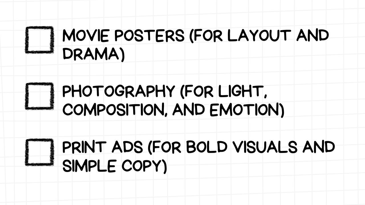
Why it works: these formats have decades of high-stakes design baked into them. They force clarity and focus, just like thumbnails should.

You’re not trying to be original for the sake of it. You’re trying to create something recognisable yet different enough to grab attention.


How AI Actually Helps, Without Killing Creativity

There’s a misconception that using AI tools in thumbnail design makes the work less creative. But in the hands of someone who understands composition and storytelling, AI actually enhances creativity, not replaces it.

David Altizer’s workflow is a perfect example. He didn’t start as a graphic designer. He came from filmmaking and YouTube. But with tools like Generative Fill, Magnific, and rule-of-thirds overlays, he was able to speed up production and punch way above his weight, even in his first year designing.

A screen capture showing the Adobe Photoshop interface with a blue frame. The central view is a zoomed-in portion of the thumbnail image featuring the brown and white cow's face, wearing a brown leather halter, and Max Fosh's hand holding a silver chain lead. His maroon vest and the frothy beer in his glass are also partially visible. On the right side, a circular inset shows a man with glasses and a cap, wearing headphones and speaking into a microphone, indicating he is likely part of a podcast. Within the Photoshop interface, the "Layers" panel is open, showing numerous layers related to the editing process of this thumbnail. A small pop-up menu with "Snap" and "Cancel" options is visible near the bottom of the zoomed-in image, suggesting an action is being performed on the image. At the bottom, a banner reads "1 OF 10 PODCAST." The zoomed-in view suggests detailed editing work is being done on specific elements of the thumbnail, possibly related to lighting, color correction, or adding effects, while being discussed or demonstrated during the podcast.
Close-up editing of the cow in Photoshop during a podcast.

Here’s how AI can elevate your thumbnails without taking over:

1. You Still Need a Clear Vision

AI is powerful, but only if you know what you want.

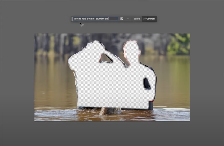
When David builds a thumbnail, he doesn't just throw assets into a generator and hope it looks good. He sketches the idea, understands the scene, and identifies what emotion or action should be front and center. AI then helps fill in the gaps (like regenerating a background or fixing blurry edges), but the idea always comes first.

A screen capture showing the Adobe Photoshop interface with a blue frame. The central view displays an image of two young men in wetsuits holding a large, light-colored catfish. The background of the image has been completely removed, leaving a checkered pattern indicating transparency. Above the image is a text input box where the prompt "they are waist deep in a southern lake" is partially visible, suggesting the next step is to generate a new background using AI. On the right side, a circular inset shows a man with glasses and a cap, wearing headphones and speaking into a microphone, indicating he is likely part of a podcast. The "Layers" panel in Photoshop is visible on the right, showing various layers related to the editing process, including layers for masking or removing the original background. At the bottom, a banner reads "1 OF 10 PODCAST." The scene illustrates the process of isolating the main subjects of an image by removing the background, likely in preparation for further editing or compositing with a new background generated by AI based on the provided prompt.
Removing the background of an image in Photoshop during a podcast.

If you're clear on your composition and focal points, AI will help you get there faster. If you aren't, it’ll just create more noise.

2. AI Helps You Clean, Not Complicate

One of the most useful tools David uses is Generative Fill in Photoshop. Instead of adding unnecessary elements, he uses it to:

A white rectangular graphic with rounded corners and a light gray grid pattern in the background. On the left side are three empty checkboxes. To the right of each checkbox is a description of a post-production editing task in bold, black text:  REBUILD CROPPED-OUT BODY PARTS (LIKE AN EAR BEHIND A POLICE OFFICER) REMOVE DISTRACTIONS IN THE BACKGROUND MATCH LIGHTING AND FOCUS WHEN COMBINING ELEMENTS The image highlights specific editing techniques that can improve the quality and visual appeal of images or videos by addressing issues like incomplete elements, unwanted background details, and inconsistencies in lighting and focus when combining different visual components.
Essential post-production editing tasks.

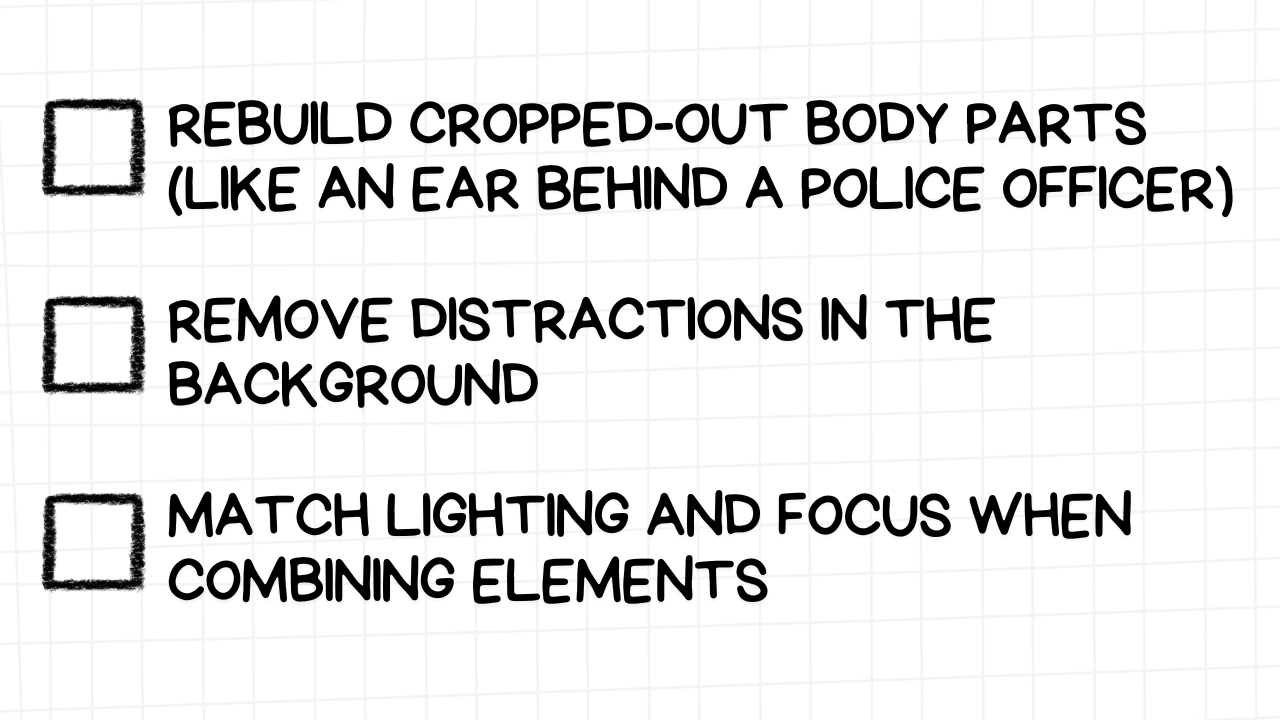
Because the AI references the actual lens, color, and depth of the photo, it creates results that look real, which is critical for thumbnails that need to feel in-camera.

That realism is what makes a thumbnail feel believable, not Photoshopped.

3. It Speeds Up Testing (So You Can Iterate Smarter)

Thumbnail performance isn’t always predictable. That’s why David builds alternate versions, sometimes with very small tweaks, and runs A/B tests using YouTube’s native tools or external platforms.

AI makes this easier. You can generate alternate crops, new props, slight pose changes, or background versions in minutes. That means you can test without spending hours redoing everything from scratch.

Adjusting the lighting of Max Fosh's thumbnail in Photoshop during a podcast.

More versions = more data = better long-term results.

4. AI Doesn’t Replace Taste

Tools like Magnific can upscale your images and add more detail, but they also create artifacts that might look off. David’s approach? Use the AI where it helps (like on eyes or hair), but mask or erase the parts that distort key features, especially faces.

A screen capture showing the Adobe Photoshop interface with a blue frame. The central view displays a smaller version of the thumbnail image featuring a police officer, a cow, and Max Fosh holding a beer. The "Camera Raw Filter" window is open on the right side, with the "Light" adjustments panel visible. Sliders for "Exposure," "Contrast," "Highlights," "Shadows," "Whites," and "Blacks" are shown, and some of these sliders appear to have been adjusted. A histogram is visible at the top of the "Camera Raw Filter" window, reflecting the changes in light distribution. On the right side of the Photoshop window, a circular inset shows a man with glasses and a cap, wearing headphones and speaking into a microphone, indicating he is likely part of a podcast. At the bottom, a banner reads "1 OF 10 PODCAST." The scene illustrates the process of fine-tuning the lighting and tonal range of the YouTube thumbnail using Photoshop's Camera Raw Filter, likely with real-time commentary or explanation during the podcast. A screen capture showing the Adobe Photoshop interface with a blue frame. The central view is split vertically, showing the "Before" and "After" states of the thumbnail image featuring a police officer, a cow, and Max Fosh holding a beer. The "After" side appears slightly brighter and with more contrast compared to the "Before" side. The "Camera Raw Filter" window is open on the right side, with the "Light" adjustments panel visible. Sliders for "Exposure," "Contrast," "Highlights," "Shadows," "Whites," and "Blacks" show adjusted values in the "After" state. A histogram at the top reflects the changes in tonal distribution between the two views. On the right side of the Photoshop window, a circular inset shows a man with glasses and a cap, wearing headphones and speaking into a microphone, indicating he is likely part of a podcast. At the bottom, a banner reads "1 OF 10 PODCAST." The side-by-side comparison visually demonstrates the impact of the lighting adjustments made in Photoshop to enhance the thumbnail image, likely being discussed or explained during the podcast.
Comparing before and after lighting adjustments in Photoshop during a podcast.

The tool might be smart, but your human judgment is still what makes the image click-worthy.


Lean Tools, High Standards: You Don’t Need a Big Team

You don’t need a massive studio or agency to produce top-performing thumbnails. In fact, the most effective creators often run lean, with just a handful of people and the right tools.

David Altizer is a perfect example. He works mostly solo, supported by a few freelance clients, and still pulls in over $100,000 a year creating thumbnails. His tech stack is light. His process is structured. And his results? Top-tier.

Here’s how he keeps quality high without overcomplicating things:

1. Build a Repeatable Workflow

The secret to speed and consistency is repeatability. David doesn't reinvent his process every time. He has templates, tools, and shortcuts he reuses across projects, things like:

A white rectangular graphic with rounded corners and a light gray grid pattern in the background. On the left side are three empty checkboxes. To the right of each checkbox is a best practice for thumbnail design in Photoshop, presented in bold, black text:  A PHOTOSHOP OVERLAY TO ACCOUNT FOR MOBILE TIMECODES AND ROUNDED CORNERS A RULE-OF-THIRDS GRID TO BALANCE COMPOSITION A CLEAR NAMING STRUCTURE AND LAYER MANAGEMENT SYSTEM FOR FASTER EDITS The image emphasizes the importance of considering mobile viewing constraints, applying compositional guidelines, and maintaining an organized Photoshop file structure for efficient and effective thumbnail creation.
Best practices for organized and effective thumbnail design in Photoshop.

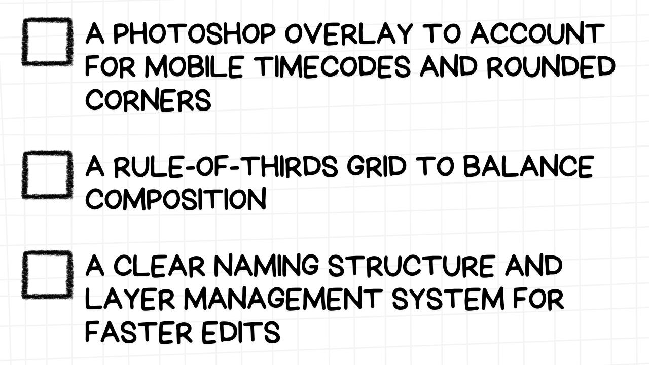
These small systems compound. When every step has a place, he’s free to focus on creativity, not logistics.

Tip: If it takes you more than 10 seconds to find your own files or templates, your workflow needs tightening.

2. Choose Tools That Make You Faster

David’s tech stack is surprisingly simple:

A white rectangular graphic with rounded corners and a light gray grid pattern in the background. On the left side are four empty checkboxes. To the right of each checkbox is a recommended software or tool and its purpose in the thumbnail design workflow, presented in bold, black text:  PHOTOSHOP (BETA) - FOR PRECISION EDITING AND GENERATIVE FILL MAGNIFIC - FOR SUBTLE AI UPSCALING 1 OF 10 - TO TEST, PREVIEW, AND PLAN THUMBNAILS WITHIN THE REAL YOUTUBE HOMEPAGE WHATSAPP - FOR DIRECT, FAST COMMUNICATION WITH CLIENTS The image suggests a modern workflow that leverages advanced editing software (Photoshop Beta with generative AI), AI upscaling tools (Magnific), a specific tool for YouTube thumbnail testing ("1 of 10"), and instant messaging for client communication (WhatsApp).
Recommended software and tools for efficient thumbnail design.

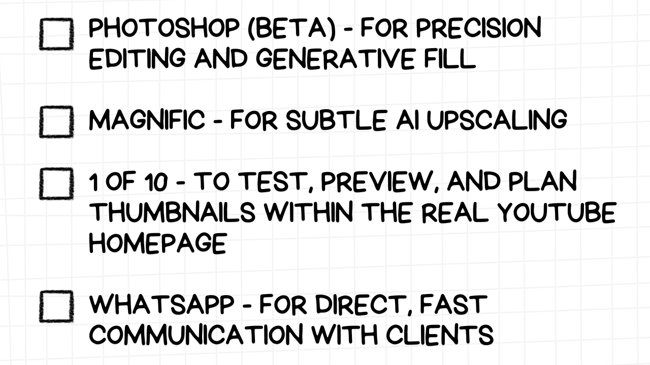
He doesn’t over-engineer his toolkit. Each tool has a purpose, and every minute saved on edits goes into creating better concepts or taking on more work.

3. Treat Feedback as a Business Variable

Not all clients are the same. Some give one round of notes. Others send 10.

David learned to price accordingly, charging full rate for complete redesigns, and half-rate for asset tweaks or A/B versions. This lets him keep the work sustainable and protects him from scope creep.

More importantly, it helps him filter the right clients: ones who are clear, collaborative, and trust the process.

4. Design for Speed, Not Just Polish

A well-composed thumbnail can take hours. But not every project needs to.

David often mocks up a thumbnail concept with rough cuts before doing any detailed editing. This lets him confirm the direction with the client early, and avoid costly rework.

If you’re designing thumbnails, speed matters. A good process doesn’t just save time, it gives you more room to test, improve, and repeat what works.


Grow in a Niche Before Going Broad, Why Mastering One Corner of YouTube Pays Off

If you're just starting out or stuck in a plateau, it's tempting to think the answer is to "go broader." But broad appeal often comes after narrow focus. That’s how David Altizer, and many of the creators he works with, gained momentum.

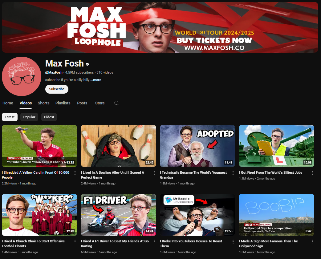
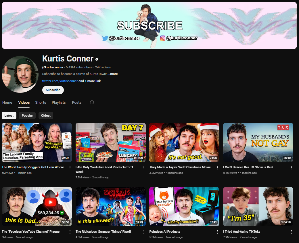
He didn't launch as a generalist. He leaned into a niche where his background in filmmaking, YouTube, and design gave him a sharp edge. And that same focus helped his clients, like Curtis Connor and Max Fosh, go from solid performers to standout stars.

Why Niches Work

Niching down helps you:

A white rectangular graphic with rounded corners and a light gray grid pattern in the background. On the left side are three empty checkboxes. To the right of each checkbox is a benefit of consistent and targeted content creation, presented in bold, black text:  GET DISCOVERED THROUGH SEARCH AND RECOMMENDATIONS BUILD TRUST FASTER WITH A SPECIFIC AUDIENCE CREATE REPEATABLE FORMATS THAT COMPOUND OVER TIME The image suggests that consistently producing content aimed at a specific audience can lead to increased discoverability, faster trust-building, and the development of content formats that gain momentum over time.
Advantages of consistent and targeted content creation.

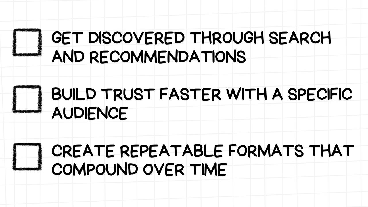
David didn’t try to make thumbnails for every genre. He focused on creators making IRL, storytelling, and commentary content, the type of YouTube he knew best. That made his work sharper, more relevant, and easier to pitch.

He could say, “Here’s what works in your style of video, and here’s why.”

If you’re designing or creating content, that’s a huge advantage: knowing the context of the content makes you way better at supporting it.

The Creators Who Mastered This

Jordan Welch focused on e-commerce content long before he moved into broader entrepreneurial topics. MrBeast’s original videos were just absurd challenges among friends, not huge productions. Even creators like Colin and Samir were laser-focused on the creator economy before exploring adjacent topics.

David highlighted how Curtis Connor has his own signature style, scrapbook-like thumbnails, with handwritten-style fonts and layered visuals. It doesn’t work for everyone. But it works for his specific audience. That’s the point.

A dark-themed YouTube channel page for Kurtis Conner. The channel banner features a light blue and purple gradient with the text "SUBSCRIBE" in a handwritten style and social media handles for Twitter and Instagram. The profile picture shows Kurtis Conner giving a thumbs-up. The channel name "Kurtis Conner" is in white letters, followed by a black dot. Below is the channel username "@kurtisconner", the subscriber count (5.41 million), and the video count (242). The banner also includes the text "Subscribe to become a citizen of KurtisTown! ...more" and a link to his Twitter account, along with a "Subscribe" button. The channel page displays tabs for "Home," "Videos," "Shorts," "Playlists," "Posts," and a search icon. Below these tabs are sorting options for "Latest," "Popular," and "Oldest." The video thumbnails showcase Kurtis Conner in various comedic and often bewildered expressions, often reacting to internet culture, reality TV, and social trends, with titles like "The Labrant Family Launches Parenting App," "The Worst Family Vloggers Got Even Worse," "I Ate Only YouTuber Food Products for 1 Week," "They Made a Taylor Swift Christmas Movie: It's Not Good.," "I Can't Believe This TV Show is Real," "The 'Faceless YouTube Channel' Plague," "The Ridiculous 'Stranger Things' Ripoff," "Pointless AI Products," and "I Tried Anti-Aging TikToks."
The YouTube channel of Kurtis Conner, known for his comedic commentary and observational humor, with 5.41 million subscribers.

Trying to serve everyone too soon usually just leads to generic work, and an invisible channel.

Going Broad After You’ve Earned It

Once you’ve built authority in a niche, you can stretch out. You can remix your format. Introduce new topics. Even bring in humor or commentary from outside your original space. But you’ll be doing it from a place of trust, not desperation.

And here’s the trick: the people who follow you from niche content will often want to hear your thoughts on broader topics, because you’ve already proven your value.

How to Apply It

If you're stuck trying to “be more relatable” or “reach a wider audience,” take a step back and ask:

A white rectangular graphic with rounded corners and a light gray grid pattern in the background. On the left side are three empty checkboxes. To the right of each checkbox is an introspective question for content creators, presented in bold, black text:  WHAT PROBLEM DO I SOLVE BETTER THAN MOST? WHAT TYPE OF VIEWER AM I ACTUALLY GOOD AT SPEAKING TO? WHICH FORMATS COME NATURALLY TO ME, AND WHICH FEEL FORCED? The image encourages content creators to reflect on their unique value proposition, their ideal audience, and the content formats that align with their natural abilities.
Introspective questions for content creators.

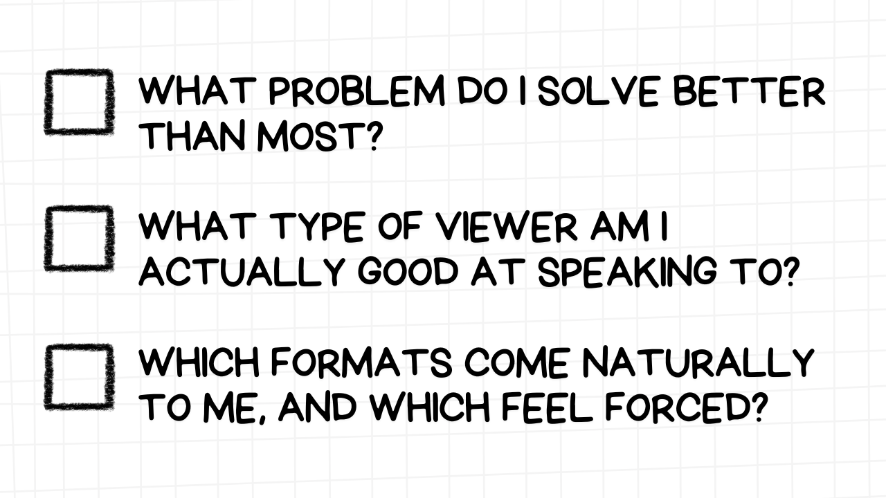
Start there. Dominate that corner. Then grow.

Niches aren’t boxes. They’re foundations.


Conclusion

David Altizer’s path isn’t a step-by-step formula. It’s a proof point.

He didn’t wait until he was “ready.” He started with the skills he had, leaned into his background, and picked up tools as he went. He focused on real impact over trends. Simplicity over flash. And above all, he listened, to creators, to audiences, and to what actually made videos perform.

If you’re trying to grow on YouTube, or help others grow, the biggest takeaway is this: everything compounds when you focus on what matters. The idea. The image. The viewer experience. And the people behind the screen.

Design better. Think sharper. Work smarter. Because, like David said, every creator is one thumbnail away from changing their career.