
How to Design Engaging Thumbnails That Drive More Clicks on YouTube
Thumbnails are your first impression. Keep them simple, bold, and use contrasting colors. Faces and emotions draw viewers in. Use text sparingly but strategically. Tease your content without revealing too much. Test different designs and iterate based on performance.
Creating a great video is one thing, but getting people to click on it is an entirely different challenge. Thumbnails are your first line of defence (or offence, depending on how you see it) when it comes to drawing viewers in. They act as the bait, the thing that catches someone’s eye in a sea-sized pool of videos. Whether you're just starting on YouTube or looking to tweak your strategy, designing engaging thumbnails can be the game-changer that pushes your videos to the next level.
Let’s talk about what makes a thumbnail stand out and get those clicks!
1. Keep It Simple But Bold
What It Means
One of the biggest mistakes creators make is cramming too much information into a thumbnail. You don’t need your entire video’s storyline squished into that little rectangle. Think of your thumbnail as a billboard on the highway: it needs to be clear, bold, and immediately grab attention, even at a quick glance.
- Use clear visuals: Get rid of the clutter. Stick to one or two elements in your thumbnail that gets your message across quickly.
- High contrast: Bright colors with strong contrasts can make your thumbnail pop against YouTube’s white or black background (depending if you’re on bright or dark mode). A thumbnail that jumps out is more likely to catch someone's eye as they scroll.
You don’t want someone squinting at their phone or monitor trying to figure out what’s happening. Remember, simplicity doesn’t mean boring, it means focused.
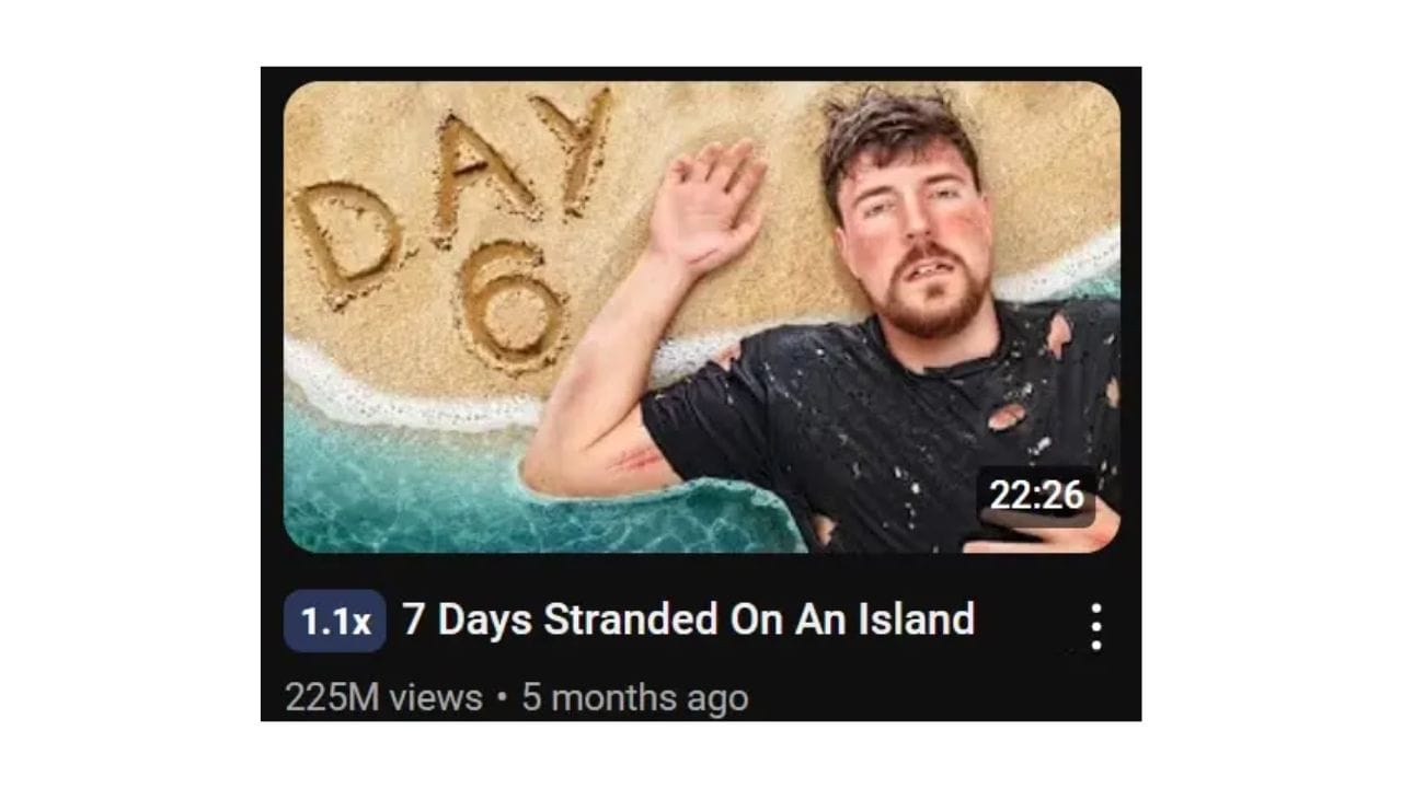
Think of channels like MrBeast. His thumbnails are super simple but dramatic. Usually, it’s just a large, expressive face and a couple of words, and yet, it makes you curious enough to click.
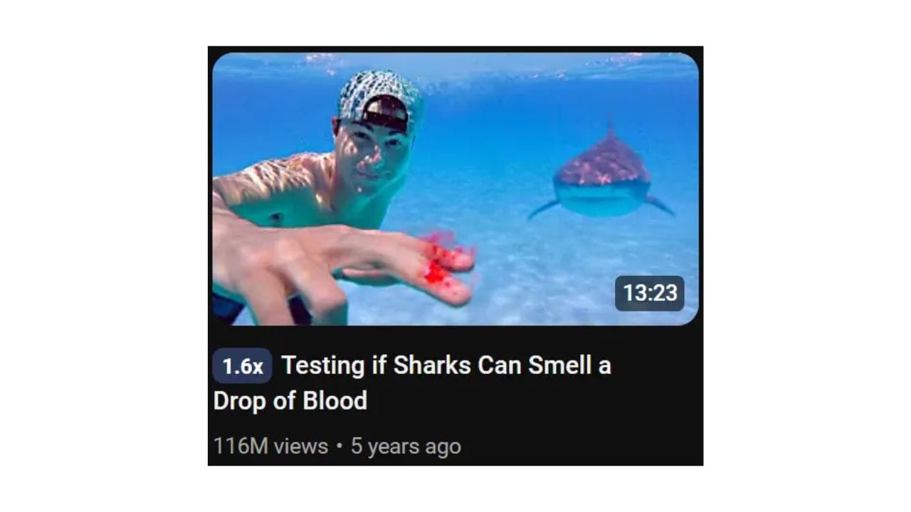
2. Faces Work (Especially With Emotion)
What It Means
Humans are wired to connect with faces. We naturally are magnetized toward content that features people, especially if those faces are Showing strong emotions. Whether it's surprise, excitement, confusion, or shock, an expression can tell a lot of information at a glance.
- Expressive faces: If you're in the video, use your own face. Make sure it’s clear, large, and showing an emotion that matches the video’s mood.
- Positioning: Place the face in a way that it’s not crowded by other elements. This helps it stand out even more.
Not into being in front of the camera? No problem. You can still use a person’s face, even if it’s a stock image. The key is make sure that the emotion being told feels real and related to your content.
Look at Mark Rober's thumbnails. His face usually shows some sort of curiosity or excitement, which matches the content in his videos. Even if you have no idea what the video is about, the face alone pulls you in.
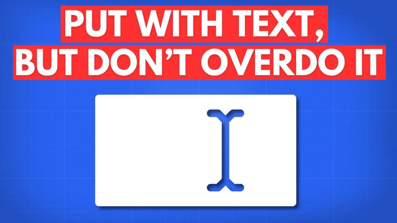
3. Put with Text, But Don’t Overdo It
What It Means
You want to include text in your thumbnails, but the trick is to keep it short and to the punch. Think of your text as a hook that complements the title. If your video title is already doing the heavy lifting, the text in the thumbnail should give an extra tease without repeating the same info.
- Use 3-5 words max: That’s all you really need. People aren’t going to spend time reading, just glancing.
- Bold fonts: Use bold, understandable fonts that are easy to read.
- Strategic placement: Don’t cover important parts of the thumbnail, like a face or a key object. Make sure the text feels like part of the design rather than an afterthought.
PewDiePie uses only a few words in his thumbnails, but they do a lot. The font is bold, and the words are usually placed in a way that’s impossible to miss.
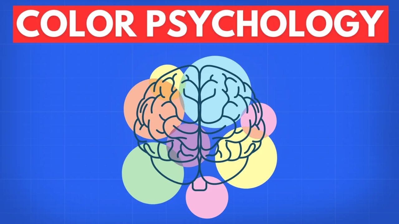
4. Color Psychology
What It Means
Colors are incredibly important when it comes to thumbnail design. Certain colors can create specific emotions, and more importantly, certain colors just flat-out grab attention. Warm colors like reds, oranges, and yellows tend to be more eye-catching, but that doesn’t mean you should always use them. You want to choose colors that fit the tone of your video and brand.
- Contrasting colors: Don’t let your thumbnail blend in with the YouTube background or your video content. Contrasting colors will make your thumbnail more noticeable.
- Consistent branding: If you’re building a brand, think about using consistent colors in your thumbnails.
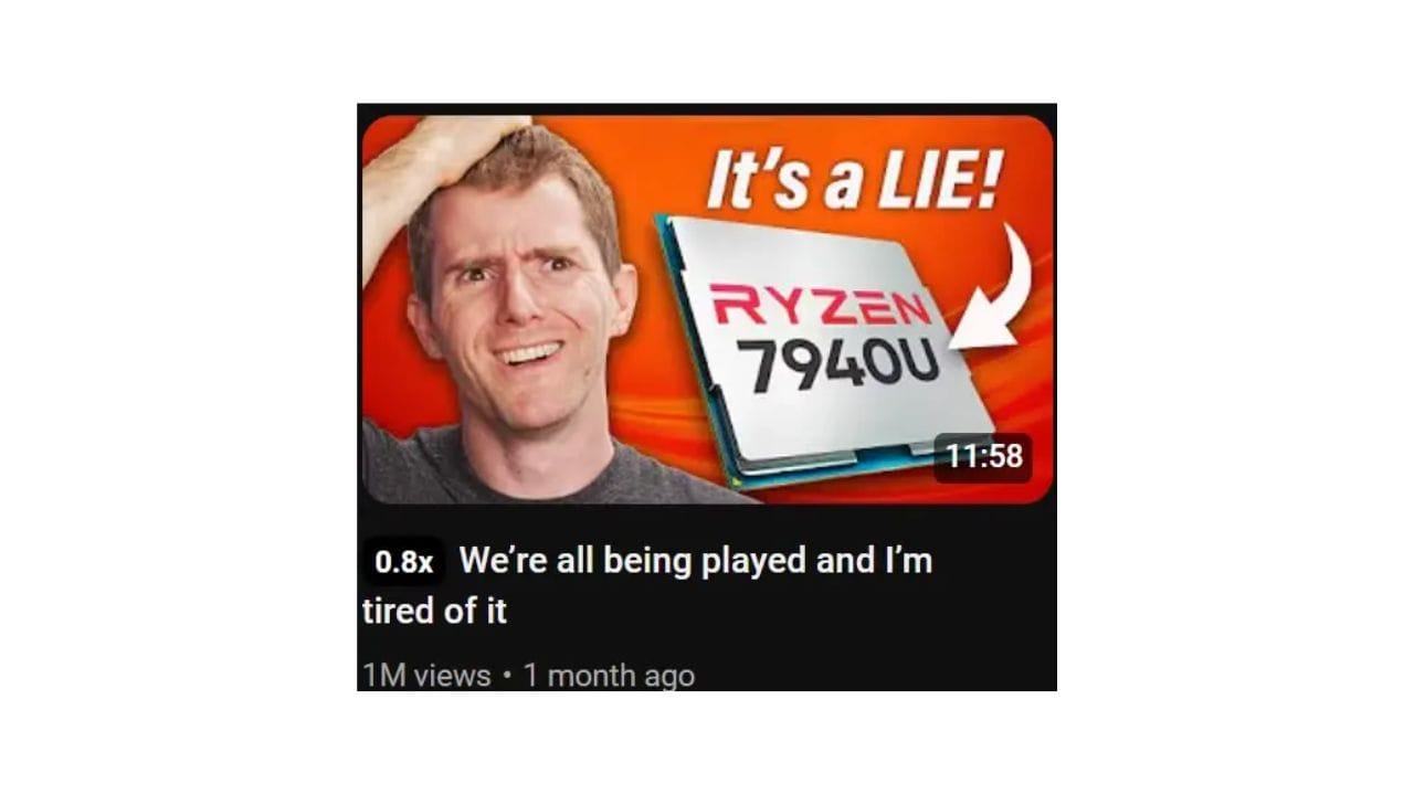
Linus Tech Tips uses bright oranges and bold fonts to create contrast, but it never feels out of place because the colors fit his brand. His thumbnails are instantly recognizable, building some sort of familiarity with his audience.
5. Show Context and Curiosity
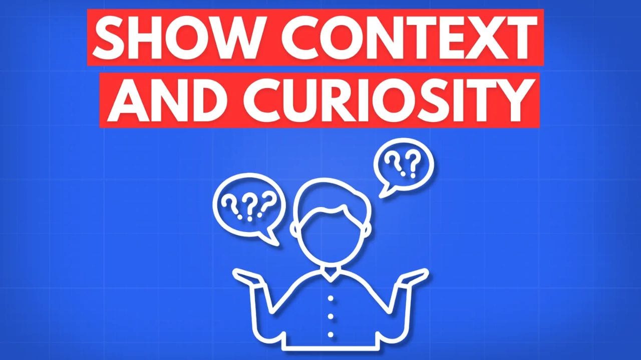
What It Means
People don’t want to feel tricked into clicking a video, so your thumbnail should give them a sense of what the video is about while also teasing something to pique their curiosity. It’s a balancing act between clarity and mystery.
- Use relevant images: If your video is about unboxing, show the product (but not too much of it). If it's a tutorial, include an image of the end result.
- Tease with visuals: Try using parts of images, blurred backgrounds, or question marks to hint at something without fully revealing it. This builds up a sense of curiosity and makes potential viewers want to click to find out more about your video.
Yes Theory is known for thumbnails that are both intriguing and somewhat revealing. They usually show just enough of a crazy adventure or a challenge to get viewers wondering what happens next.

6. Test What Works and Iterate

What It Means
You can read all the tips in the world, but at the end of the day, you’ll only know what works for your audience by testing. Experiment with different styles, color schemes, and layouts. Track which thumbnails lead to higher click-through rates (CTR) and then double down on what’s working.
- A/B testing: YouTube offers A/B testing features for thumbnails. Try two different designs for the same video and see which one performs better.
- Look at analytics: Look into your YouTube Studio and watch your CTR. Compare videos with high CTRs to those that are lower and find out what sets the top performers apart.
1of10’s grown the channel by constantly tweaking thumbnails and figuring out what our audience likes. Sometimes it’s just a small tweak, other times it’s changing the whole thumbnail.

Designing engaging thumbnails doesn’t have to be complicated. Keep experimenting, pay attention to what resonates with your audience, and remember, your thumbnail is usually the first step in turning a casual viewer into a subscriber.
If you want to see how other creators are evolving their thumbnails or learn from different design strategies, check out 1of10 for more ideas and inspiration!