
Fitness Thumbnail Ideas That Beat Big Channels
Your thumbnail looks good. Clean text, solid image, maybe even a before-and-after shot. So why isn't anyone clicking?
Here's the hard truth: most fitness thumbnails look exactly the same. Shirtless guy pointing at abs. Woman mid-lunge with a timer overlay. You've seen it a thousand times, and so has everyone else scrolling past your video.
Copying what the big creators do won't save you either. Their thumbnails work because they've already built trust. You haven't, not yet.
But that's fixable.
I've broken down what actually works for fitness thumbnails, whether you're posting fat loss tips, muscle-building routines, or quick home workouts. These aren't guesses. They're patterns pulled from videos that turn impressions into views.
If your click-through rate has been stuck in the mud, keep reading. Your next thumbnail might be the one that finally stops the scroll.
Transformation Fitness Thumbnail Ideas
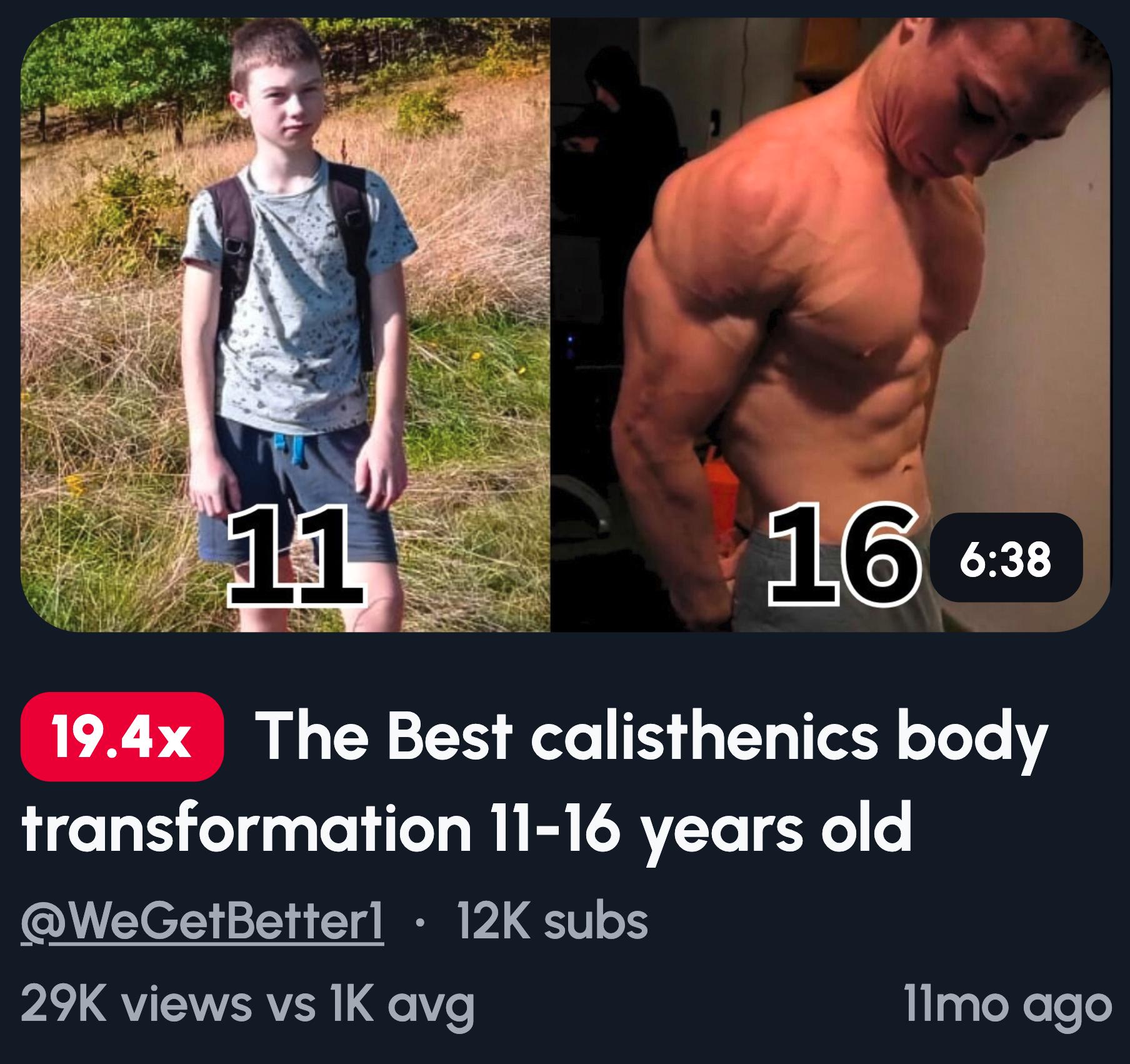
Transformation thumbnails work because your brain can't ignore contrast. It's wired to spot differences. When someone sees a body shift from soft to shredded, curiosity kicks in and hope follows.
Here are ideas that nail it:
- Before vs after body split, same pose, different results
- Day 1 vs Day 30 with bold text
- Skinny to muscular, side by side
- Belly close-up to flat stomach
- Clothes tight vs loose fit, same outfit
One rule: use hard contrast. If someone has to squint, you've lost the click.
Reaction-Based Fitness Thumbnails
Faces stop the scroll faster than anything else. Your brain is trained to read expressions, and emotion pre-sells the result before anyone reads a word.
Here are ideas that work:
- Shocked face with a physique reveal
- Pain face mid-rep, mouth open, veins popping
- Proud mirror check with a subtle smirk
- "Did this really work?" expression, eyebrows raised
- Regret face holding junk food
One thing to remember: exaggeration beats realism. A natural smile won't cut it. Go bigger. If it feels over the top, you're probably in the right zone.
Workout & Challenge Thumbnails
Clear challenges set clear expectations. Viewers want to know exactly what they're getting into. When you reduce time and effort upfront, clicks go up.
Here are ideas that work:
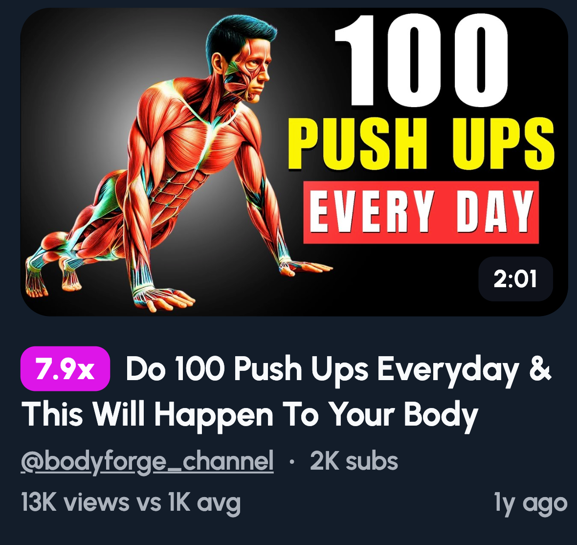
- "10 MIN WORKOUT" in bold text
- 100 Push-Ups Challenge with a sweaty face
- One Exercise Only, simple and intriguing
- Full Body Burn with flames or red tones
- No Equipment Workout, just you and the floor
Keep your text to 2-4 words max. If your thumbnail needs a paragraph, it's doing too much. Short and punchy wins every time.
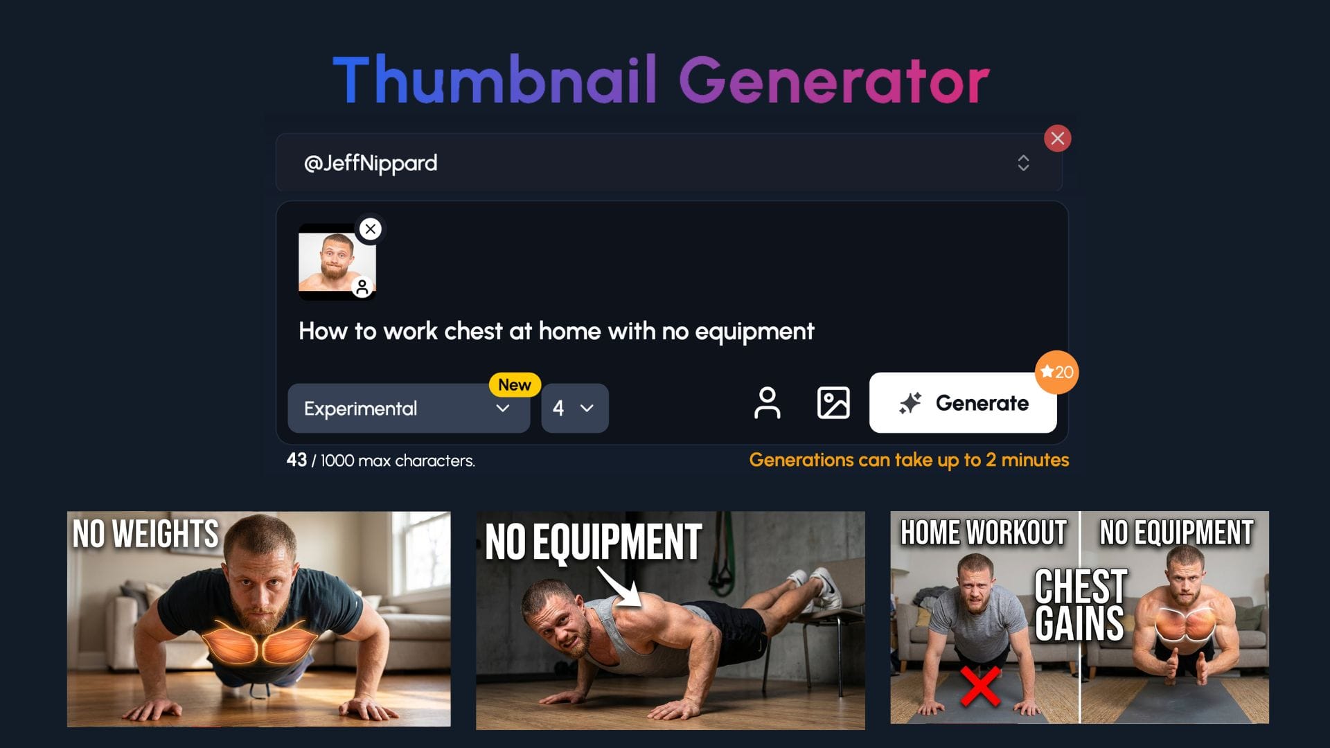
Use 1of10's Ai Thumbnail Maker
1of10 is designed to take the guesswork out of thumbnails by designing them from start to finish in 1-click.
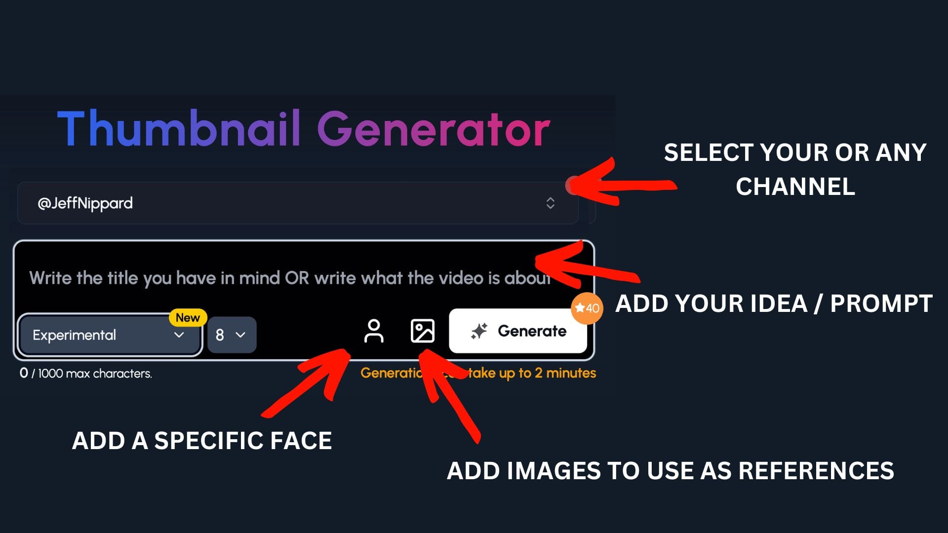
Step 1: Select your channel or a competitor's channel to help 1of10 get inspiration
Step 2: Decide if you want to upload your specific face or add images to use as a reference - perfect for fitness channels to upload themselves and equipment
Step 3: Write the title or describe your idea
Now watch you ideas come to life.
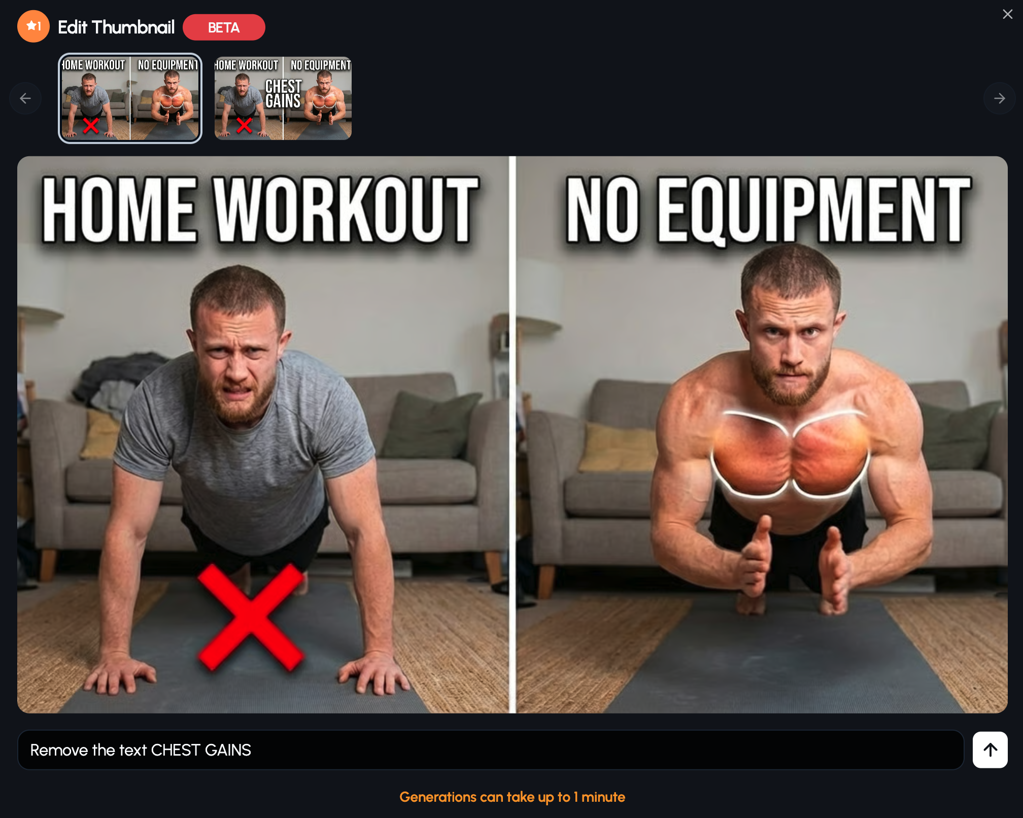
You can also edit individual thumbnails for refinement.
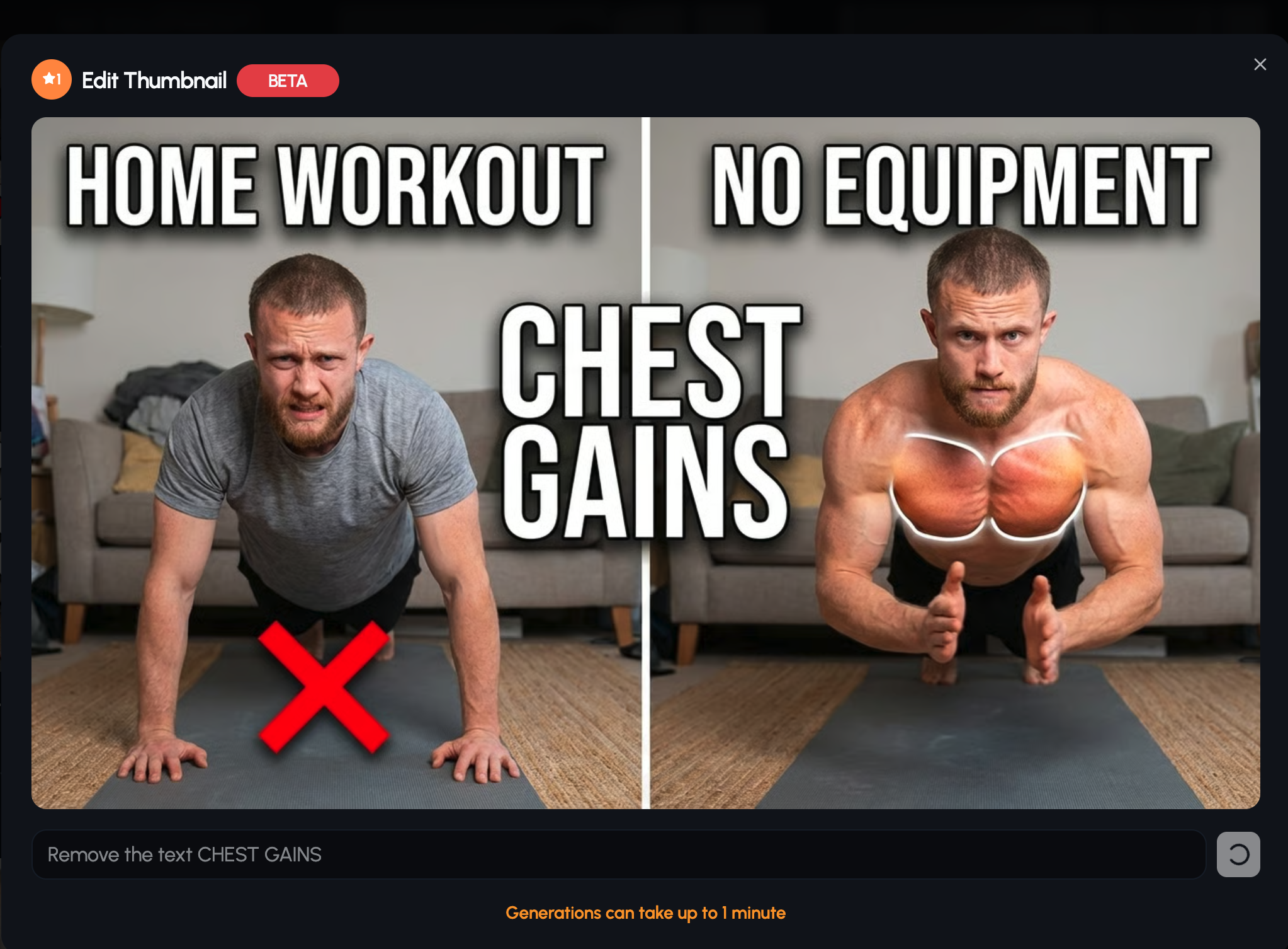
I wanted to remove the text, "CHEST GAINS" in the center.
Mistakes & Warning Thumbnails
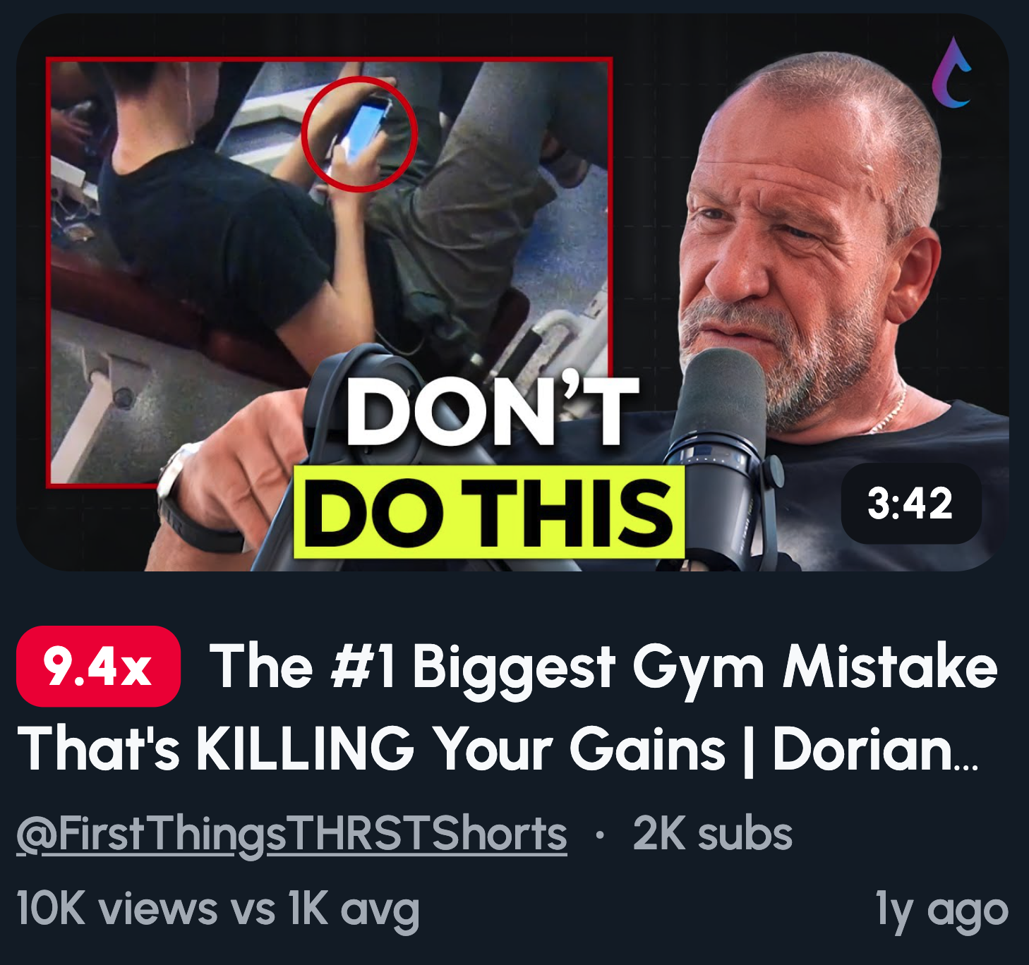
Fear of doing it wrong drives clicks. Nobody wants to waste weeks on a workout that doesn't work, or worse, get injured. Warning thumbnails tap into that anxiety.
Here are ideas that work:
- Red ❌ on bad form, green ✓ on correct
- Wrong vs Right split down the middle
- "STOP Doing This" with a hand signal
- Injury-risk highlight with a red circle on the problem area
- Beginner mistakes visual showing common slip-ups
Skip the text-heavy explanations. Use arrows, Xs, circles, and symbols to tell the story. One glance should be enough for viewers to get the point and click.
Fat Loss & Diet Thumbnails
Fat loss is the number one fitness intent on YouTube. People searching for answers want visual proof, not long explanations. Show results and they'll click.
Here are ideas that work:
- Belly close-up with an arrow showing progress
- Scale shock moment, eyes wide at the number
- Healthy vs junk food split, side by side
- "Why You're Not Losing Fat" with a confused expression
- Calories visualized with food stacks or portion sizes
One note: focus on progress, not shame. Thumbnails that celebrate wins land better than ones that make viewers feel bad. Keep it motivating and you'll build trust with your audience.
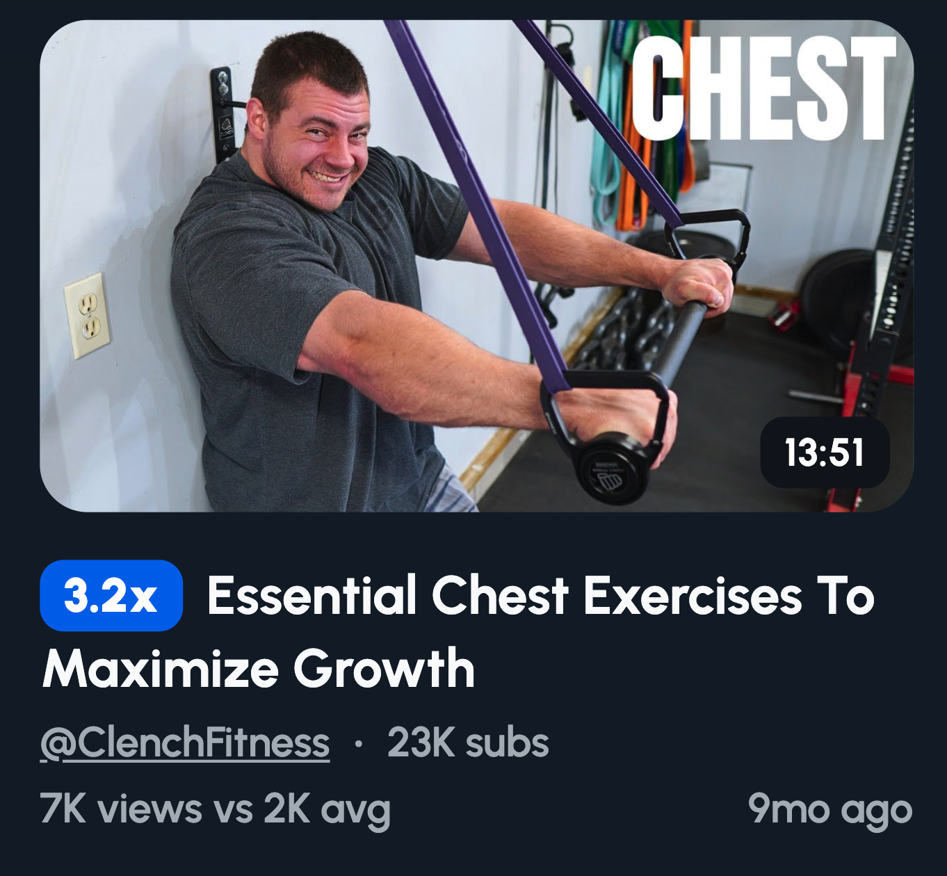
Muscle & Aesthetic Thumbnails
Aspirational visuals trigger desire. Viewers see the physique they want and click to learn how to get it. Close-ups amplify that impact, making results feel tangible.
Here are ideas that work:
- Arm flex pump shot, fresh from a set
- Chest day sweat close-up, glistening under light
- Back width comparison, lats spread wide
- Abs under harsh lighting, shadows doing the work
- Veins popping macro shot, zoomed in tight
Here's the secret: lighting matters more than camera quality. Harsh side lighting carves out definition. Soft overhead light flattens everything. Nail your lighting and a phone camera can outperform an expensive setup.
Home Workout Thumbnails
Convenience removes friction. When viewers see a workout they can do right now, no gym required, they're more likely to click. Relatable environments outperform shiny gym setups.
Here are ideas that work:
- Living room workout setup, couch in the background
- Resistance bands only, simple and accessible
- Bodyweight only text, no equipment visible
- Small space workout, tight corners on display
- No Gym Needed with a home setting
Here's what works best: messy but real beats polished. A perfect studio looks aspirational. A living room with a coffee table pushed aside looks doable. Show viewers their own space and they'll believe they can start today.
Fast & Lazy Fitness Thumbnails
Speed and simplicity sell. Viewers want results without the grind, and thumbnails that promise effort reduction get clicked. Nobody's scrolling YouTube looking for harder workouts.
Here are ideas that work:
- "5 MINUTES" in big, bold text
- Lazy workout pose, lying down or slouched
- Minimal setup visual, just a mat and nothing else
- One dumbbell only, keeping it simple
- Fast results promise with a short timeline
The formula is easy: big numbers, few words. "5 MIN" beats "Quick Five Minute Routine." Let the visual do the talking and keep text punchy. If it takes longer to read than to understand, trim it down.
Relatable & Viral Fitness Thumbnails
Humor increases shares. Relatability builds trust. When viewers see themselves in your thumbnail, they click because it feels like you get them.
Here are ideas that work:
- Gym fail freeze frame, mid-disaster moment
- First day vs day 30, awkward beginner to confident
- Post-leg-day walk, stiff and struggling
- Reality vs Instagram, flexed vs relaxed side by side
- Sweat-soaked T-shirt, proof you actually worked
The golden rule: authenticity beats perfection. Polished thumbnails feel like ads. Real moments feel like content worth watching. Show the messy, funny, honest side of fitness and your audience will stick around.
Common Fitness Thumbnail Mistakes
Even solid content flops with a weak thumbnail. Here are the mistakes killing your click-through rate:
Too much text. If it takes more than a second to read, it's too long. Stick to 2-4 words max. Your thumbnail isn't a title card, it's a visual hook.
No emotion. A blank face gives viewers nothing to connect with. Expressions sell the click. Shock, pain, pride, whatever fits the video, show it on your face.
Overcrowded gym shots. Busy backgrounds steal focus from you. Random gym equipment, other people, cluttered mirrors, all distractions. Keep the focus tight and simple.
Low contrast lighting. Flat images blend into the feed. Harsh lighting creates shadows and definition. If your thumbnail looks dull at a glance, it's getting scrolled past.
Generic stock photos. They scream "I didn't try." Viewers can spot a lazy thumbnail instantly. Use real shots of yourself, even imperfect ones beat polished fakes.
Why Fitness Thumbnails Matter on YouTube
Fitness is a results-driven niche. Viewers aren't clicking for fancy editing or cinematic b-roll. They click what promises visible change or a clear benefit. Your thumbnail is the promise, and your video is the payoff.
In most niches, production quality matters. In fitness, your thumbnail often matters more than your editing. A shaky video with killer results will outperform a polished video with a forgettable thumbnail every time.
Here's what actually moves the needle:
- Results over aesthetics. A grainy before-and-after beats a high-res gym shot with no story.
- Emotion over perfection. A real reaction lands harder than a posed smile.
- Clarity over clutter. One focal point wins. If viewers have to figure out what they're looking at, they've already scrolled.
Nail your thumbnail and the algorithm rewards you. More clicks mean more watch time, which means more impressions. It's a loop, and your thumbnail is the starting point.