
Cooking Thumbnail Ideas for YouTube - Go Viral
Your food looks incredible. So why isn't anyone clicking?
You've nailed the recipe. The lighting's good. You hit publish, and... crickets. Meanwhile, channels with half your talent are racking up views.
Here's the truth: on YouTube, your thumbnail eats first. Not your dish.
It doesn't matter if you're plating Michelin-level meals. If your thumbnail looks like every other cooking video, you're invisible. Viewers scroll past in a heartbeat.
The good news? A few simple tweaks can turn your thumbnails into click magnets. Let's break down what actually works.
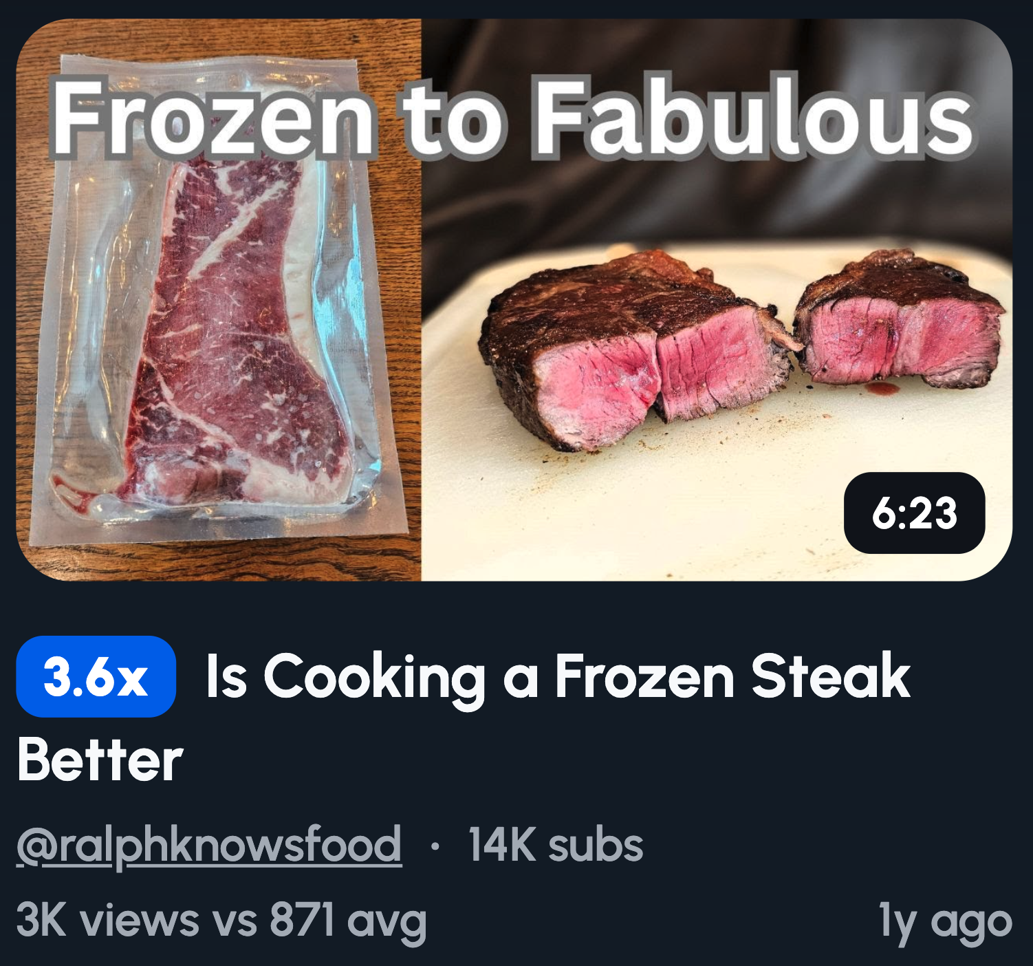
Before vs After Thumbnails
Before vs after thumbnails work because transformation is impossible to ignore. Your brain wants to know how A became B. It's the same reason makeover shows are addictive. You see the "before" and you need the payoff.
This format practically writes itself for cooking content.
Ideas to try:
- Burnt disaster vs golden perfection
- Raw ingredients scattered vs final plated dish
- Sad frozen meal vs your homemade version
- Chaotic mid-cook mess vs restaurant-worthy result
The bigger the contrast, the stronger the curiosity. Make that gap dramatic.
Reaction-Based Thumbnails
Faces grab attention faster than food ever will. It's hardwired into us. We're social creatures who read expressions before language. A genuine reaction tells viewers exactly how that dish tastes without a single word.
Your face becomes the review.
Ideas to try:
- Close-up of your first bite, mid-chew
- Shocked expression with fork frozen mid-air
- Eyes closed, pure bliss face
- "Wait, that actually worked?" surprise look
Capture the real moment and let your face sell the food.
Comfort Food and Texture Shots
Texture makes people taste with their eyes. A cheese pull or sauce drip triggers cravings instantly. You're not just showing food, you're making viewers hungry. That's a powerful click driver.
Static plated shots don't hit the same way.
Ideas to try:
- Cheese stretching to its breaking point
- Sauce dripping in slow-motion glory
- Fork cracking through crispy golden crust
- Gooey center oozing out of a cut
Capture the moment right before it breaks or falls. That tension is what makes thumbs stop scrolling.
Fast Easy and Lazy Cooking Thumbnails
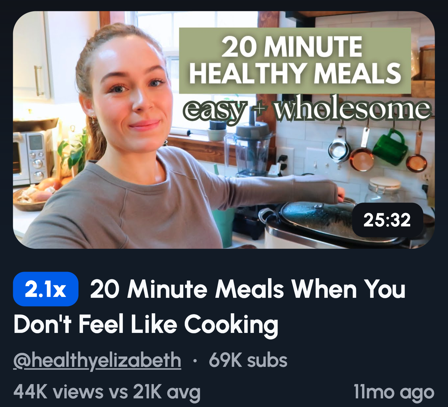
Speed sells because everyone's tired. Viewers want great food without the effort.
When your thumbnail promises a shortcut, you're solving a real problem. That's instant value before they even click.
Nobody wants to spend hours in the kitchen after work.
Ideas to try:
- Bold "5 MINUTES" text next to the finished dish
- One-pan meal with everything visible in the shot
- Just 3 ingredients laid out clean and simple
- Air fryer sitting next to a crispy result
Lead with the time saved or effort cut. Make lazy look delicious.
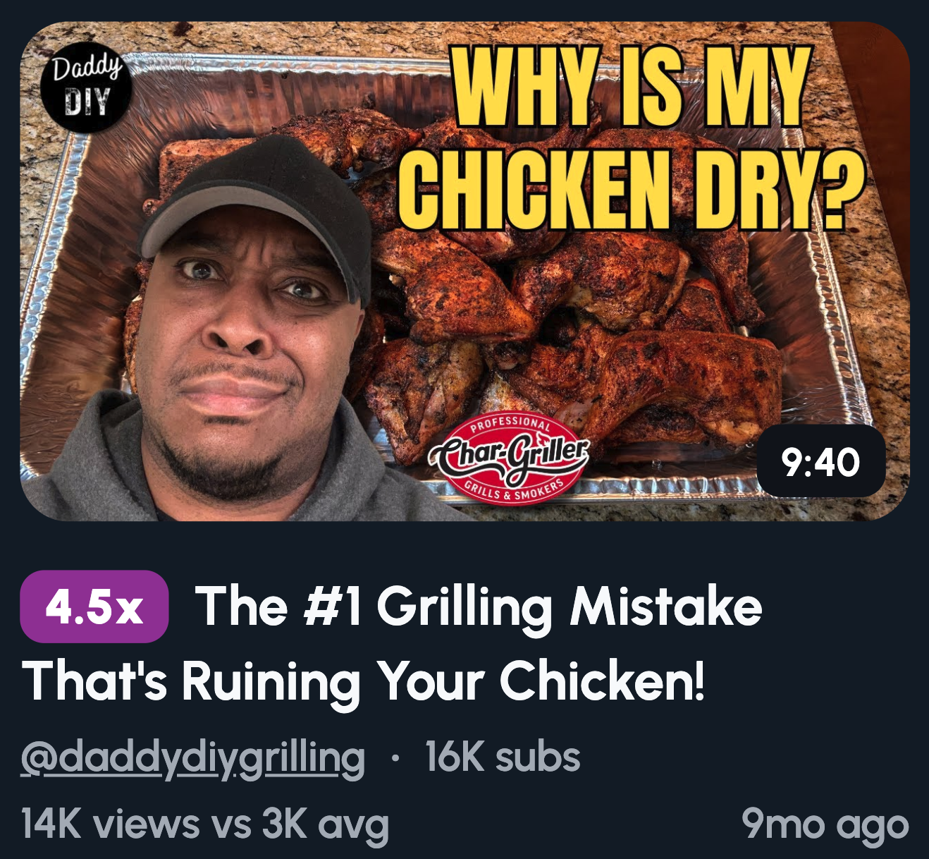
Cooking Hacks and Secrets
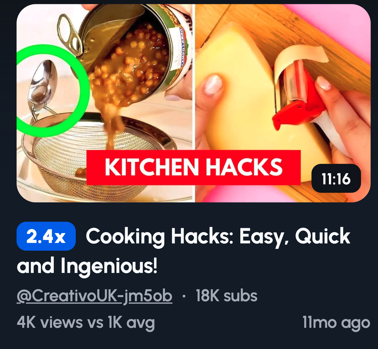
Mistakes hurt, so we click to avoid them. Hack thumbnails tap into fear of doing it wrong. They promise insider knowledge that most people don't have. That exclusivity is irresistible.
You're offering a cheat code for the kitchen.
Ideas to try:
- "STOP doing this" with a clear mistake shown
- Red X vs green checkmark comparing two techniques
- You pointing directly at what's wrong
- "This changes everything" text next to a simple trick
Position yourself as the person who figured it out. Viewers want your shortcut so they don't waste time learning the hard way.
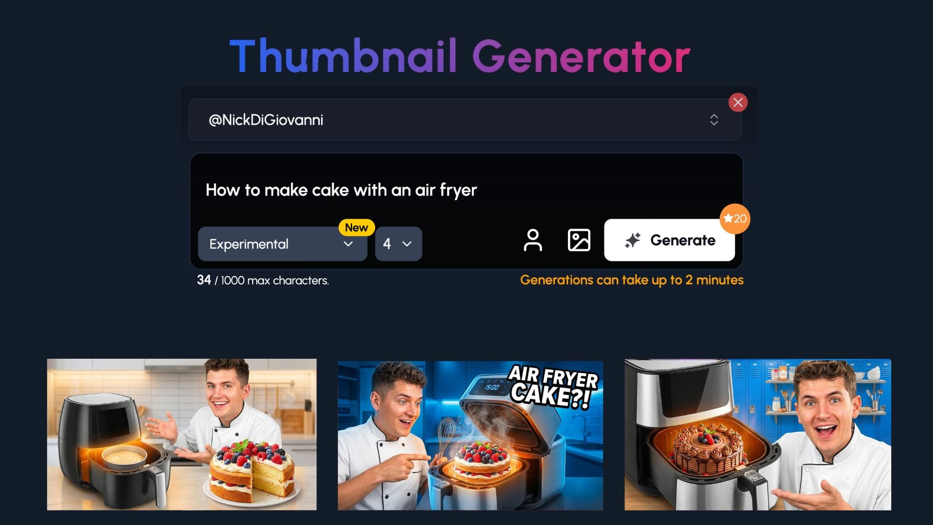
How 1of10 Can Help You Make Better Cooking Thumbnails
You've got the ideas. Now you need to know what actually works for your channel.
That's where 1of10 comes in.
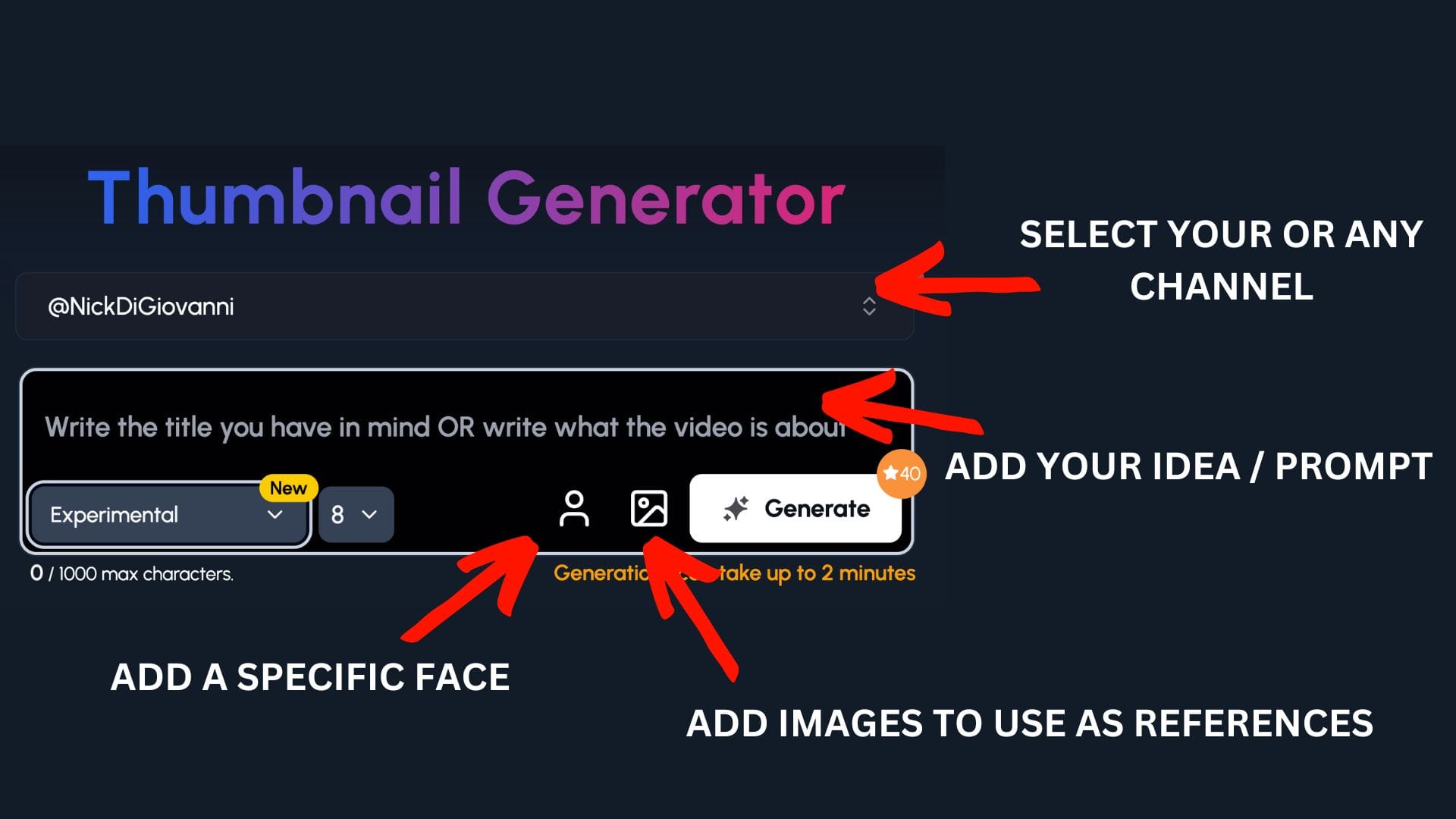
Step 1: Select your channel or a competitor's channel to help 1of10 get inspiration
Step 2: Decide if you want to upload your a specific face or add images to use as a reference - perfect for cooking channel to upload themselves and recipes
Step 3: Write the title or describe your idea
Now watch you ideas come to life.
Fail vs Fix Thumbnails
Kitchen disasters happen to everyone. That's exactly why fail vs fix thumbnails get clicks. Viewers see their own struggles in your mess. Then they stick around for the rescue.
It's relatable and useful in one frame.
Ideas to try:
- "I RUINED THIS" on one side, "I FIXED IT" on the other
- Dry, sad chicken vs juicy, sliced perfection
- Broken split sauce vs smooth glossy finish
- Collapsed cake disaster vs clean perfect slice
Show the failure big and ugly. Don't minimize it. The worse it looks, the more satisfying the fix becomes.
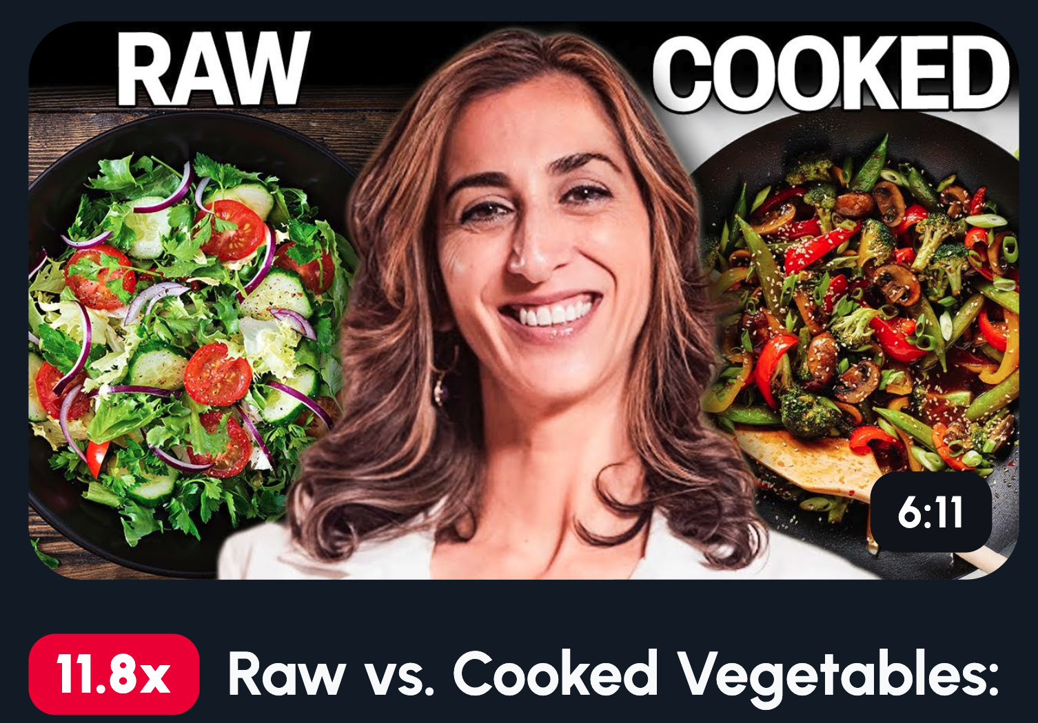
Side-by-Side Cooking Tests
Comparisons answer the question viewers are already asking. Which one's actually better? You're doing the testing so they don't have to. That's a click built on pure curiosity.
Decision fatigue is real. Your thumbnail solves it.
Ideas to try:
- Cheap steak vs expensive steak, side by side
- Store-bought version vs your homemade attempt
- Same dish cooked in pan vs air fryer
- Fresh ingredients vs frozen, final results shown
Make both options clearly visible and evenly framed. The visual standoff creates tension. Viewers need to know the winner.
POV and First-Person Cooking Thumbnails
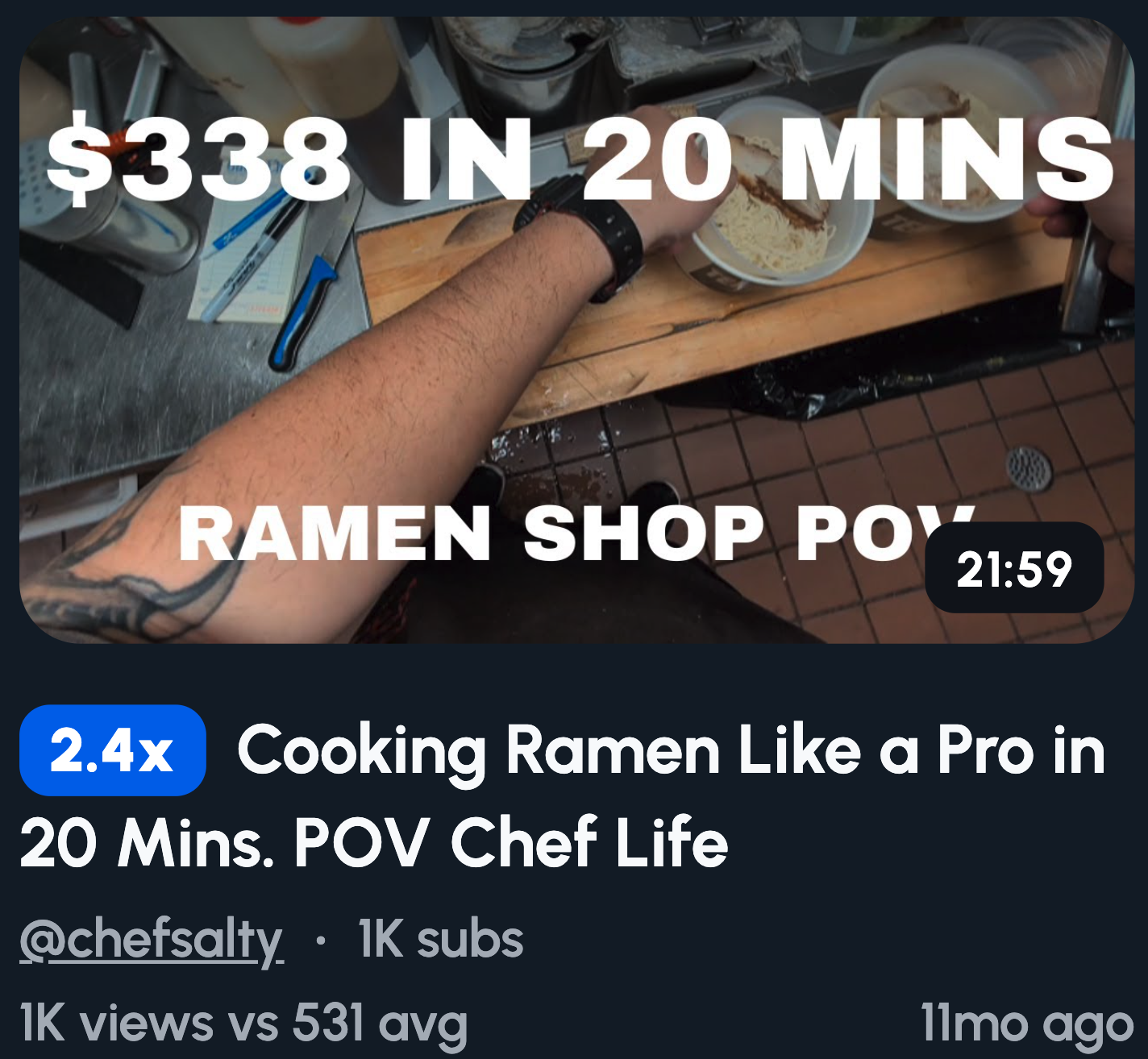
POV thumbnails put viewers in your shoes. They're not watching you cook, they're cooking. That perspective shift makes content feel personal and immersive. It hits different on mobile where the screen is already in their hands.
You're inviting them into the kitchen.
Ideas to try:
- Your hands plating a dish from your eye level
- Knife slicing through meat, close and detailed
- Top-down shot of a pan sizzling with action
- Sauce pouring from your perspective
Keep hands visible when possible. It reinforces the "you're doing this" feeling. Clean nails and minimal clutter help too.
Don’t Do This Thumbnails
Fear of messing up beats the promise of success. People click to avoid regret, not just to learn. A "don't do this" thumbnail triggers that protective instinct. Nobody wants to be the person making rookie mistakes.
It's loss aversion doing the heavy lifting.
Ideas to try:
- "DON'T COOK IT LIKE THIS" with the wrong method shown
- Big red X over the mistake, correct way beside it
- Facepalm reaction with the disaster in frame
- "You're doing this wrong" text, direct and blunt
Call out the mistake clearly. Don't be vague. The more specific the error, the more viewers think, "Wait, is that me?"
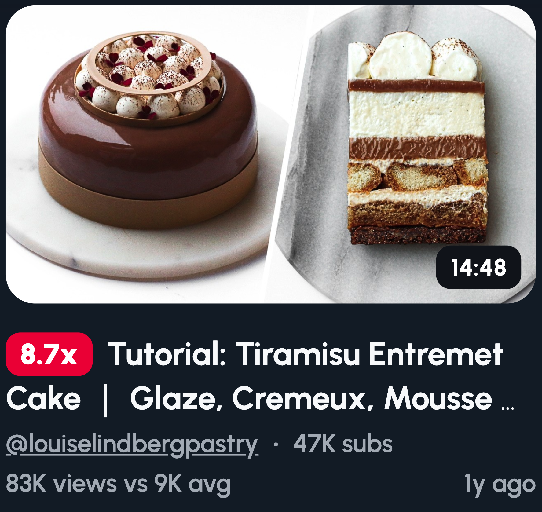
Minimalist Food Thumbnails
When everyone's screaming, silence stands out. Clean thumbnails cut through cluttered feeds like a sharp knife. While others pile on text and arrows, you let the food breathe. That contrast gets noticed.
Sometimes less really is more.
Ideas to try:
- Single dish centered on a plain background
- One hero ingredient lit beautifully, nothing else
- Extreme close-up of texture filling the whole frame
- Zero text, just pure food that triggers cravings
This works best when your food photography is strong. No distractions means nowhere to hide. The dish has to carry the entire thumbnail alone.
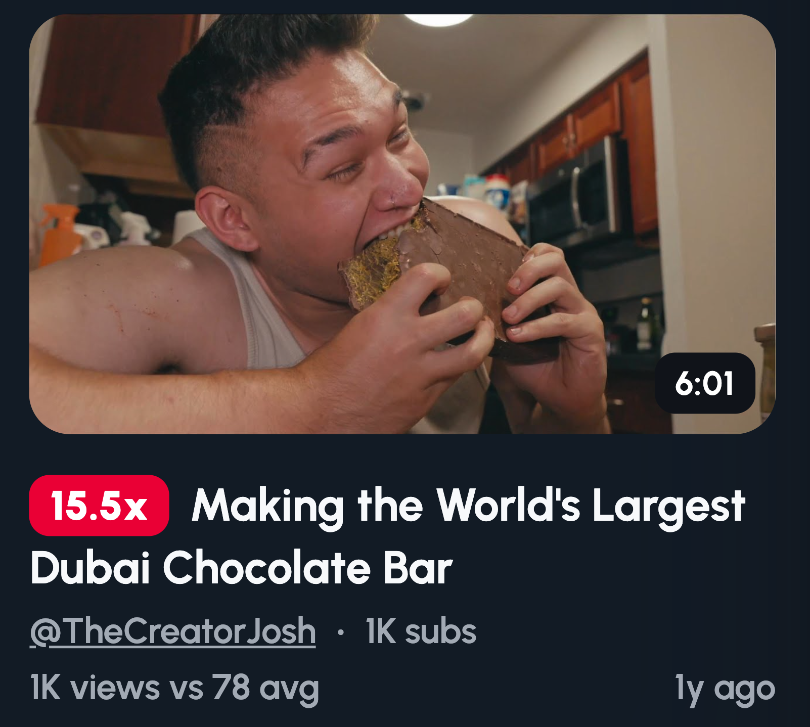
Extreme Results and Experiments
Extremes spark curiosity because they break expectations. Normal doesn't get clicks, weird does. When you push something to its limit, viewers need to see what happens. It's the same reason car crash videos get views.
You're offering a kitchen experiment they'd never try themselves.
Ideas to try:
- "I cooked this for 24 HOURS" with the final result
- Giant portion vs tiny portion, same dish
- Overcooked vs undercooked, side by side comparison
- Strange ingredient combo with your honest reaction
Go big or go bizarre. The further you stray from normal, the harder it is to scroll past. Just make sure the payoff matches the promise.
Chef vs Home Cook Thumbnails
This format works because it answers the question we all secretly ask. Can I actually do that at home? The gap between pro and amateur creates tension. Viewers want to know if the effort's worth it.
It's aspiration meets reality.
Ideas to try:
- Chef's pristine plating vs your honest home attempt
- Professional knife work vs your regular kitchen knife
- Restaurant-style dish vs what you made in your kitchen
- "Is it worth it?" text with both versions visible
Play up the contrast, but don't fake incompetence. Viewers root for the home cook. Let them see themselves in your attempt.
Common Thumbnail Mistakes Cooking Channels Make
Great food won't save a bad thumbnail. These mistakes tank your click-through rate before anyone tastes a thing.
Wide shots where food is tiny. Your dish should dominate the frame. If viewers can't tell what it is on a phone screen, zoom in.
Too many ingredients in frame. Clutter kills focus. Pick one hero element and let it shine. Three items max.
Low contrast, beige on beige. Brown food on a brown table with brown walls? Invisible. Add a pop of color or swap your background.
Small text and long phrases. If your text needs squinting, cut it. five words max, sized to read on a thumbnail the size of your thumb.
No clear outcome. Viewers scroll fast. If they can't instantly tell what the dish is, they're gone. Show the finished product clearly.
Fix these first. You'll stand out from channels still making them.